The rise of "hyper goo" aesthetics The minimalist, essential visual imaginary has given way to a more maximalist visual trend
For many years, the design of numerous consumer products, both physical and digital, intended for the mass market, has been characterized by a rather essential aesthetic: muted colors, minimalist branding, clean surfaces and sober packaging. Many brands have built their identity on this imagery, for example favoring the use of pastel tones such as the famous "millennial pink", a delicate pink that became very popular in 2010. The fashion sector has also partly followed this direction: this is shown by the growing popularity of the so-called "normcore", a trend that emphasized deliberately somewhat anonymous and ordinary clothing.
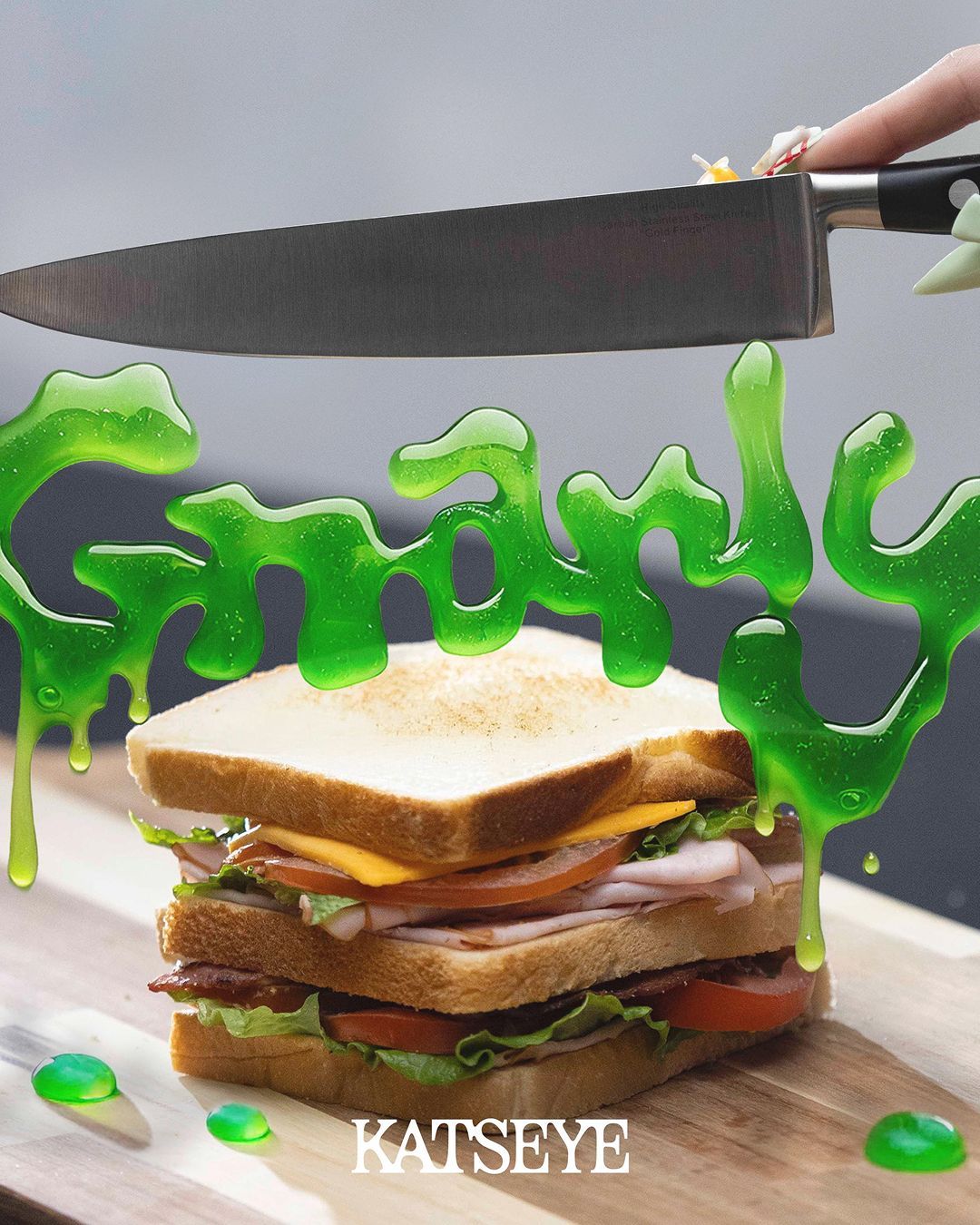
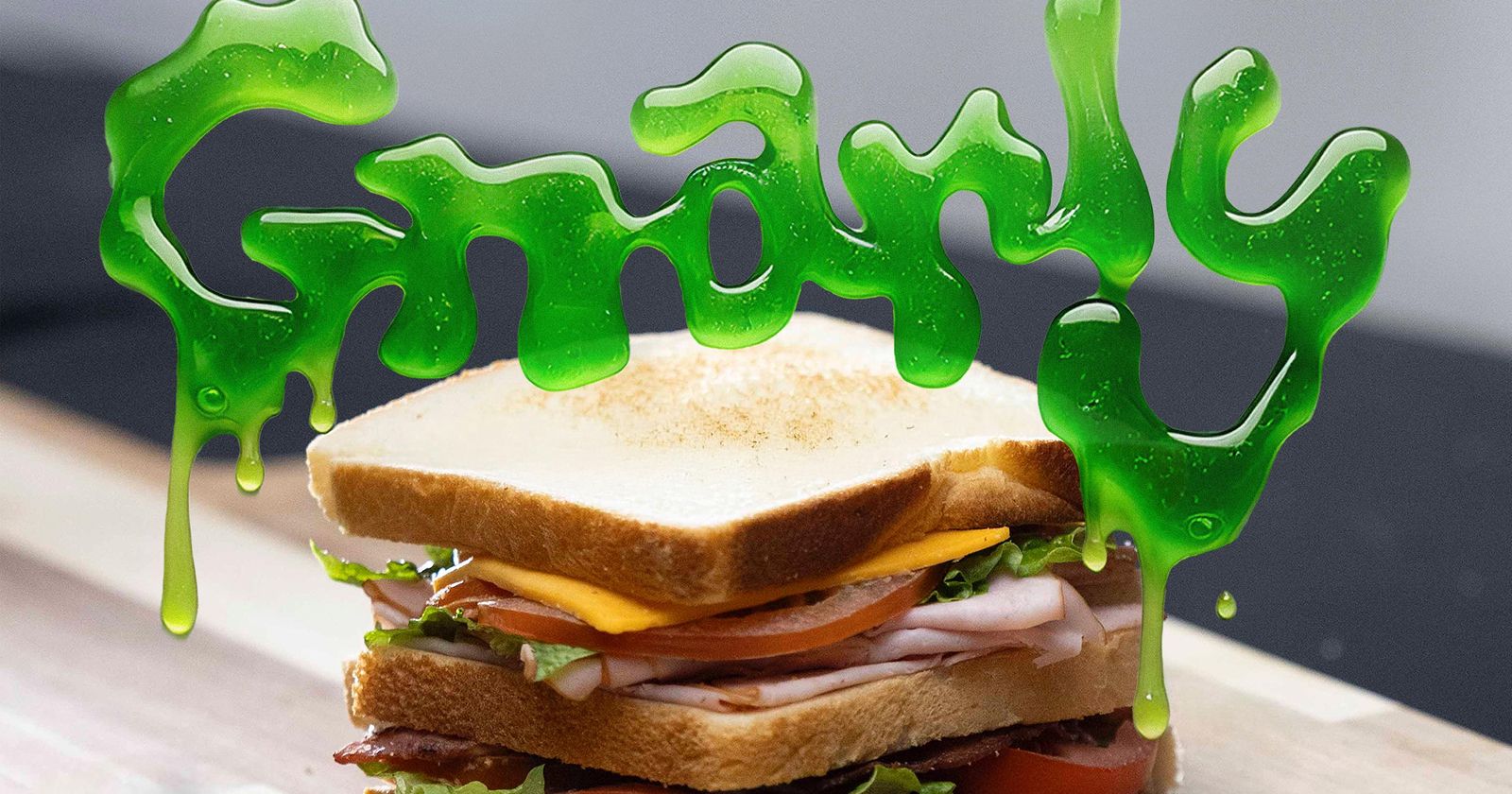
All of this, however, has ended up fostering what has been defined as "millennial blanding", that is a progressive aesthetic homogenization that has made many brands almost indistinguishable from one another. This uniformity, however, has at the same time contributed to the rise of a visual language at the opposite end of the spectrum. As reported by the New York Times, an aesthetic characterized by vivid colors, irregular shapes, distorted lettering and a deliberately imperfect appearance is in fact emerging. This imagery has been dubbed "hyper goo", an expression that evokes something fluid, organic and – by its very nature – resistant to being contained within regular forms.
The new visual language of Gen Z
Hyper goo is distinguished by a set of elements that seem to draw both from the digital imaginary and from a certain aesthetic typical of animation for children. For example, typographic characters appear swollen, soft and deliberately distorted, while empty spaces are often filled with doodles, textures and irregular graphic elements. In addition, there is a tendency to favor the contrast between extremely "flat" surfaces and digitally altered images. Colors, finally, are pushed to the limit of saturation. All of this contributes to creating visual identities designed to immediately capture attention.
This shift in design is not only an aesthetic choice, but highlights a different way of interpreting contemporaneity. If the minimalism of past years communicated security and control, hyper goo instead seems to reflect a more complex, unstable and constantly evolving social, political and economic context. As stated in the New York Times, it seems that Gen Z – raised among social networks, various economic crises, the experience of the pandemic and continuous technological revolutions – recognizes in these fluid visual imaginaries a more faithful representation of the reality they experience every day.
How brands are adapting to this new aesthetic
@softpowerfeelings Is Gen Z branding too trendy and overdone??? Why do all new CPG food brands look the same… asking for a friend! #genzbranding #packagingdesign #designtok #packaging #branding #brandingdesign #greenscreen original sound - pyone
Many brands have noticed the change brought by the rise of hyper goo and are adapting their visual communication accordingly, with the aim of capturing the interest of younger consumers. This is quite evident in some supermarkets, for example, where many food products packaging – including various snack and beverage brands – are adopting pop and maximalist identities, through graphic compositions rich in detail, fluorescent palettes and bulky typographies.
Other markets are also aligning with this trend. Some new-generation electronic devices, such as certain products intended for nicotine consumption, have adopted an increasingly flashy aesthetic, with rounded shapes, bright colors and small interfaces inspired by typical 1990s video game screens – whereas in the past these same products were marketed using essential and elegant aesthetics. In addition, many historic interior design companies, such as Cassina, Zanotta and B&B, are reissuing historical pieces (highly sought after in the vintage market) characterized by rather fluid shapes, such as the Bambole line of sofas and armchairs, the Onda sofa and the Soriana sofa.