


Why illustrated brand identities are so popular in the food sector It’s an increasingly visible trend, but one that has roots in the past
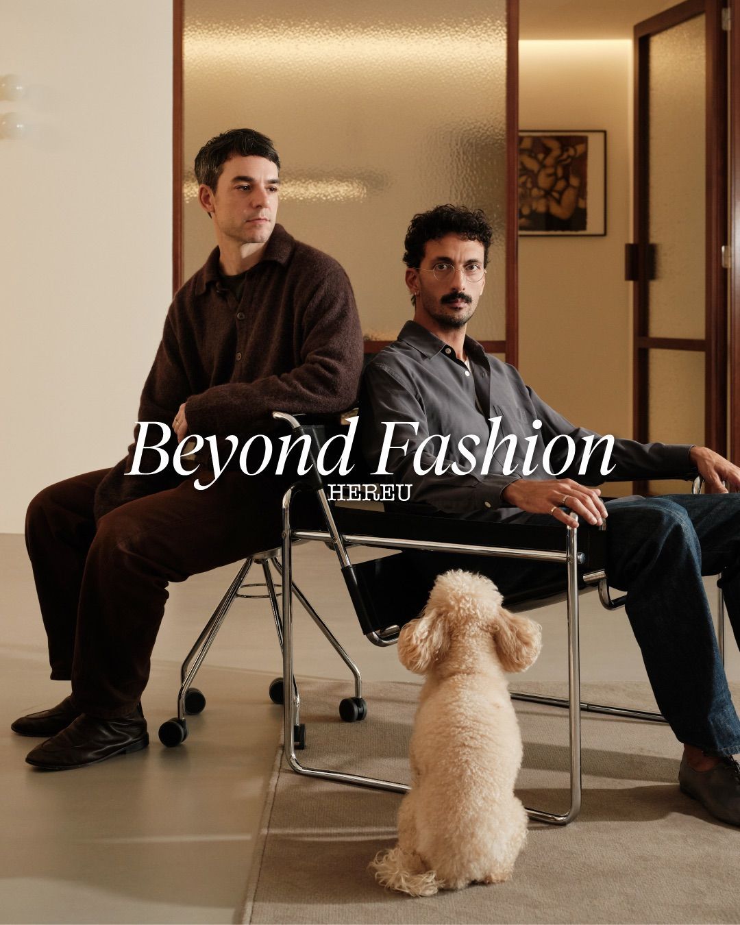
In recent years, many businesses active in the food sector and beyond have adopted an illustrated identity that is playful and deliberately pop. This stylistic choice is especially common in certain pizzerias, wine bars, breweries, and fast food spots, among others, but is increasingly found as well in some products aimed at large-scale retail.
Hank's Bagelry by Studio Ongarato
— Brand Archive (@brandarchivexyz) August 28, 2025
Now on Brand Archive: https://t.co/gEELT7lSVA#branding #design #logo #mascot #bagels #brandarchive pic.twitter.com/NqzMRUY3Iu
As noted by the Guardian in an article dedicated to the topic, this form of branding is often accompanied by a character or an illustrated mascot, as well as a soft typography. The overall identity maintains a fairly essential approach - unsurprisingly, this aesthetic is sometimes categorized under what is known as Minimal Bold. The brand’s color palette is also almost always vibrant, helping to define an informal and contemporary visual language.
How did this graphic style originate?
@yardsalepizza FIND THE BOX, WIN THE TICKETS follow on I G to find the clues in our stories every day this week!!! #yardsalepizza #pizza #pizzalover #londonpizza #pizzapizza #pizzalondon #pizzarestaurant #pizzatime #lido #lidofestival #freetickets #treasurehunt All You Children - Jamie xx & The Avalanches
The aesthetic in question is a reworking of a specific visual language from the past - as often happens in the field of graphic design, to the point that people in the industry sometimes say that «design doesn’t exist, only redesign.» This style, in fact, derives directly from an animation trend known as Rubber hose, typical of cartoons from the early decades of the twentieth century, in which characters were depicted with arms and legs resembling rubber tubes (hence the name), without visible joints and characterized by extremely elastic movements.
Over time, other influences have been added to this historical foundation, including the ironic graphics of early 2000s T-shirts and the mood typical of certain comics. The trend initially spread in Anglo-Saxon countries, traditionally more open to refined visual identities even for products aimed at a broad audience, becoming almost a standard for many businesses in the food sector. Only later did it arrive in Europe and the rest of the world, while remaining primarily associated with the food industry.
Why is this aesthetic so popular?
@morphdesign.gr Making of Promo Animation video for @Hawkers Smash Burger & More Based on the logo characters, in a 20’s cartoon style, with traditional 2d frame by frame animation that gives a fun tone, and highlights the characters of "Hawkers" with this mini backstory animation. Stefanos & Vasilis, are brothers that worked all around the world, by being a chef & a captain for years. They decided to return and open a warm and welcoming place back in their home city, Thessaloniki with all kinds of flavors, specialized in smashed burgers. #animation #2danimation #character #cartoon #framebyframe Cartoon - Athostvz
Some see this visual trend as a reaction to the overly clean and standardized graphics that have characterized communication design since around 2010. More specifically, it is often contrasted with the illustrated style known as Corporate Memphis, characterized by bright colors and figures now considered excessively flat, impersonal, and at times even cheap.
The aesthetic that has gained traction in the food sector in recent years instead moves in the opposite direction. This visual language is generally adopted to convey an idea of craftsmanship and independence, associated with a fresh and youthful image.
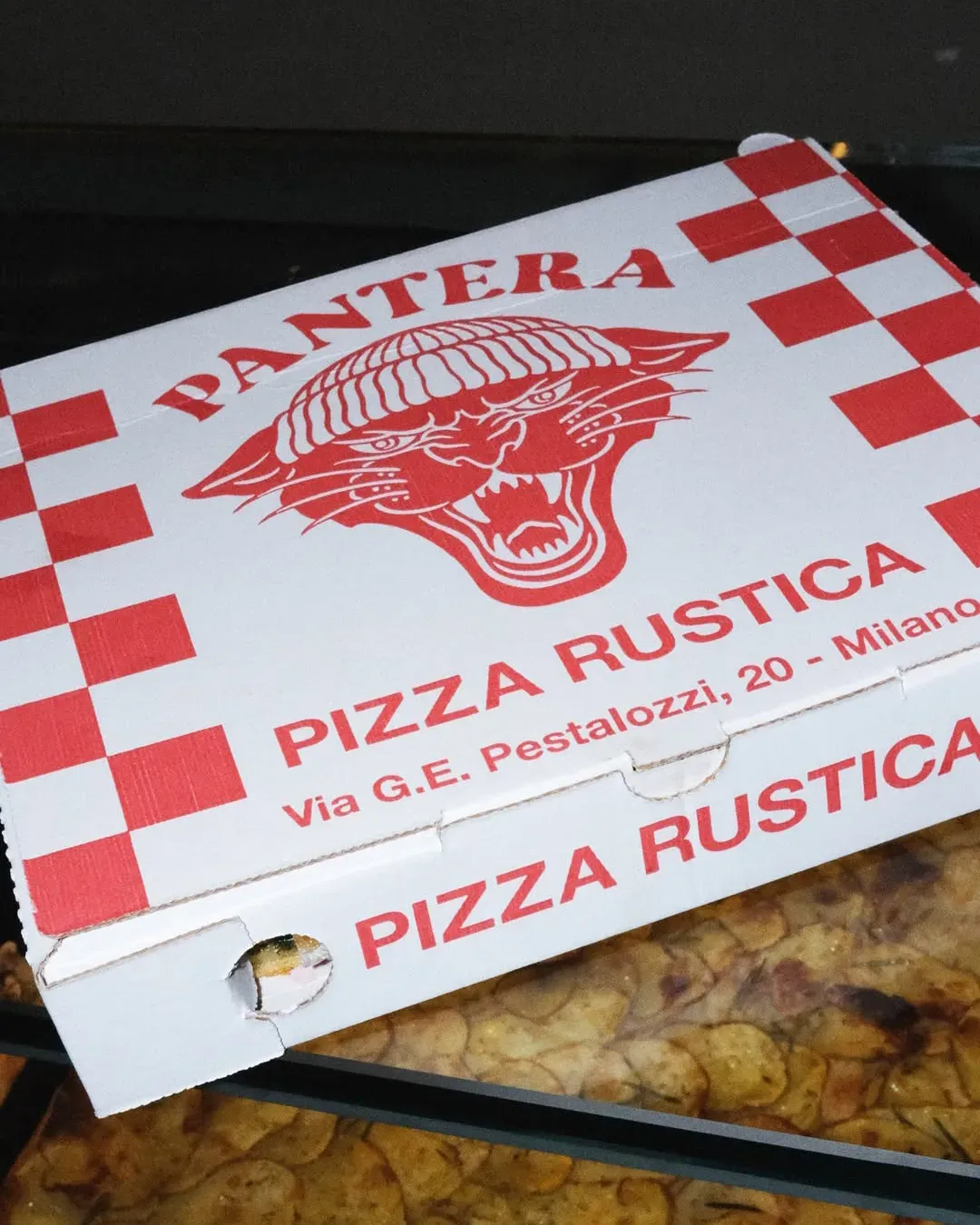
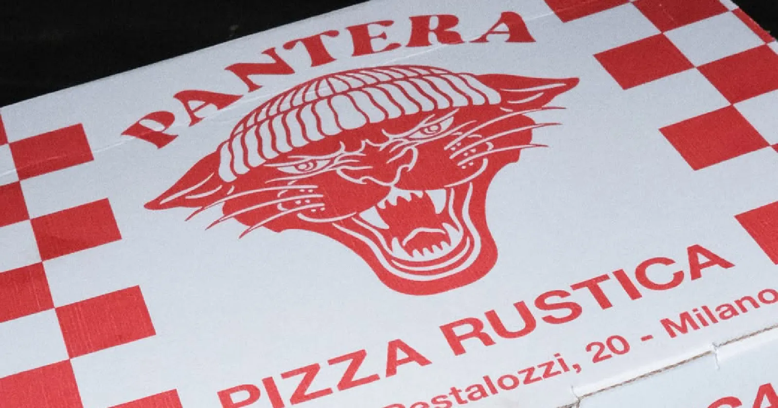
In Italy, one of the businesses that has ridden the wave of this trend is the pizzeria Pantera, located between Rome and Milan, whose mascot is a panther wearing a beanie, echoing the aesthetic of old school tattoos. Other examples imported from the United States include the chain Chuck’s, whose logo - a cheerful hamburger wearing a baseball cap - has expanded from New York to London, Milan, Paris, and Rome, as well as the cartoon devil of FONZO’S NYC, which has recently opened in Milan.
This raises the question of whether the new rubber hose-style mascots are part of a truly effective marketing strategy, or whether they simply represent a graphic trend that ultimately fails to differentiate products, making those of one chain indistinguishable from another.