What is the anti AI aesthetic? Graphic designers prefer imperfection nowadays
According to several observers, the growing spread of artificial intelligence in the field of image production is changing — more or less indirectly and to varying degrees — the way many people relate to certain visual solutions, especially those seen online. The theory essentially claims that graphics that are excessively clean, precise, and orderly are increasingly associated – almost automatically – with content created using artificial intelligence.
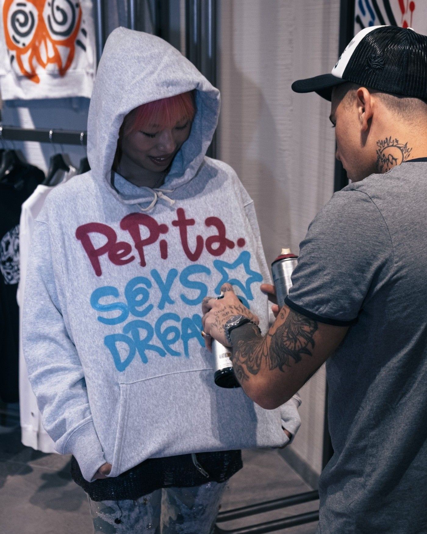
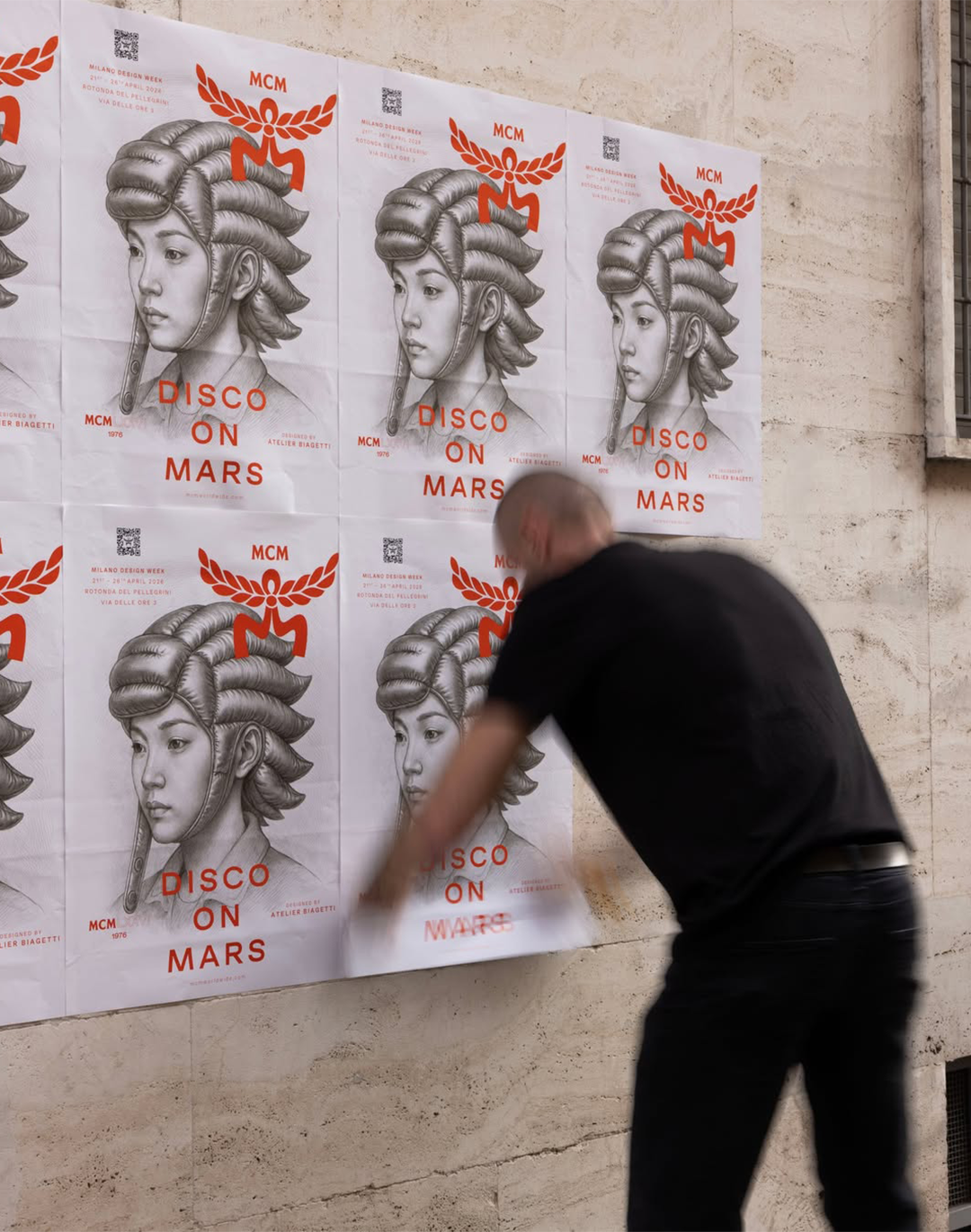
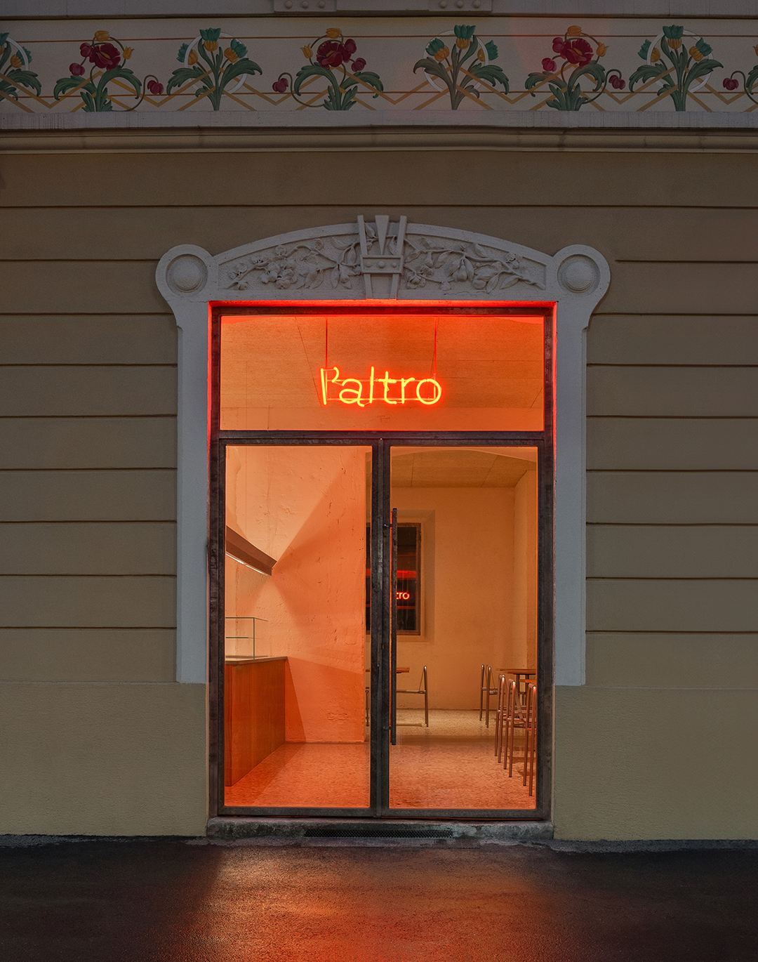
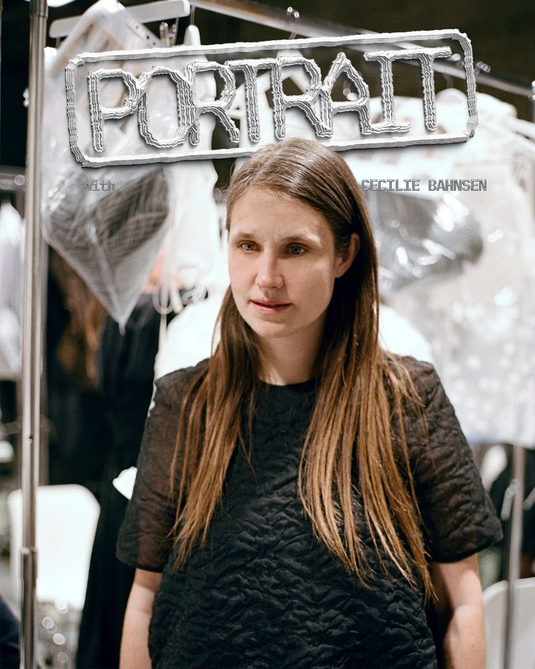
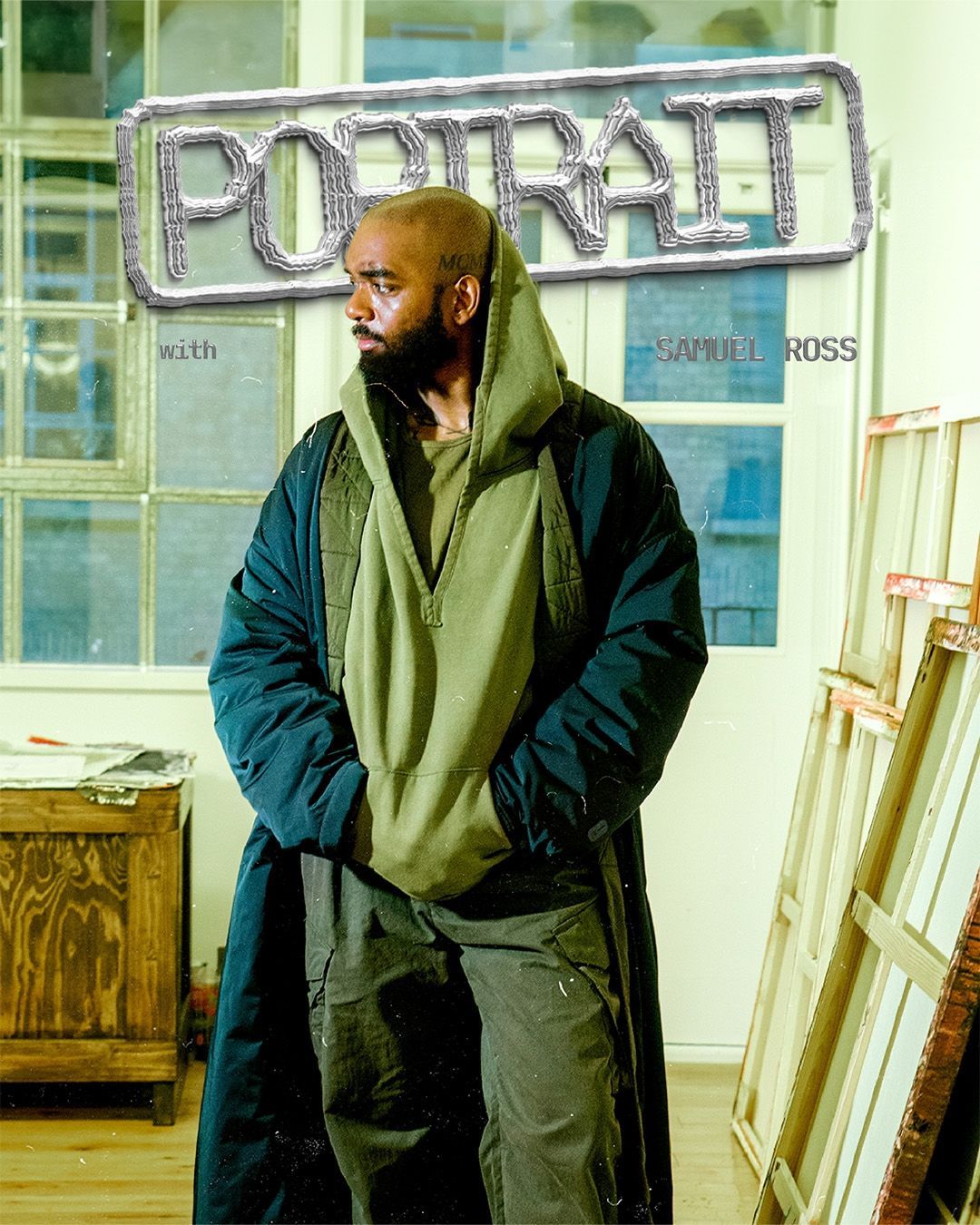
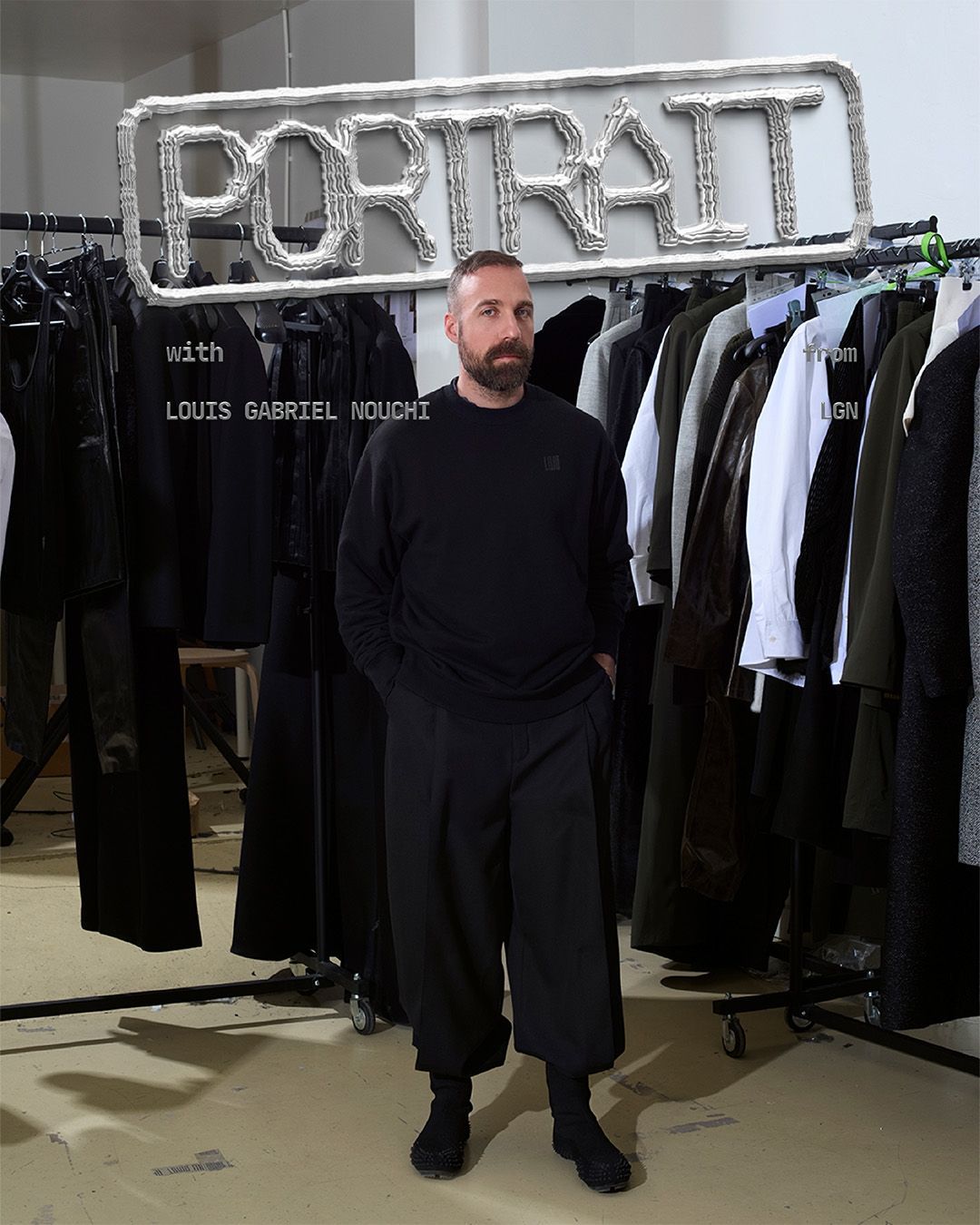
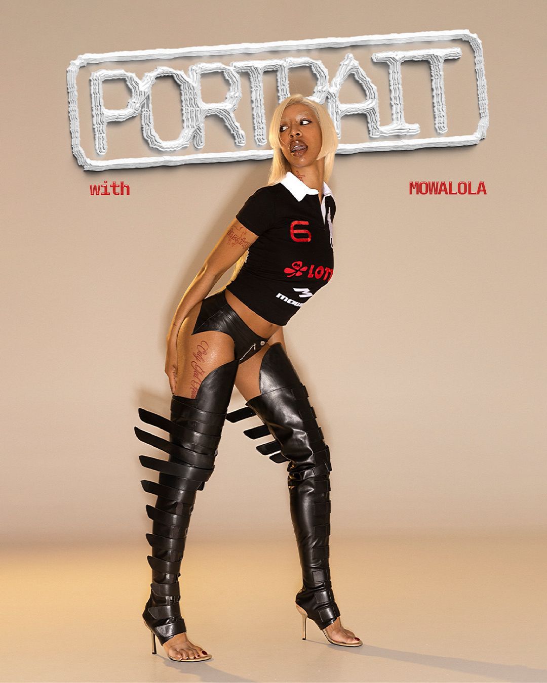
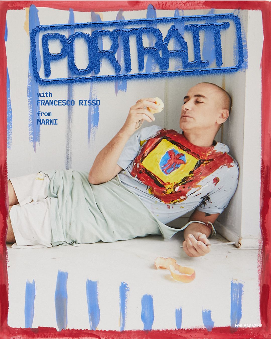
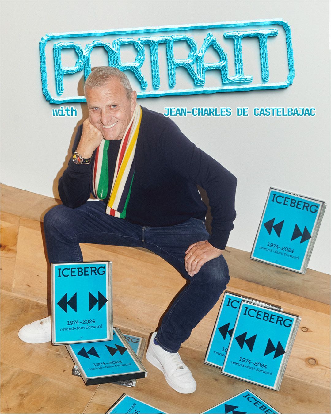
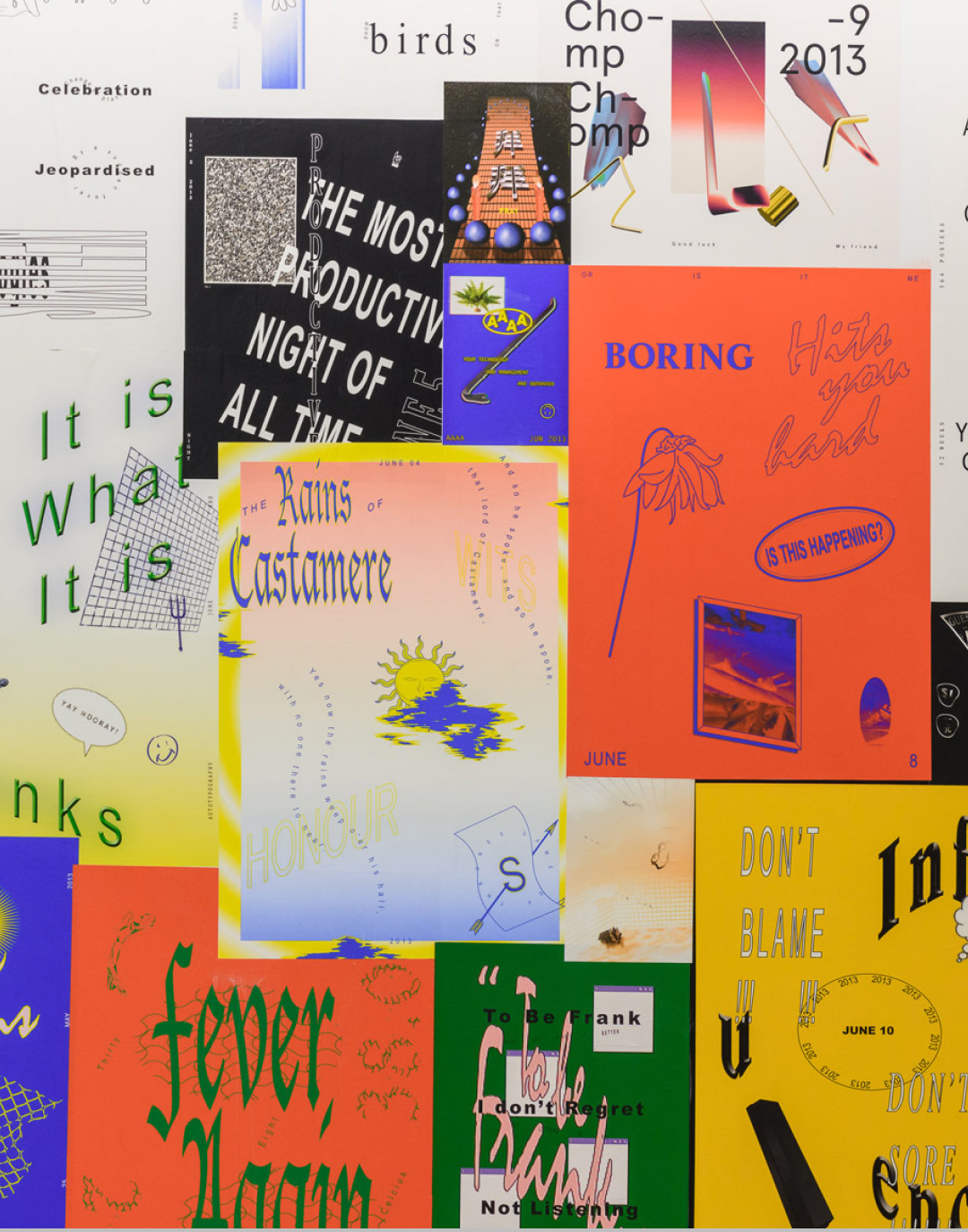
It would therefore not be surprising if, in the field of visual design, styles and approaches that deliberately play with imperfection are coming back into fashion. For example, the so-called chicken scratch typography – increasingly used in many successful visual projects – goes exactly in this direction: the lettering is irregular and looks as if it was hurriedly sketched, and perhaps it is precisely this apparent authenticity that makes it so appreciated. A product with a visual identity that is too rigorous, in some cases, now risks appearing excessively “artificial”, whereas a deliberately more approximate look would make everything more credible and “human”, especially in the eyes of less experienced audiences.
With AI, real content can look fake instead of the opposite
@didoriot #greenscreen back again!! Lemme know ur thoughtssss. #discourse #ai #aiart #trends original sound - didoriot
The growing accessibility of tools for automatically generating images and videos has made a large part of the visual content found online — and beyond — potentially suspicious. Recently, for instance, new concerns have emerged regarding a specific use of AI software, which is no longer being used only to create deepfakes, but also to retouch material that is authentic in itself, making it appear fake.
In this case, the debate arose around some promotional videos shared by actor and rapper Will Smith, which seemed intended to make viewers believe that a very large crowd had attended his concerts. The audience was indeed present, but some clips had been partially digitally modified with targeted retouching (such as removing blur or increasing sharpness), which ended up producing effects typical of AI-generated videos – including excessively pronounced contours and shadows. Faced with situations like this, the risk is that the public will believe that the entire content was artificially created, with all the consequences that entails.
Understanding the rise of anti-design
@itsnicethat Anti-design is back—and this campaign might be the best (worst?) thing you’ve seen all week. Exemplified through clashing colours, rogue use of early web typefaces and a scrapbook approach to hierarchy, antidesign is a playful space for self expression and an unserious approach to design. #antidesign #designtrend #graphicdesign #trendprediction #nostalgia #earlywebdesign #90saesthetic Aesthetic Coffee - Febri Handika
In scenarios like this, many designers often choose to focus on deliberately “messy” and handcrafted visual solutions. This is the case of the so-called "anti-design", which uses disorder, confusion, and inconsistency to generate a strong aesthetic impact. Overlapping elements, unbalanced spacing, and seemingly unharmonious palettes are some of the typical approaches of this movement: the result is identities that are anything but linear and “optimized”, yet still visually compelling.
Faced with the increasing presence of “synthetic” images, imperfection thus becomes a way to communicate originality – at least within certain fields, such as branding or, more broadly, visual design. This shift in perspective also affects clothing and the visual styles tied to fashion: certain imaginaries typical of the 2000s – for instance – may have returned to cult status also because their deliberately chaotic and at times playful aesthetic was considered, all things considered, authentic.

