


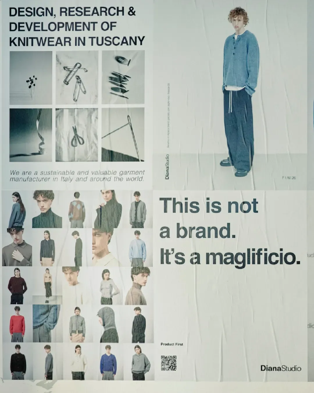


Burberry unveils new logo and pattern Riccardo Tisci presents the news on his Instagram account
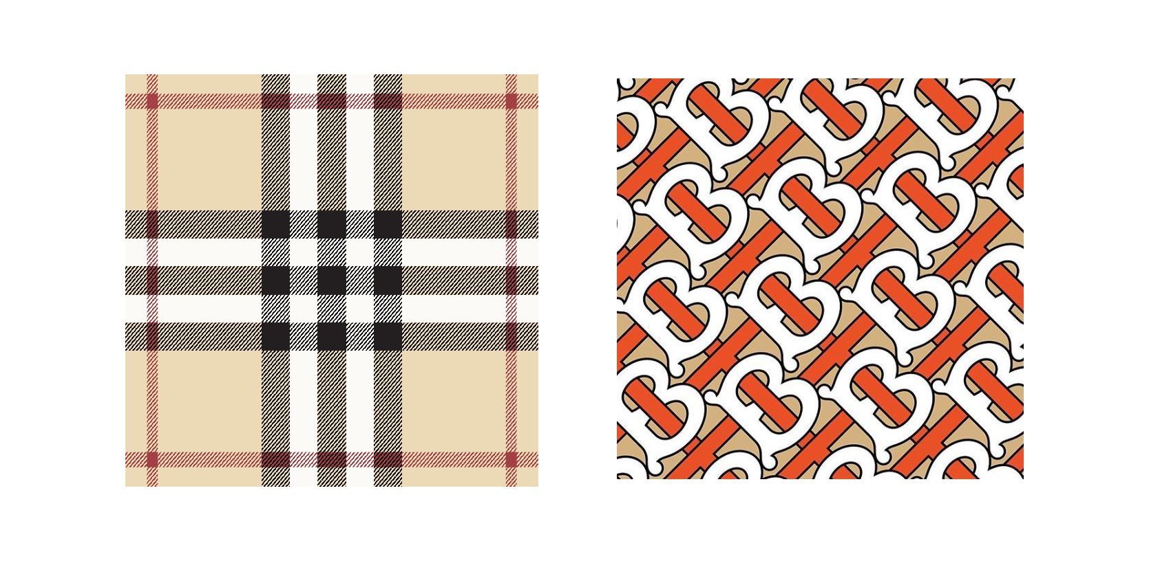
Riccardo Tisci presents the new Burberry's logo and monogram.
The creative director, appointed last March, in this way in this way honors Thomas Burberry, who founded the brand in 1891, today in the hands of Tisci, formerly Givenchy's mind. The novelty of the monogram, just presented, is in the intertwining that is created between the initials T and B which, merging, form a chain with optical illusion. At the same time, however, the geometry of the classic Burberry tartan seems to be implicitly preserved, through the alignment of the letters and the beige that appears in the background. The monogram was created by Tisci together with Peter Saville, a Graphic designer and Art director who, during his career, has collaborated with famous brand like Calvin Klein (last year he redesigned the logo of the label together with Raf Simons), Jil Sander and Yohji Yamamoto.
Farewell to the equestrian rider, too classic, the new logo opts for a more minimal style, proposing a bold writing and the words "London" and "England" positioned below. For the construction of the new logo Peter Seville would seem to have started from the structure of the font family "Gotham Bold", then going to modify it. The upper eyelet of the B is reduced, while that of the R has been altered, thus making the letter more slender. The others remain unchanged in the form, while it has generally intervened with a bold font making the font bolder than the original version.
Waiting for the first Burberry collection by Riccardo Tisci next September during LFW.