


The history of the Dior logo From 1946 to the present day
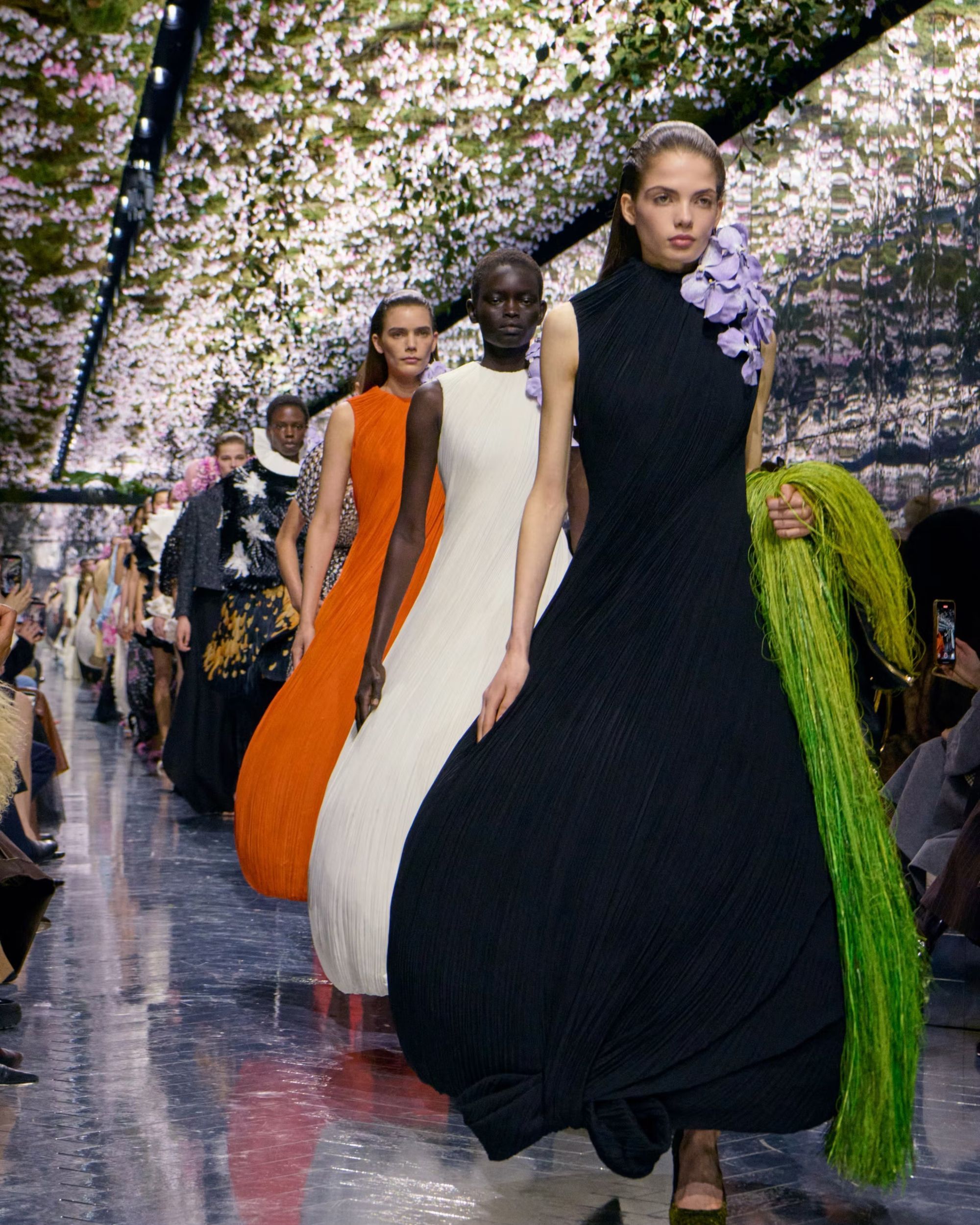
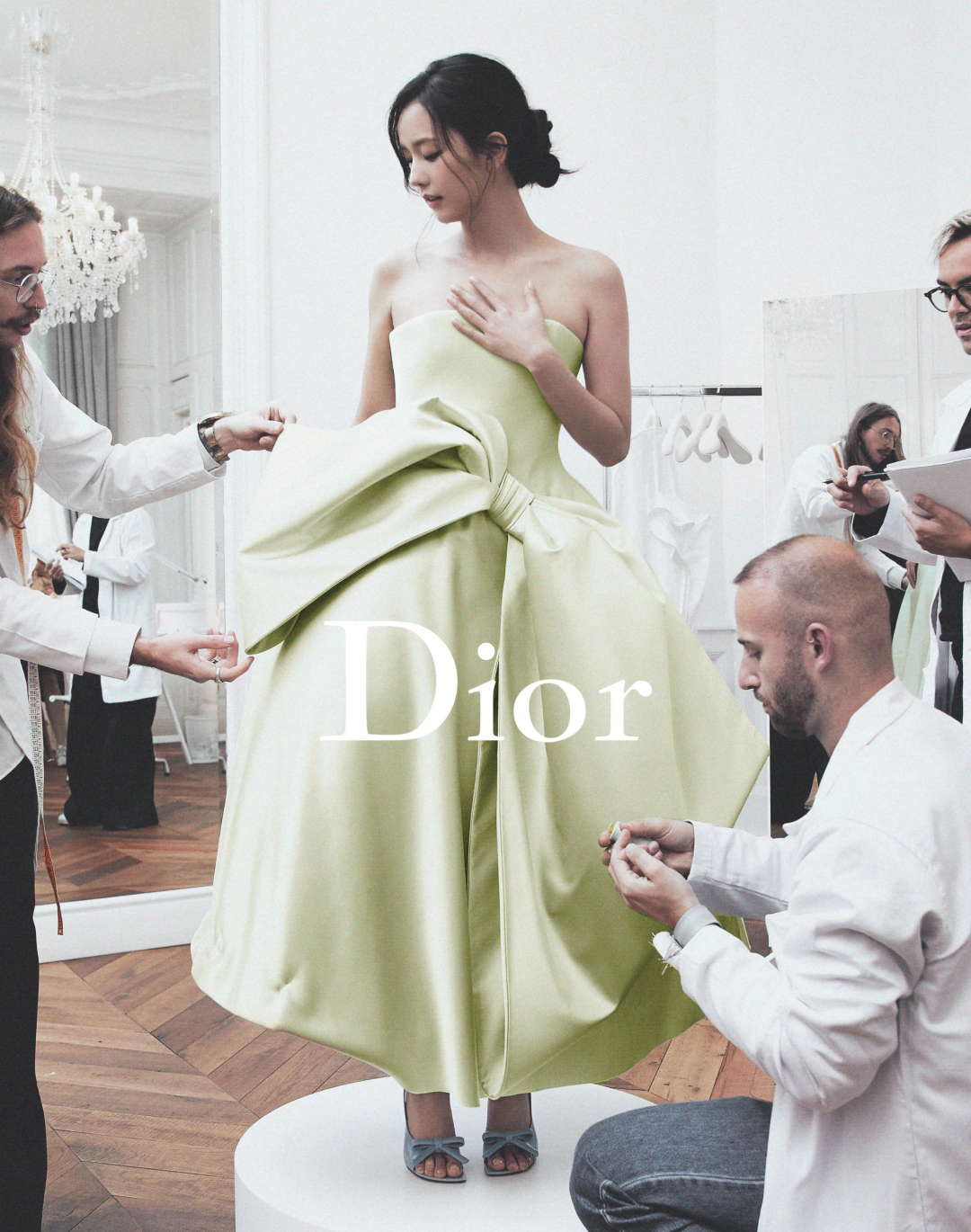
In a sea of all-caps logos, a few months ago, shortly after being appointed as Dior’s creative director, Jonathan Anderson showed the world how the Maison would return to using Christian Dior’s original 1946 logotype, with Cochin as its font. As Anderson himself stated in an interview with Lois Prigent, his goal with this logo change is to «decode it to recode it», a tabula rasa to go back to the brand’s origins before beginning a new creative chapter. Disappearing is the all-capital “DIOR” used since 2018: in its place reemerges a capital “D” followed by lowercase letters, a choice that reconnects the Maison to its typographic grammar. For now, the change is visible on labels and textile details, having already appeared, sparingly, in the menswear show and becoming a protagonist during his official womenswear debut yesterday for the SS26 season.
The history of the Dior logo
To understand the scope of this move, we need to go back to the beginning. When Christian Dior founded the house in 1946, he chose a typeface rooted in French tradition: the Cochin typeface, designed in 1912 by Georges Peignot and named after the 18th-century engraver Charles-Nicolas Cochin. It is an engraving serif, with sharp serifs and an elegant rhythm, capable of translating into letters the idea of “architectural” couture that Dior expressed with the New Look in 1947.
In the following years, the Maison’s visual identity became layered. Alongside the “editorial” logotype in Cochin, in 1967 Marc Bohan introduced the now-famous “Oblique” monogram: Dior’s four letters tilted and repeated diagonally in a jacquard pattern designed for accessories and leather goods. Presented to the public in spring 1969, the “Oblique” became a second alphabet of the Maison, ready to resurface cyclically, from Galliano’s era to its recent exploits in accessories.
How Dior’s logo changed with its creative directors
I’m not typically moved by a logo change but I think JA’s choice to bring back the original Dior logo made a major impact on the collection. It’s subtle but looks so much better than the all caps block logo Chiuri introduced
— ONLY MADE (@onlymade_co) June 27, 2025
From the 1990s onwards, the alternation between typographic logotype and monogram created an ongoing dialogue between classicism and the desire for brand exposure. During Hedi Slimane’s creative direction in the early 2000s, a new menswear logo appeared, now officially renamed Dior HOMME, with an all-caps addition (which later also became part of the branding for the perfume of the same name).
Between 2016 and 2018, a shift occurred in the opposite direction: like many luxury brands, Dior simplified its mark into an all-caps “DIOR”, more assertive and scalable across digital touchpoints, aligning with the era of so-called blanding, the homogenization of logos into neutral, minimalist forms. This shift coincided with the change of direction for both lines, with Maria Grazia Chiuri taking over womenswear in 2016 and Kim Jones succeeding Van Assache at the helm of menswear in 2018. From there, all of the French Maison’s lines, from beauty to Haute Couture to packaging, followed the new branding rules, standardizing to uppercase.
Jonathan Anderson’s Dior logo
@iwenttotheartschool Dior introduces a new logo in Cochin. Less bold, more refined — signaling a return to heritage and poetry. But is it evolution, or nostalgia? #Dior #Cochin #LogoDesign #PFW #ArtSchool Originalton - I WENT TO THE ART SCHOOL
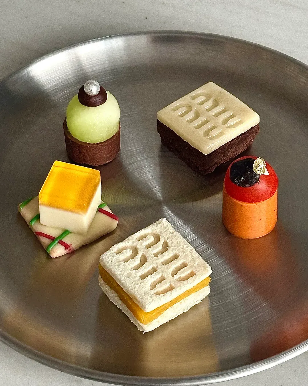
Then we arrive at 2025, where Anderson’s move goes against the grain. It is not mere nostalgia but an act of montage, as he himself emphasizes. Returning to Cochin means reactivating a historic voice and using it as a living material for a contemporary narrative. The serif, with its micro-irregularities and its “human” weight, gives the brand a distinct timbre in a flattened visual landscape; and, above all, reconnects Dior to a French graphic tradition (engraving, printing, publishing) that provides the cultural backdrop to couture. There is also a systemic aspect. The return to Cochin does not erase the “Oblique”: the two languages are complementary. The first governs the institutional perimeter—labels, captions, titles, and perhaps in perspective packaging and windows—while the second will continue to enliven surfaces and textures, from tote canvases to jacquard fabrics, even if it has not yet fully appeared in the Irish designer’s first collections.
The monogram has endured for decades precisely because it dialogues, rather than competes, with the logotype. Anderson’s novelty rebalances the relationship, bringing the “text” (the word Dior) back to the center, without abandoning fabric. It is a logic consistent with Anderson’s motto, that of decoding in order to recode. First, the field is cleared of redundant signs, then the codes, with couture, craftsmanship, and typography, are reassembled into a new balance. If, as often happens, logos are the true editorials of brands, Dior’s 2025 version is a programmatic editorial: it doesn’t shout, but it guides.