


Fashion now would rather see its logos shrunk Small lettering, big impact
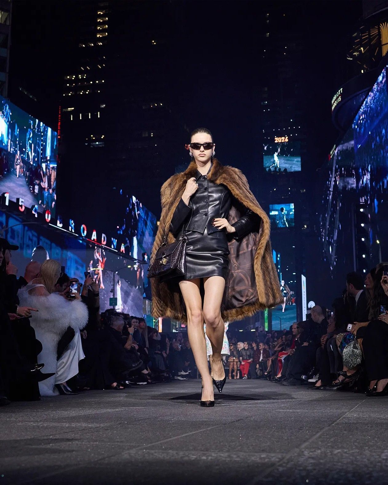
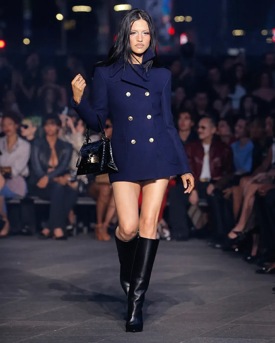
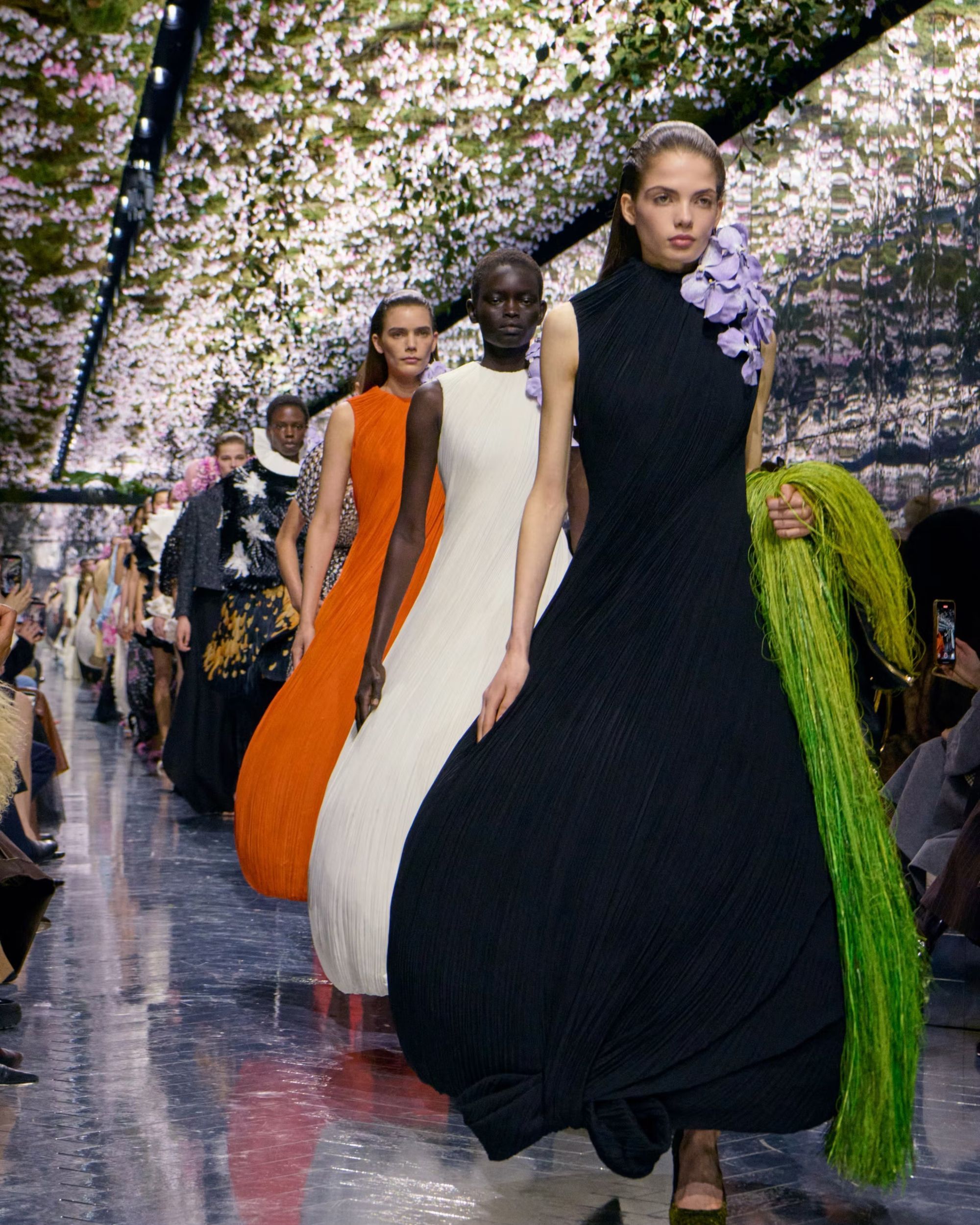
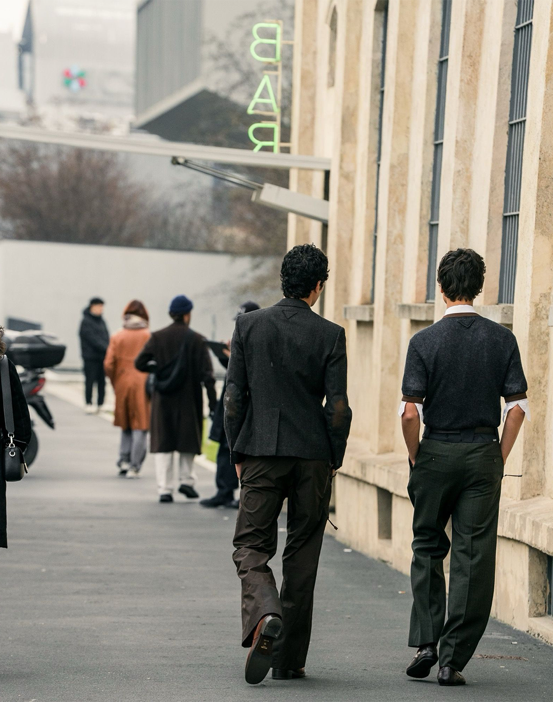
During the last Paris Fashion Week in October, a week filled with expectations, twists, and above all debuts, the fashion ecosystem noticed one thing: Parisian proposals no longer draw their strength from noise and opulence, but from discretion, silence, and above all, details. This was evident in the first women’s ready-to-wear collections by Jonathan Anderson for Dior and by Matthieu Blazy for Chanel, which, though rich in feathers, voluminous hats, and endless trains, stood out for the small, even the infinitesimally small, by presenting discreet logos, almost imperceptible, whose quiet strength made more noise than the loud typographic statements of the past.
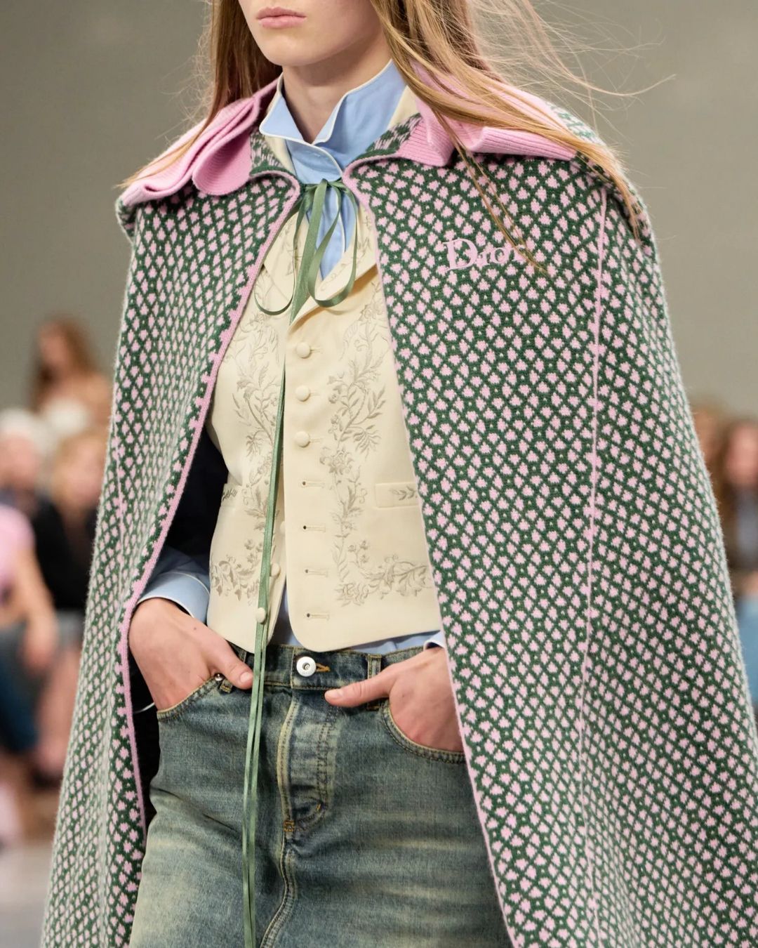
Barely through the doors of Dior’s ateliers, Jonathan Anderson decided it was time for change, giving the French Maison’s logo a new form, or rather, an newly old one. The Irish designer chose to abandon the uppercase logo established in 2018 by Maria Grazia Chiuri and Kris Van Assche, returning to the roots, the right ones: a logo with lowercase letters (except for its initial D), the one chosen by Christian Dior in 1946.
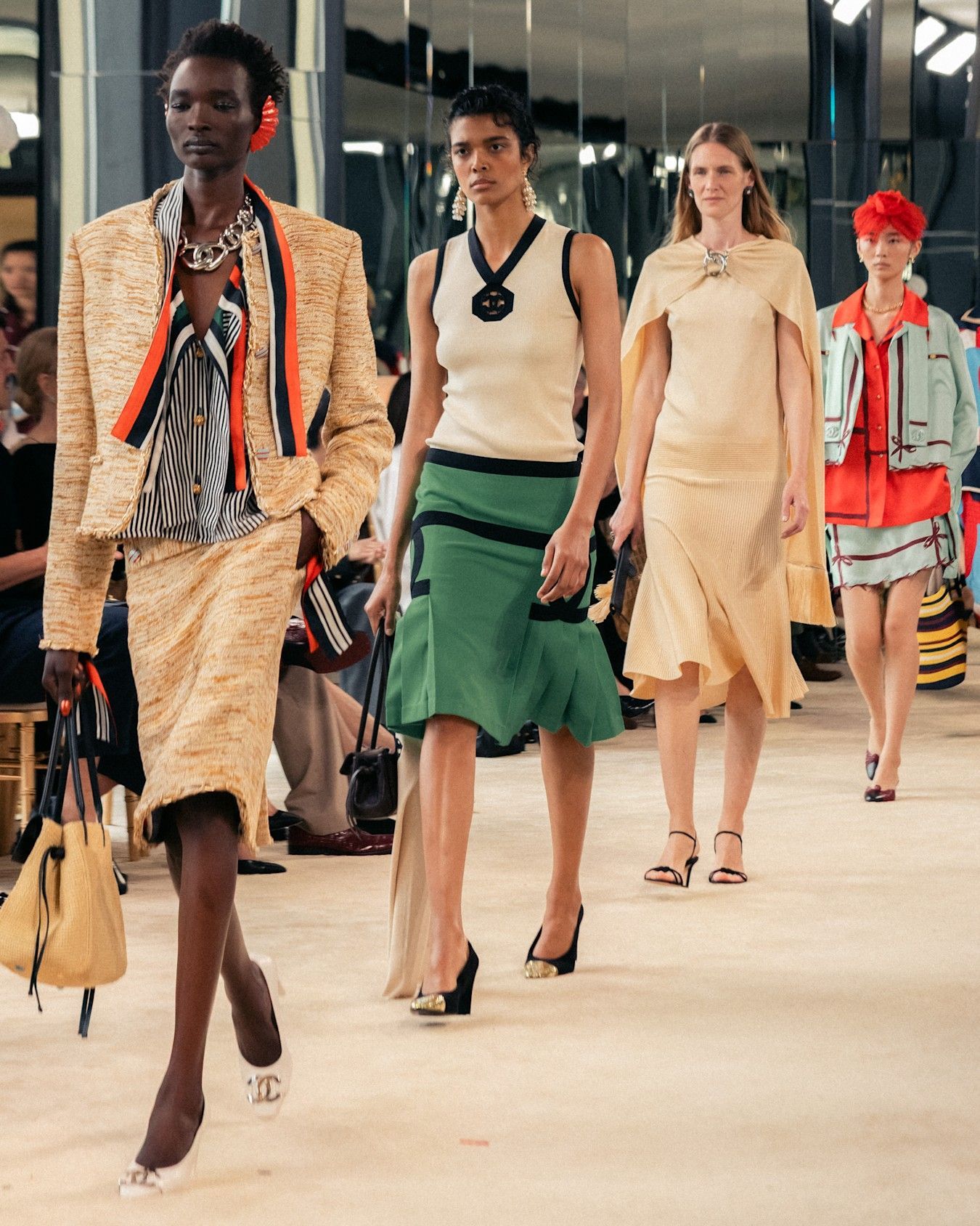
As for Chanel, now under Matthieu Blazy’s direction, it was not the legendary double C that underwent a slimming treatment, but rather the lettering of Maison Charvet, a historic institution that supplied shirts to the rue Cambon house in Gabrielle Chanel’s time, with which it has collaborated again for FW26. The surname of the pioneer of the world’s first shirtmaker appeared embroidered in cursive on the iconic shirts, finding the perfect balance between subtlety and an obvious yet not deafening nod.
Yet even before these recent and remarkable makeovers, fashion and its logos had already gone invisible. A few months ago, nss had already noted that the logos of major brands, from Miu Miu to Balenciaga and Louis Vuitton, were gradually shedding their embroidered, colorful, and noisy threads, shifting to a second dimension by blending into the fabric, becoming one with the garment. Has the once feverish, even epidemic logomania become shy? According to China and the “luxury shame” phenomenon, which has condemned high fashion for over a year, yes. According to France, it’s rather a new way of making noise, and above all, views and sales.
This newfound simplicity, launched by the new generation of creative directors, is not only a quest for aesthetic discretion but rather a symbol of a return to origins, to the carefree beginnings, to the initial aesthetics of these historic and established brands, through a narrative that is familiar yet not repetitive, anchoring the house’s designer in its history while creating buzz through a nostalgia factor that never fails. Thus, the old becomes new, rarity becomes abundance, and abundance transforms into sales.
For collectors, pieces from the new collections stand as relics even before they appear in stores. For the new clientele and younger generations, they represent a unique understanding of the house and its heritage without falling into the outdated, fitting perfectly into the spirit of the times. A historical continuity that doesn’t repeat itself but reinvents, increasing not only the value of new collections but also their resale price. Moreover, the smaller the logos, the harder they are for counterfeiters to replicate.
@branding.team The Power of Black in Luxury Branding #brand #brands #branding #logo #luxury #black #elegant original sound - Branding Team
It shows that even a small typographic nuance can make a big difference, also from a legal standpoint, as all these new logos make life not only harder for counterfeiters but also for authenticity verifiers. A letter taller than in the previous collection, wider spacing, or a slightly changed angle can change everything. The work of human verifiers must therefore be broader: their analysis can no longer be limited to the main logo but must extend to temporal details, production clues, and the entire packaging. As for computerized systems, they must undergo frequent retraining, while regular updates to their algorithms and databases are essential to follow the evolution of brands, thus avoiding false negatives on genuine products.
For Chanel, Dior, and many other Maisons whose logos have gone, or will go, silent, this quiet typographic revolution stands not only as a minor aesthetic detail but as a well-crafted strategy. Between building a narrative strength and creating both economic and emotional value, this revolution of detail conveys, through just a few letters, far more than grand, overflowing statements sometimes manage to express. The language of heritage is, definitively, the lingua franca of the fashion ecosystem.