


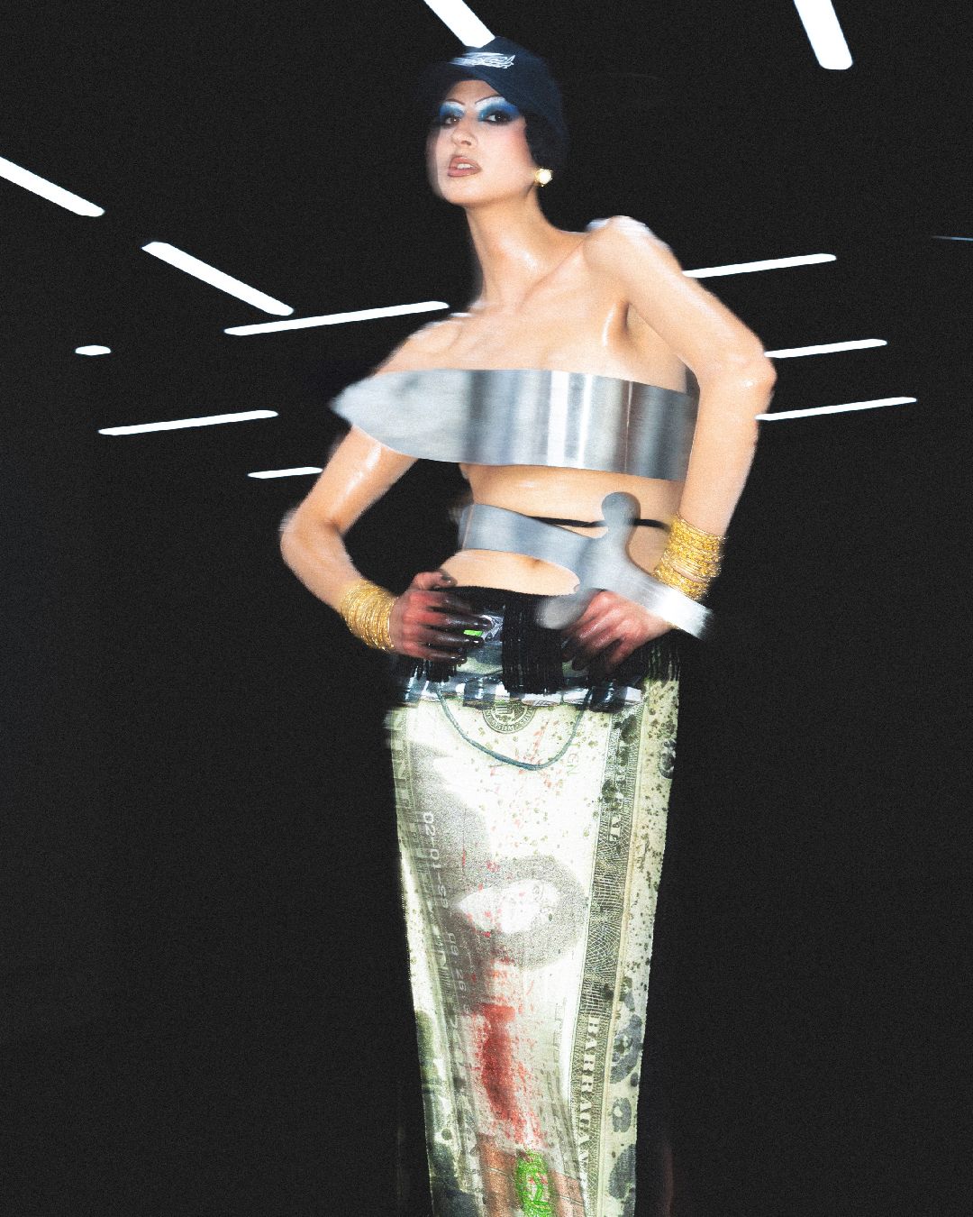
We live in an increasingly monochromatic world Gray cars, minimalist logos, beige interiors, and a white like Pantone 2026
The Pantone Color of the Year 2026 is white. It’s called Cloud Dancer, and it’s the first time in the program’s twenty-five-year history that the institute has chosen a shade of this color. According to the company, it is a «soft white that acts as a whisper of tranquility and peace in a noisy world.» The press release speaks of a «frenetic society rediscovering the value of quiet reflection» and of an escape «from the distractions of external influences.» Reassuring, almost therapeutic words, yet the choice has sparked polarized reactions: some have welcomed Cloud Dancer as a symbol of purity, while others have defined it as a «recession indicator», sterile and lifeless, even an extension of conservatism.
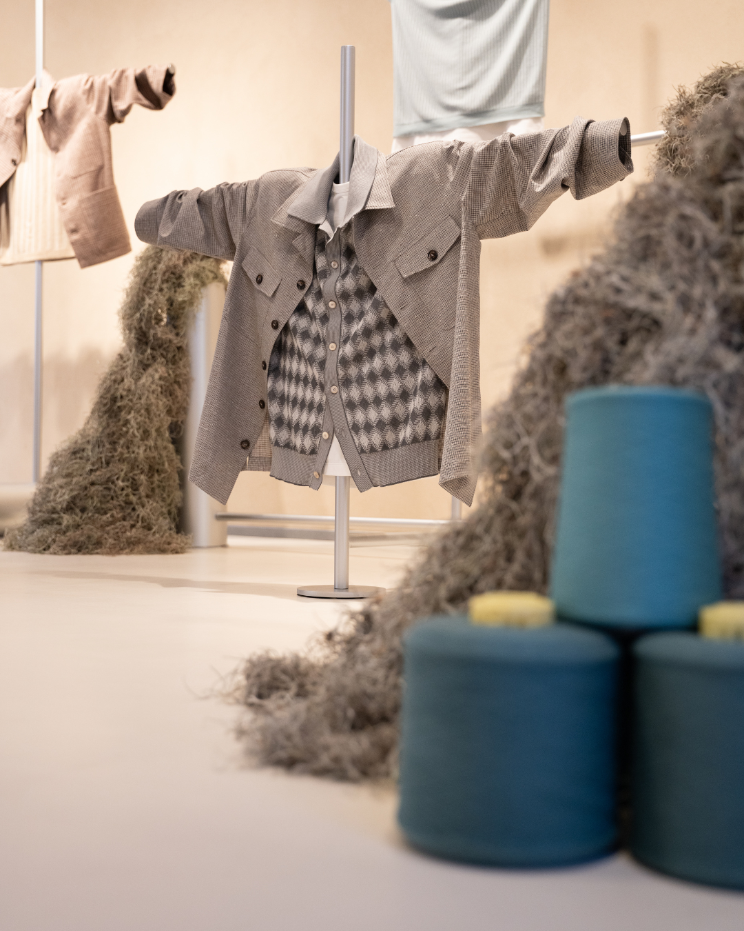
The point is that this white doesn’t come out of nowhere, it fits into a broader trend, backed by data and research, that tells us that color is disappearing from our lives. In 2020, the Science Museum Group in London analyzed over 7,000 photographs of everyday objects such as phones, household appliances, watches, and lamps, from 1800 to today. The results show that starting in the early twentieth century, the color palette of objects has progressively grayed.
The browns and yellows of wood and leather have given way to the grays of plastic and steel. The most common color in the entire collection is a dark charcoal gray, present in over 80% of the photographs analyzed. Two hundred years ago, monochromatic shades accounted for about 15% of objects; today they dominate nearly 60% of everything around us.
There have never been so few red cars
Cars for sale in the 1970s. Spot your favourite! pic.twitter.com/B7pwjdXW9m
— Bobbie (@bo66ie29) January 21, 2025
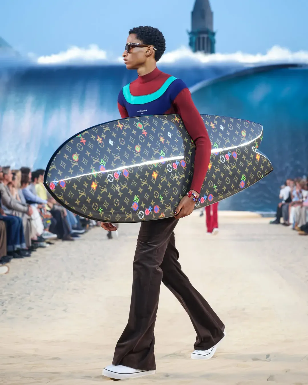
The automotive sector is perhaps the clearest example of this shift. According to the Axalta Color Popularity Report 2025, 74% of cars sold worldwide are white, black, or gray. In the United Kingdom, gray has been the best-selling color for seven consecutive years, with a 27.8% share in 2024. Black follows at 21.7%, blue at 14.9%, while red, once a symbol of sportiness and passion, has recorded its lowest market share in the last twenty-two years. Truly chromatic colors such as green, yellow, and orange together account for less than 10% of the market.
The disappearance of color in design
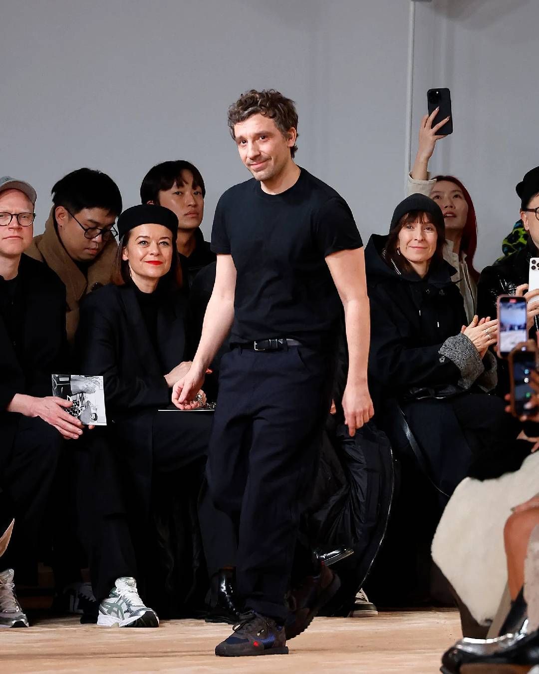
But the same chromatic flattening has also affected digital design and branding. Over the past ten years, the logos of major tech companies (Google, Microsoft, Uber, Airbnb) have undergone a process of radical simplification: out go gradients, shadows, illustrative details; in come clean lines, sans-serif fonts, and stripped-down color palettes. According to DesignRush, 42% of consumers associate clean, modern logos with greater reliability, but this leads to visual homogenization that makes many brands indistinguishable from one another.
@kileanryeel baffled by all you sad beige haters and this will probably piss you off even more #sadbeigechildren #sadbeigetoys #sadbeigekids #neutraloutfits #viral #sadbeigebaby #sadbeigeplayroom #montessoriinspired #montessori Sure Thing (sped up) - Miguel
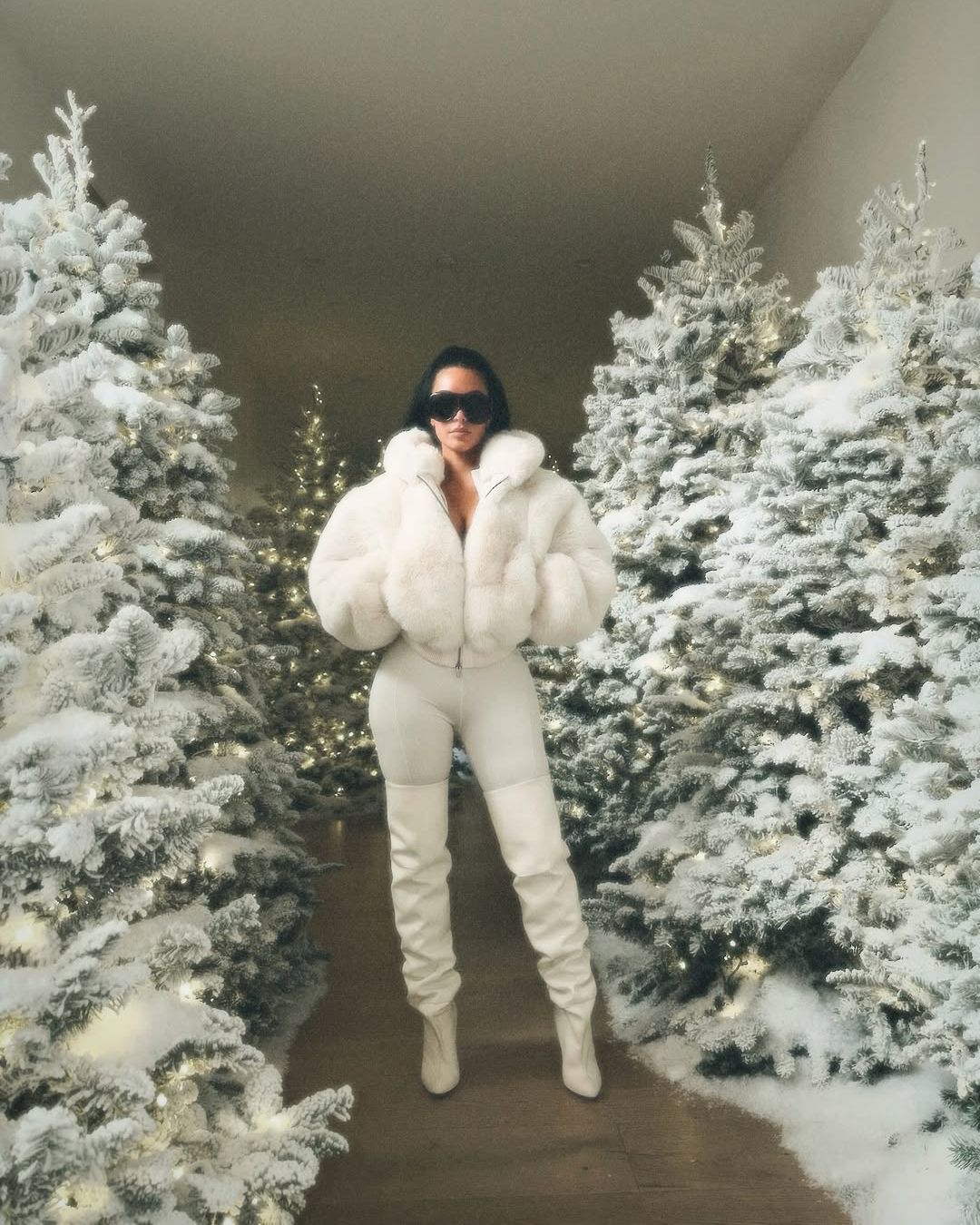
Interior design follows the same trajectory. The sad beige trend has turned homes into monochromatic environments where everything - from sofas to kitchen utensils - must adhere to a palette of whites, beiges, and grays - while in pop culture, the creative direction of projects such as Rosalia's Lux or Kim Kardashian's Skims leverage chromatic simplicity.As Neelam Tailor writes, there is also an economic reason: painting walls gray increases a property’s resale value, because neutral tones appeal to a wider range of potential buyers. Color, in this context, becomes a risk, an element of personality that could narrow the market.
@figfeelings Why I remove visual clutter in my house. #labelcensorship #declutter #visualclutter #organization original sound - [51%] [89] 7\
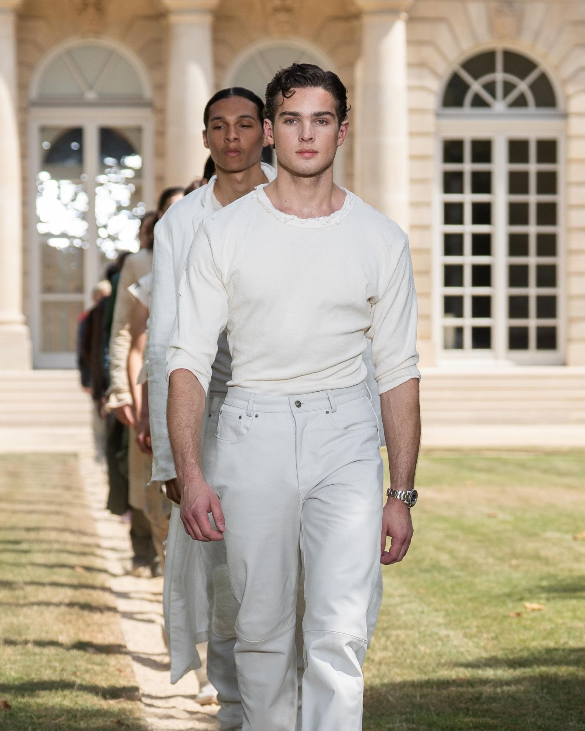
The question, then, is not whether color is disappearing, but why we are letting it disappear. According to Riccardo Falcinelli, Italian graphic designer and author of Cromorama, the answer lies in «visual noise»: in a world saturated with commercial stimuli, shouting packaging, and advertising competing for our attention, gray and white become a form of silence, a refuge. Cloud Dancer, in this sense, is the end point of a cultural arc that Pantone presents as «a blank canvas that opens the doors to creativity and innovation.»
In an age of sensory overload, white represents the promise of a pause, of an uncolonized space. What remains to be seen is whether it is truly a new beginning or simply the absence of imagination. Whether 2026 will be the year of chromatic calm, or just another chapter in a visual boredom we’ve stopped recognizing as such.
Takeaways
- The choice of white as Pantone 2026 reflects a desire for calm and visual silence, but it divides public opinion.
- From the nineteenth century to today, objects have shifted from rich, material palettes to a clear predominance of industrial grays.
- Colorful cars have become an exception: white, black, and gray dominate the global market, while historically symbolic colors like red are at historic lows.
- The disappearance of color does not only concern physical objects, but also the visual language of contemporary design.
- In interior design, color is perceived as an economic risk: neutral palettes increase the market value of homes, but erase identity and personality.
- White promises a pause from sensory overload, but the crucial question remains open: is it a new creative beginning or a sign of cultural fatigue?