


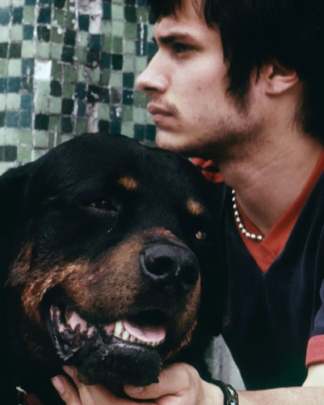


Do you also find that films are a bit too “beige” nowadays? In recent times, the lack of bright colours in films and TV series has become apparent
Someone has stolen cinema of its colors. The gradual lowering of pigments and tones in images on screen, whether big or small, has by now become a widespread curse, as if someone had cast a spell stripping much of the films and TV series in circulation of their hues. A grey veil that has fallen like a heavy axe over the world of entertainment, inflicting desaturation and a progressive reduction of light, almost like a bad dream.
Or worse, a fable in which, in a village (cinema and serialized storytelling), its citizens (the viewers) have been deprived of the brightest and most exuberant shades, forced to live under a metallic haze devoid of any joy. The need for the intervention of a hero or heroine is clear and, every now and then, someone comes to the rescue. In 2025 there were the orange, the light blue, the cobalt skies captured by cinematographer Autumn Durald Arkapaw in Sinners, winner of the Academy Award, colors that still warm us long after watching Ryan Coogler’s film, just as we can still feel the sting in our eyes from the piercing sunlight of the final chase in One Battle After Another by Paul Thomas Anderson, shot by his collaborator Michael Bauman.
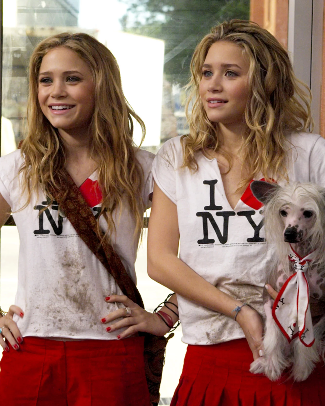
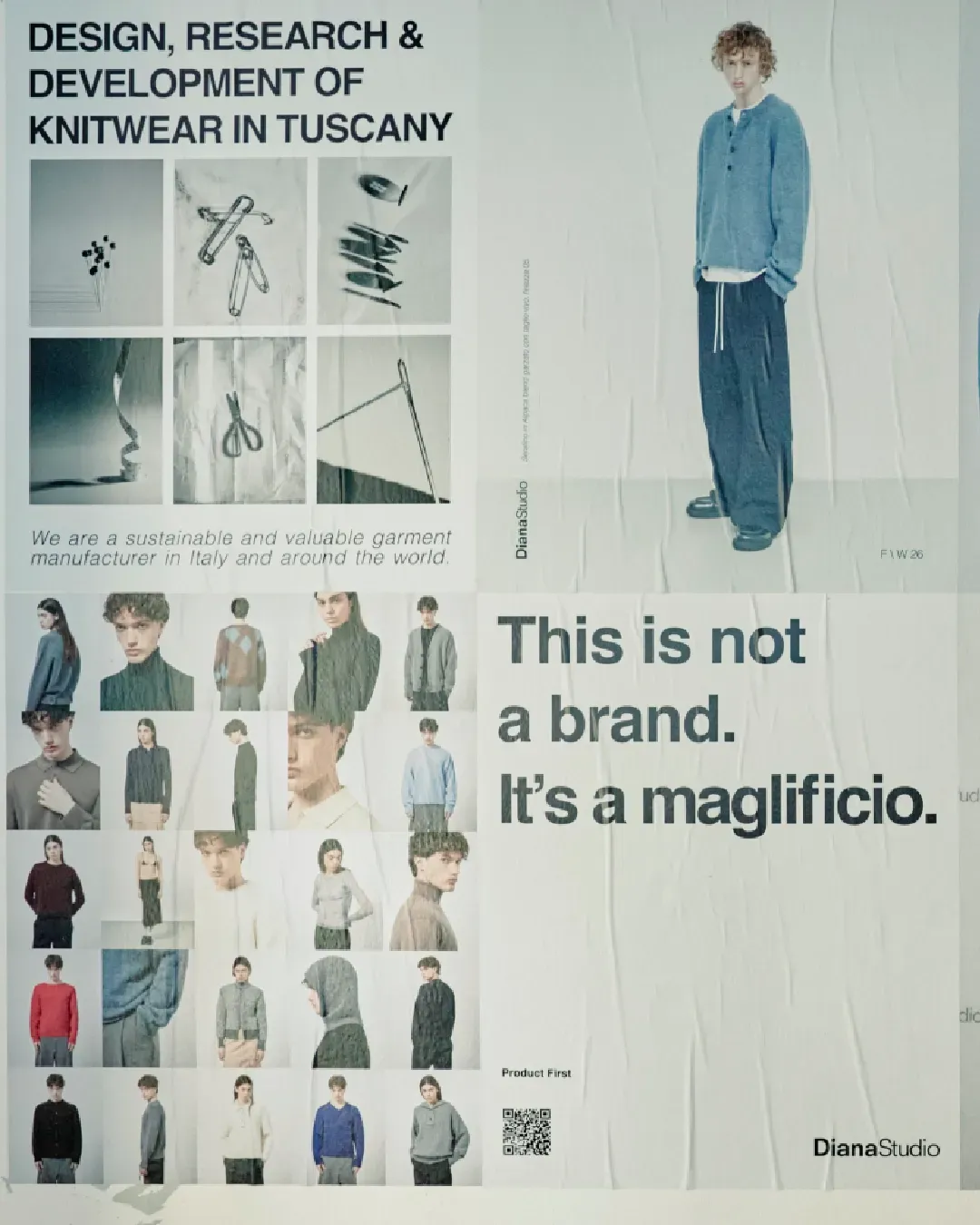
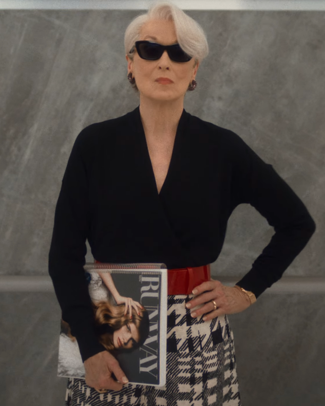
What happened to color in films? The case of The Devil Wears Prada
Bringing color back to images means restoring enthusiasm to an audience that has not failed to notice the steady depletion of nuance in audiovisual products, something that over the past few years has faded in a subtle yet constant, minimal, almost imperceptible way, but continuously. A process that reached one of its most evident peaks with the release of the first trailer of The Devil Wears Prada 2, which, although it shows Meryl Streep, Anne Hathaway and Emily Blunt more fierce and stylish than ever, also reveals a flattening of brightness in 2026 New York compared to the warmth of the first film released in 2006.
And if in this chapter the editor-in-chief of Runway takes a dive into the past by asking her former assistant Andy for help, perhaps cinematographer Florian Ballhaus could have benefited from a similar journey back in time, drawing from what he had previously done, having worked on both films twenty years apart.
The sequel to The Devil Wears Prada is just one of many cases that has led people to question what happened to color in cinema and television. A disappearance that has become increasingly evident and that calls loudly for the aesthetic choices of the past. An investigation in which cinematographers and colorists, those responsible for shaping the final look, should certainly be questioned, but who cannot be held accountable for every decision and consequence of the final product, which can never be separated from the historical moment it belongs to.
Technicolor: the difference between The Wizard of Oz and Wicked
Dorothy entering Technicolor. One of cinema’s most beautiful transitions in Victor Fleming's 'The Wizard of Oz' (1939) pic.twitter.com/q8cAJe1hPy
— Lost In Film (@LostInFilm) March 11, 2026
If we think about Technicolor, a process used to enhance color saturation, it experienced its golden age starting in the 1930s, when color was still a novelty in black-and-white cinema, and evolved through the 1950s, alongside the transformation of technologies and the emergence of new cinematic languages. For over twenty years, films were shaped by its use, and today, in 2026, we must look at the tools with which cinema and television are made, with technological progress that first and foremost marked the shift from analog to digital and, with it, a gradual evolution of filming techniques.
The more cameras and lenses have become precise in handling frames (alongside post-production work), the more imperfections have given way to a flattening of image brilliance, even in films where vibrancy should be central to the setting. The comparison between The Wizard of Oz (1939) by Victor Fleming and its prequel, the two-part musical blockbuster Wicked, is ruthless. The same applies to the many programs that are bringing films from twenty or thirty years ago back to theaters, where it is hard for any modern title to match the magnificence of, for instance, Baz Luhrmann’s Moulin Rouge.
A pursuit of perfection that has completely forgotten that what feels most real often emerges from a margin of error, sometimes even from a flaw. A grain that is now different not only in light, but in the very texture of a film which, if stripped of color as well, ends up becoming an animated surface that is no longer “alive”. There are, of course, exceptions, and they can be extraordinary, as demonstrated in recent years by filmmakers such as Damien Chazelle: yellow, red, blue and green instantly come to mind at the mere recollection of Someone in the Crowd from La La Land, or the tonal shifts across its seasons, as well as the festive, emphatic orange-gold of the exuberant Babylon.
The phenomenon of “Netflix lighting”
why have they added an adolescence colour grade to it?? does anyone remember COLOUR https://t.co/MxdwmC8R6j pic.twitter.com/AlQa48Q8vp
— Frank (@FrankFWJH) March 25, 2026
It is also impossible to remove platforms from the equation. As mentioned by Impact during an interview with Justin Whittingham, a documentary cinematographer and colorist, we are now faced with the so-called “streaming look”, meaning the way content appears (or is expected to appear) when it reaches platforms. Players such as Netflix, in fact, favor a “clean” image that is often synonymous with dullness. This approach is meant to show every gesture, movement and interaction in detail within the story. The progressive standardization of Netflix’s visual language has not only become evident, but also counterproductive; many titles end up looking visually identical and lack any real edge. Every now and then, films like The Ballad of a Small Player still emerge, where there is a clear and well-thought-out approach to color. Yet it is equally evident how, even in Edward Berger’s film, everything gets leveled out by the meticulous definition of the image.
Let’s hope that the audience’s increasingly vocal demand will renew research into and the use of color. Its absence can sometimes carry meaning, as seen in the latest seasons of Game of Thrones, although they were criticized precisely for their darkness. Not as in the horror miniseries Something Very Bad Is Going To Happen, where it may make sense to evoke fear and leave room for imagination to fill in what lurks in the darkest corners of a deadly forest or a claustrophobic house, but it would still be fair to at least perceive what we are looking at, not just a black blur – the other side of Netflix productions, which often fail to provide any depth to the image. May someone break the spell and bring life back to images, whether by following a yellow brick road or any other color.