


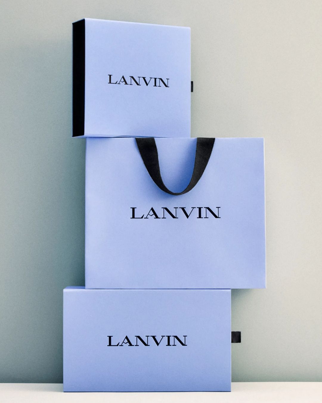
Lanvin's celestial heritage is making a come back How the Lanvin Blue made its way from the Florentine paradises to the Maison's packaging
As the days leading up to the presentation of Peter Copping's SS26 collection for Lanvin quickly dwindle, the time has come for change and surprises at the French Maison. A new creative director signals a profound transformation for Lanvin. Already underway, this transformation, instead of looking far into the future, has chosen to start from the past, beginning not with the product but with its packaging. Just days before Copping's second collection for Lanvin debuts, the bags and boxes that hold the Maison's precious pieces are once again adorned with the iconic "Lanvin Blue," the brand’s signature chromatic tone whose story deserves to be told.
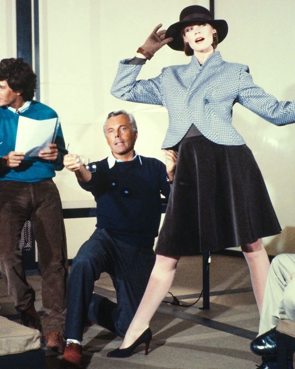
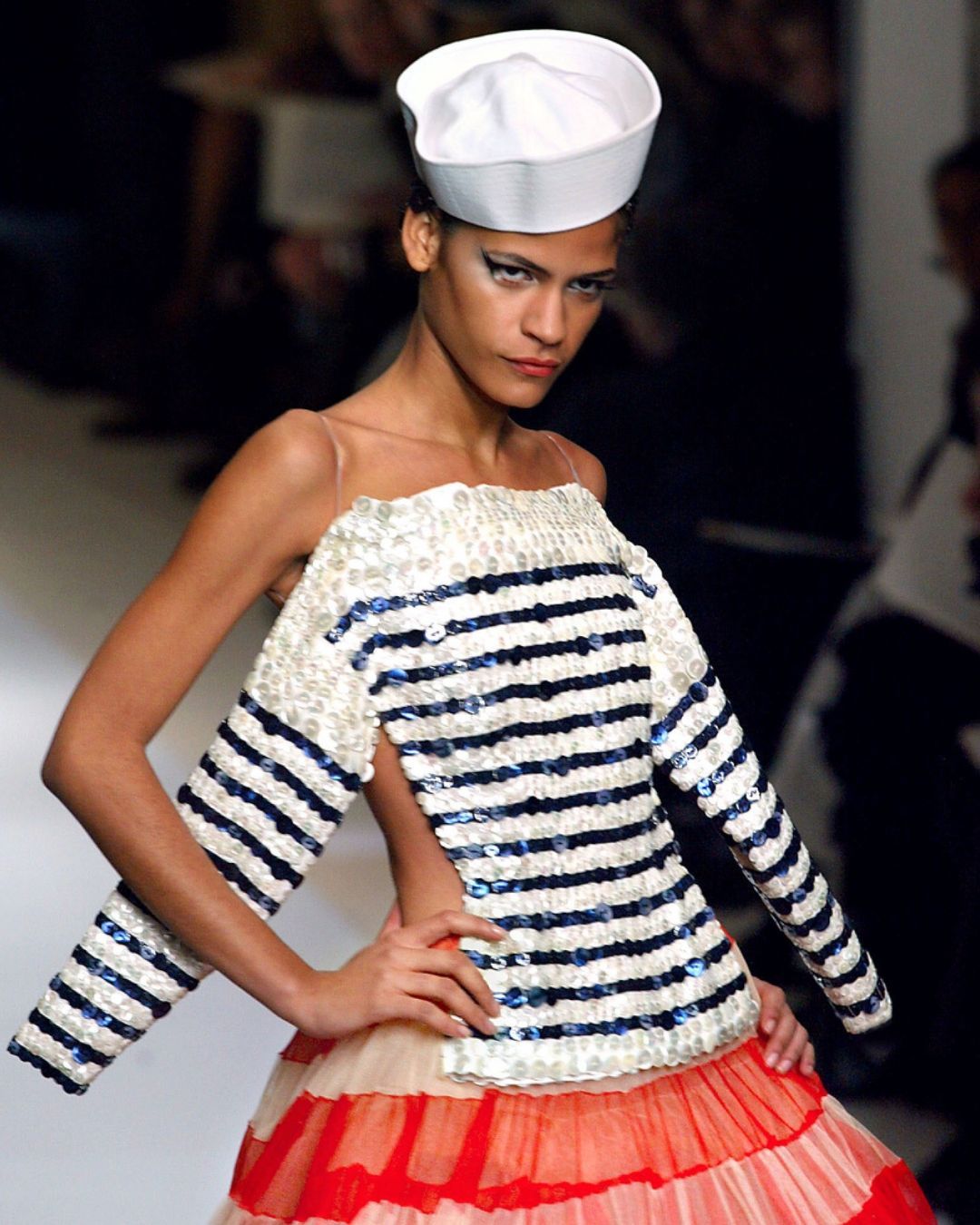
It all began about a century ago, when Jeanne Lanvin masterfully directed her eponymous brand. A Jeanne Lanvin who loved to linger on details, take her time, and contemplate for hours and hours the frescoes of painter Fra Angelico in Florence, paying particular attention to their captivating celestial blues. So captivating that these shades of blue very quickly became Lanvin’s signature, which the couturière applied to a wide range of products, from dresses to accessories to perfume bottles. Not limiting herself to just one shade of these blues that so fascinated her, Jeanne Lanvin developed 23 different ones within the four walls of her dye factory in Nanterre, starting in 1923, in an extremely visionary approach for the time. The famous "Lanvin Blue" quickly became a mark of recognition, just like Yves Klein’s blue. In 2025, under the aegis of Peter Copping, Lanvin proudly embraces once again this blue synonymous with softness and serenity, bringing it back not only on its clients’ bags, but also in its SS26 collection, which we will discover in just a few days on the runways of Paris Fashion Week.
“We have been careful and deliberate in the reinvention and redefinition of every gesture that signals a new direction for Lanvin,” explained Siddhartha Shukla, deputy general manager of the house, to WWD. This reintroduction of blue is not a mere "marketing stunt," but a return to the brand’s fundamental values. As Shukla pointed out, “Color at Lanvin is not a gimmick... it is fundamental to the house’s ethics and our artistic expression.” The new artistic director Peter Copping also emphasized the personal connection he feels with this shade. For him, the “tranquility and serenity of blue” carry a particular resonance. If in the dictionary of symbolism blue generally signifies serenity, trust, wisdom, and stability, let us hope that this is what Copping will find during his tenure at the French Maison.