


Are fashion logos changing again? The end of the all-caps logo era
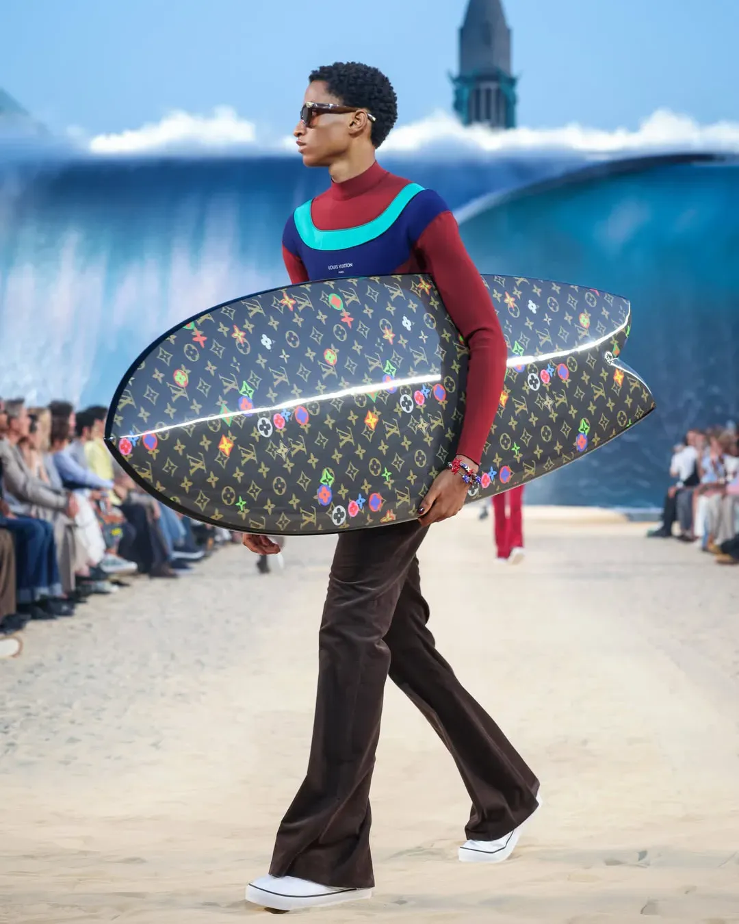
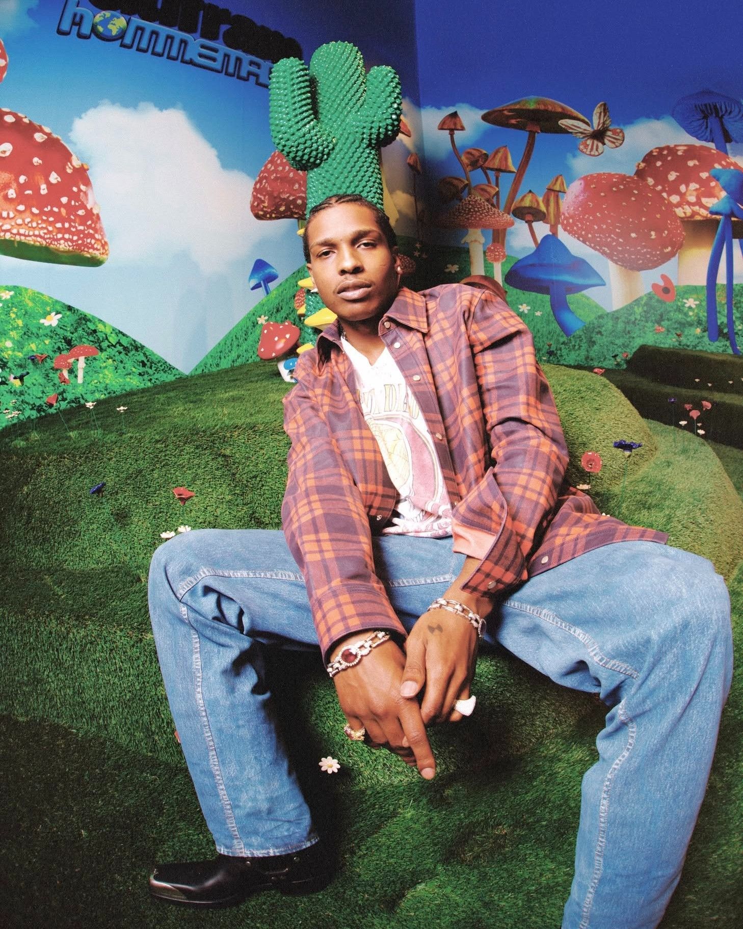
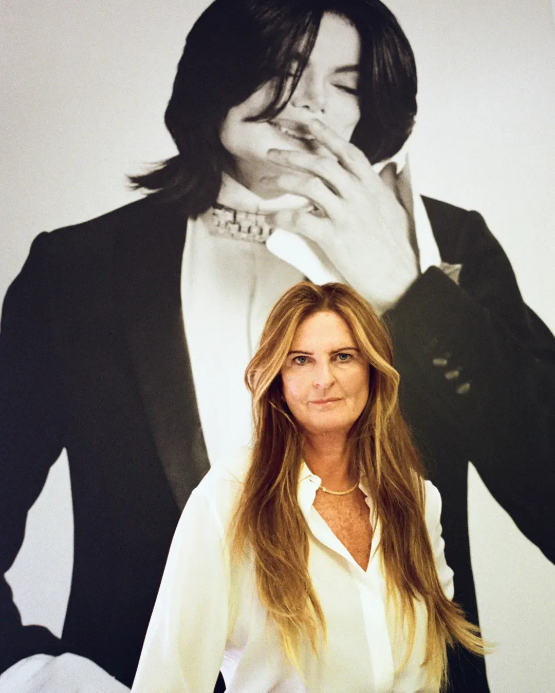
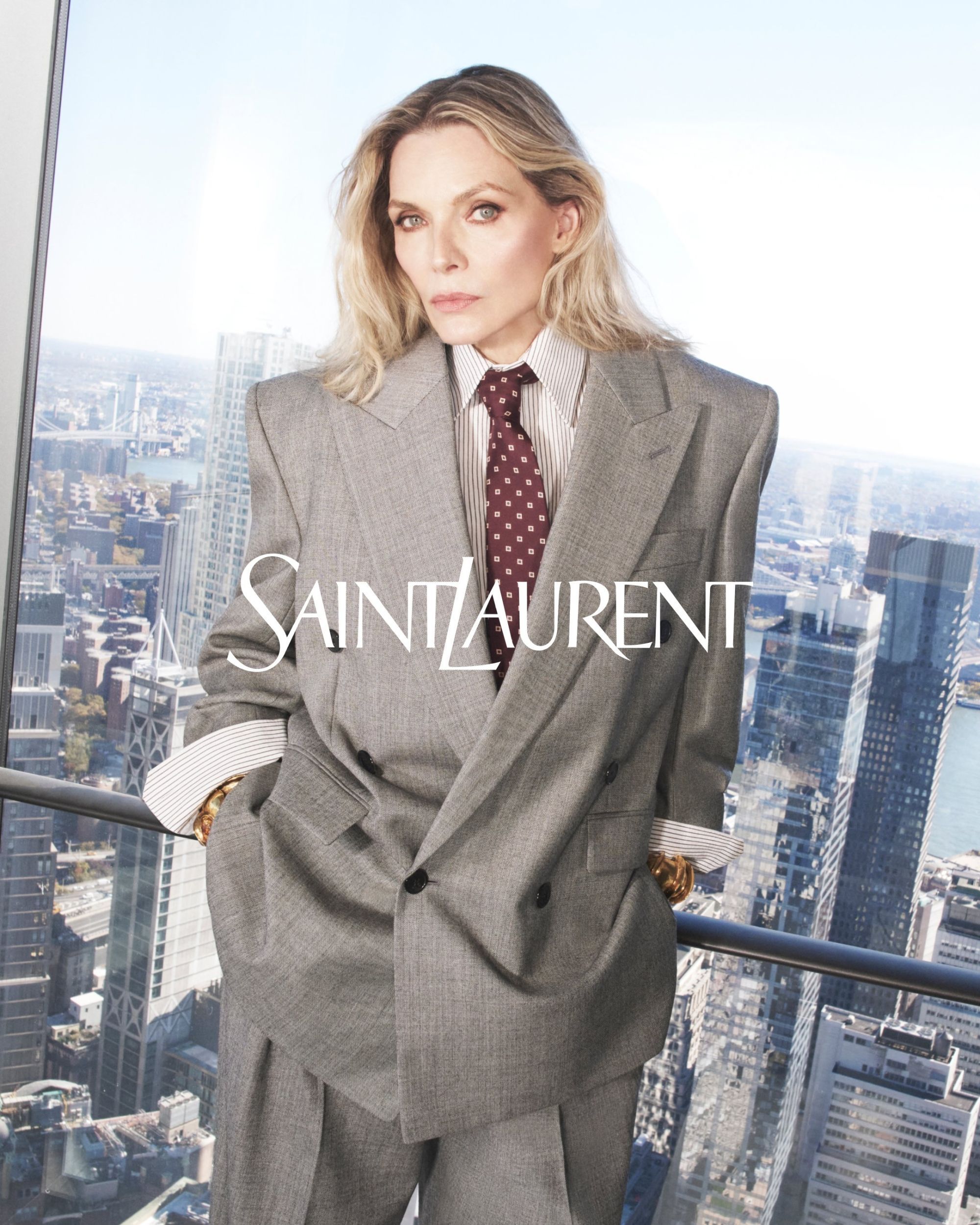
Since around 2018, there has been talk of “blandification” in fashion, referring to the trend of major fashion brands simplifying their logos graphically. Historically, it was Hedi Slimane who inaugurated the trend, changing the name of Yves Saint Laurent to Saint Laurent Paris in 2012, with a new sans-serif logo – but virtually everyone else followed suit. Burberry, Fendi, Balenciaga, Balmain, Ferragamo, Zegna, Givenchy: whether it was a graphic simplification to make the logo readable on phone screens and social media icons, a rebranding aimed at lightening the brand name and making brand awareness more agile, or the symbol of an increasingly conformist fashion industry, “blandification” seemed to be everywhere. We say “seemed” because today, things appear to have changed: Saint Laurent has already been using the old serif font again for some time, Burberry introduced a new logo after Daniel Lee’s return, while on Dior sweaters from Jonathan Anderson’s debut, the lowercase logo of the past has returned; and since Pharrell Williams arrived, even Louis Vuitton logos have started to expand and multiply into a wide range of monograms and fonts, as alternatives to the traditional classic logo which still remains on the inside of garments and in much of the branding; and already at Celine, with Michael Rider, the old monograms with the “C” have returned on scarves and bags – although the new logo established by Slimane some time ago has remained the same, and will likely stay that way. But why?
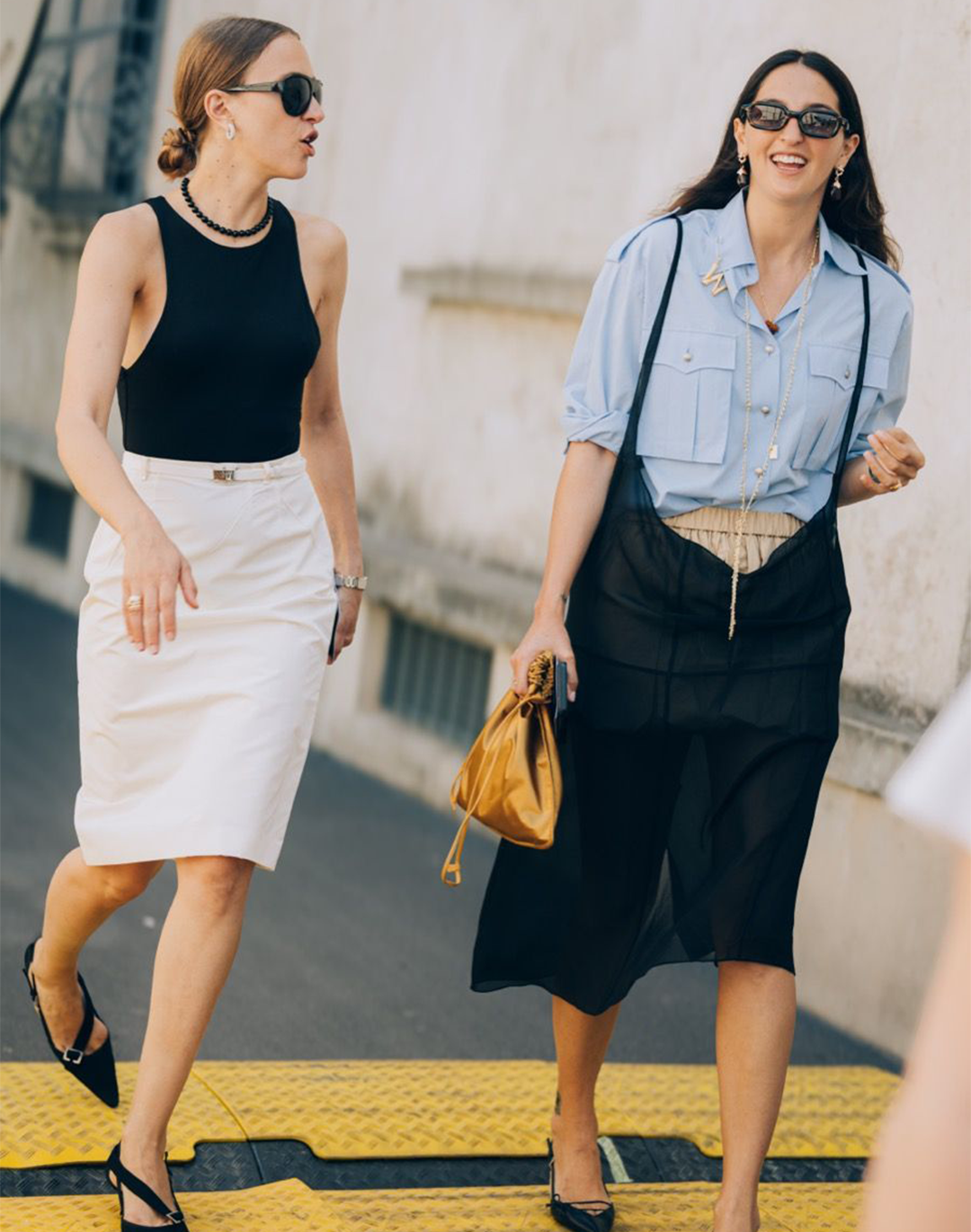
The gradual evolution of fashion logos roughly corresponds to the closure of the cycle of luxury democratization, which ended, at least symbolically, with the lockdown and the passing of Virgil Abloh, who had made accessibility (at least cultural) in fashion a nearly programmatic focus of his work. This democratization had widened fashion’s playing field – a field that now seems to be narrowing again, as seen in the rapid and progressive decline and near-forgotten status of many fashion brands born in the 2010s, and the revenue decline of brands that had achieved great success by relying on their aspirational customer base which, today, has been almost completely abandoned. With the crisis (the most optimistic reports speak of “stabilization” or “normalization”) in commercial fashion revenues, the problem has become apparent: if many brands competing for the attention of a single user segment resemble each other too much, it becomes impossible to tell them apart and, therefore, to prefer one over another. In other words, luxury may have realized it’s time to return to having its own personality and a recognizable identity – preferably even a nostalgic one. And the first way to enact this change is to update the logo, distinguishing it from the lineup of all-uppercase, sans-serif logos.
Burberry unblands its brand, deciding to hold on to 120 yrs of equity in their logo.
— Ethan Decker (@ehdecker) May 31, 2023
Prorsum! pic.twitter.com/Z9nRpqdqiR
Will the change we’re seeing now in its early stages actually take hold? Time will tell, but it seems quite telling that this phenomenon is emerging precisely alongside the season of great creative renewal already underway with the debuts of Jonathan Anderson, Michael Rider, and Glenn Martens, and which will culminate with Demna’s debut at Gucci next March. It’s a phase in which not only are creative directions changing, but also many managers and CEOs, as well as production, communication, and distribution strategies. A moment of widespread refreshment in which the all-uppercase, “blandified” logos of the past may pay the price. Of all the complex mechanisms that determine a brand’s life, the logo is ultimately the most public and customizable expression – and it’s now clear that if luxury intends to survive, it must clarify its identity even to itself.