


The sneaker revolution starts at the toe Four centimeters that are changing the way we think about shoes
I have a theory that I often repeat to those who work with me: “the personality lives at the extremities of the body”. Head and feet communicate much more than the rest. Glasses, hairstyles, hats, but especially shoes, tell who we are through an immediate and extremely powerful visual language. For years they taught me to look people in the eyes, but I learned to look at their shoes. And I am much less wrong. What seemed like a provocation is now becoming a true creative obsession.
In recent years something particularly interesting has happened. Nike is losing attraction on the market, the entire sneaker world seems to be temporarily losing its direction. These are precisely the moments when creativity finds space to express itself. When Nike dominates, the system rigidifies: precise codes emerge, replicated everywhere. Even in stores, shoes are displayed following almost ritual rules, often showing the left one, always in the same way. It seems crazy, but that’s how it is. When that balance breaks, the system reopens. And creativity breathes again.
The silent revolution of the toe
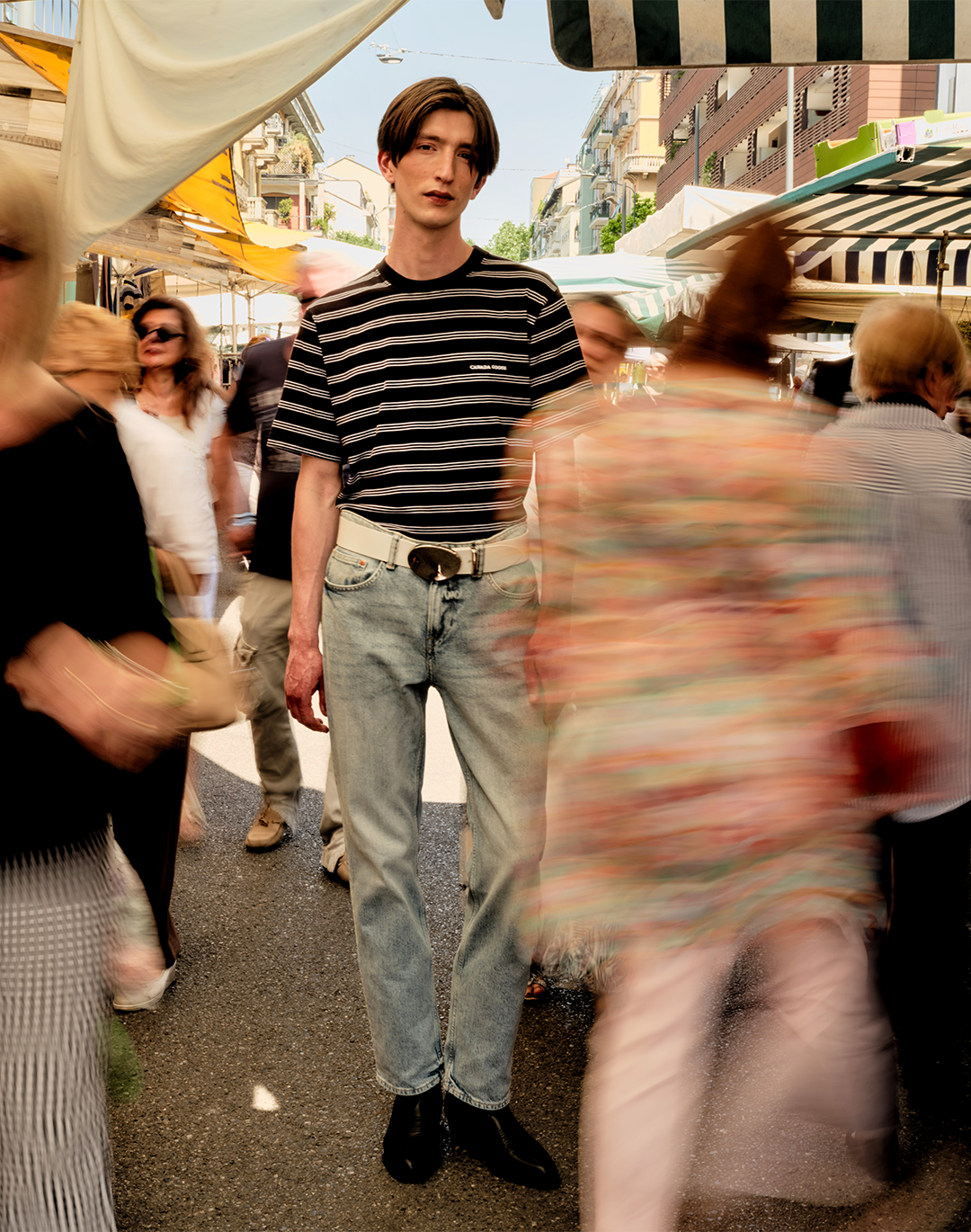
In recent years a transformation as veiled as it is radical is taking place. Attention is shifting from the side of the shoe to the toe. The change is evident and concerns the entire sector, from sneakers to more classic footwear. Until a few years ago we wore pants designed to enhance the side of the shoe. Nike’s swoosh should never be covered. Today we wear all kinds of pants, long, short, tight or very wide with the same shoes. Often this is almost completely covered. This creates a new visual need: the shoe must tell itself in the first few centimeters. Brands have started to understand it.
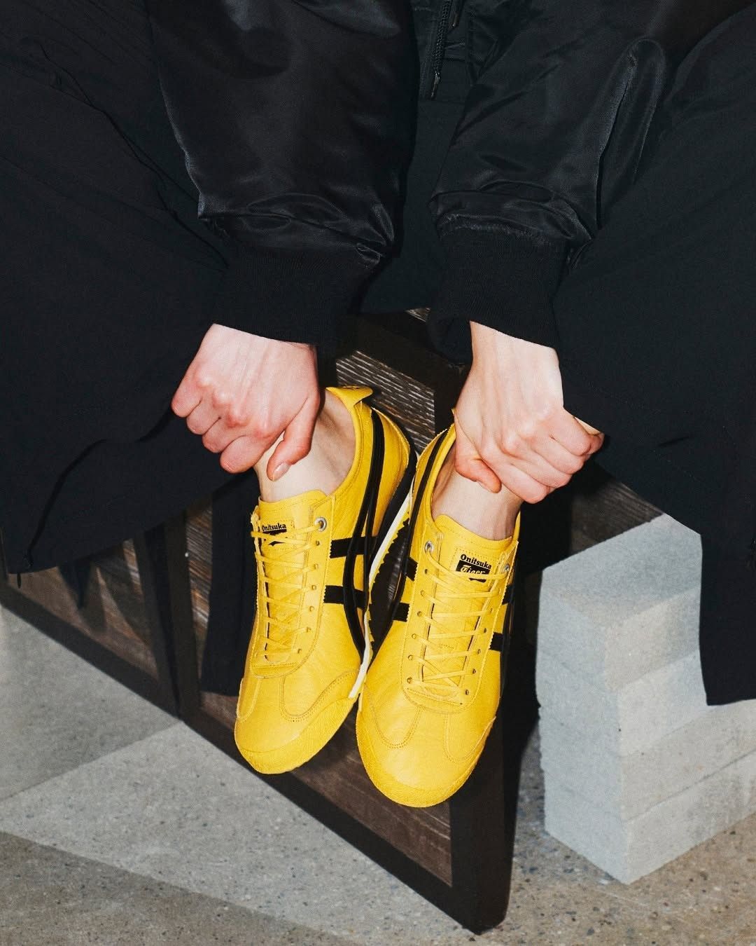
The market itself confirms this trend. In technical shoes the change is clear and highly visible: brands are starting to place their identity right on the toe, as in the case of the Salomon XT 6 and Roa’s Sella sneakers. In luxury sneakers something similar happens: the logo appears in the front area, before the laces; in some cases it becomes a true accessory, in others it moves all the way to the toe, even reaching the outsole. Some projects declare it openly, others do it more subtly. The result, however, is the same: the narrative is concentrated in just a few centimeters. It is not only an aesthetic issue, but one of reading: the shoe is observed frontally, no longer laterally.
When a trend becomes a brand
@justshoesinfo Shoe collection spotlight / MARTIN SALLIERES J U S T / S H O E S Image Library - coming soon Join the waitlist www.justshoes.info Personally selected shoe inspo Searchable & Organised For footwear pros & shoe lovers Built to inspire but not overwhelm #justshoes #footweardesign #shoetrends #shoeinspiration #shoes #footwear #shoetok #justshoesimagelibrary #martinsallieres everything is embarrassing sky ferreira - qori
Entering the world of research sneakers, this dynamic becomes even more evident. The project by designer Martin Sallieres, with his namesake brand, synthesizes this concept to the minimum terms. The shoe seems to grow from the heel toward the toe in a gradual and constant way, drawing attention precisely there, where the logo is impressed on the outsole. Just a few centimeters are enough to recognize it.
Another independent brand is The Village, which blends the world of climbing with skate philosophy, giving life to a deeply contemporary and interesting project. Here too it is impossible not to notice the same dynamic, even though we are faced with a different type of language. The toe is extremely short, characterized by rubber that invades the upper and by lacing close to the toes. Even fewer centimeters are needed to understand that we are looking at one of the many examples in which the climbing world becomes the reference scenario.
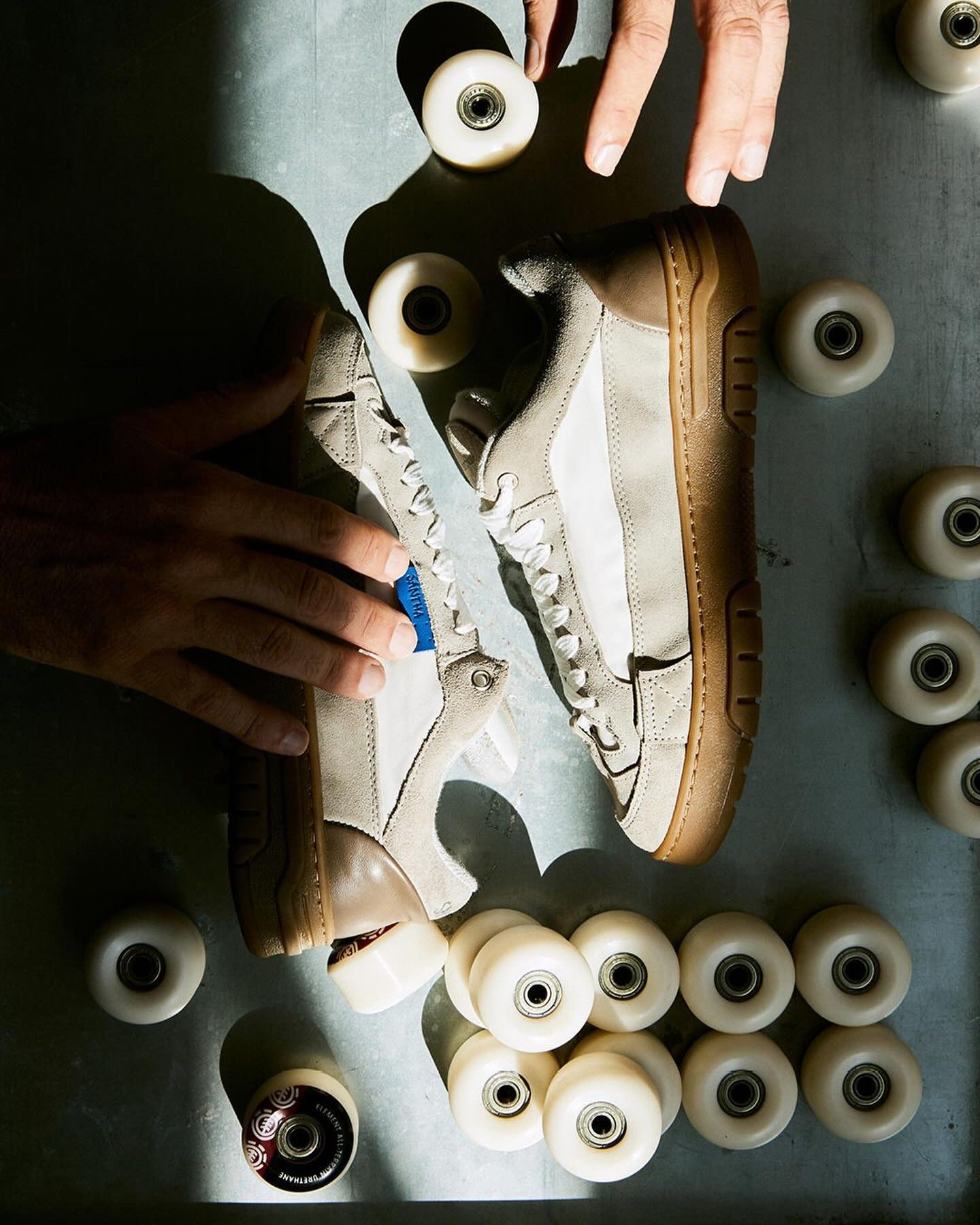
It is not only The Village that is influenced by the outdoor world. Brands like Keen are making a strong comeback on the market right now and present the same stylistic features, as does Stone Island, which offers a wall-climbing shoe. Finally, Loewe, with the “Grip”, makes an explicit reference to the same sporting universe. Returning to the independent brands that seem to follow this creative flow, we can mention Santha and Abra. In the first case it is skate, in its purest essence, that traces the line. The imagery of the early 2000s becomes the perfect frame for a raw and direct story. The new silhouette features the number 8 on the first lace loop, once again emphasizing the same area.
Even more marked is the creative intervention in the collaboration of Danilo Paura, where a punk element was introduced, capable of further emphasizing that point of contact. The result is the Santha “Love Park” by Paura. As for Abra, designer Abraham Ortuño Perez with his ballerina-sneaker directs the gaze toward the toe by intervening on the lacing. The shoe appears laced from the opposite side, with the bow positioned on the first loop, right at the toe.
Aesthetics becomes system
@elliot_duprey Quick history lesson that has been told a million times before and will have to be told again #fashiontok #fashiontiktok #fashionhistory #margiela #adidas #sneakertok #sneakers #GAT #maisonmargiela #greenscreen #mensfashion #archivefashion Freestyle - Westside Gunn
Another interesting signal concerns three brands totally different from each other, yet surprisingly aligned. They are working on the same aesthetic matrix: an essential shoe in which the side is reduced to the minimum and the toe builds the identity. It is a shared language, declined in different ways but clearly recognizable. All three brands draw inspiration from the military shoe, which in turn seems to have become a true object of desire in the vintage world. Clean surfaces. Smooth leather and absence of superfluous elements: Pane sneaker, Adidas “Army”, Maison Margiela “Replica” and German army shoe.
Three brands. Three interpretations. A single intuition. And the market, at least for now, seems to prove them all right. The Tabi are not a new project. Martin Margiela presented them in one of his most iconic collections. Yet it is impossible not to notice how much this shoe has impacted the market. In recent seasons we have seen it transform into a sneaker, a classic women’s shoe, a ballerina, becoming more and more a status symbol for enthusiasts.
The Open Toe Revelee décolleté by Valentino became a real hit in the shoe world in a very short time. At first glance it is a classic décolleté, but approaching the toe you discover that part of the shoe disappears completely. The toe vanishes, giving even more emphasis to that very point. An absence that generates presence. It disappears by making itself evident.
The return of the foot
@joydeslyn God forbid I care about my foot health and want to be grounded all the time. @Vibram #vibram #vibramfivefingers #fivefingers #toeshoes #fyp original sound - Jordan Stone
Many women’s brands that had built their identity around the heel are progressively losing relevance. At the same time, models that put the natural shape of the foot back at the center are emerging. From the runways to everyday life, we are witnessing an ever wider diffusion of barefoot silhouettes. Anatomical shapes, wide toes, structures that follow rather than force the body. This is not just an aesthetic trend, it is a cultural shift. The shoe no longer imposes a shape, it accompanies it. And in this process the toe returns to being the protagonist. It is Birkenstock that traces this trend.
The same happens with models like the FiveFingers by Vibram, where the toes themselves draw the aesthetic. Never so close to the sensation of walking barefoot, coming into contact with the ground. Many brands, in order to identify themselves and build an image in people’s minds, focus on a movement that is not frenetic but constant. Continuing to show themselves always in the same way but continuously creates a status that allows them to be recognized by small details at first glance. It is belonging. There is a growing need for reclamation: of one’s own identity, one’s own taste, one’s own way of being in the world.
Nike pushes a communication that visually shows us the impact of “doing”, carrying with it many other similar values such as speed, dynamism and movement. This, however, can be interpreted to the point of being taken to the extreme. In this way the message becomes obsession and frenzy. In recent years the side of the shoe has been designed to be observed by others, but it is not in visual contact with us. The toe, on the other hand, we see directly, without the need for artifices.
This simple gesture makes us aware of what is happening. We once again take possession of an intimate movement that belongs to us: watching how we voluntarily choose to move, to evolve. It happens naturally. Let’s take as an example the phase in which we move from crawling to walking. We return to being owners of our movements. All this leaves the sensation of recognizing ourselves again as living animals, immersed in a nature that does not reject us, but questions us. We are living, through the extremity of the body, a profound call toward the earth. Is it a coincidence that Nike is now relaunching from its archives the ACG “All Condition Gear” project designed for outdoor use? And ironically, the logo is enclosed in a triangle.