


The flat logo trend is spreading in the automotive industry We can call it a trend, but it is rather a practical resolution to the growing issue of readability
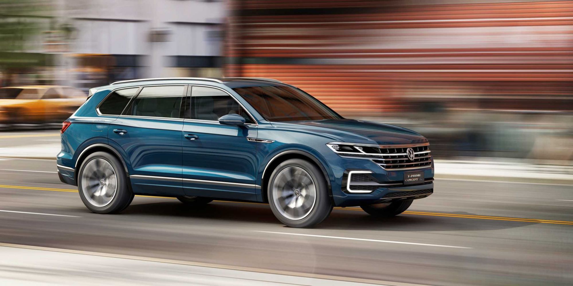
Volkswagen
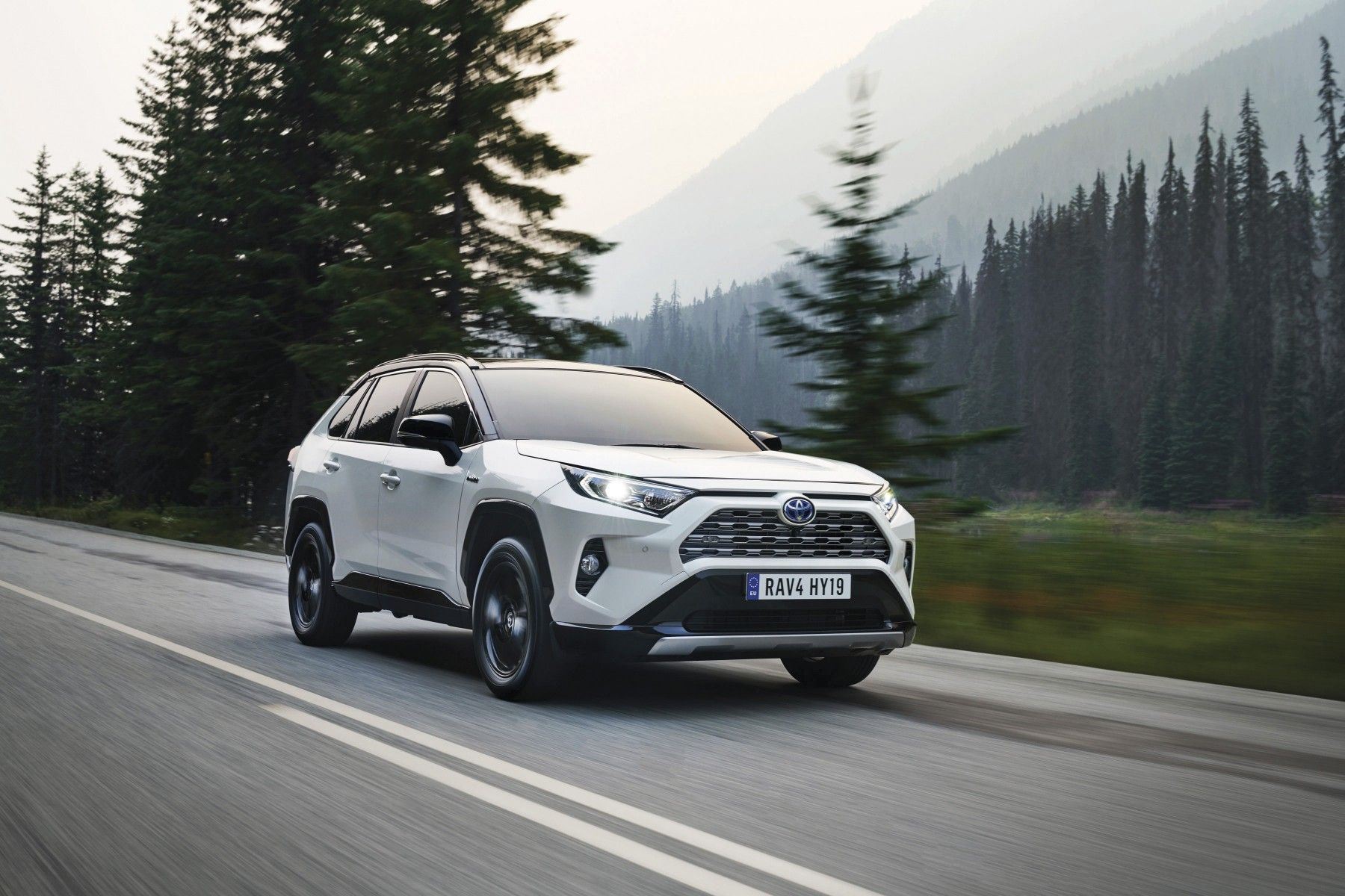
Toyota
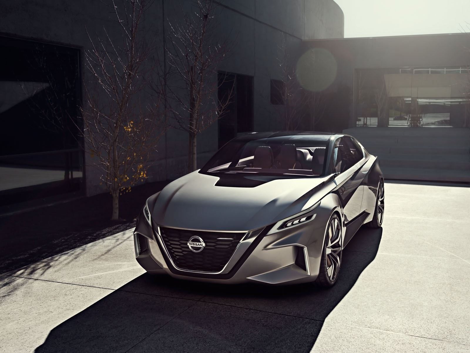
Nissan
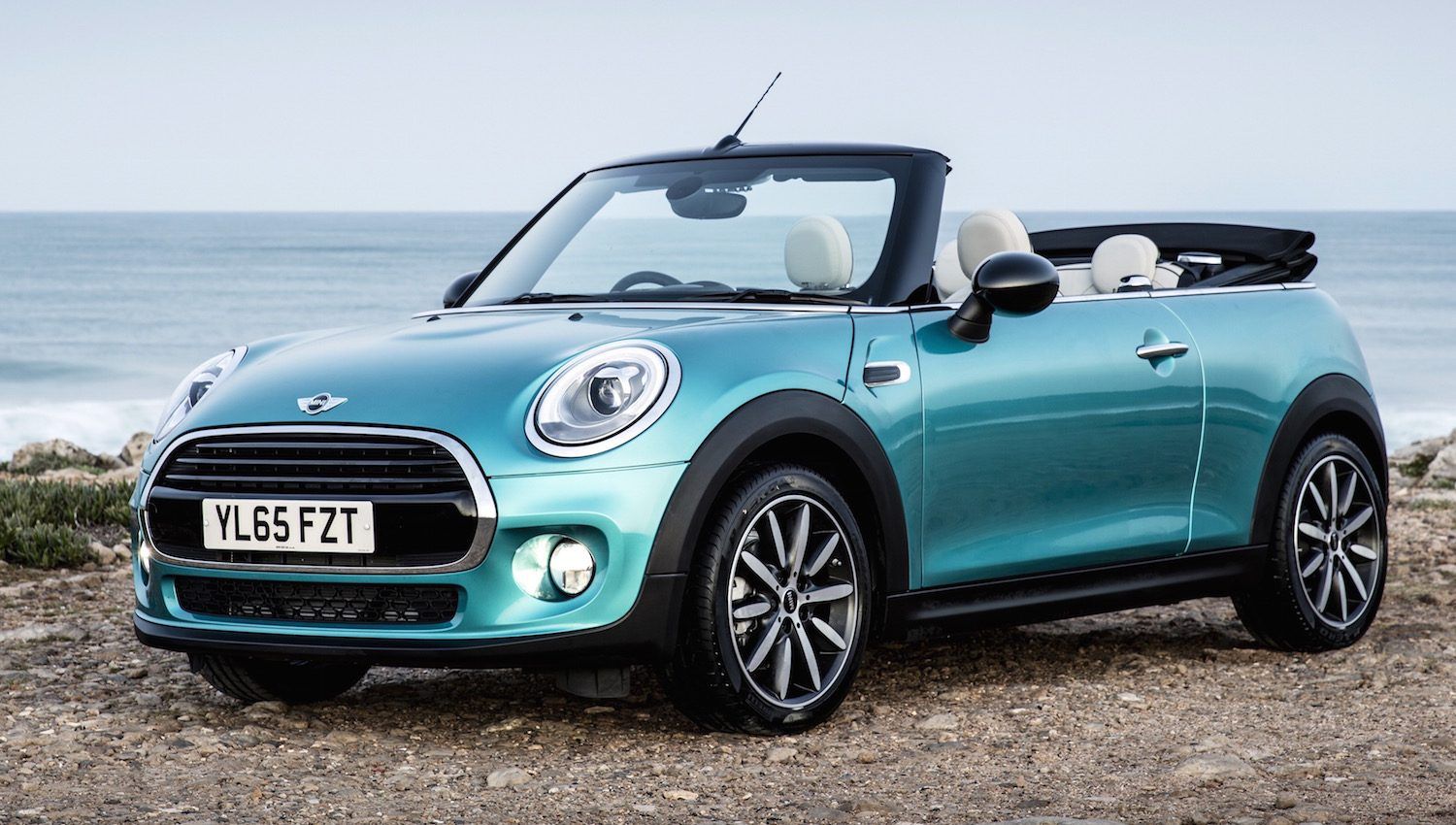
Mini
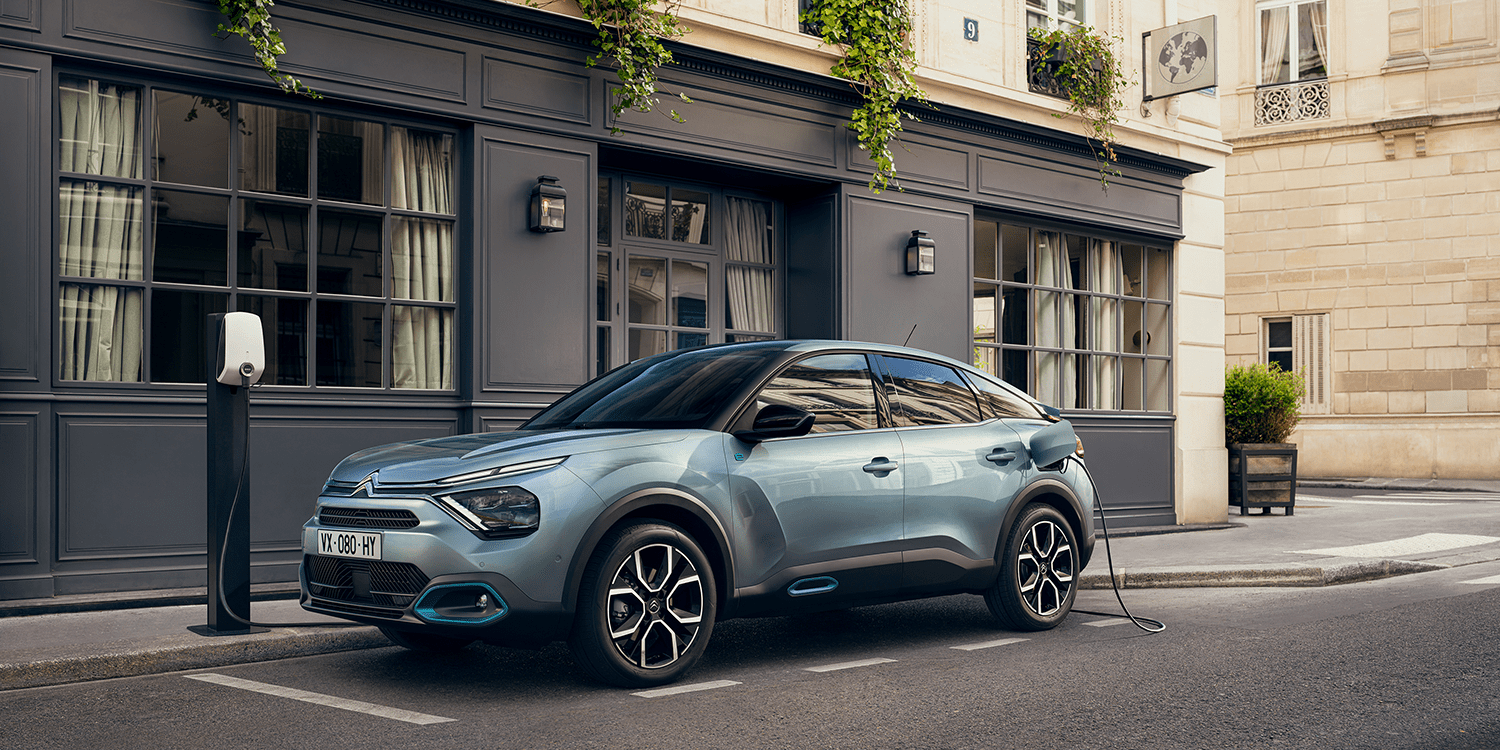
Citroën
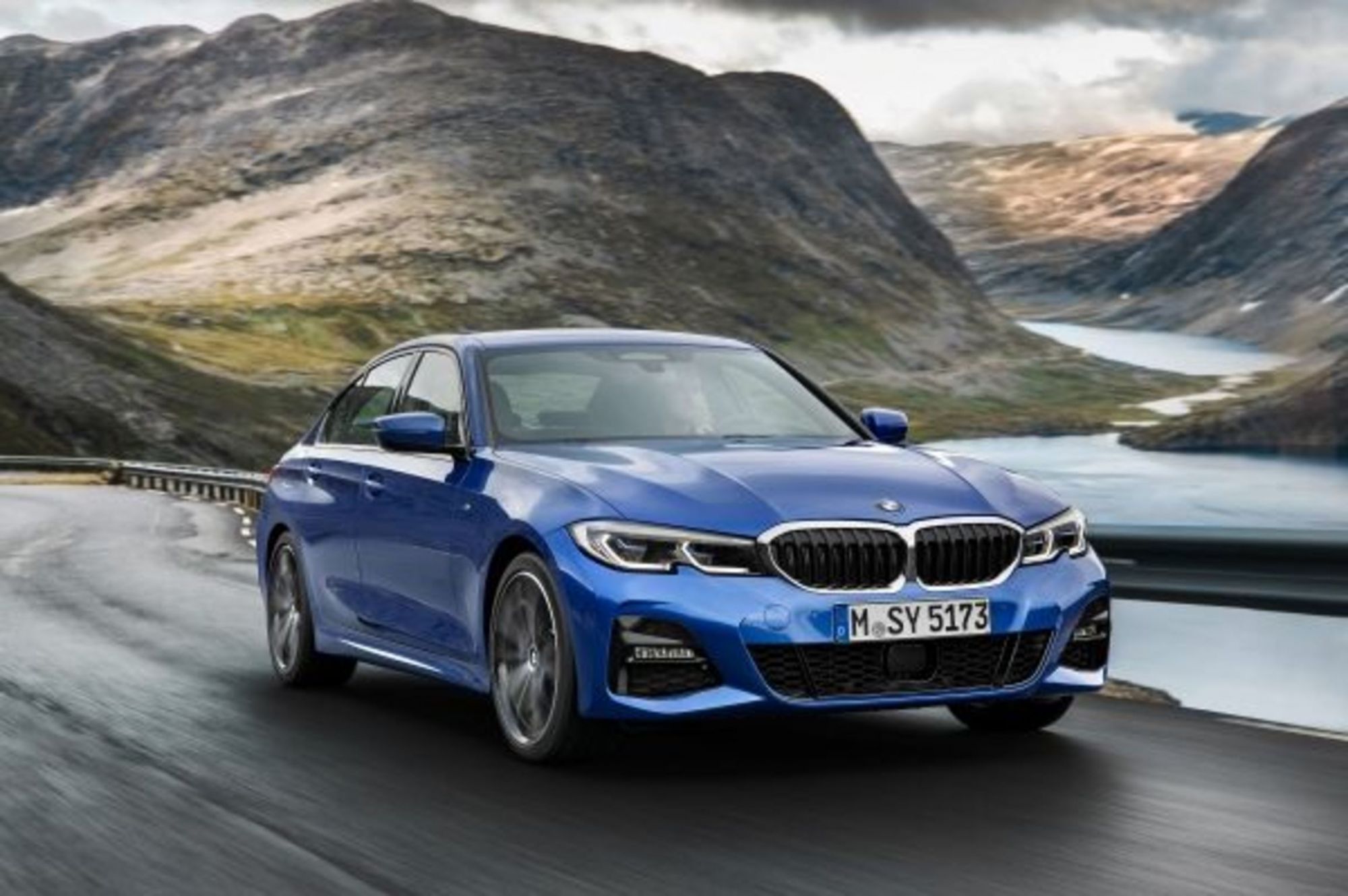
BMW
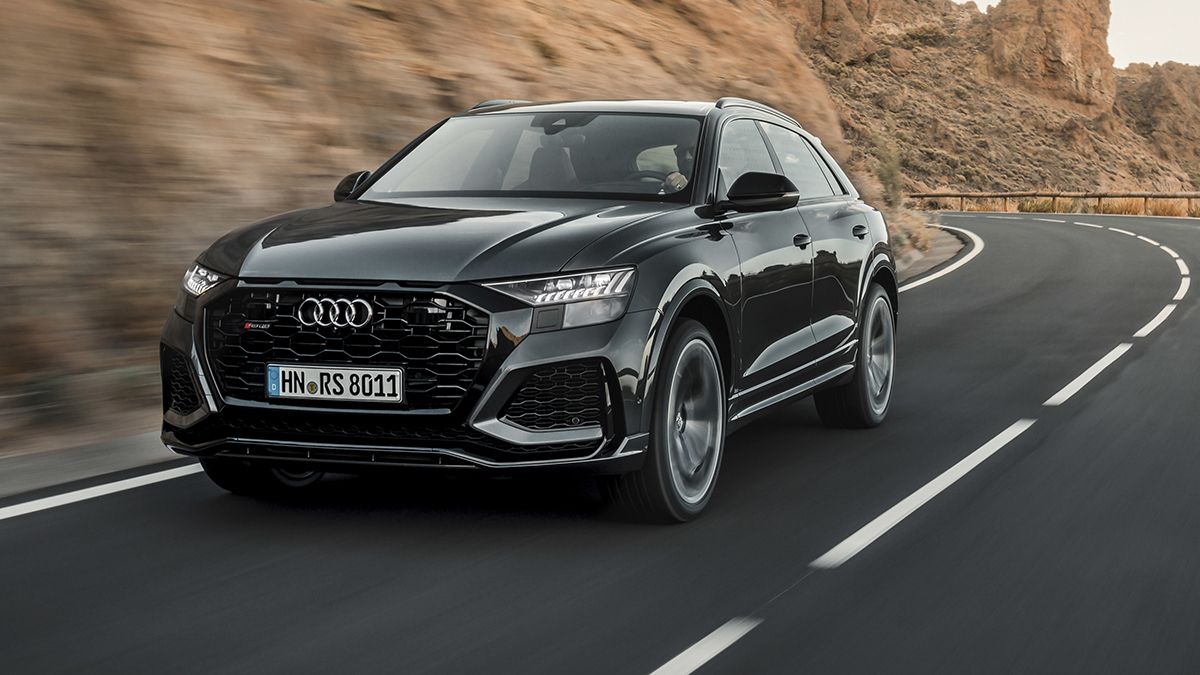
Audi
The logo of a car is like the signature of an artist: a small part without which all the others would have no identity. It is the logo that gives the name to the car and, in some ways, it is the logo that first conveys the values and history of a car manufacturer. But the logo also reflects, with its changes, the various stages of life of a brand – the adaptability of which to the present determines its longevity. In recent years, the automotive industry has seen a trend that has led car manufacturers such as Nissan, Toyota, Citroen and Audi to make two-dimensional logos that, in the 80s and 90s, were three-dimensional, simplifying their graphics. The trend stems from a marketing need: with brand communication increasingly taking place on digital platforms, a logo too complex, too rich in realistic visual effects and gradients loses distinctiveness. Something similar has happened in the fashion world with the phenomenon of blanding, which has seen numerous brands standardize the font and color of their logos to better protect intellectual property and self-represent themselves with uniformity through different platforms, digital and not.
Audi
BMW
Citroën
Mini
Nissan
Toyota
Volkswagen
In the field of graphic design, this realism is known as skeumorphism – a style that, in the age of iPhone and social media, has become less and less screen-friendly, leading to the simplification of the logos that have been witnessed from 2015 onwards. As Dan Beckett, one of the leading designers of Toyota's new logo, explained to Dezeen:
"With the advent of digital brand touchpoints and especially small mobile screens, all those fiddly bevels and gradients meant the logos became little grey smudges, indistinguishable from one another. I don't see [flat design] as a new trend. I see it as the logical solution to a universal problem created by a different trend".
The first car manufacturer to modify its logo with a two-dimensional re-design was Mini, in 2015, which not only eliminated the color and three-dimensional elements of its logo but changed the font used with the new MINI Serif. The old logo remained on the cars while the new one was used in the brand's communication, both print and digital. In 2016 it was Citroen that lost not only the chrome but also the red color of the name, opting for a gray tint seen as more versatile for future graphic uses. Black, on the other hand, was the color chosen by Audi in 2017 when it attached its iconic logo to better reposition itself on the digital market – a move recently followed by the new possibility, given to users, to interactively select the thickness of the four chained rings that compose it. In 2019, Volkswagen also flattened the logo and simplified its color scheme. Unlike previous automakers, Volkswagen accompanied the re-design with the launch of ID.3, its first electric car, thus reinforcing the narrative of the brand's redefinition entering a new era. The "new era" for the brand came after the so-called Dieselgate scandal erupted following the discovery of falsified diesel engine emissions data in brand cars sold in the US and Europe - a scandal that brought down Volkswagen's shares and led to the resignation of the then CEO, Martin Winterkorn.
The long wave of flat design trend comes until 2020, with the debut of BMW's new simplified logo this March, which in addition to the usual flattening saw the exterior black ring that contained the brand name disappear. The change was designed to accommodate the colors of the bodywork, making it different from one model to another. At the beginning of July, then, it was the turn of Nissan that perhaps applied the most radical re-desing by even removing the box that contained the name of the brand and transforming the metal circle into two minimal white semi-circles. More soft was the update made by Toyota, finally, which saw the fall of the name and a monochrome look dark gray to the post of the previous chrome 3D.