


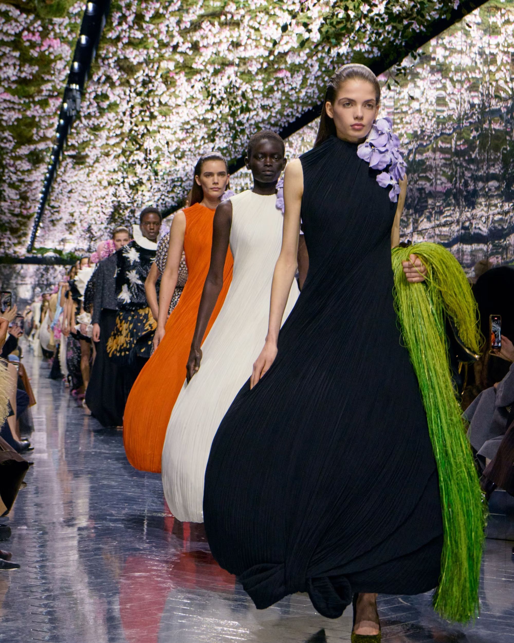


The new Logo of Los Angeles and the branding problem of Italian tourism Every market needs its brands, including Italian tourism

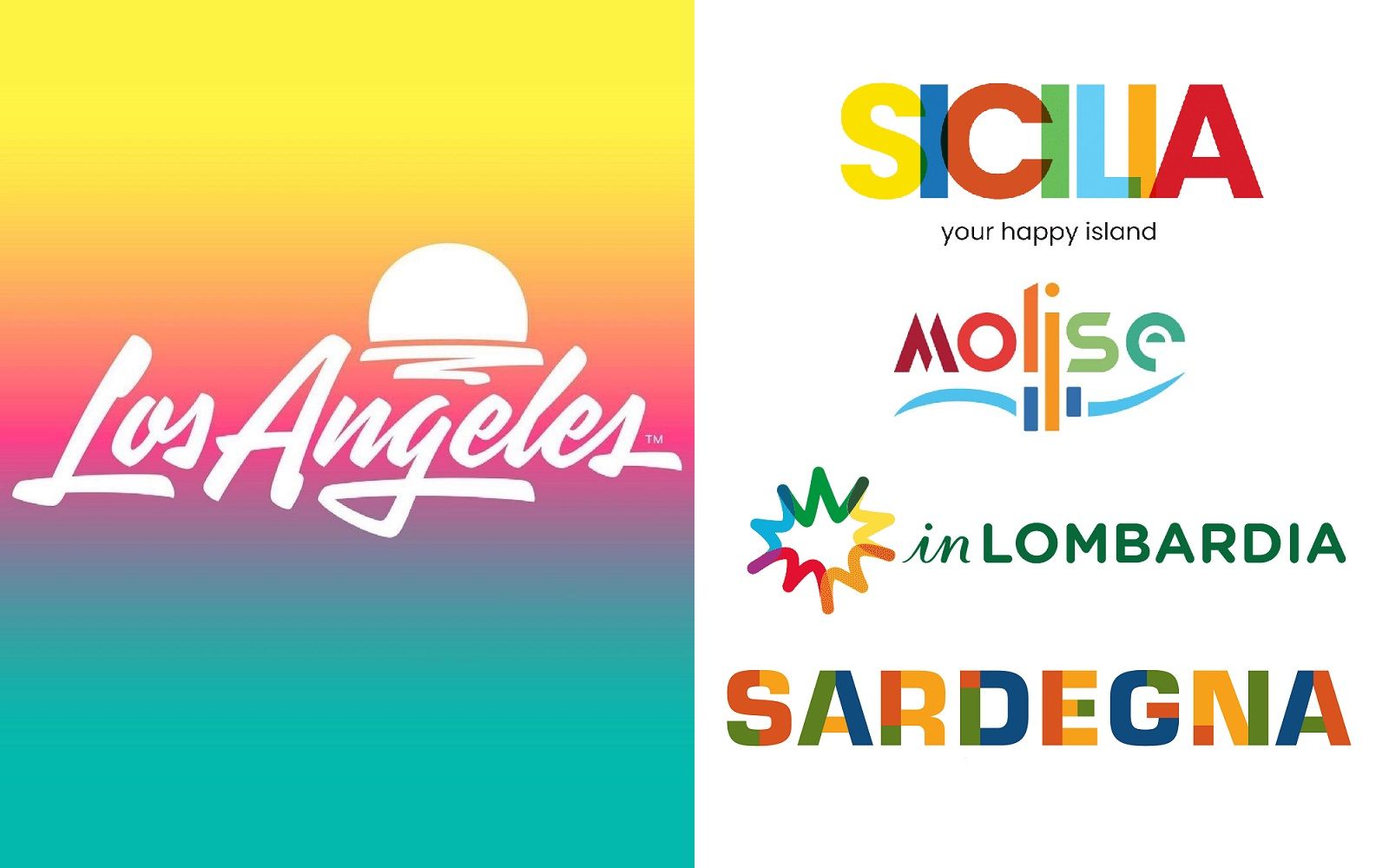
Shepard Fairey, the American artist behind Obey and Obama's "Hope" poster, has created a new city logo for Los Angeles along with design studio House Industries. The new logo was commissioned by city authorities, and especially by the Los Angeles Tourism & Convention Board, to give a new brand identity to the city and attract tourism flows. The result was a new and less institutional logo, with a vague '80s flavor, in a gradient of yellows, reds and green waters that evokes the beaches and the sea and a setting sun. As simple as it may seem, the new logo has a very unconventional street sensibility in the world of city branding – that is, of all that iconographic apparatus made of fonts, coats of arms and logos that should summarize the identity of a city and its institutions, especially tourist.
The new logo of L.A., among other things, also has the merit of having been designed by an artist who comes from the street world, and who therefore is far from the somewhat plastered aesthetic usually adopted by institutions. Speaking of this logo, Jeff Beer of Fast Company rightly points out:
«Tourism slogans and brand identities aren’t typically all that memorable, primarily because these are designs aimed to appeal to quite literally the broadest cross-section of people possible».
Specifically, Beer continues, the old L.A. logo was even so generic that it could not even be registered as a trademark, paving the way for an avalanche of unofficial souvenirs and improper uses of the same. This discourse on the brand identity of cities underlines the renewed importance that tourism has assumed in the post-pandemic world: if the concept of identity is abstract, the logo becomes a quantifiable, controllable and saleable identity and even large cities must equip themselves with their own to reaffirm this identity and use it to attract tourism flows.
What about Italy?
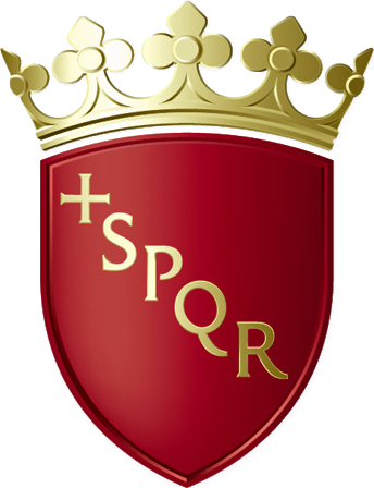
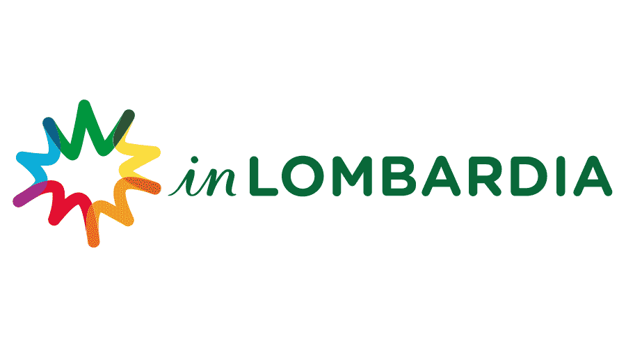
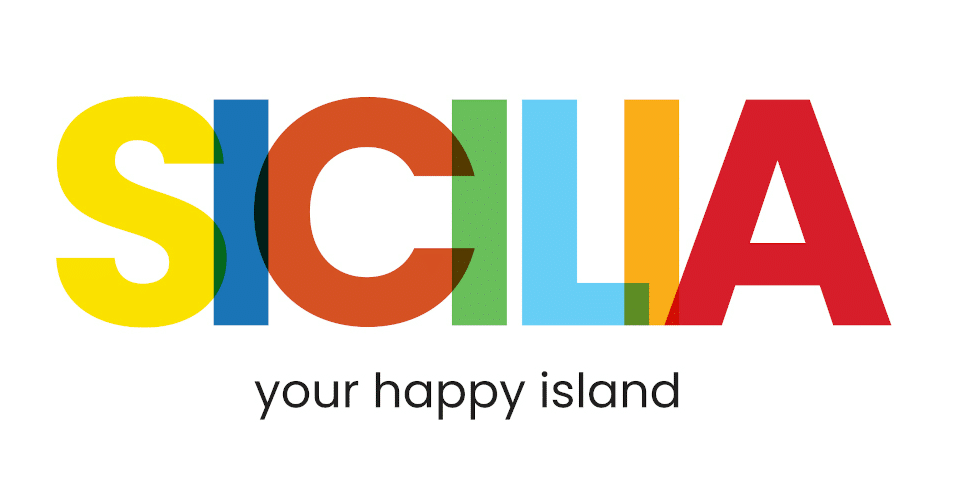
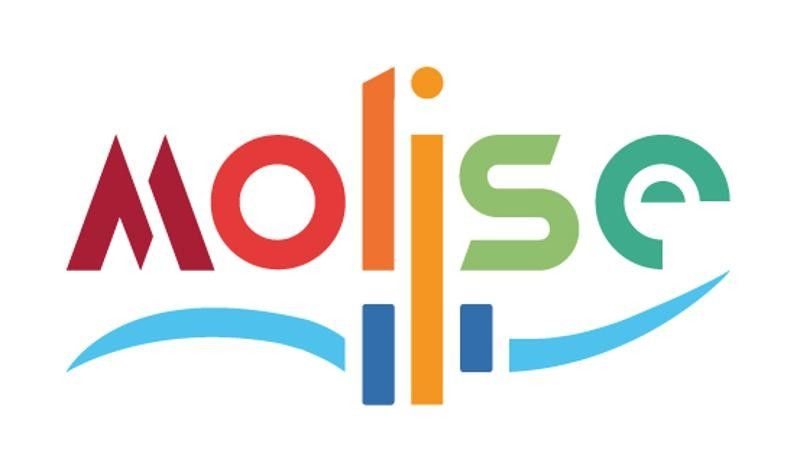
Italy is a country founded on tourism, which from a certain point of view has a very strong identity, but which has also become famous over the years for a series of somewhat clumsy attempts to update both its branding citizens and its local identities. The main problem, one might say, is the lack of a modern aesthetic and concrete audacity. Take for example the new logos that sicily was equipped with last year, Molise in February and the logo of the inLOMBARDIA campaign with which the Lombardy region wants to relaunch tourism, but also that of Sardinia: all include a rainbow colorway that is supposed to represent the territory and, in reality, they are not very expressive of the individual regional identities – they are literally just colors. In Rome, instead, the logo is the same as that town hall: a red coat of arms with the inscription SPQR. But a form of self-awareness exists: the councilor for tourism of Molise, Vincenzo Cotugno, achieved the purpose of the operation well by saying at the press conference that «to become a tourist destination a territory needs a brand, an identification mark».
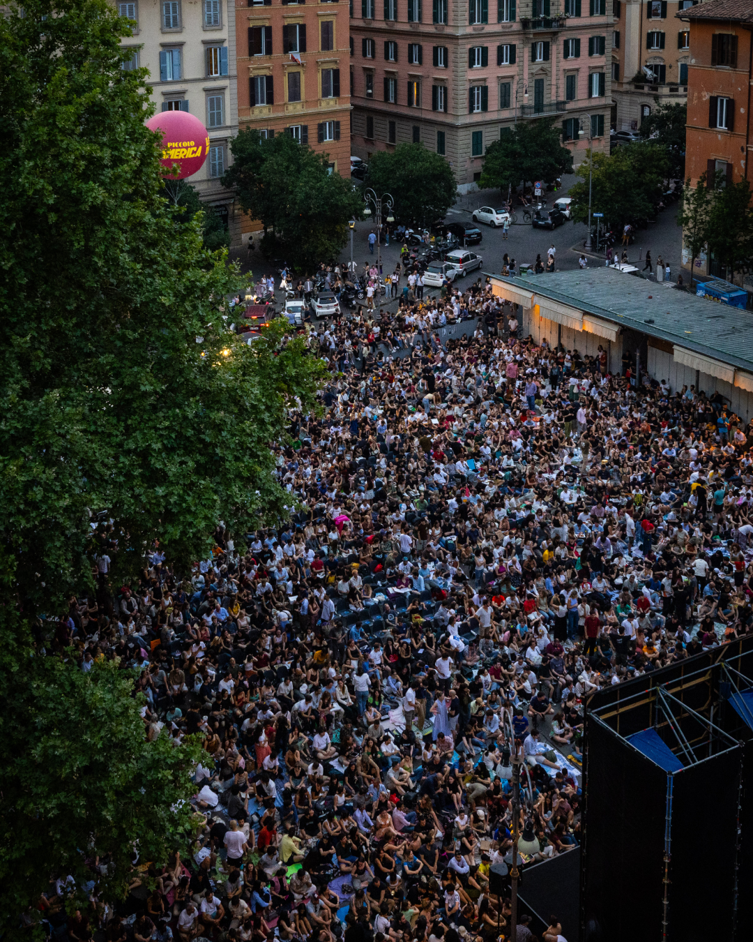
Last week, in a new initiative, the mayors of Rome, Venice, Florence, Milan, Naples and Palermo presented six stamps representing the main squares of the various cities which, as Repubblica says, «are a show of hope for the resumption of tourism in the Belpaese». An initiative that is certainly noble but that will hardly reach those who are not passionate about philately – a hobby that can be safely defined as "for the elderly". The series of stamps with the views of the historic Italian squares represents a bit the problem of many Italian tourist initiatives: they are boomer stuff. But in general, both in Lombardy and in Rome and elsewhere, little has been done to elevate tourist communication above videos shot with a drone in which a suggestive voice-over describes the landscapes, the spaghetti, the alleys of the ancient village – a type of communication that has nothing wrong in itself but is so trite and repetitive that it leaves the potential consumer a little insensitive. We recall here the absolute cringe of the video Terra Mia by Gabriele Muccino, a complete orgy of clichés that led Helga Marsala of Artribune to speak rightly of «a communicative vocation declined downwards, out of any innovative and international standard, devoid of any desire for research and rejuvenation».
A possible solution
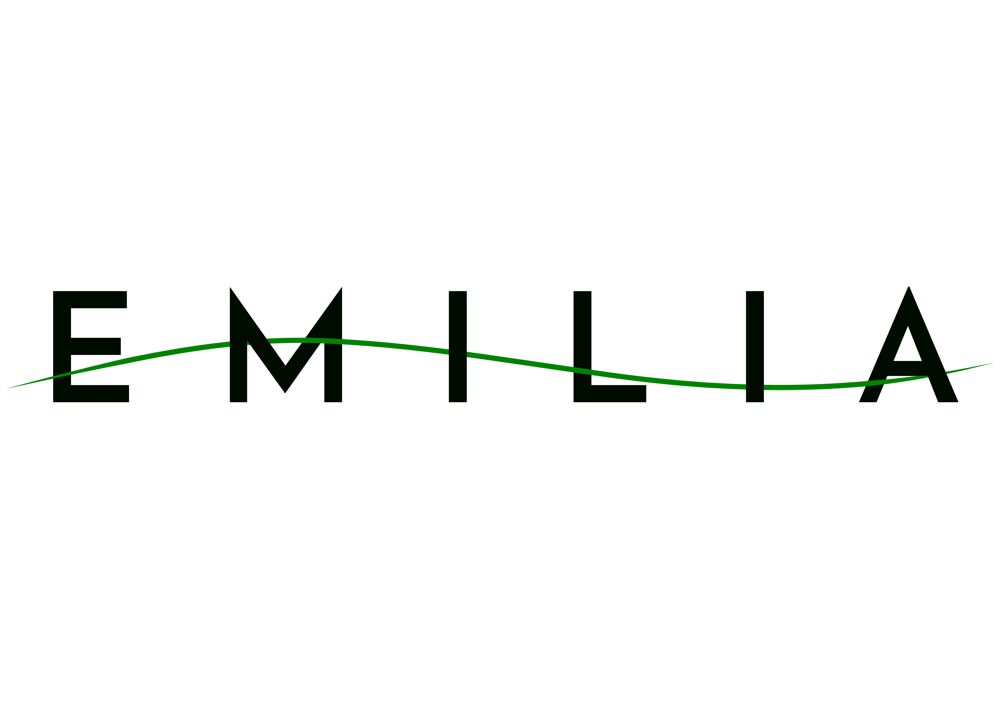
As pointed out before, speaking of the case of Los Angeles, the new logo of the city will also implicitly serve the production of official city merch – thus emphasizing how the nature of a logo is above all commercial. In a previous article on the merch of Italian museums, we had underlined the importance of the merch on the level of cultural belonging. As the crisis brought by the lockdown has pointed out, in fact, tourism is first of all a market and the goods that are sold in this market are the tourist destinations that therefore need precise identity and branding. In this sense, Emilia-Romagna has recently renovated the new site with a modern and clean logo and a modern aesthetic even if conventional but in general attractive and sober. To keep the sector going, in fact, you need first of all a certain sensitivity towards the good that is sold, for example not by building supermarkets near the ancient castles as was going to happen in Barletta last month, but also a sensitivity on the needs of the market and understanding where and when it is possible to invest and speculate – for example with a city merch that is really attractive or on communication strategies that go beyond aesthetics from travel agency. Just like L.A. did.