


BMW has a brand new logo Appeared for the first time on the new i4 Concept electric car
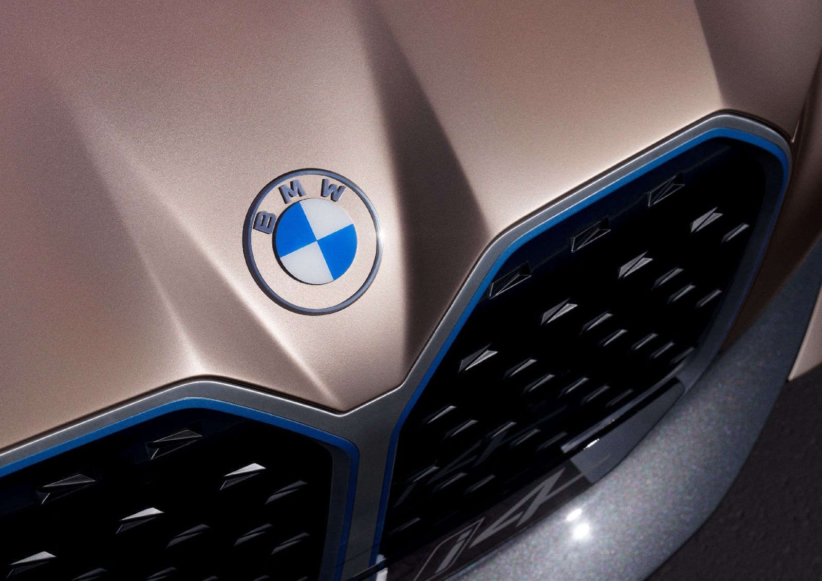
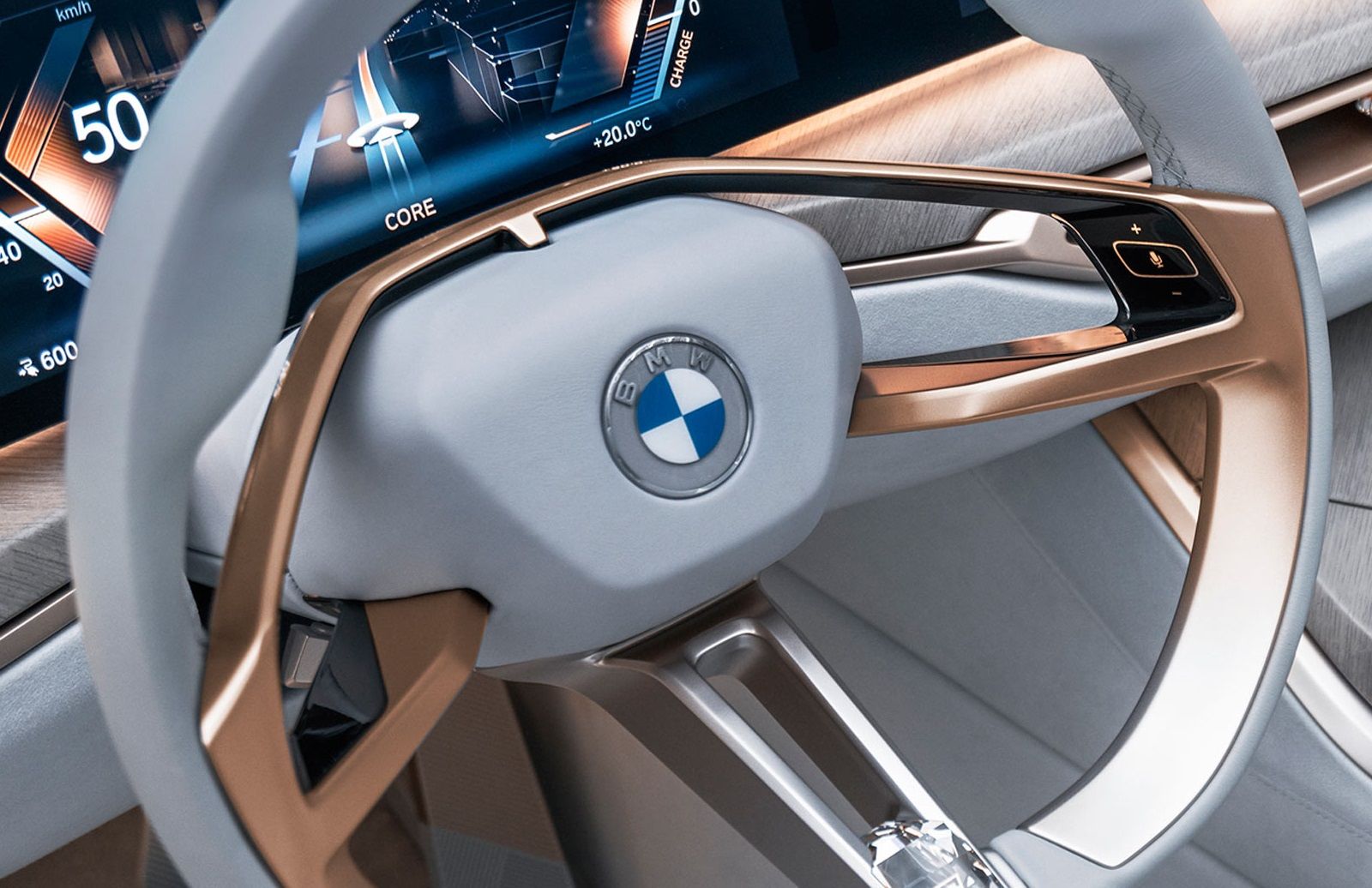
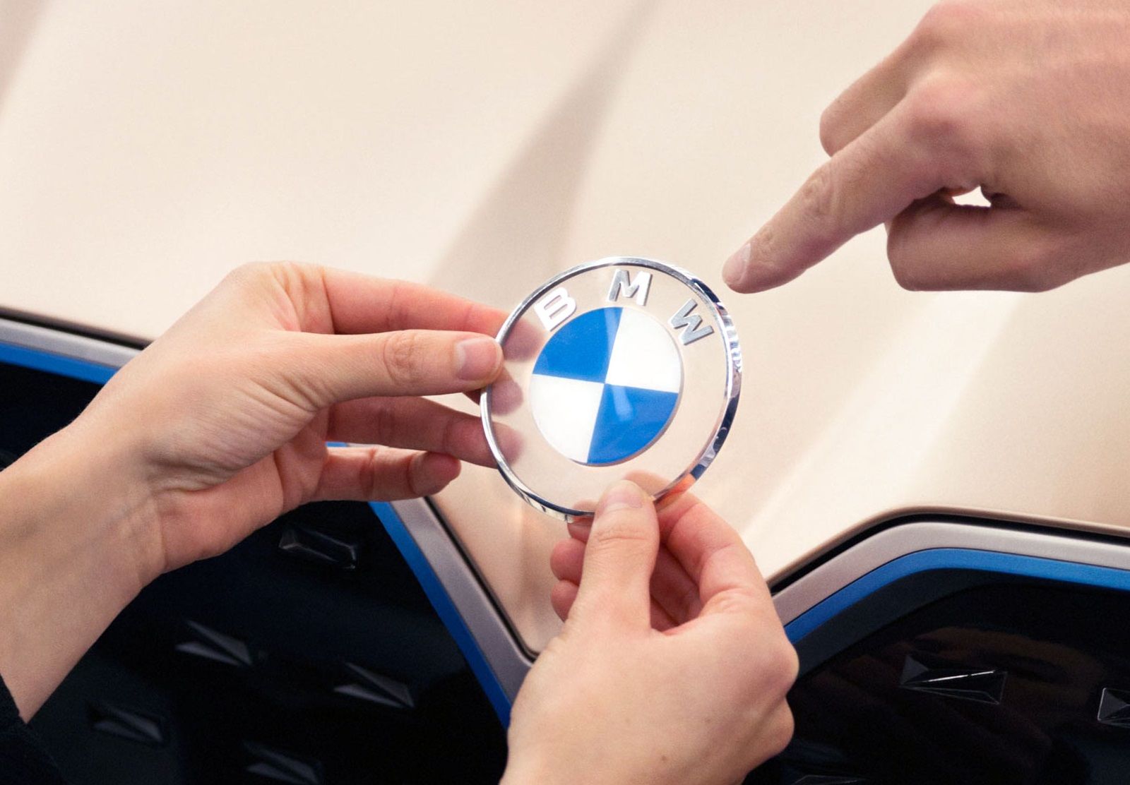
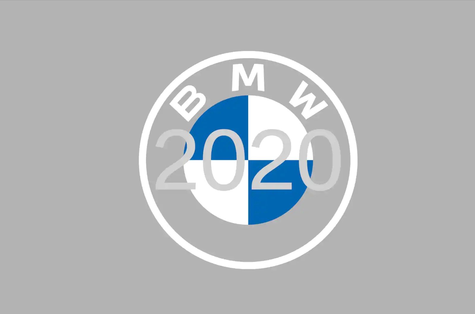
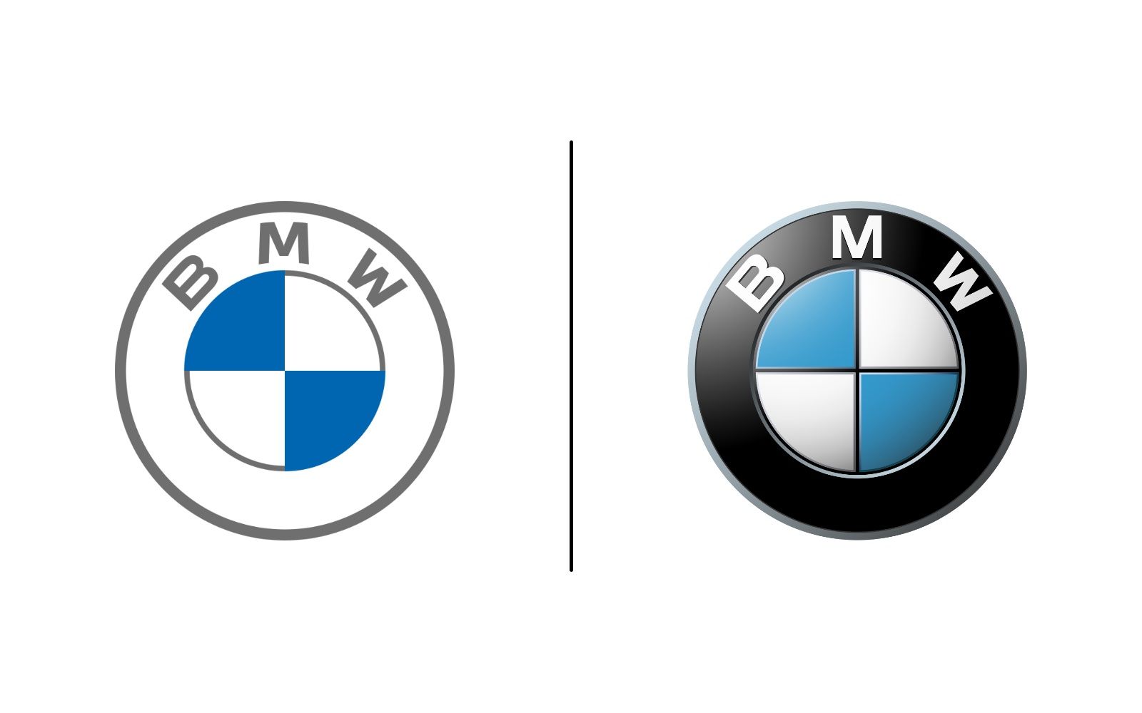
Last Tuesday, during the presentation of the new i4 Concept electric car, which was streamed following the cancellation of the 2020 Geneva Motor Show due to the Coronavirus, BMW unveiled the new logo. Following Volkswagen, the German company also decided to update its aesthetics and eliminate three-dimensionality. No more 3D, light effects and classic black outer ring, the 2020 look features a transparent, flat, minimalist design. The basic structure of the logo remains unchanged with its three key elements: the circle, the Bavarian white and blue colors and the propellers.
BMW becomes a relationship brand. The new communication logo radiates openness and clarity. - explains Jens Thiemer, Senior Vice President Customer & Brand BMW introducing the designed graphic by BECC Agency in Munich - With this new transparent variant, we want to invite our customers more than ever to become part of the BMW world. In addition, our new brand design is geared to the challenges and opportunities of Digitization for brands. With visual restraint and graphic We are equipping ourselves flexibly for the wide variety of contact points in communication at which BMW will show its presence online and offline in the future. The additional communication logo symbolizes the significance and relevance of the brand for mobility and driving pleasure in the future.
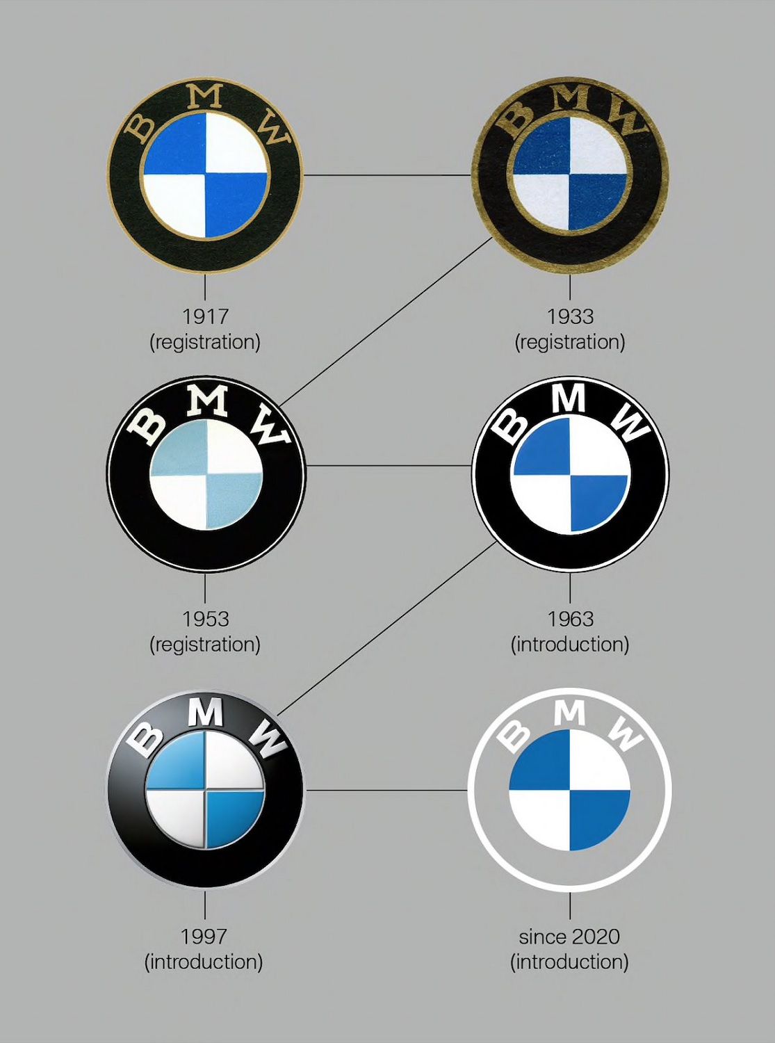
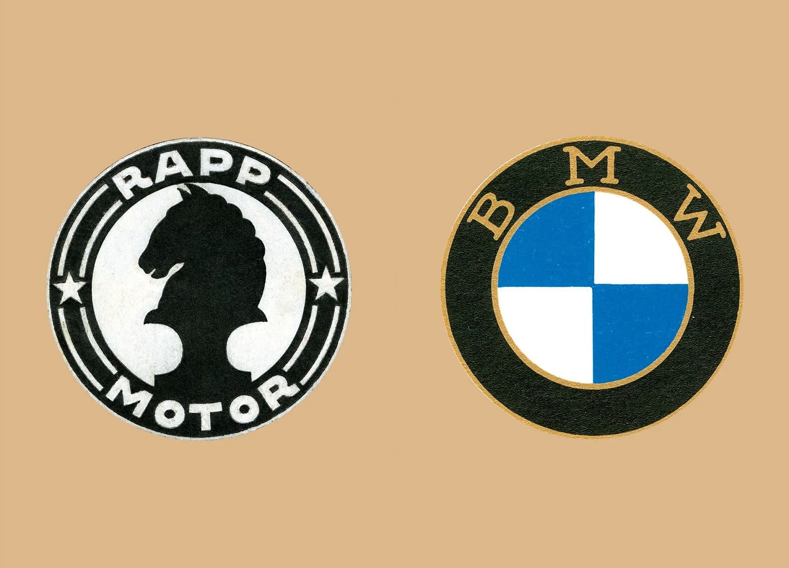
This is the sixth rebranding introduced by BMW in the course of its history. On the occasion of this graphic restyling, BMW debunked one of the most popular theories about its famous symbol: the Bayerische Motoren Werke logo does not stand for a stylized propeller.
The company we know today as BMW (Bayerische Motoren Werke) was founded upon the basis of Rapp Motorenwerke, an aircraft engine manufacturer. Co-founder Josep Popp decided to use the Rapp brand as the model of the BMW brand: a circle with a black horse in the middle, RAPP MOTOR and a black horse in the middle. The first logo of the new company was created on 5 October 1917.
The company’s home state of Bavaria was also to be represented on the company logo. The quarters of the inner circle on the BMW badge display the state colors of the State of Bavaria – white and blue. But they are in the inverse order (at least as far as heraldic rules are concerned, where you read clockwise from the top left). The reason for this inverse order of blue and white in the BMW logo was the local trademark law at the time, which forbade the use of state coats of arms or other symbols of sovereignty on commercial logos.
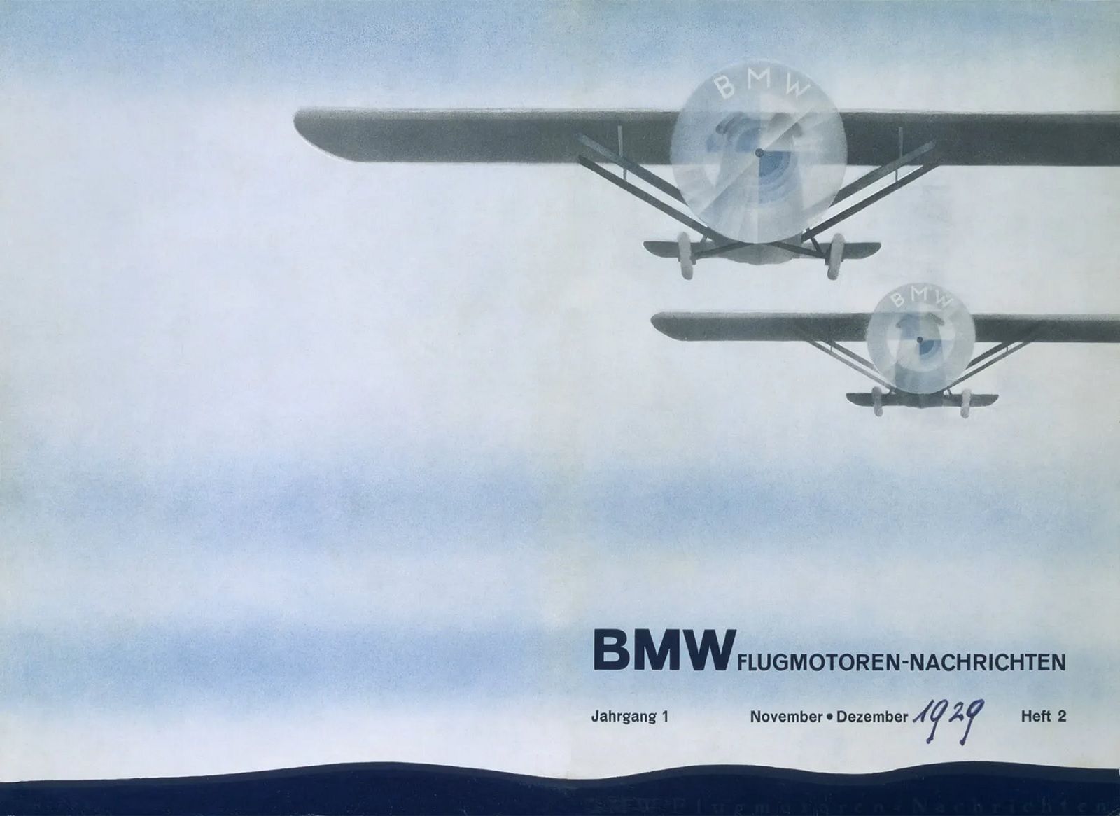
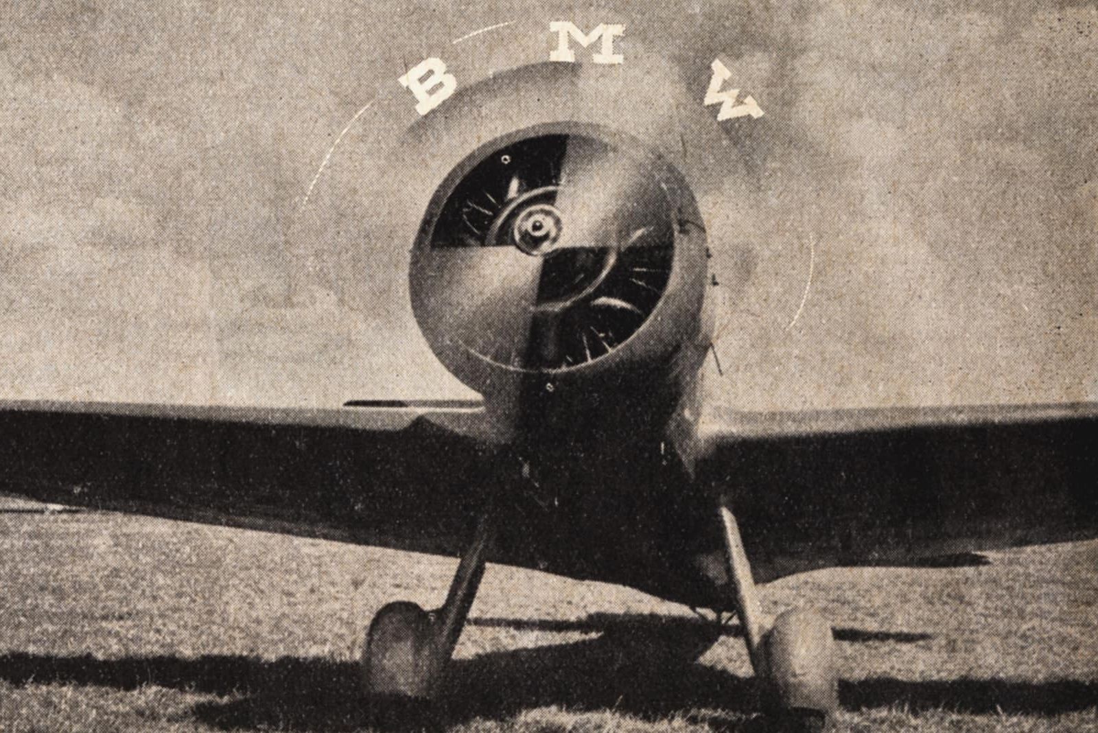
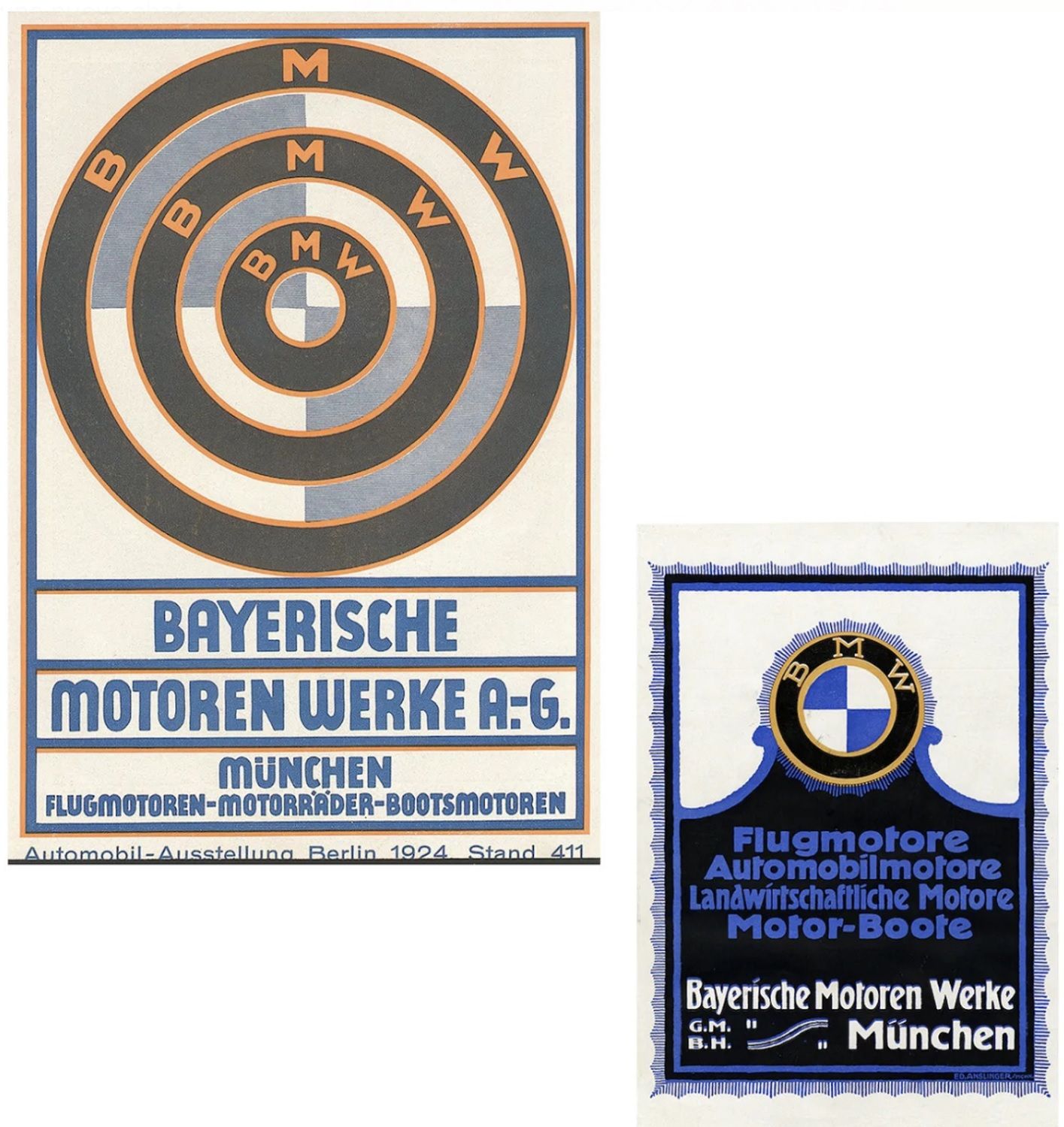
Why do many people still think today that the BMW logo shows a propeller in motion? The clean, rigorous design, consisting of four segments, two blue and two white, framed by a black circle, undeniably reminds one of it, but the origin of the misunderstanding dates back to a 1929 German company advertisement showing an aircraft with the BMW logo in a rotating propeller.