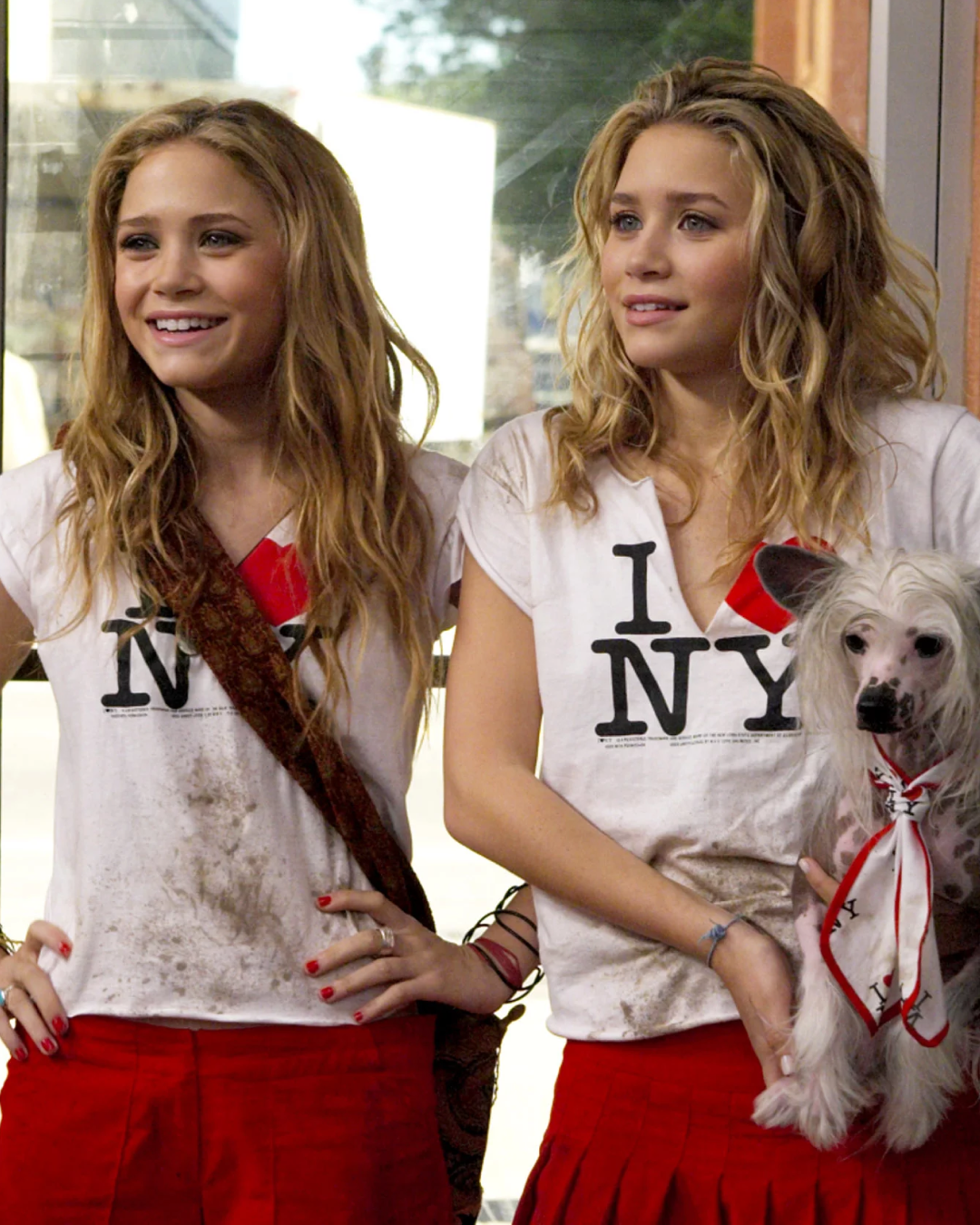


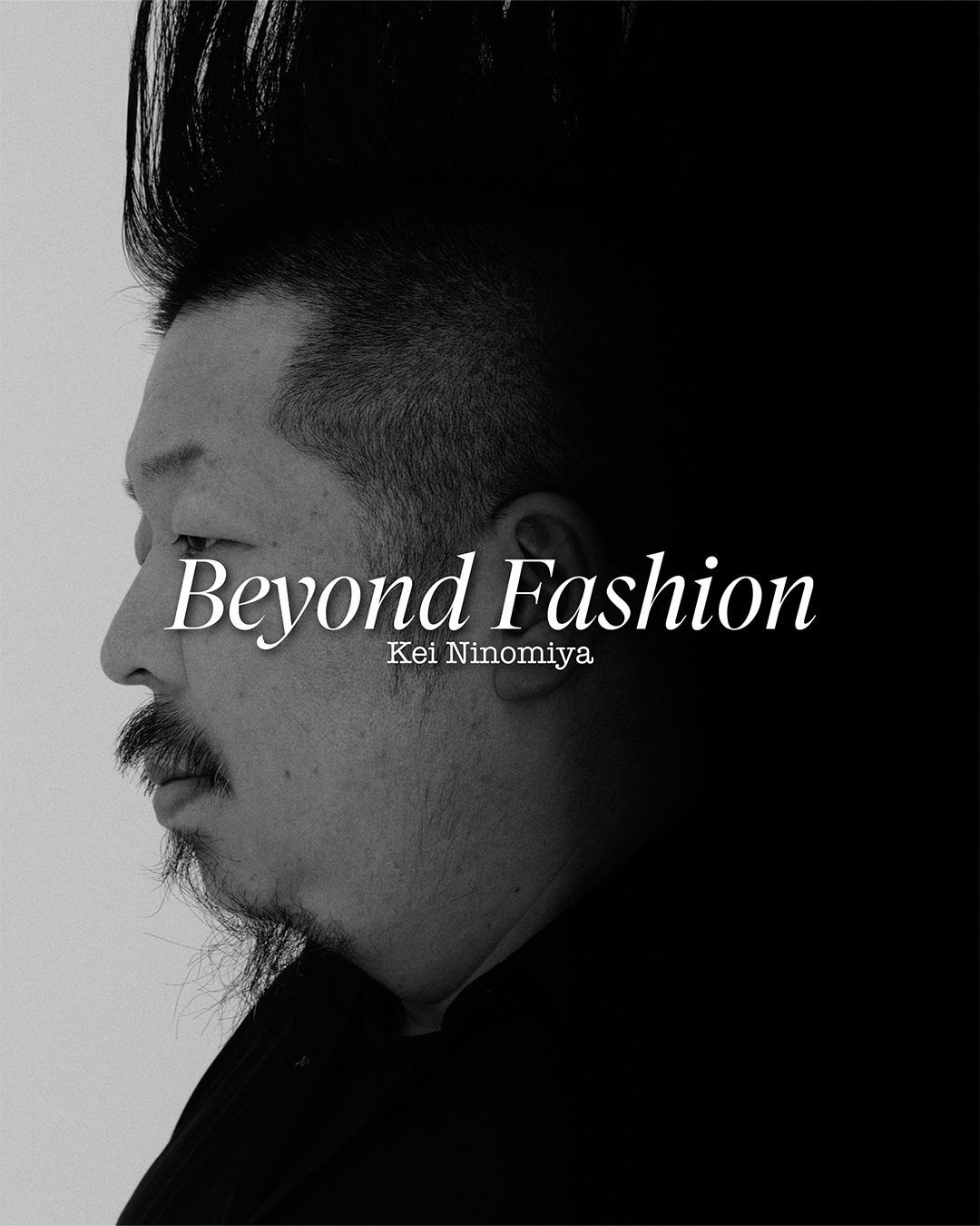


The “I Love” aesthetic is never going down How a municipal logo became one of fashion’s most enduring templates
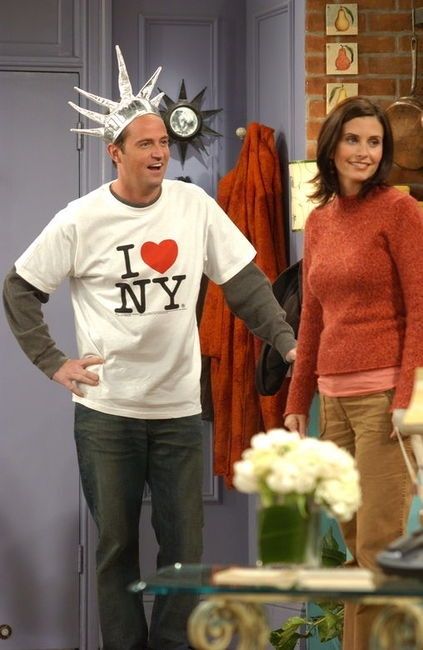


When visiting a new city, it's almost guaranteed you’ll come across “I love” T-shirts and merchandise in every souvenir shop and airport terminal. Once a cliché of mass tourism, the simple typographic slogan has evolved into one of fashion’s most enduring—and adaptable—aesthetics. Reborn time and time again, the design now appears on club kids in Paris, in every tourist stall in downtown Manhattan, and on the backs of runway models and influencers during Fashion Week worldwide. Ironic, nostalgic, and endlessly remixable, the “I love” motif has long outgrown its souvenir-shop origins to become a visual language of its own. The original version dates back to 1977, when graphic designer Milton Glaser sketched “I Love New York” in red crayon on the back of an envelope. At the time, New York City was in crisis: rising crime, a faltering economy, and plummeting tourism. With the backing of advertising executive Mary Wells Lawrence, the logo became the centerpiece of a campaign that was only supposed to last a few months. Instead, the design outlived the campaign, the crisis, and most of the city’s marketing efforts since. By the 1990s and 2000s, the logo was part of everyday visual culture. It appeared in Friends, Sex and the City, and Gossip Girl. Other cities copied it, with varying degrees of sincerity. But over time, the slogan moved from municipal branding to visual shorthand. And eventually, fashion took notice.
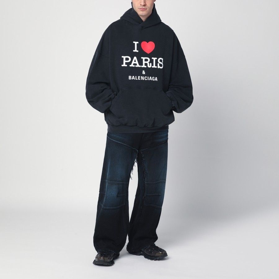
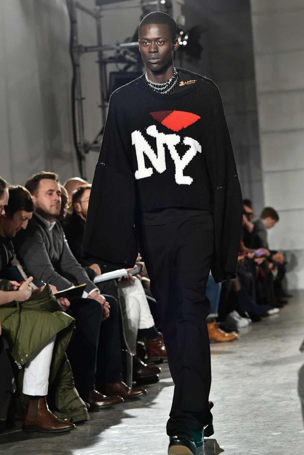
A notable tipping point was Raf Simons’ FW17 collection. In the middle of the Trump era and post-election chaos, Simons sent an “I Love New York” knit down the runway. Worn by some of the biggest rappers of that era, including A$AP Rocky and Playboi Carti, it marked a shift in perception. The heart motif was no longer kitsch. The same sweater, later reissued with “RS” instead of “NY,” and now sells for up to 2,000 USD on resale platforms. Its appeal lies in subtlety: a familiar format, rebranded to express the designer rather than the city. In the seasons that followed, the slogan evolved into a kind of visual code. Balenciaga released its own version—“I Love Paris & Balenciaga”—across a range of pieces, including caps, sweatpants, T-shirts, and hoodies, in black and white. Prices range from 350 dollars for a cap to over 1,000 for a hoodie. Most recently, Mark Gong incorporated his own take on the heart motif in his FW25 show at Shanghai Fashion Week, featuring a T-shirt that read “I Love Mark Gong, Money & Boys.” The collection was a tribute to early 2000s it-girls, and the slogan captured the campy, self aware tone of the show. In the hands of designers like Gong, the “I Love” aesthetic becomes high fashion.
Very few logos last fifty years without turning obsolete. Even fewer become fashion statements. But the heart, it seems, is timeless. The logo is trademarked by the New York State’s Department of Economic Development, which continues to license it officially. Still, that hasn’t stopped its widespread adaptation—the design has long since slipped beyond the reach of legal control. The visual success of the design lies in its simplicity and its elasticity—endlessly adaptable in any color, on any fabric, and in any format. There is also a quiet defiance embedded in the design. The original designer once explained that the logo resonated because people needed a way to express something they couldn’t otherwise say. “People were moving out,” he said. “And the ones who stayed wanted to say, ‘I love New York.’” That emotional undercurrent still exists in today’s reinterpretations. What began as a piece of crisis-era branding has become one of the most quietly enduring symbols in fashion, precisely because it asks for so little while saying so much. It has been worn in sincerity, in irony, and everything in between. Designers return to it again and again. It’s not just that people are still wearing “I Love” T-shirts—it’s that they keep finding new ways to wear them. That kind of cultural permanence is rare. The heart endures.