


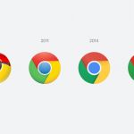
Google Chrome changed its logo for the first time in 8 years
The trend of simplifying logos continues
Pills
February 9th, 2022
February 9th, 2022
Elvin Hu, Google's Interaction Designer, announced yesterday that Google Chrome will change its logo design for the first time in eight years. The new icon that will appear with the Canary update will be slightly more stylized than what everyone is used to, without shading, with more balanced proportions and brighter colors «to align with Google's more modern brand expression.», as Hu explained. The change is not very noticeable but it is significant of a new trend in the redesign of logos that sees the icons of the past simplify more and more, becoming more and more geometric and two-dimensional – something that we had already seen especially with Facebook and Meta in recent years but recently also in fashion with the new hyper-simplified logos of Trussardi, Balestra and Zegna to name a few.


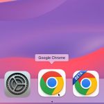


Also in his tweets, Hu explained how the Google team found that certain shades of green and red, when juxtaposed, produce an unpleasant effect and for this reason a subtle color gradient was inserted in the new icon to mitigate the effect of the color combination. The icon has also been customized according to the various operating systems: the colors will be softer on Windows, brighter and sharper on the Chrome operating system, three-dimensional for the Mac while for iOS operating systems the icon will keep its outline in white on a blue background – a reference to the focus on Apple's developers. Hu later also showed mock-ups of possible versions of the icon with different colors, explaining that, by inserting negative space, the touch of white made the icon seem smaller by lowering its recognizability. Finally, Hu explained that in the coming months the new updated logo will begin to appear on the various platforms.