Ice cream ads are the soul of Italian summers
A dive into iconic catchphrase and colors
August 3rd, 2022
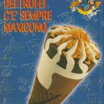
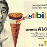
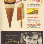
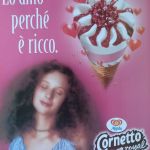
"There's a soft heart for us / and a sweet ice-cream cone", sings the jingle of an advertisement of the famous Cornetto Algida from 1978 entitled Il sole intorno a noi. Rewatching this video today represents a dive into nostalgia and it's surprising how over forty years that language has been updated but without really changing: there is summer, there are friends, love, the sea, swimming pools, the sun, leisure, children playing.
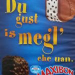
The imagery of the Italian summer, that of the girls in sundresses riding on bikes, that of the young couples lying on the beach, of the chalets and the promenade, of the summer, hit songs is all here – a mood board ante-litteram for that bright and light world that has managed to infiltrate even beyond the beaches, to arrive, in the form of illustrated tin signs, at the door of many Italian bars, colonizing not only our cities but also our collective imagination: anyone in Italy knows directly or indirectly the phrase of Stefano Accorsi who hits on with two American girls at the bar «Du gust is megl che uan» or Mecna's song for the Sammontana ad, as cringe as it is unforgettable, «Summer is when things happen».
Colour coding the summer
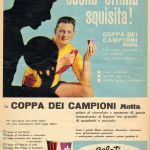
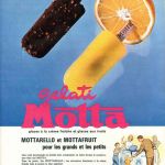
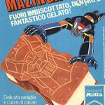
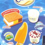
Over time there has been a strange process: the summer feeling evoked by those advertisements, among the most iconic of Italian pop culture, has been synthesized in an increasingly precise and at the same time abstract visual language in which colour becomes the signifier of an entire image. The idea of the sea, for example, has turned into a bright blue colourway that has a deep but not dark hue and that is defined, in English, Capri or Deep Sky Blue and is said to have been from the Blue Grotto of the eponymous island. Interestingly enough, the 50-year-old Motta Ice Cream ad uses the same shade of blue that is used today.
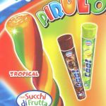
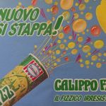
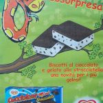
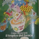
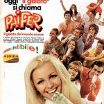
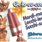
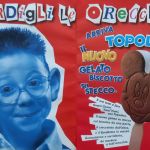
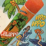
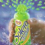
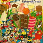
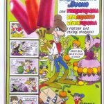
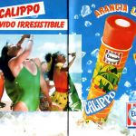
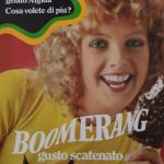
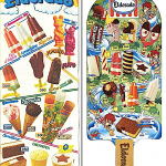
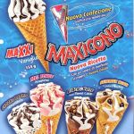
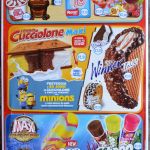
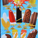
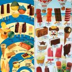
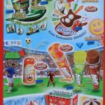
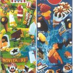
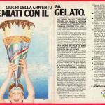
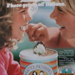
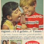
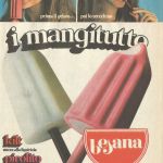
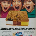
Around the images of ice creams, always portrayed at dynamic angles almost as if they were jumping out of the background like dolphins, drops and splashes of water appear – an entire visual apparatus that evokes the experience of diving into the sea. Finally, there is the language of colors: waffles have the same color as sand and then the bright tones of yellow, mint green and red seem to resume the sun, palm trees, umbrellas and summer fruits. Over time, various visual clues have accumulated: on the one hand, images of young women or smiling young couples emerging from the pool appeared, on the other hand, children's ice creams such as those in the shape of Mickey Mouse or the famous Cucciolone, which accentuated the feeling of almost childish play that dominates these advertisements.
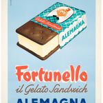
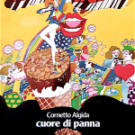
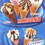
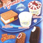
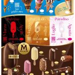
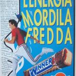
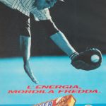
The key to the graphic language of advertisements is the contrast of colors. Contrasting colors is a great classic of visual marketing. The one preferred by Italian brands is undoubtedly red: ubiquitous in the old advertisements of Fortunello Alemagna (a company then merged together with Motta in Nestlè), ubiquitous in the advertisements of Algida croissants that also exploit the image of the heart, gradually replacing the original yellow-orange colorway; also ubiquitous in the lettering of Gelato Motta and its iconic Maxibon. An eccentric case is that of the Antica Gelateria del Corso, also owned by Motta, which has always opted for a beige colorway in line with its proposal of the highest-end ice cream, as also seen from the logo that portrays two nineteenth-century ladies intent on entering a refined café surrounded by the Art Noveau-flavored lettering of the brand.
Mediterranean aesthetics and beyond
It would soon be said that the charm of this language is completely superimposed on that of Mediterranean Aesthetics, that vast iconographic archipelago that describes summer life in that geo-cultural basin from which it takes its name. But this is not really the case: if Mediterranean aesthetics refers above all to a lifestyle and is expressed through lifestyle, the operation conducted by the language of Italian ice cream is, in many ways, more synthetic as it wants to express a data that is sensory, instinctive and almost pre-conscious. It is the elementary language of the heat of cold, soft and liquid but, above all, of sweet – this essential nature, not to say almost conceptual, is precisely what has made the language and aesthetics of Italian ice creams a "product" substantially unchanged over the decades and exported, with minimal name changes, in half the world.
As an aspirational, the Mediterranean aesthetic changes with the change of society and its desires: the jet-set of aristocrats that Slim Arons photographed in Capri in the 1960s has now disappeared along with all its codes, replaced by a society that possesses its own aspirations and its own ways of realizing them. As purely sensory, however, the visual language of ice creams always remains the same: the advertising of the Cornetto Algida of '78 today touches the same keys that touched yesterday and in fact, from the 80s to the hour, that language has stabilized and remains almost unchanged – which is also why ice cream advertisements, both on video and in the form of catalogue signs at the entrance to bars, remain a fixed presence in our pop culture.


