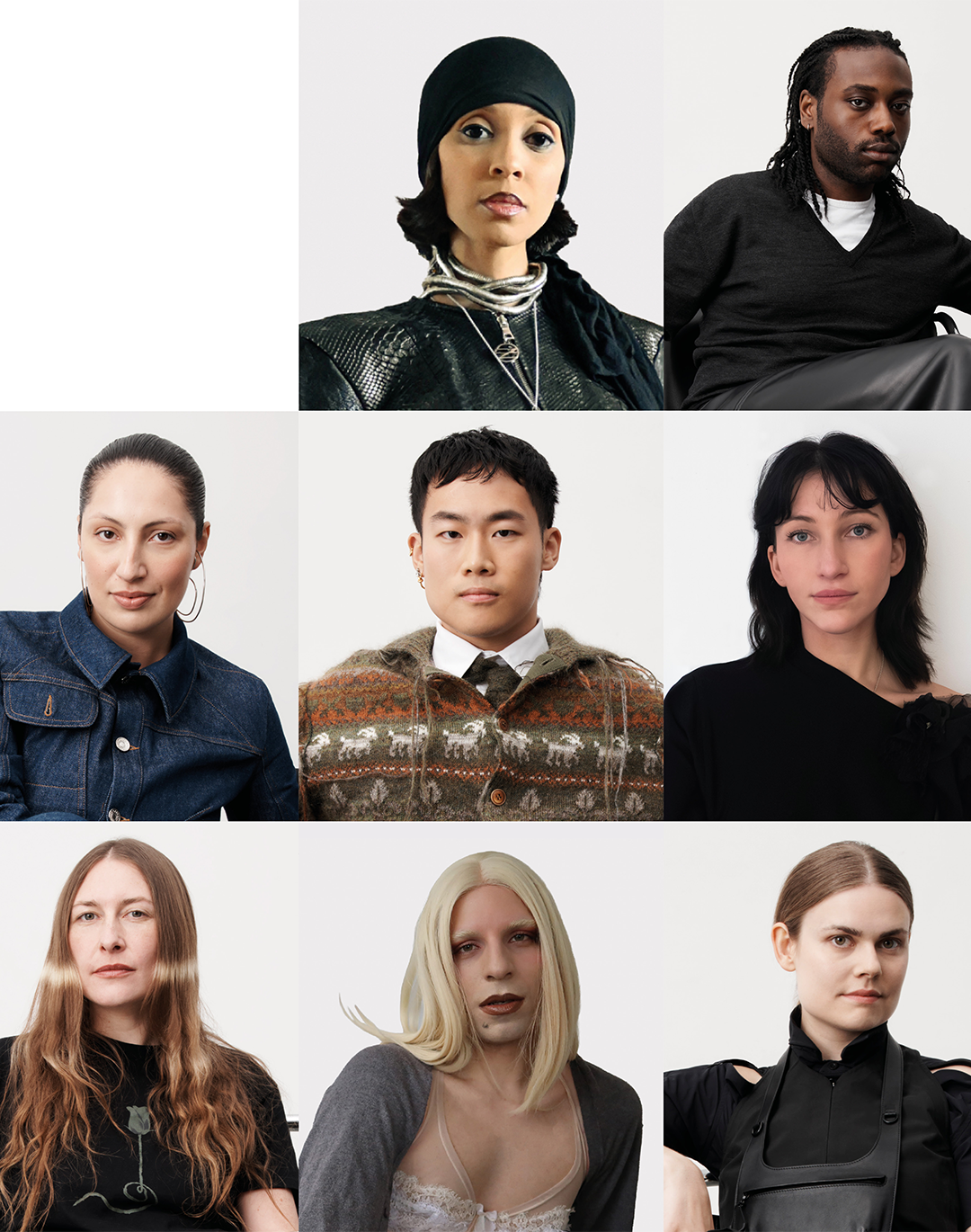


Pantone Fashion Color Report - the reference colors of Fashion Week Directly from the Pantone Color Institute
Nothing is coincidental, even in fashion.
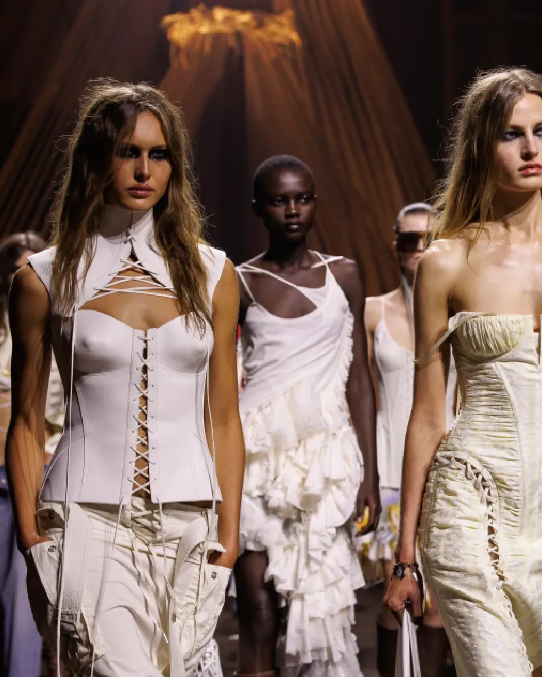
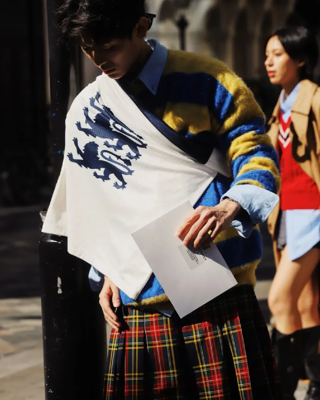
Also the dresses you admire walking during fashion weeks around the world are the reflect of some socio-cultural dynamics of the moment. We don't need a graduation in Costume History to understand it and I'm not here to bore you with some lessons about it, but I think it's clear that the dresses we wear, we see in the store windows and on some very cool magazine are somehow a glamour transposition of the modern reality we live. So, dresses as slides of a moment, but also the colors are used to create them have the same importance. It's Pantone who reminds this us with its Fashion Color Report for the FW17 season. By focusing on the recent New York and London Fashion Weeks, the analysis underlines the fact that one trend seems to conquer almost all the fashion designers of the last weeks, namely the "cocooning".
"Cocooning colors are something you just want to wrap around yourself and feel comforted. We live in a time when that’s what we’re looking for", Pantone Color Institute executive director Leatrice Eiseman said.
The need of sublime colors, but also cozy silhouettes, is maybe the answer to the radical economic/political and social changes we are facing in last 12 months. Donald Trump election, Brexit, the problem of immigration and climate change, increasingly dangerous, and the global economic crisis are factors who disturbs and it's not surprising if people prefer to find comfort in "reassuring" colors, which also can give force. So, here are the 20 colors which have been the stars of the New York and London fashion shoes, according to Pantone. Who knows if Milan and Paris will confirm this trend.
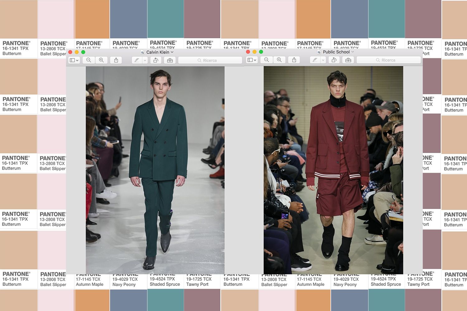
#1 New York
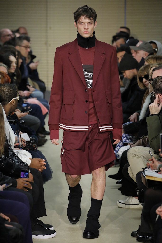
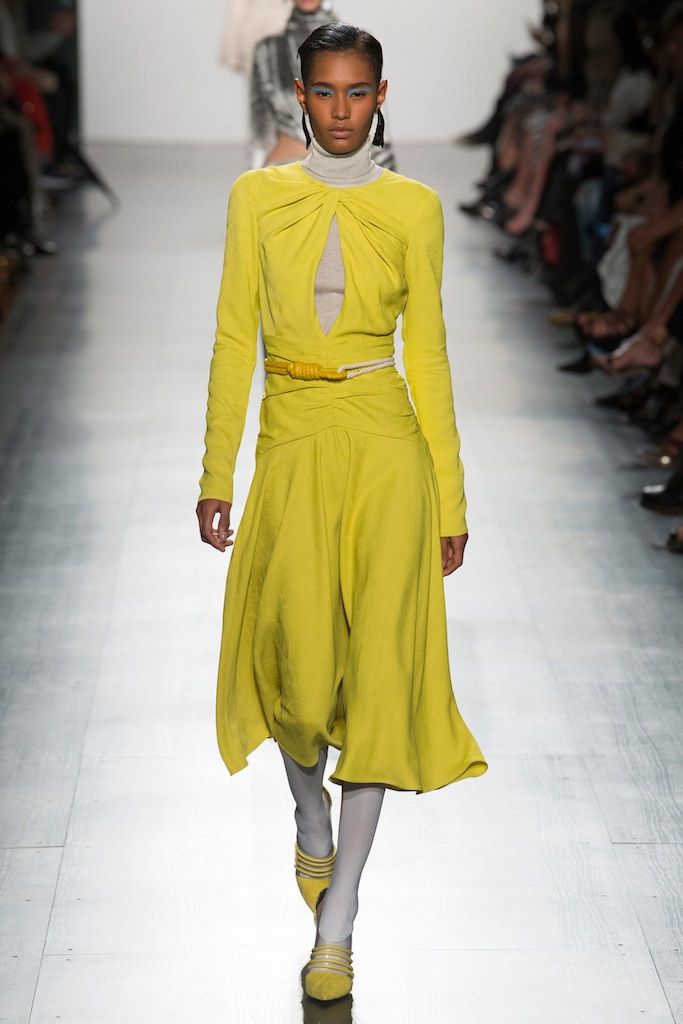
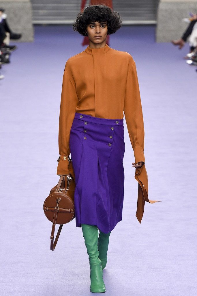
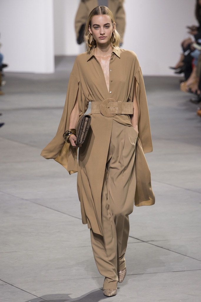
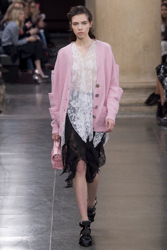
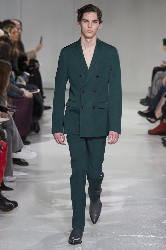
The most used colors by fashion designers during New York week tap into the autumn palette, like the brown hues and the dark shades of green and blue. There are also some bright or neutral tones to break and enrich chromatic uniformity. So, the ten most used colors are the Autumn Maple 17-1145, employed by Phillip Lim, the Butterrum 16-1341 from Michael Kors and Jenny Packham's clothes, the Tawny Port 19-725 of Anna Sui and Public School's fashion shows. Also, the hues of the forest floor appear thanks to the color Shaded Spruce 19-4524, which Raf Simons is a fan, using for his Calvin Klein fashion show, but there are also the shades of blue, like the Navy Peony 19-4029, who is "a mainstay of the season" according to Leatrice Eiseman. Finally the Golden Lime 16-0543 of Prabal Gurung's turtlenecks, which recalls the green, but with a charming touch always appreciated. A bit of light, but also of calm, is given by the Victoria Beckham and Proenza Schouler's Grenadine 17-1558 color, and the light pink Ballet Slipper 13-2808, used by Ralph Lauren and Marchesa. But also the Neutral Gray 17-4402 – "This color choice can also be economically driven in that shoppers tend to choose it for big-ticket items like outerwear and boots to get their money’s worth" Leatrice Eiseman explained – and the Tory Burch's Marina 17-4041 are some of the most important colors of New York Fashion Week.
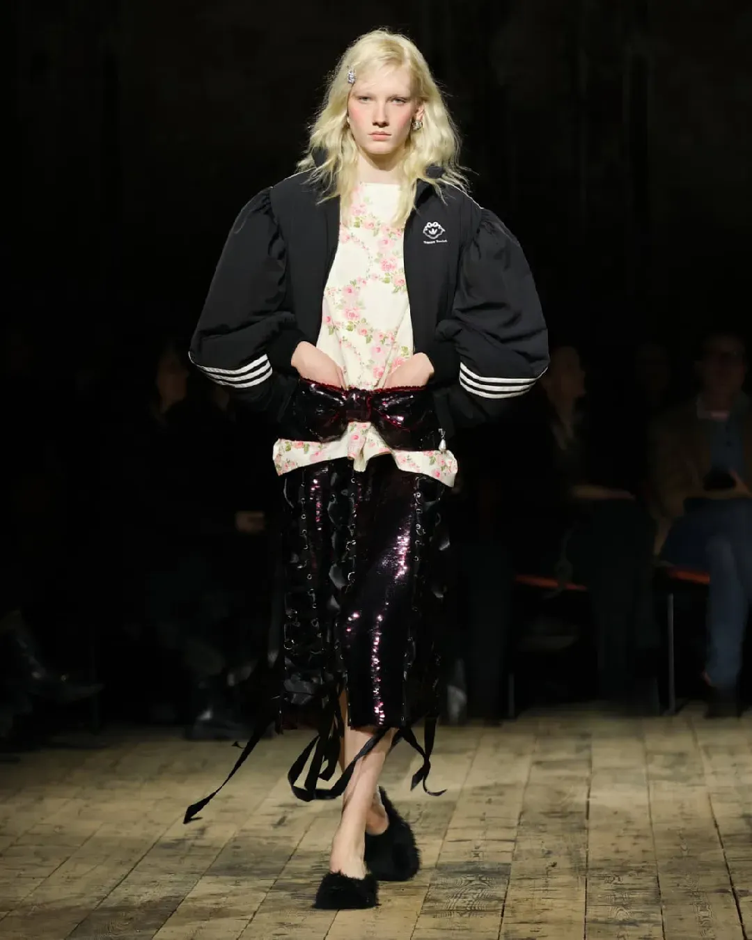
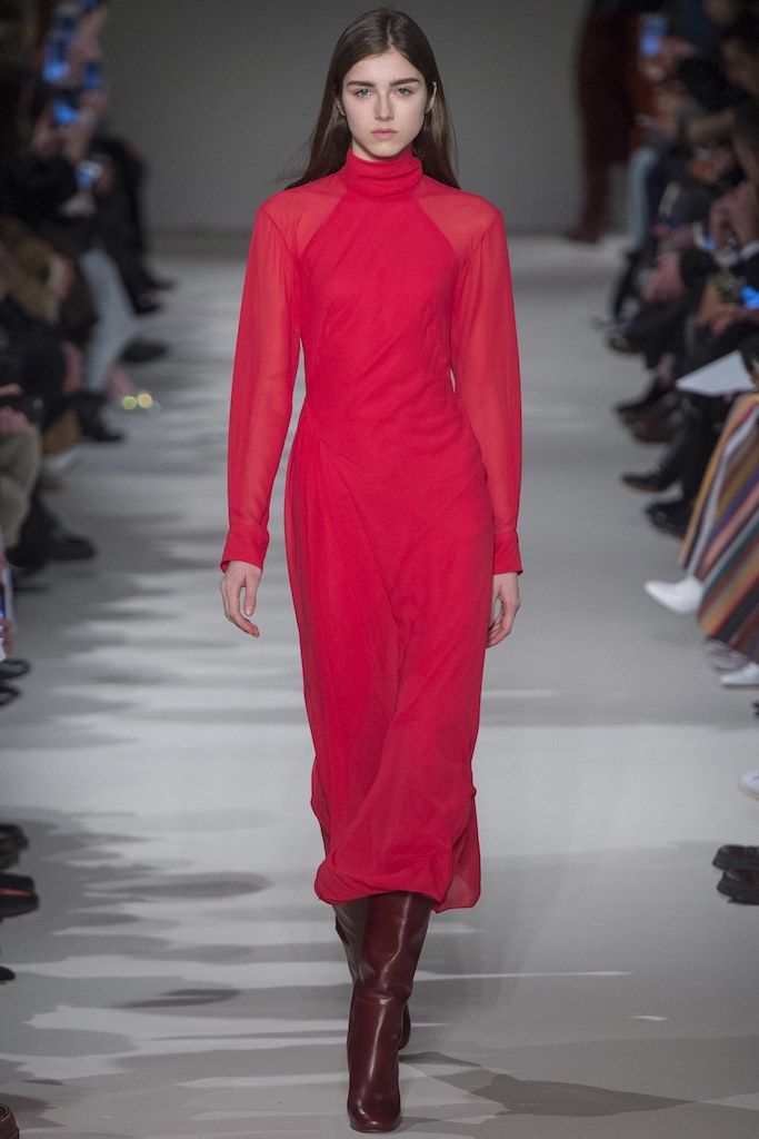
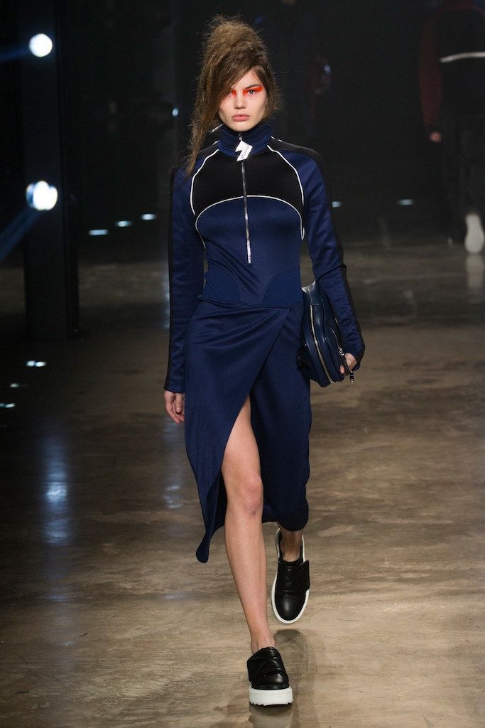
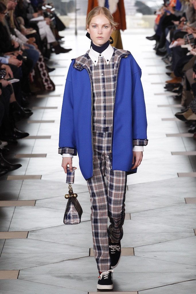
#2 London
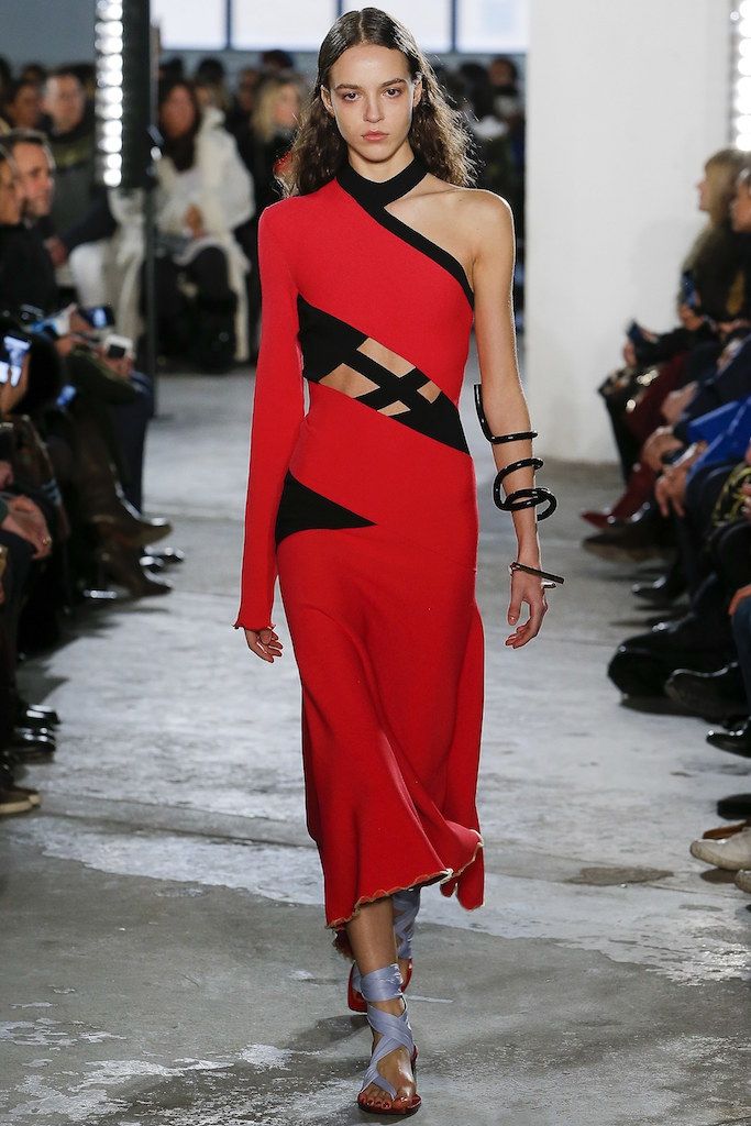
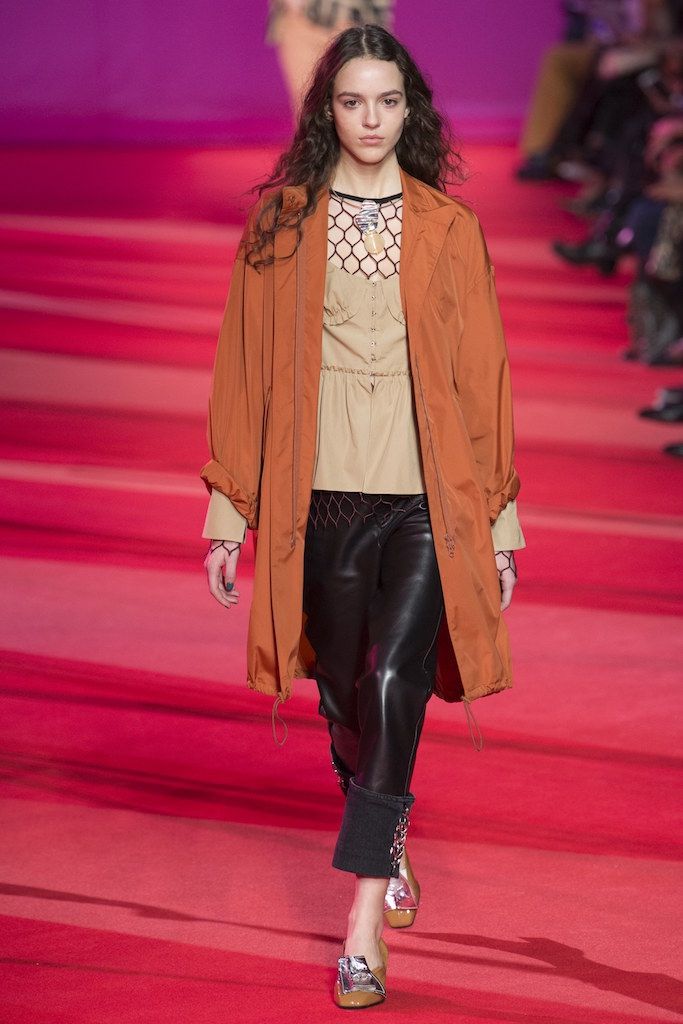
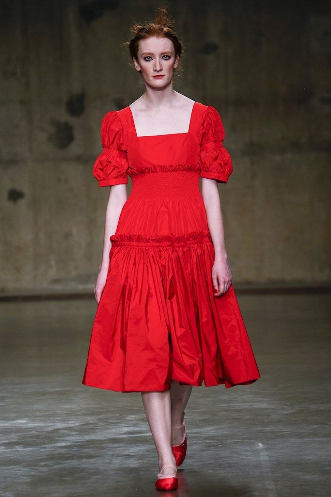
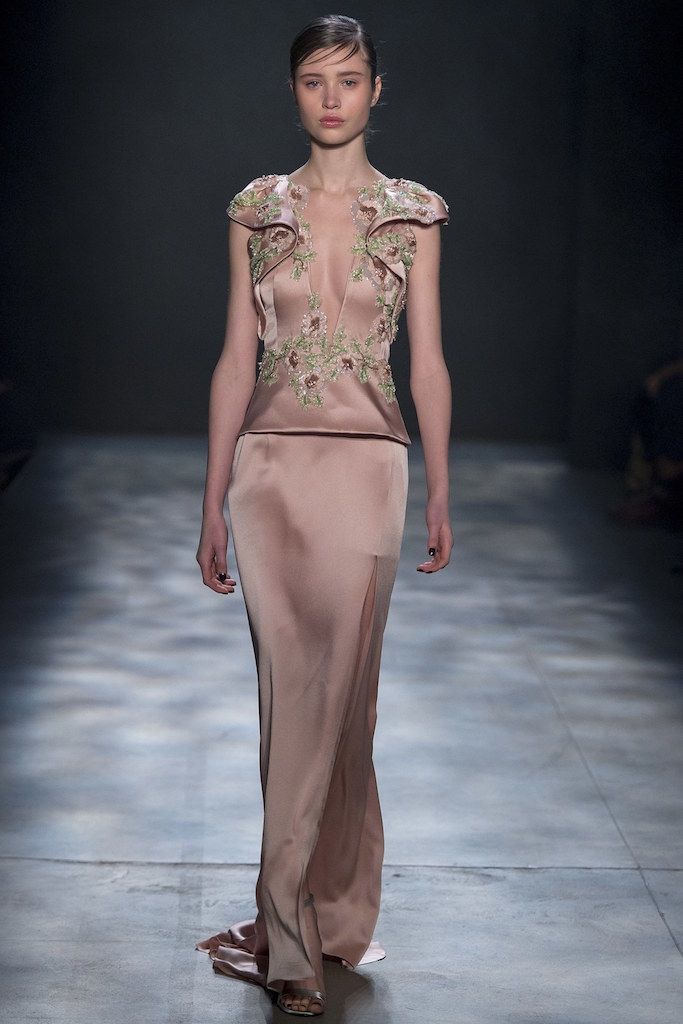
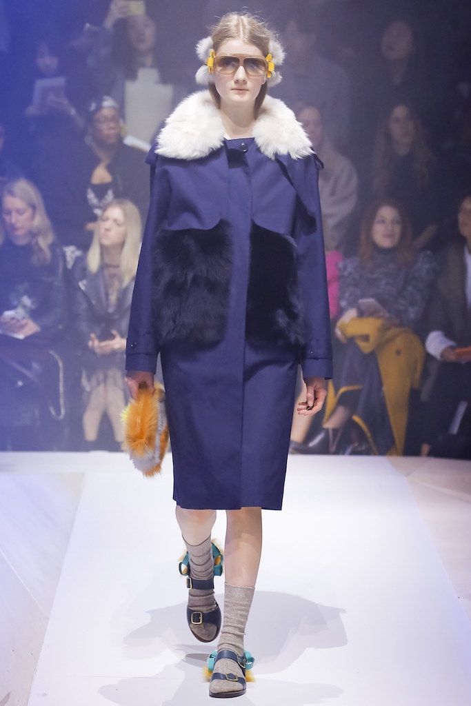
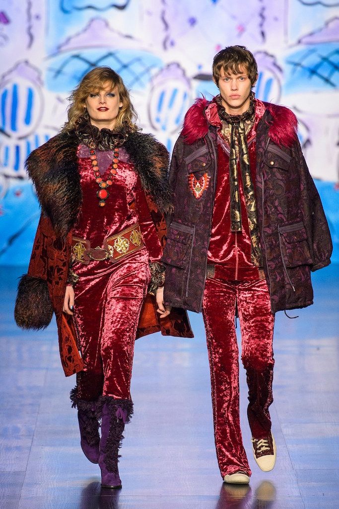
We fly overseas, and we find different colors. While remaining a classic palette for the fall season, London seems to choose in particular neutral tones and also hot shades like red and brown hues. We find the Molly Goddard's Flame Scarlet 18-1662 who gives, like the previous Grenadine, dynamism, and self-confidence. The there are a series of pastel tones, from the Christopher Kane's Primrose Pink 12-2904 to the Blue Bell 14-4121 who recalls the Marina from New York shows. Among we find some brown hues, which has a historical significance for England, for years this color considered a country tone: from the dark Jasper Conran's Otter 18-1018 to the Toast 16-1331, walking through the Mulberry's Copper Tan 16-1338. The Lemon Curry 15-0751 has the role to give the collection an exotic and catchy vibe, in particular when it's used with the Royal Lilac 18-3531, creating an as unusual as an interesting combination. Finally, we find the Navy Peony 19-4029, widely employed by Versus Versace, considered one of the most important colors after black, according to Leatrice Eiseman.