


The White House has a new logo
First rule: tradition and minimalism
Art & Design
February 22nd, 2021
February 22nd, 2021
With Joe Biden's arrival at the White House as the new President, after Donald Trump's turbulent four years, the desire for change has been strong and he has expressed himself both politically, with a heap of executive orders that repealed almost all of Trump's legislation, and on purely aesthetic, with a new logo for the White House. The new logo was created by Wide Eye agency along with White House creative director Carahna Magwood and illustrator John Mata. According to reports, it took thirty attempts to refine every detail and create a logo system suitable for all the different mediums and communication channels used by the US presidency. Wide Eye spokespeople explained to Dezeen:
Following the tradition and the legacy of past White House brands, we depicted the north facade [the one with the official entrance], symbolising that the White House is the People's House and accessible. This is symbolic of the president's desire to bring the country together: conveying a sense of openness, warmth, inclusion, and humanity.
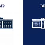
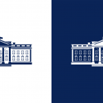
The new version of the official logo, in fact, represents a return to tradition but also a further simplification of the logo. In Bush's time, in fact, the house logo was white and three-dimensional, inserted in a navy blue oval with the inscriptions The White House and Washington. Obama had then removed the writing to simplify it but maintained the three-dimensional style. With Trump, the logo had been flattened and made more minimal but the colours reversed: now the house was blue and the background white. With the update, the colours have returned to reverse with the blue embossed architectural details and the actual body of the house returned to white – adding an emphasis on the architectural structure that is both a symbol of attachment to tradition and, in its exaltation of details and shadows (missing from the Trump logo), representative of an approach that looks at the complexities and nuances of the real.
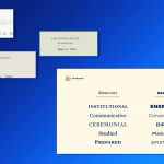
The logo is accompanied by two new fonts, already seen during the Biden campaign: one is the Mercury Serif, more elegant and «befitting the office of the President», as the typographer who drew them, Jonathan Hoefler, said; while the other is called Decimal, it's inspired by the lettering used during Kennedy's presidency in the 1960s, and will be used in press releases and stationery and which, in his mood board, the printer defined «energetic, conversational, direct, plainspoken, epistolary».