


The story behind Acne Studios' Face Logo Jonny Johannson designed it thinking of the Swedish concept of "lagom", the perfect balance
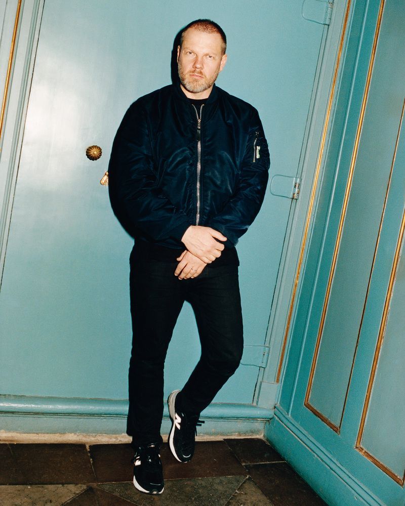
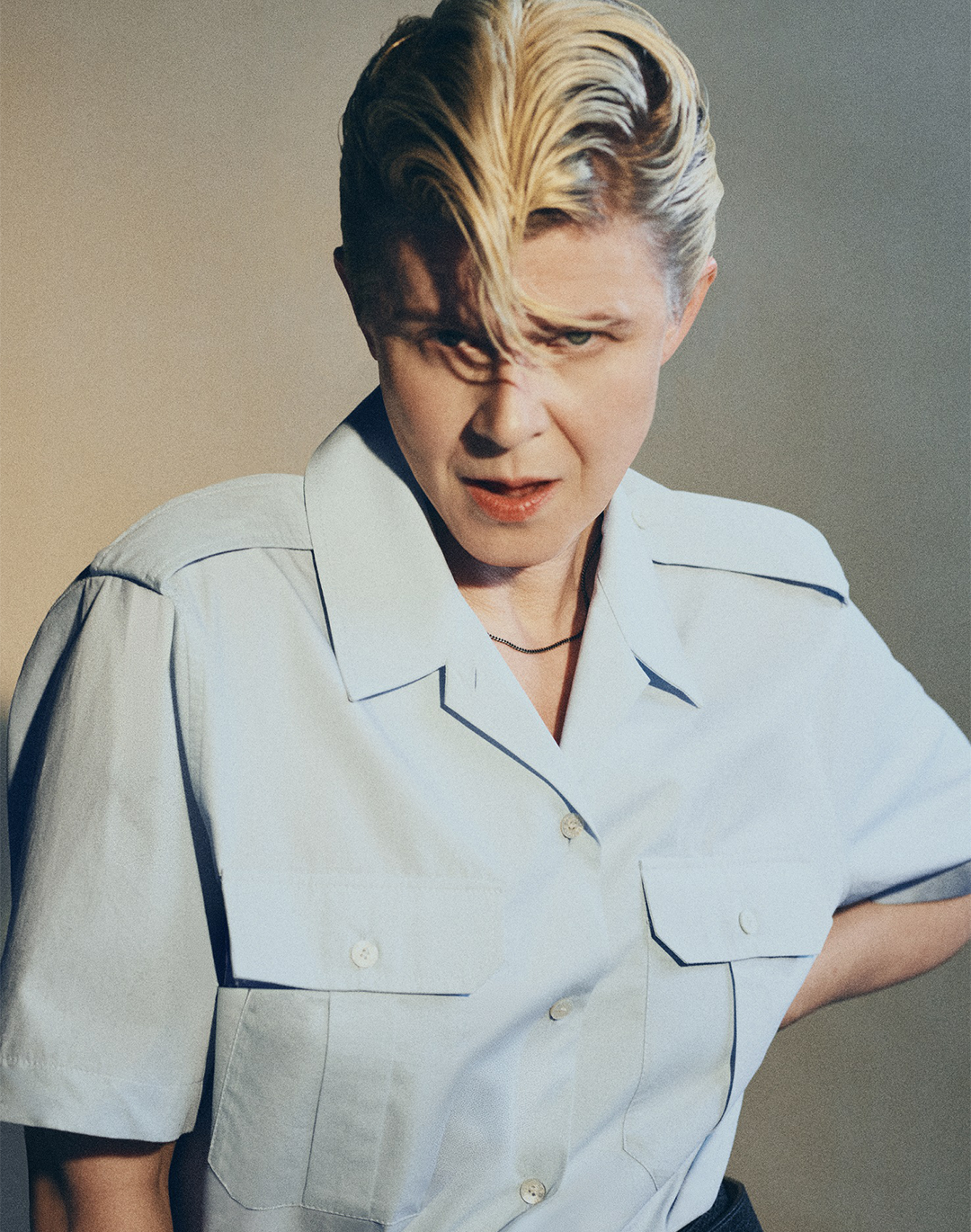
Jonny Johannson by Tung Walsh
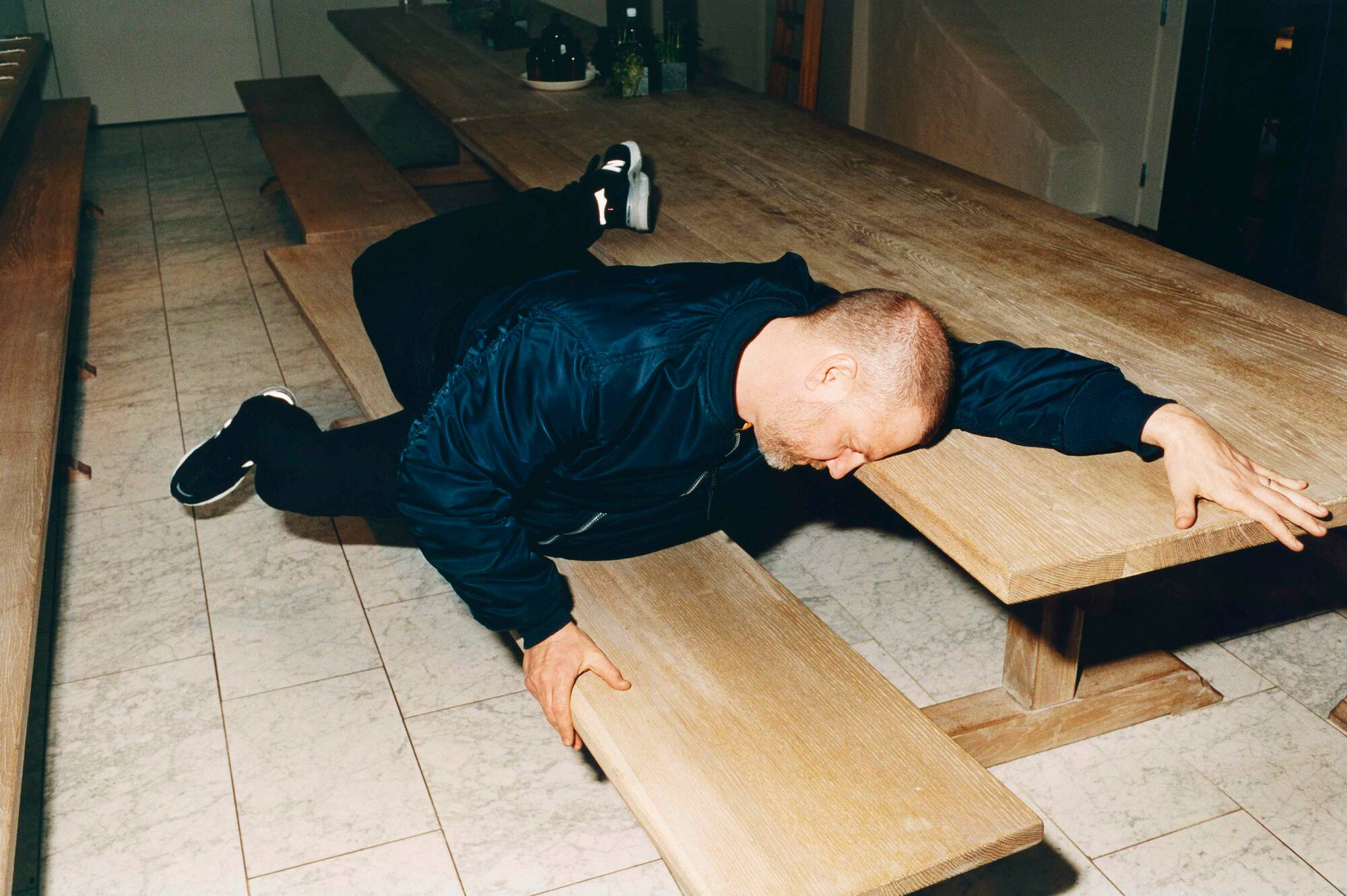
Jonny Johannson by Tung Walsh
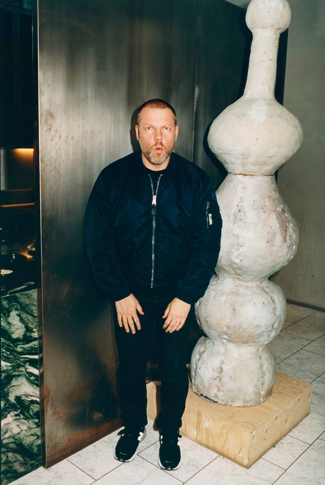
Jonny Johannson by Tung Walsh
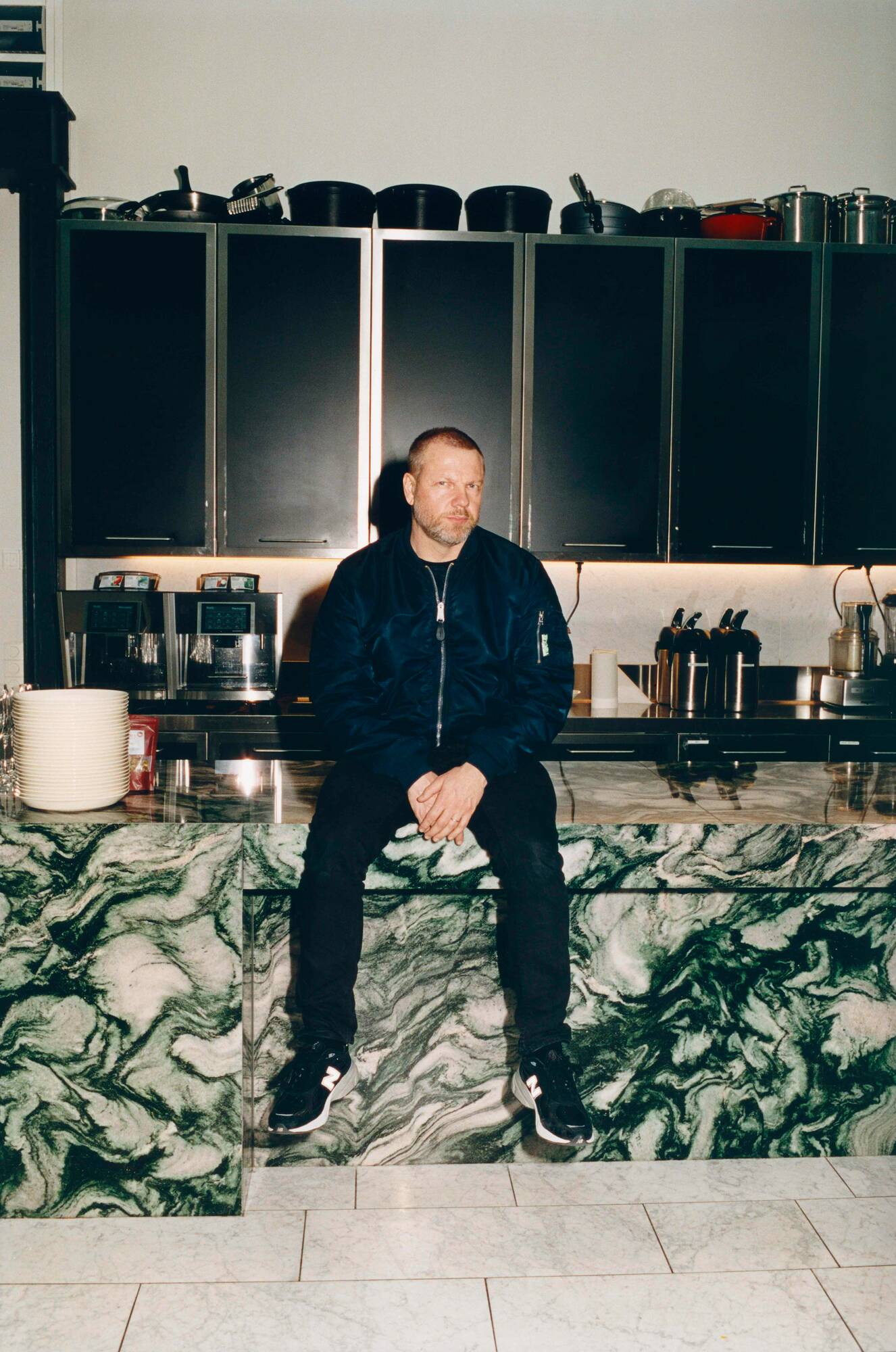
Jonny Johannson by Tung Walsh
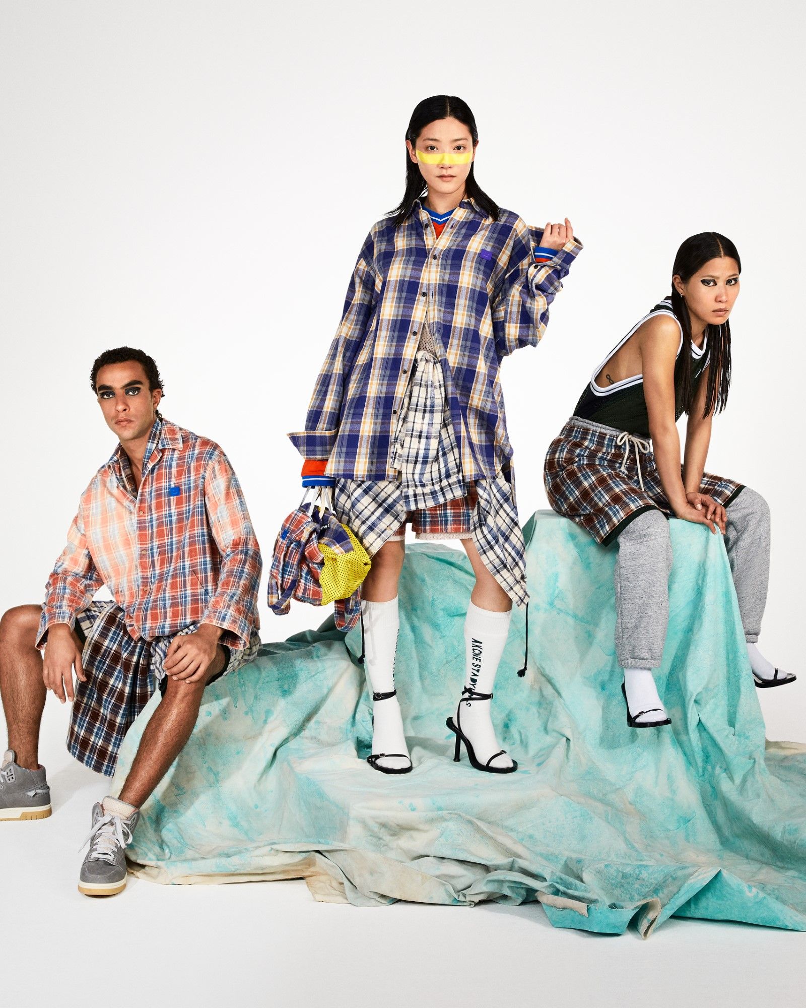
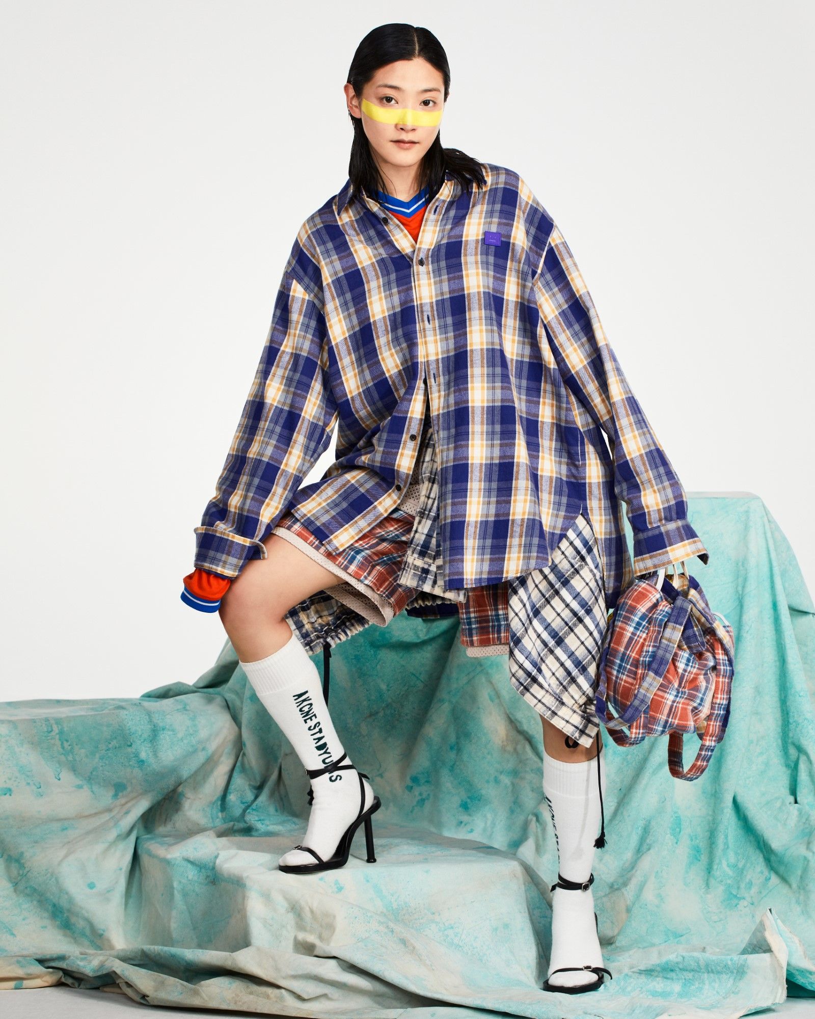
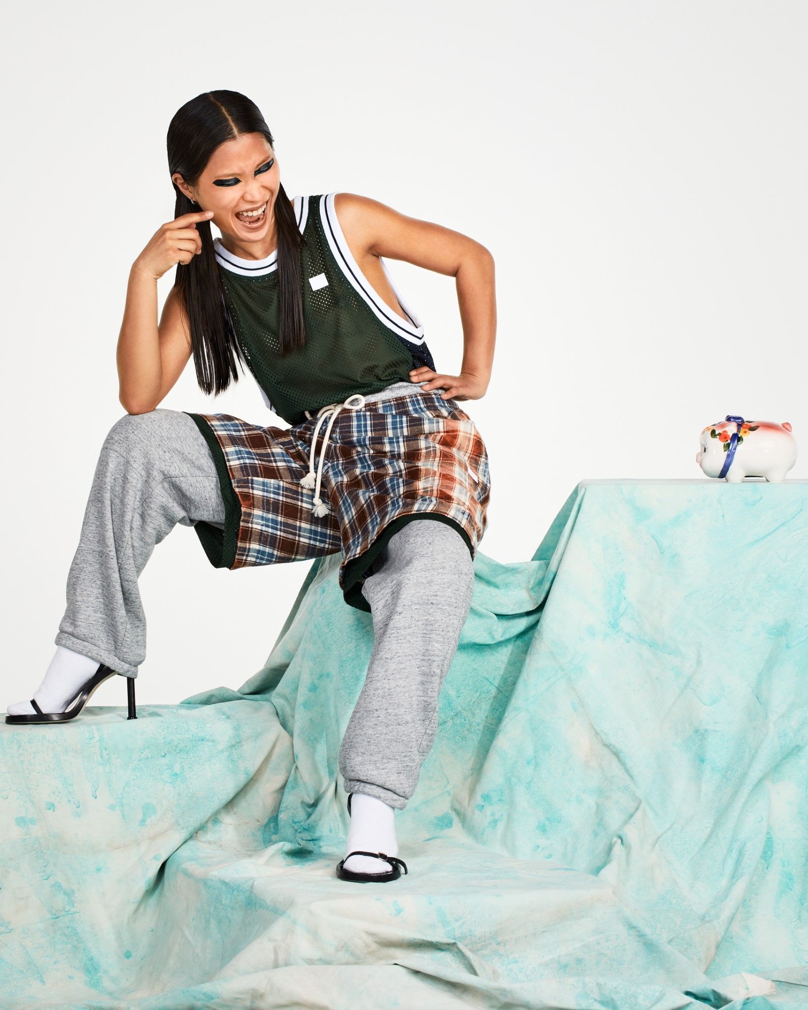
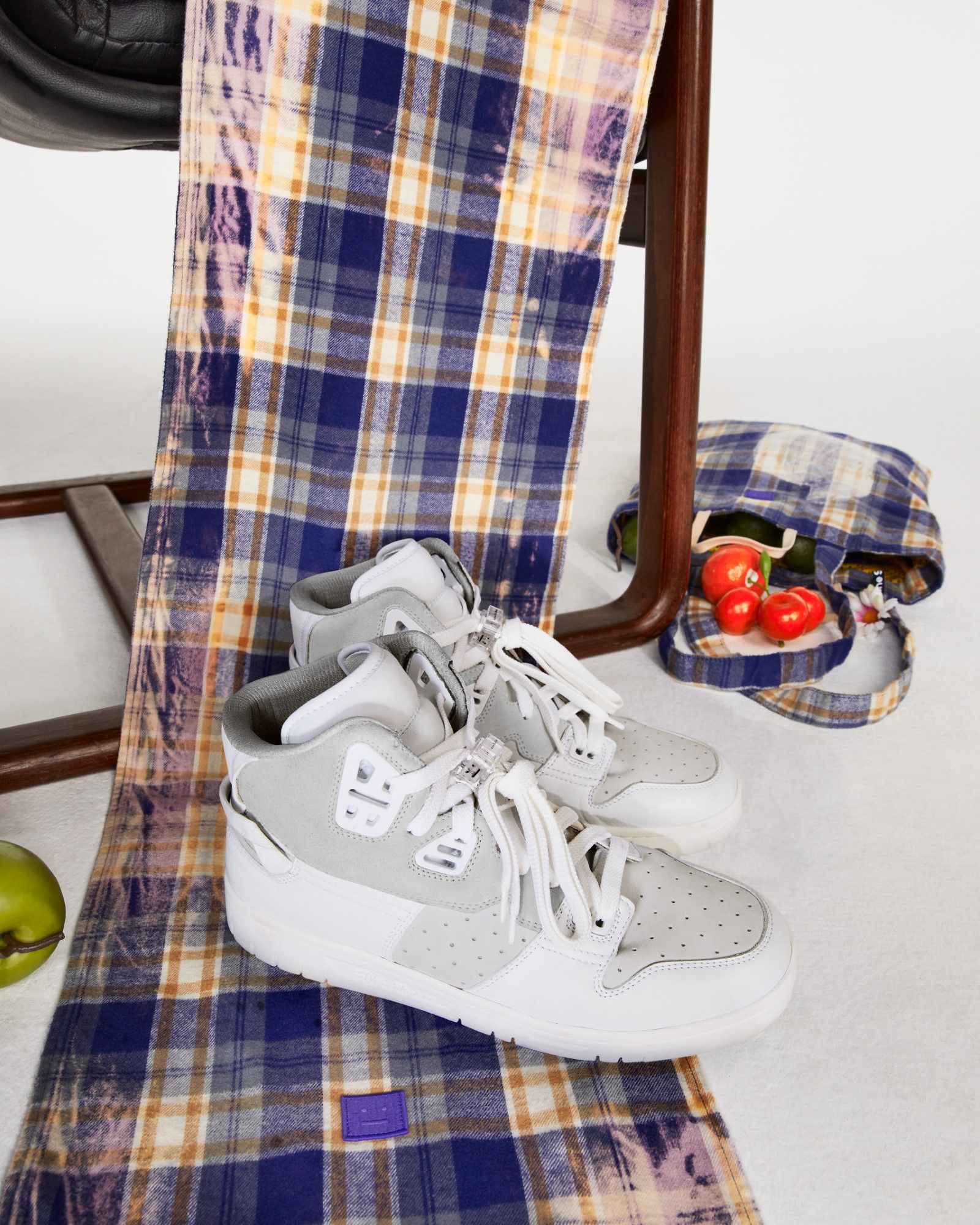
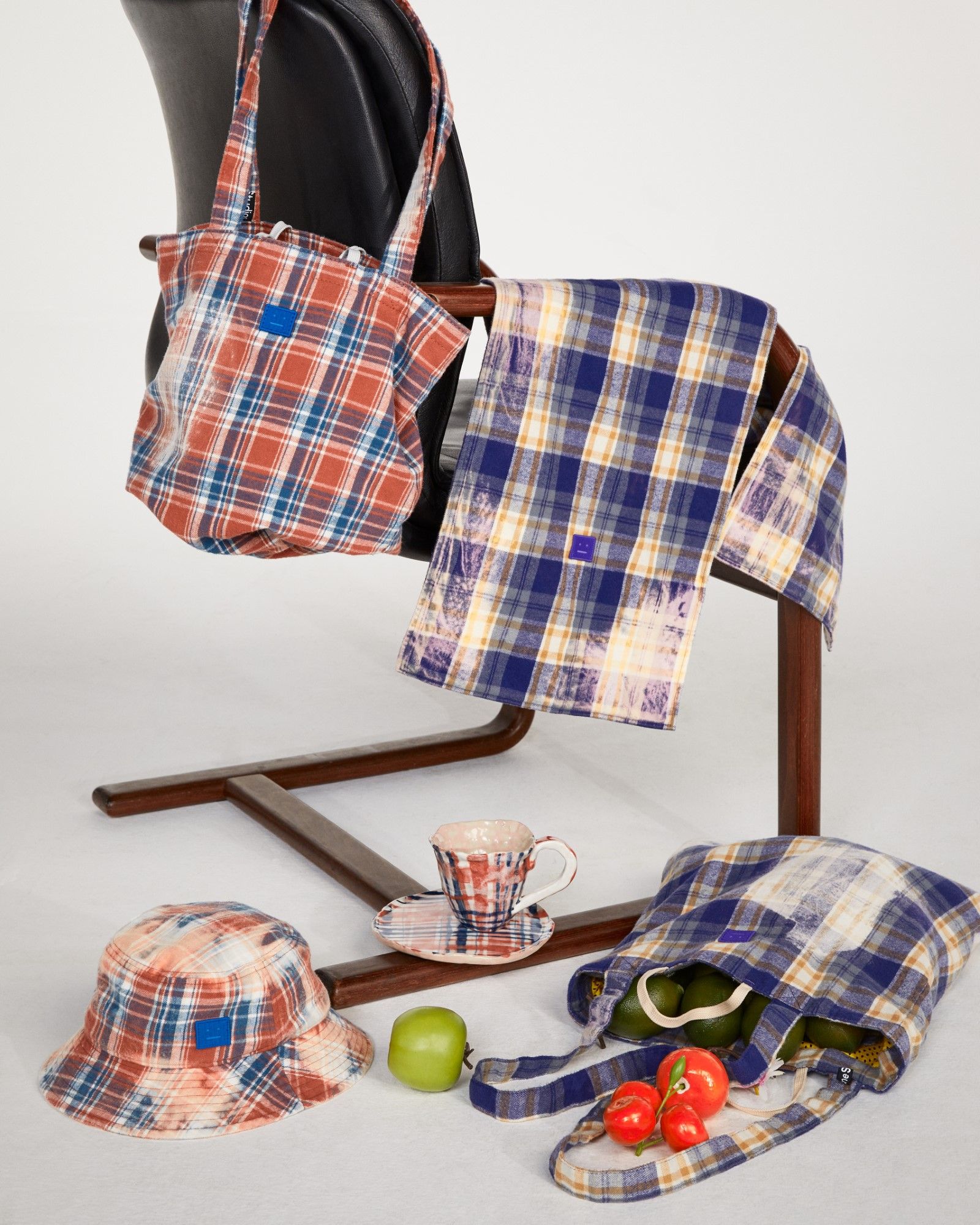
Acne Studios Face Motif Collection Campaign
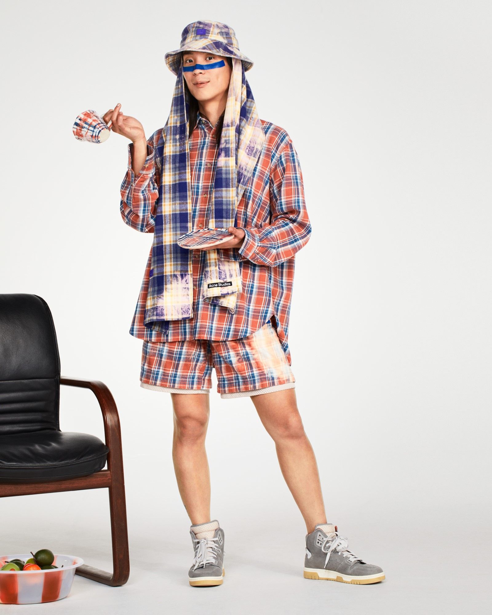
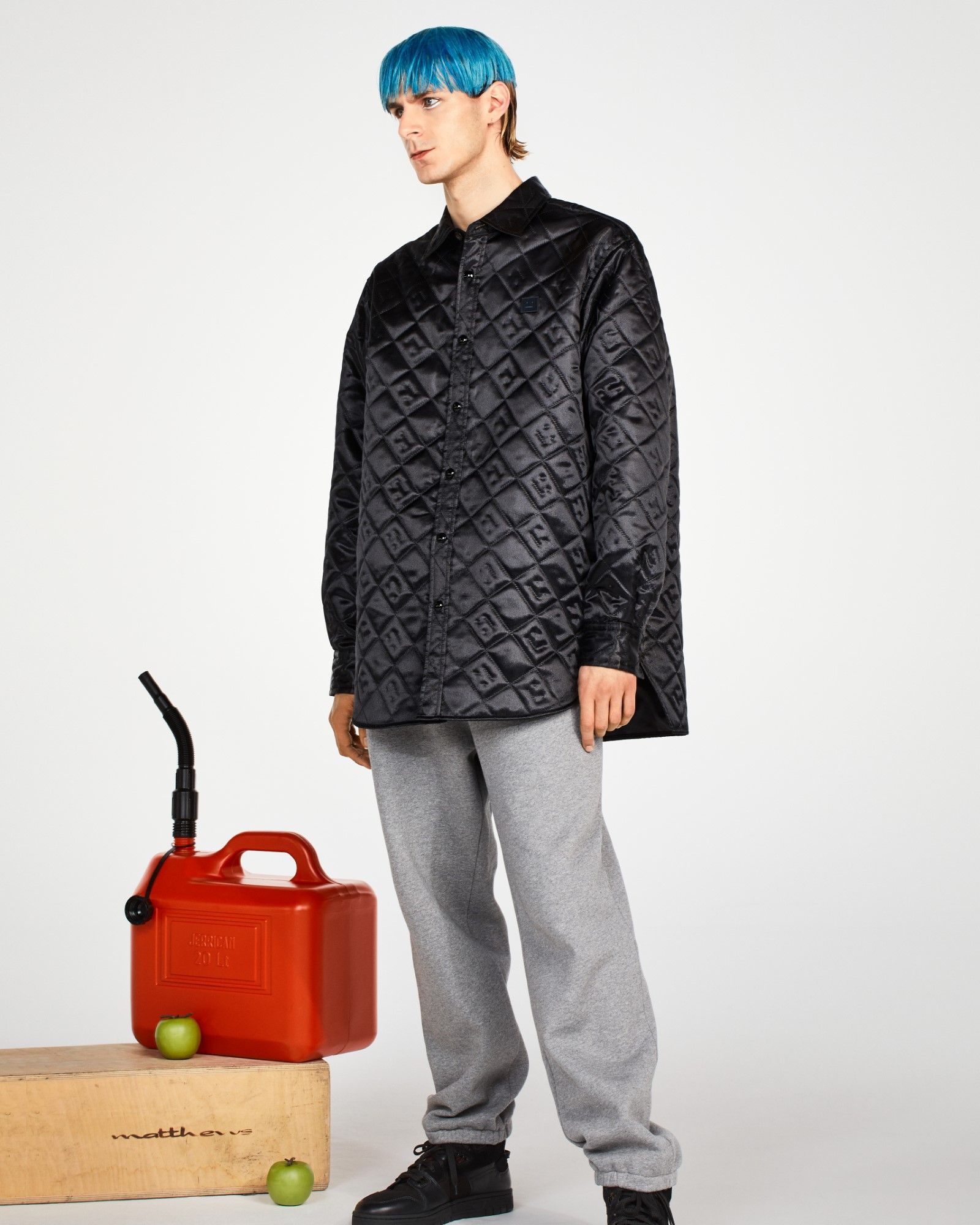
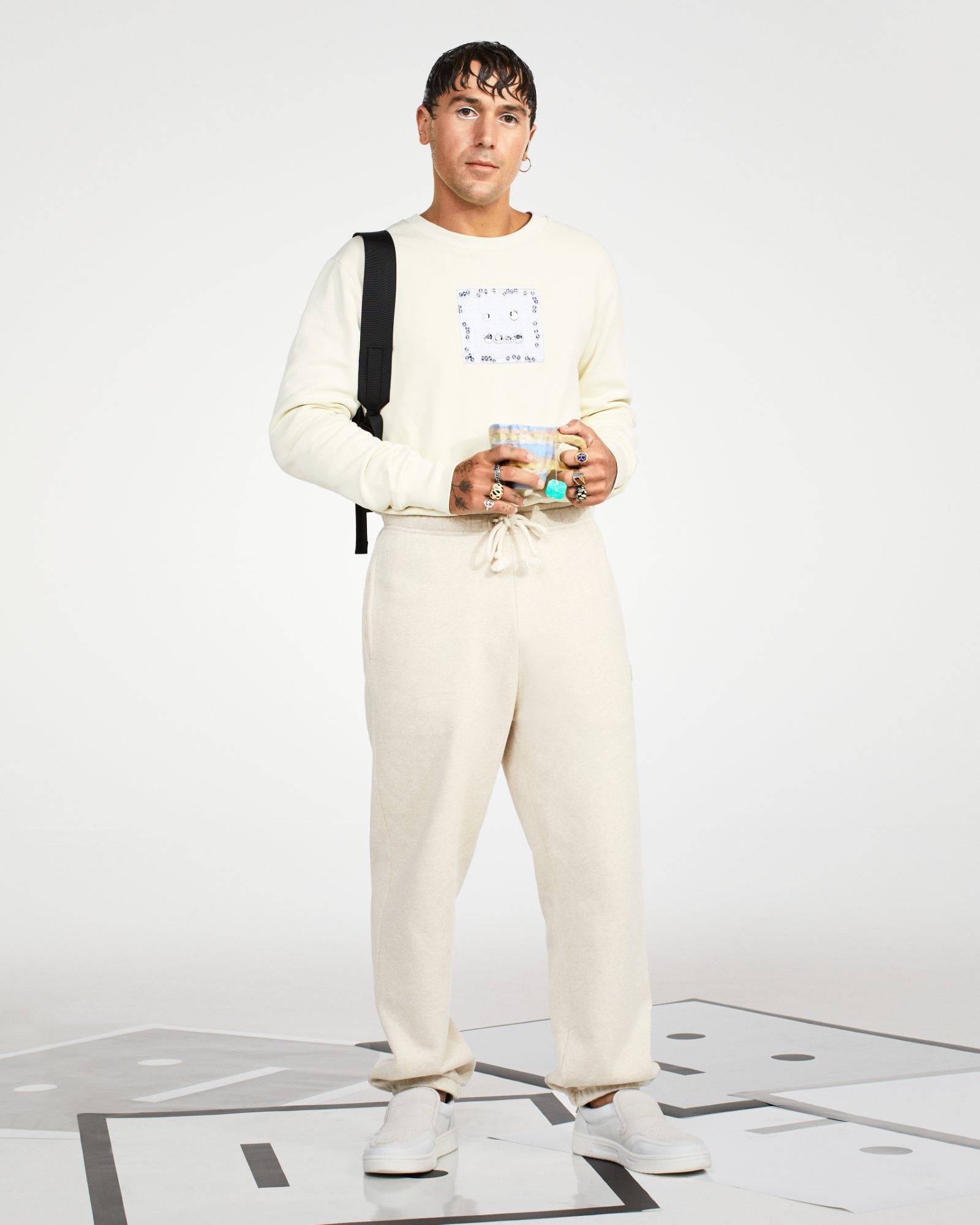
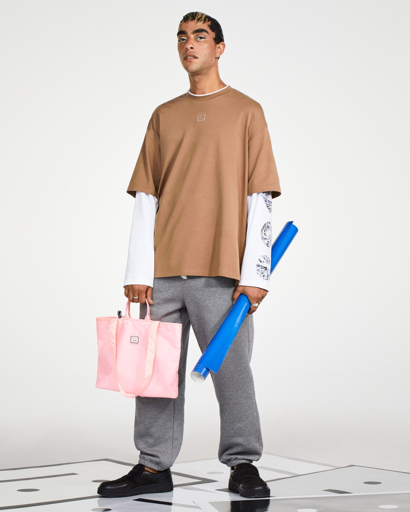

Acne Studios Face Motif Collection Campaign

Acne Studios Face Motif Collection Campaign

Acne Studios Face Motif Collection Campaign
Acne Studios Face Motif Collection Campaign
Acne Studios Face Motif Collection Campaign
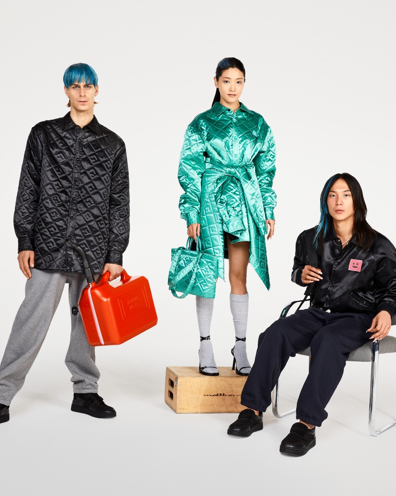
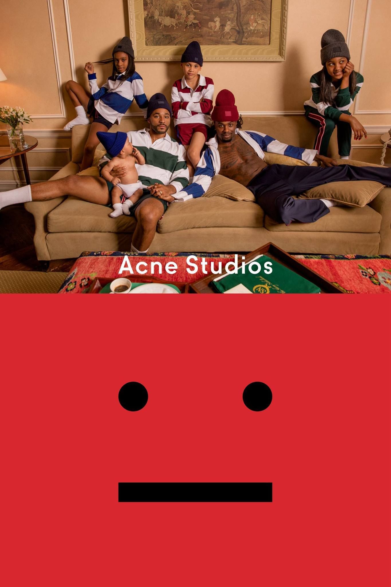
A few days ago Acne Studios unveiled the official campaign of its FACE collection designed for the next winter season. The campaign stars French bands Nyokô Bokbaë and Fairie as well as a group of environmentalists and a trio of artists, as the concept behind the campaign wants to explore the idea of "family we choose".
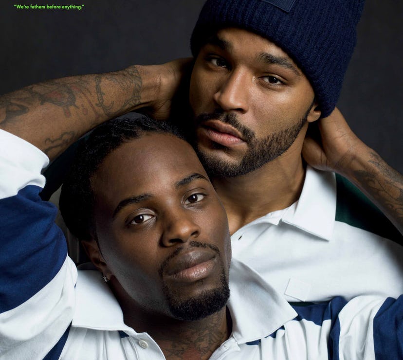
The choice of the family theme, especially coupled with the Face Logo of Acne Studios is not random. The Face Logo has become the protagonist of its own standing line and was launched with one of the most iconic campaigns in the history of the brand that had at its center the theme of the family and starred a gay couple of parents-influencers Kordale Lewis and Kaleb Anthony.
How was the logo created?
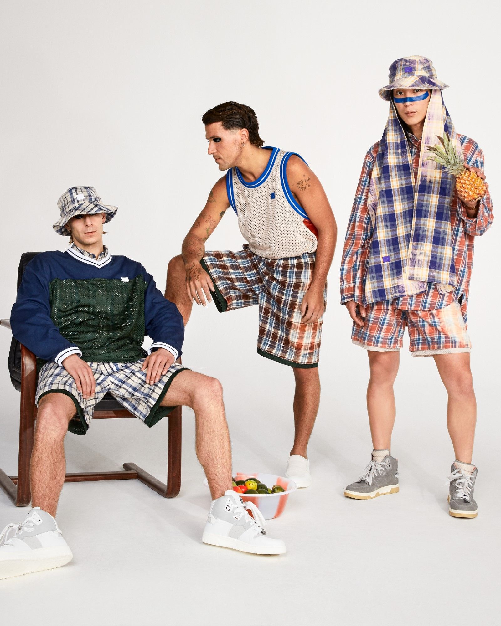
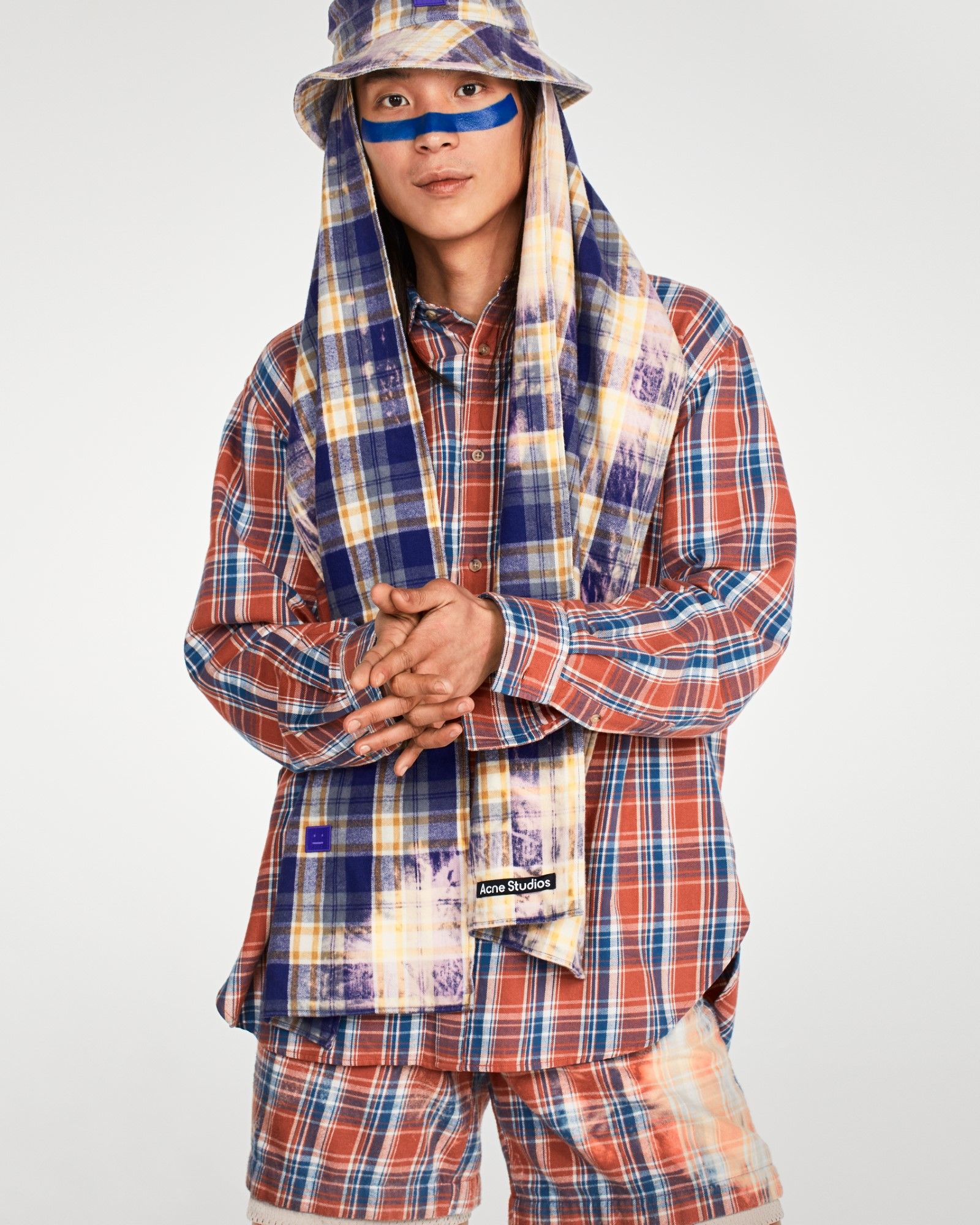
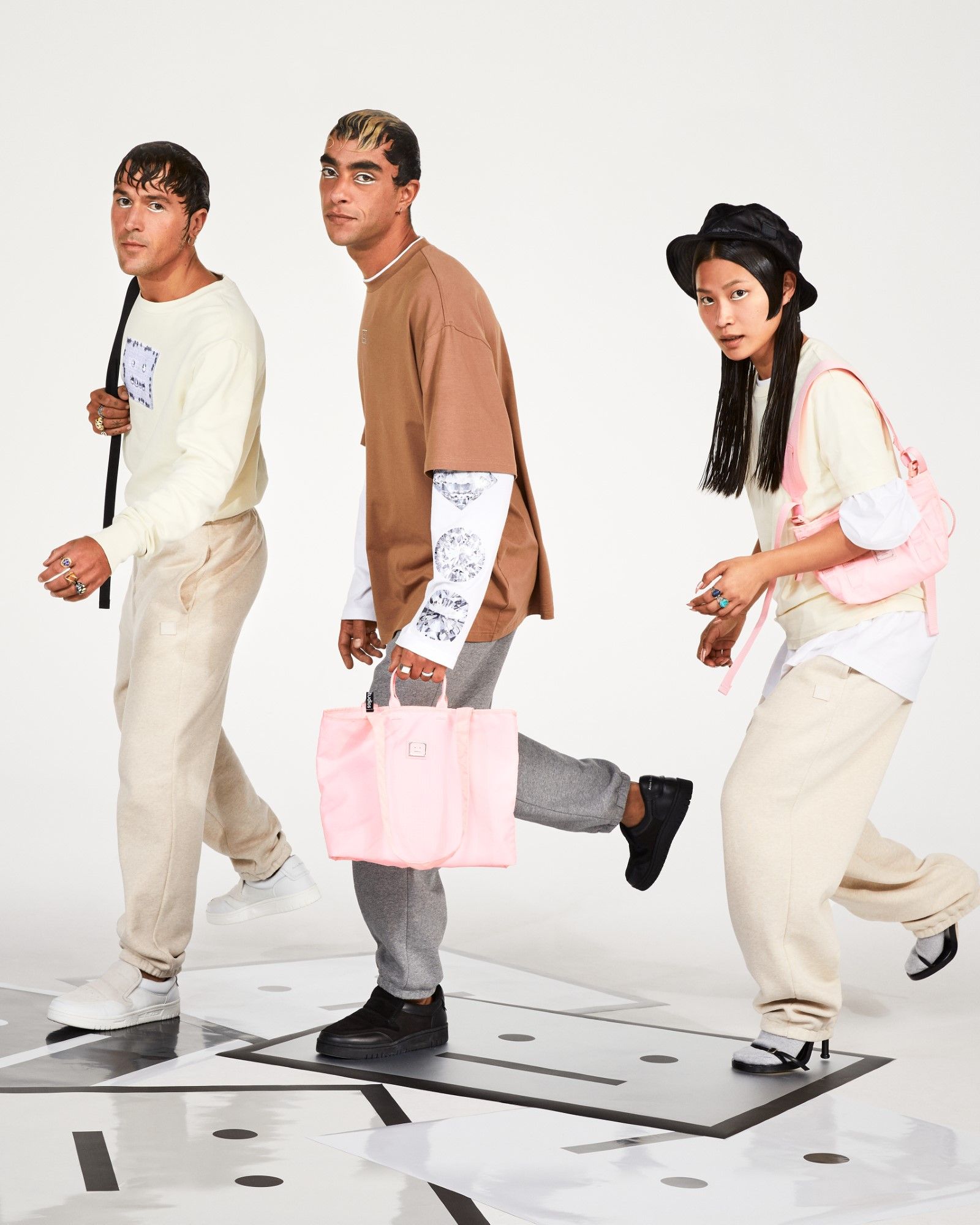
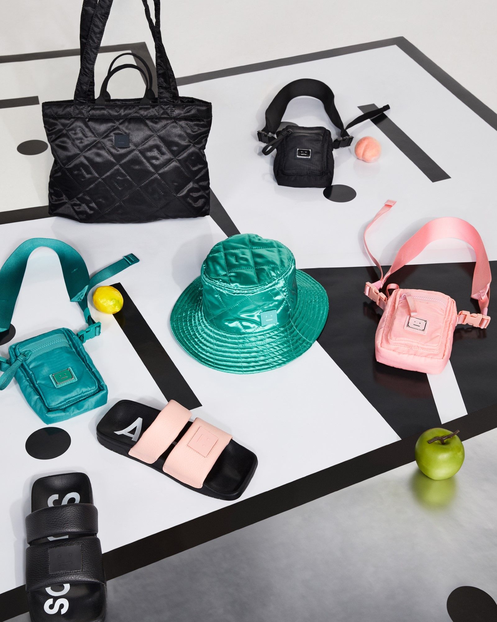
Acne Studios Face Motif Collection Campaign
Acne Studios Face Motif Collection Campaign
Acne Studios Face Motif Collection Campaign
Acne Studios Face Motif Collection Campaign
Acne Studios Face Motif Collection Campaign
Acne Studios Face Motif Collection Campaign
In 2018, Acne Studios founder and creative director Jonny Johannson told the story of the birth of the Face Logo at Esquire:
This straightface, for me, really captures the Swedish man—not too happy, not too sad. Lagom. We were just joking around, but people liked it, and we thought of how Comme des Garçons had their Play character; something cartoonish and pop. Some people thought it was a Swedish version of that, but the Face was actually born from another mother, and motivation. So we worked with him a lot, and he appeared on other things and became bigger and bigger, and rather than let it get out of hand, I thought we should take control of this dude. Everybody loves him, so I thought he has to officially belong in the Acne family.
In another interview, Johannson also tells how the idea of inserting the character into the Acne family made him think of the concept of a contemporary family, and from here came the idea for the campaign. But soon the concept expanded to reflect the very history of the brand that, let's remember, was originally born as a collective and whose dynamics, again according to Johannson, were just similar to those of a family.
Why is it important?
Jonny Johannson by Tung Walsh
Jonny Johannson by Tung Walsh
Jonny Johannson by Tung Walsh
Jonny Johannson by Tung Walsh
Starting in 2017, the Face Logo obtained its own line, called FACE or Face Motif Collection, which was dedicated to high essentials for the whole family. In this sense, the Face Logo also wants to represent neutrality – the Swedish term lagom also means the perfect balance or, neutrality, minimalism and functionality. As told by Jonny Johannson:
I’m obsessed with uniform clothing in families and I wanted to portray this phenomenon. I love those images of families dressing in the same outfit, and this new collection dedicated to the face motif also has a similar feeling of staple goods. It is also a way of highlighting that while every family is different, we all have the same love and want the best for our children. There is no ‘normal’ family—all families are normal.
Acne Studios' FACE line became one of the brand's greatest hits in no time, able to capture both its minimalism and its intellttuale liveliness and, above all, anticipating by at least three years the success of elevated essentials that would become a real trend in 2020 with the pandemic and lockdown. Finally, over time, the Face Logo became the perfect example of what a logo can represent for a brand: a sign that at first glance seems negligible, but that tells the origin and destination of a creative project, the passions and ideologies of those who direct it.