


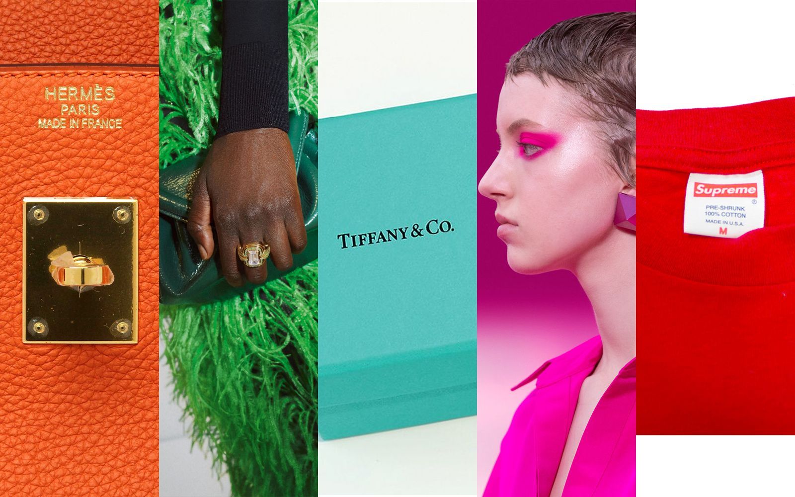
Are colors the new logos of fashion brands? Tiffany&Co., Christian Louboutin and now Glossier are perfect examples of how the New Luxury is often a shade

The removal of that acute accent that for decades had remained anchored to the first E in the Celine lettering was the symptom of a historic moment for the fashion industry, that over the last few years has seen many of its most influential and important brands - Saint Laurent, Burberry, Balenciaga - give up complex and elaborate logos, opting for more minimal and clean graphic outputs, generating what many have defined a loss of identity of fashion logos. This transformation caused another loss, intrinsic in the function of a logo itself, that's to say being identifying. That's what the two intertwined Chanel Cs are for, or the two Gucci Gs, they were the means through which fashion houses managed to build a shared language with their audience, turning into the representatives of a specific aesthetic, message, and becoming most of all a status symbol - both economic and social.
In a time where the brands' communication works and lives above all on Instagram, where every content must be catchy, instantly appealing, what is needed are new ways to make an element immediately recognizable. That's why many brands try to find their symbol in a colour, which turns into their logo (both from an aesthetic and legal point of view). Being able to turn a specific shade into the ultimate symbol of a brand is actually a process that takes a very long time, often decades, before a specific colour is linked to only one brand by a heterogeneous audience, but it's also true that the brands who managed to do this are the most powerful and influential in the world.
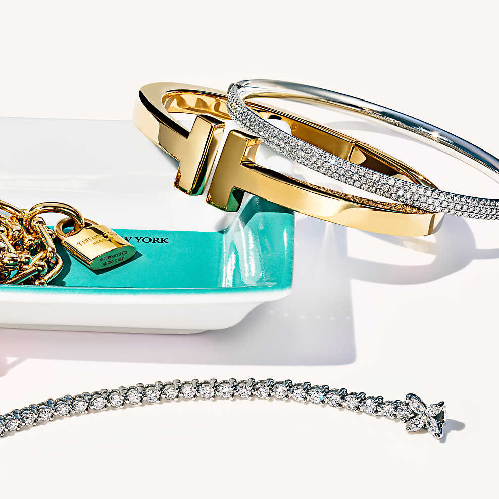
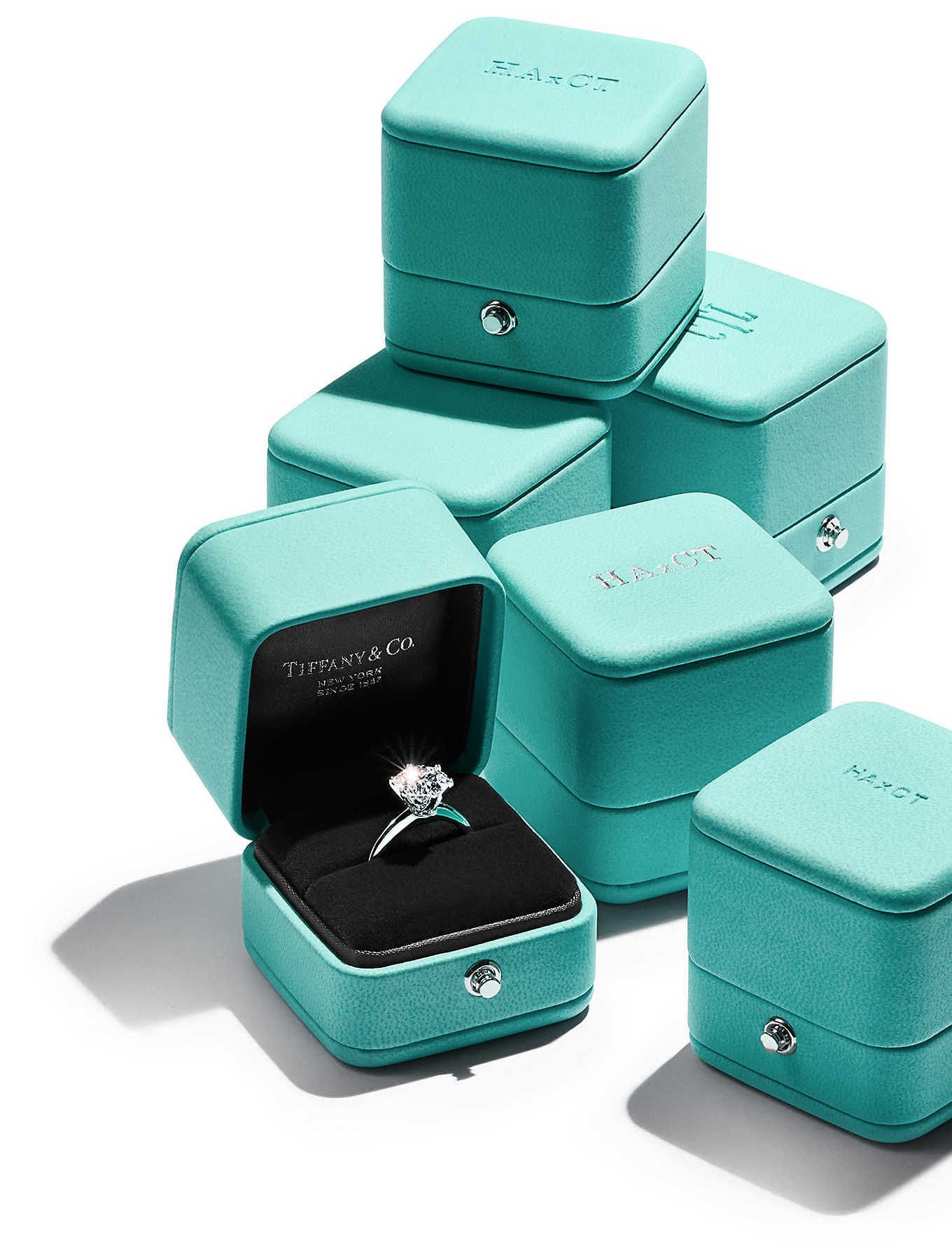
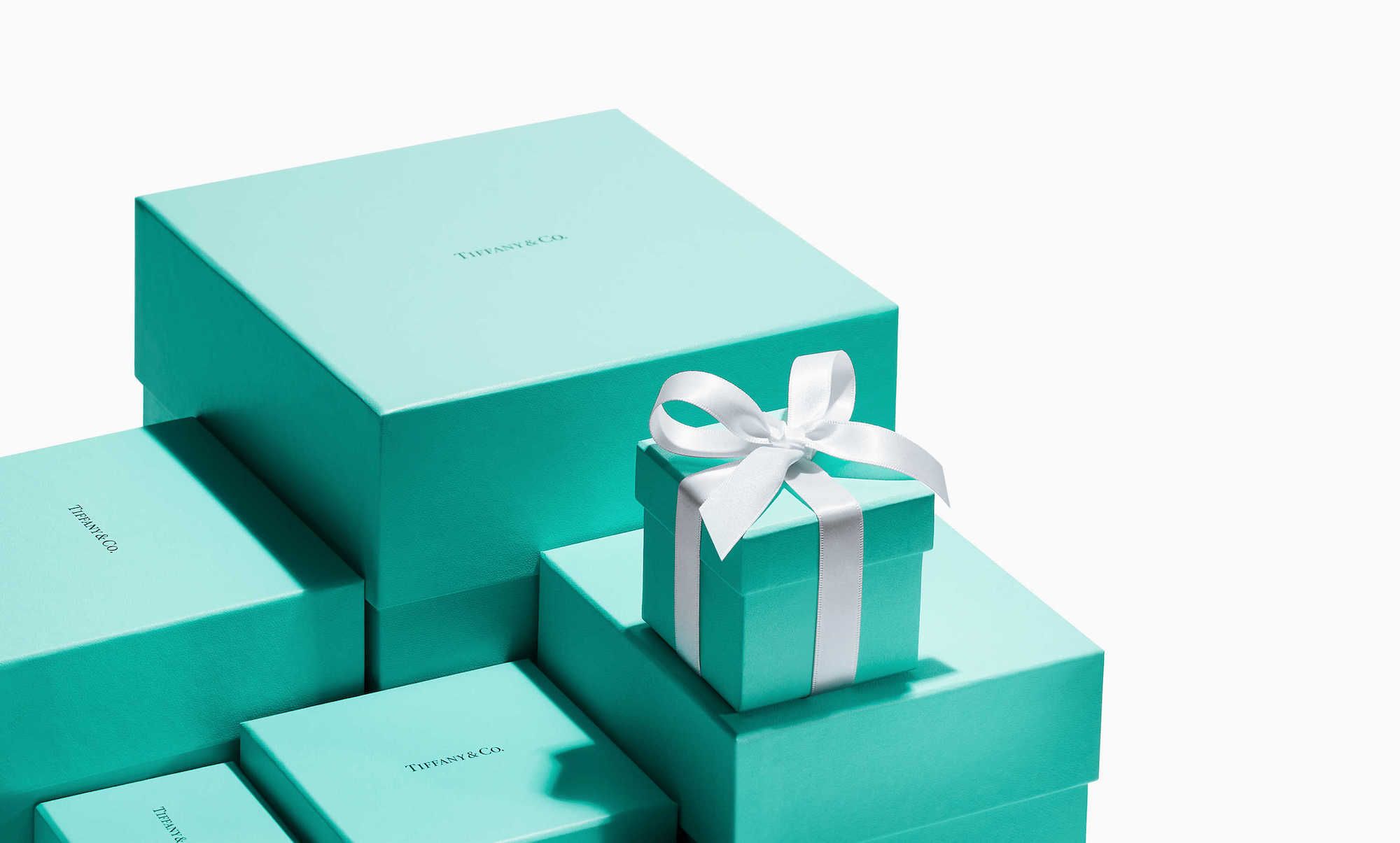
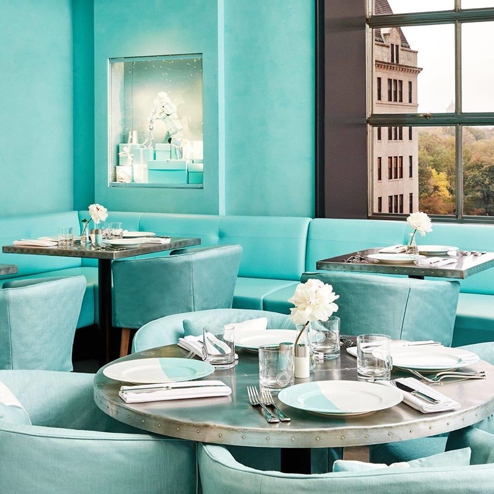
It was a 1995 US Supreme Court ruling to establish for the first time that colour could be a trademark on a legal basis, and that could, therefore, become the property of a single brand. For this to happen, the colour must have an important requirement, it must have secondary meaning: consumers must be able to lead back that shade to one and only one brand. What American courts established 25 years ago, it's something that Tiffany&Co. has made part of its philosophy and identity since its foundation more than 180 years ago.
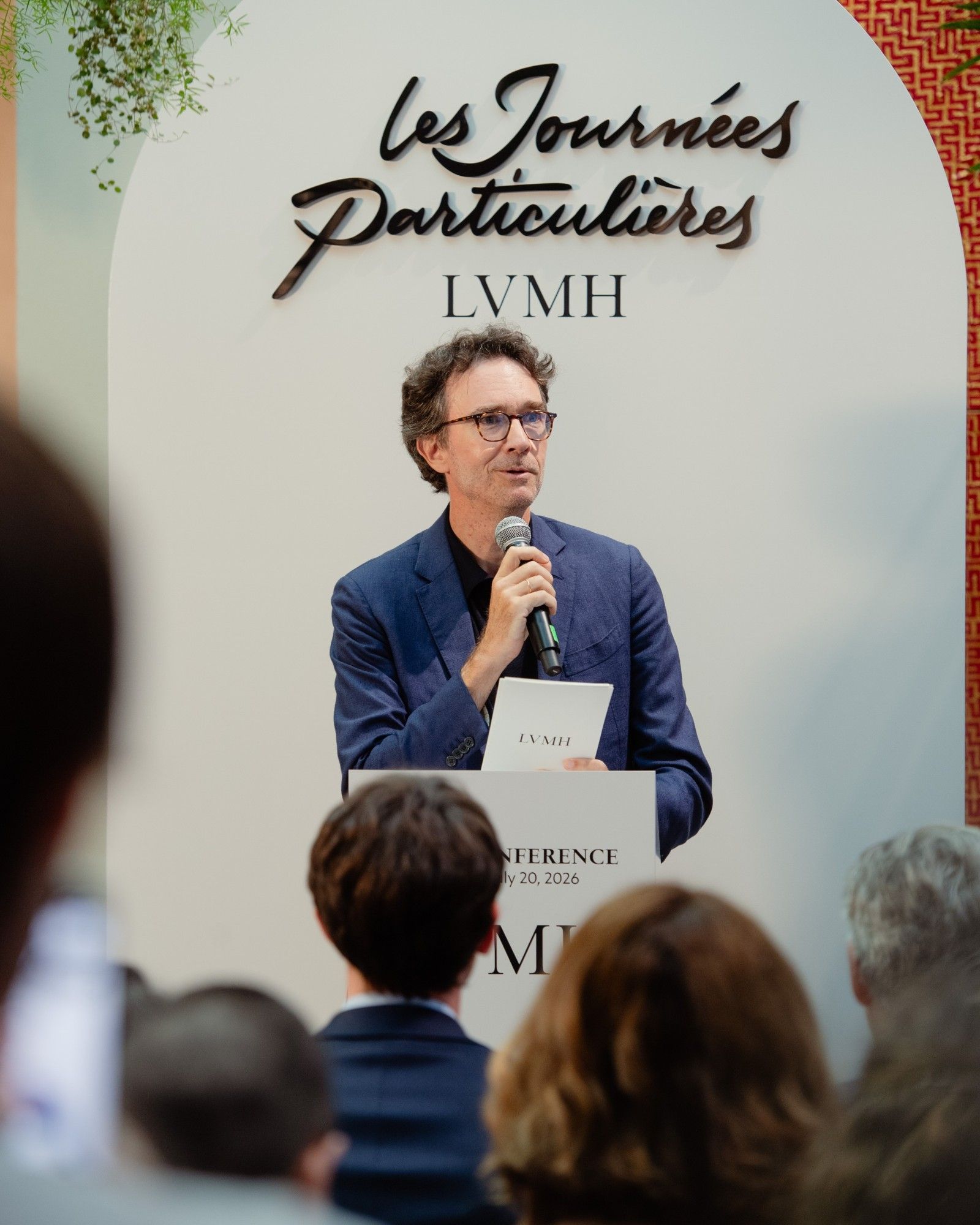
The robin-egg blue that for decades has been gracing the jewellery boxes, the shopping bags, the packagings, everything part of the American jewellery universe - recently acquired by LVMH for 16,2$ billion dollars - arrived to represent and symbolize Tiffany&Co. in its entirety in the mind of the average consumer, to the point that those little boxes are arguably the most desired and sought-after item ever. The one occupied by Tiffany&Co. is a privileged position, reserved to brands of its level and with just as much years of history behind, because its colour not only references to the products the brand is known for but above all it is the symbol of its identity, of the values it wants to convey, of the storytelling that the label has built over the years. A little box in that specific nuance goes well beyond what's in that box, as it is linked to a collective imaginary fuelled by movies, shows, tv-series and photography.
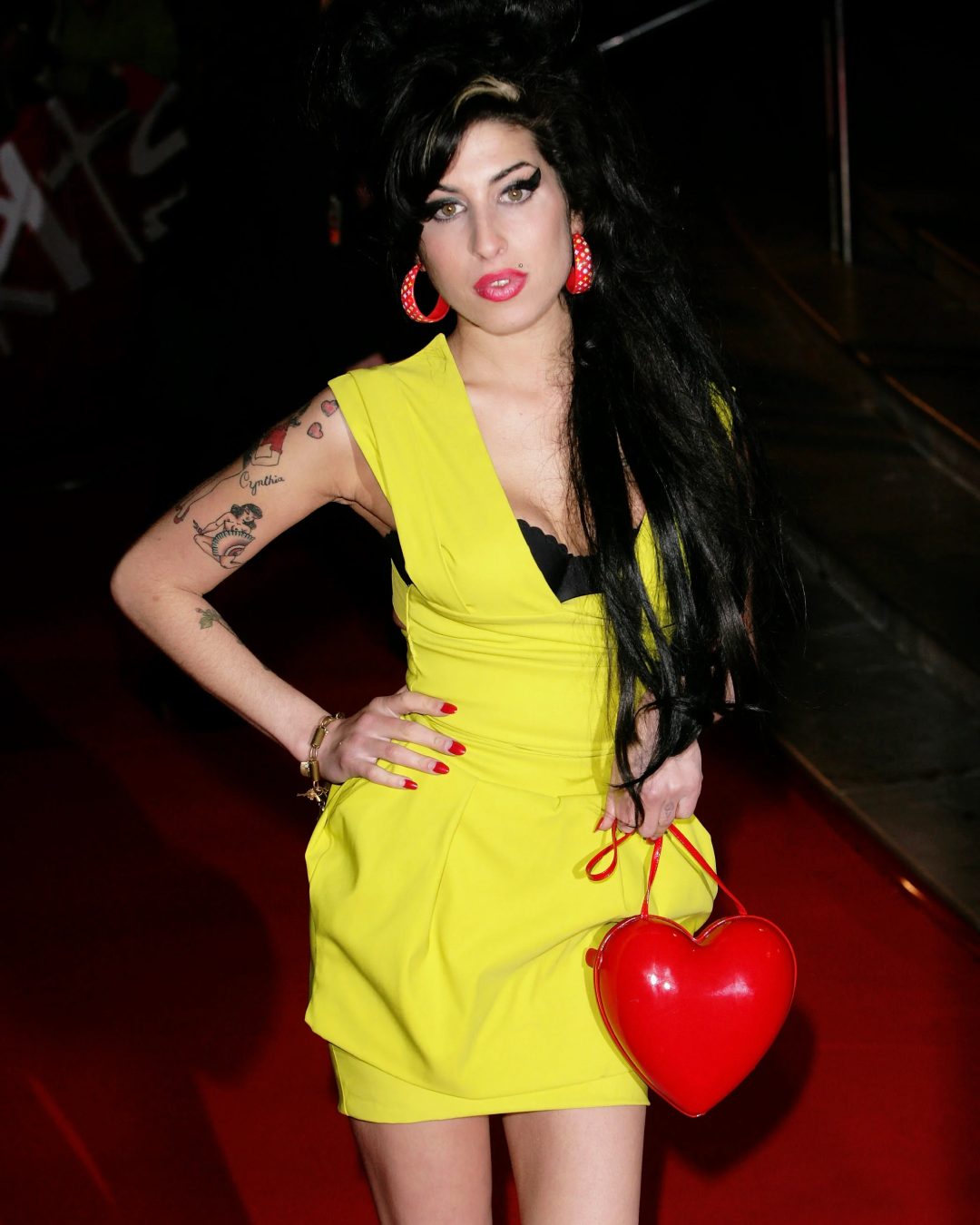
In 2018 were two court rulings, the first in Europe, the second in China, to determine that the red sole of the iconic Christian Louboutin heels could be a trademark, becoming a property of the footwear brand and therefore protected by clear and strict rules. Also in the case, the requirement of secondary meaning is widely fulfilled: thanks to countless movie scenes, TV shows, red carpet pictures, fashion shootings, the red sole is generally associated with only one brand, Louboutin. The necessity for Christian Louboutin to regulate the use of the red colour for the sole of its shoes rose after Yves Saint Laurent brought on the catwalk a pair of heels with a red sole identical to one of the French footwear designer.
The identification of a brand through a colour doesn't happen only in the fashion world. It is no coincidence that in the United States people refer to a specific brown shade with the expression UPS brown, as the colour of the uniforms of the UPS couriers. The same goes for the yellow of the Cheerios boxes, the green of the Starbucks mermaid or the yellow of the 3M post-its. Mattel, the manufacturing house of Barbie, owns the rights of the Pantone pink hues of the iconic doll for more than 100 different product categories.
A brand that since its early days has made a colour one of its identifying marks is Glossier, the beauty and skincare giant founded by Emily Weiss and recently valued 1$ billion dollars. It's a specific shade of Millennial Pink the one used for the walls of the pop-up stores of the brand in the US and in Europe, for the packaging of its best-selling products and that returns often in the pictures posted on Instagram. What Glossier is trying to do now - after the little setback due to the closure of the Play make-up line, is trademarking that pink shade, of which it already holds wide rights, also for the inner part of the boxes in which its products are shipped. Not the products thus, but the packaging.
It is actually an unprecedented operation, and it's not clear yet if the brand will be able to make it in the court. As mentioned before a fundamental requirement for the trademark of colour is the secondary meaning, while it could prevent this right the functional component of a colour, that's to say if colour is chosen and used without meaning or without a specific goal, and that could, therefore, be replaced by another colour. Glossier objects to these statements, weighing on the secondary meaning of its boxes, as "relevant consumers immediately recognize [its unique and distinctive use of] the colour pink as applied to only the interior of a box indicates that the cosmetics and skincare products originate from Glossier and not from any other source." The brand goes on stating that "This is bolstered by the fact that so many of [its] purchasers make a point to share photos of not just the cosmetic products, but also the box they come in, [which] speaks to the distinctiveness of the Glossier packaging.”
Two are the main differences in the Glossier case compared to the precedents set by Tiffany&Co. and Louboutin. To prove the identifying value of pink, Weiss's brand focuses mainly on the role of social media, especially Instagram, and on the comments and opinions that its costumers express and share on those platforms. In this way, it is further highlighted the online presence of a brand that started out as a blog and that has made its social communication one of the reasons for its success. In this respect, Glossier reflects perfectly in the parameters that define what is today the New Luxury, turning into the example of the principle that states that A brand's identity and values must be felt in digital and physical form.
The second main difference between the brands taken into exams is the years of history behind them. If Tiffany&Co. was founded in 1899, it took Glossier potentially only five years to make a pink shade - not even that special - identifying, recognizable and therefore iconic.
The evolution of a logo from complex and tangled graphic output to a colour shade represents the ultimate passage towards a much more immediate and therefore powerful communication, that nevertheless will remain for a long time prerogative of a very limited number of brands, that for this reason will become even more exclusive.