


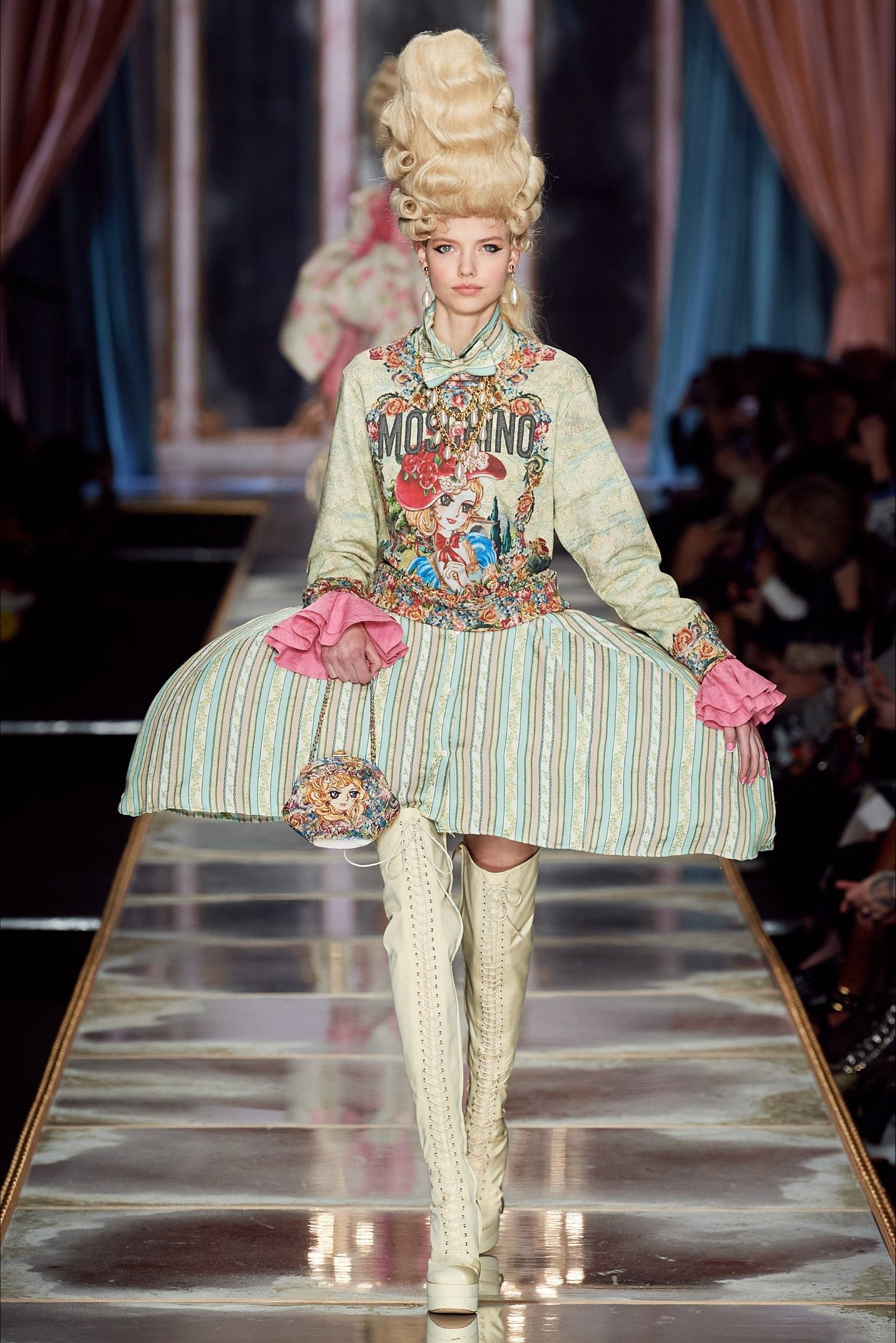
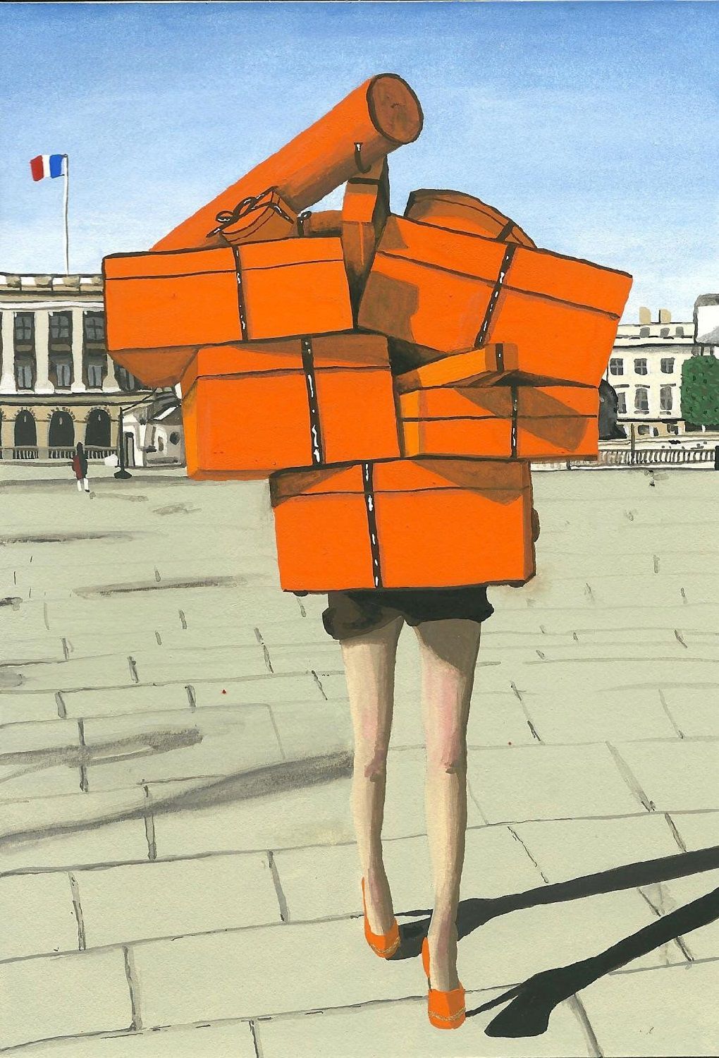
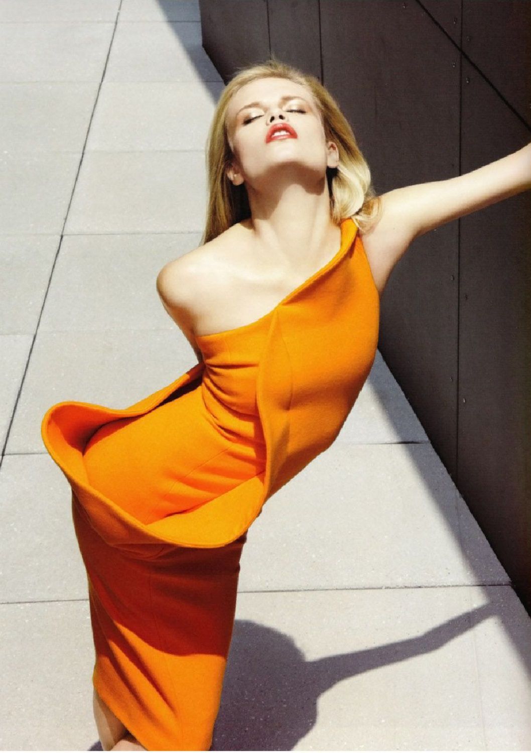
Orange's anatomy The relationship between fashion and the hottest color of the moment


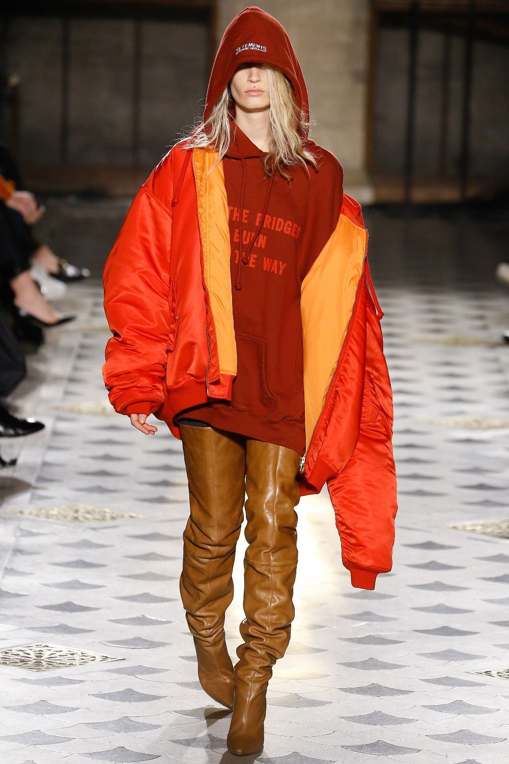
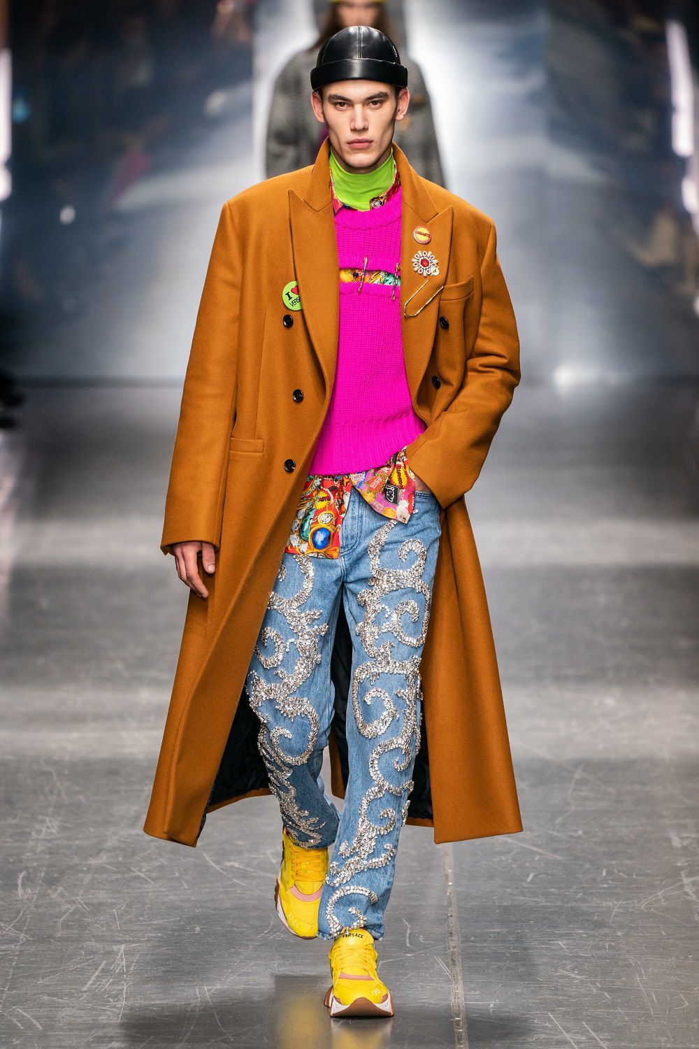
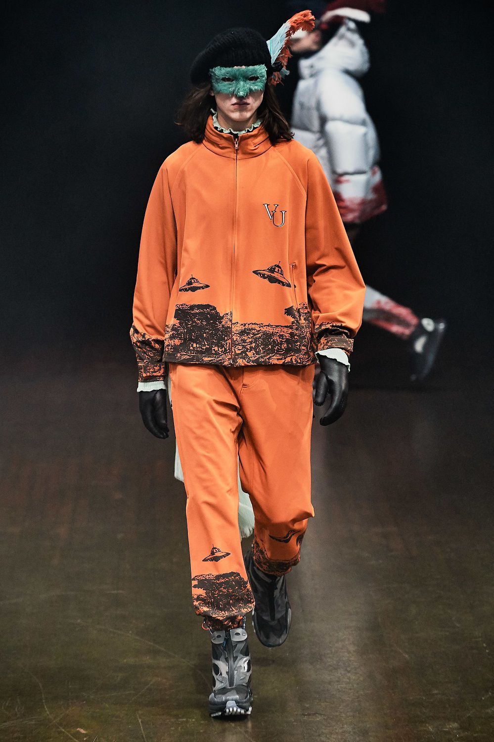
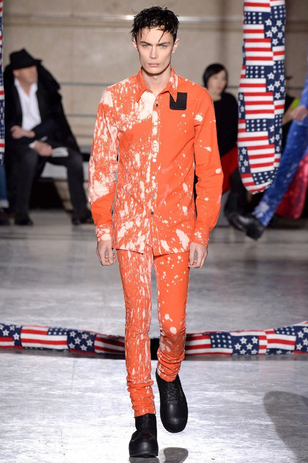
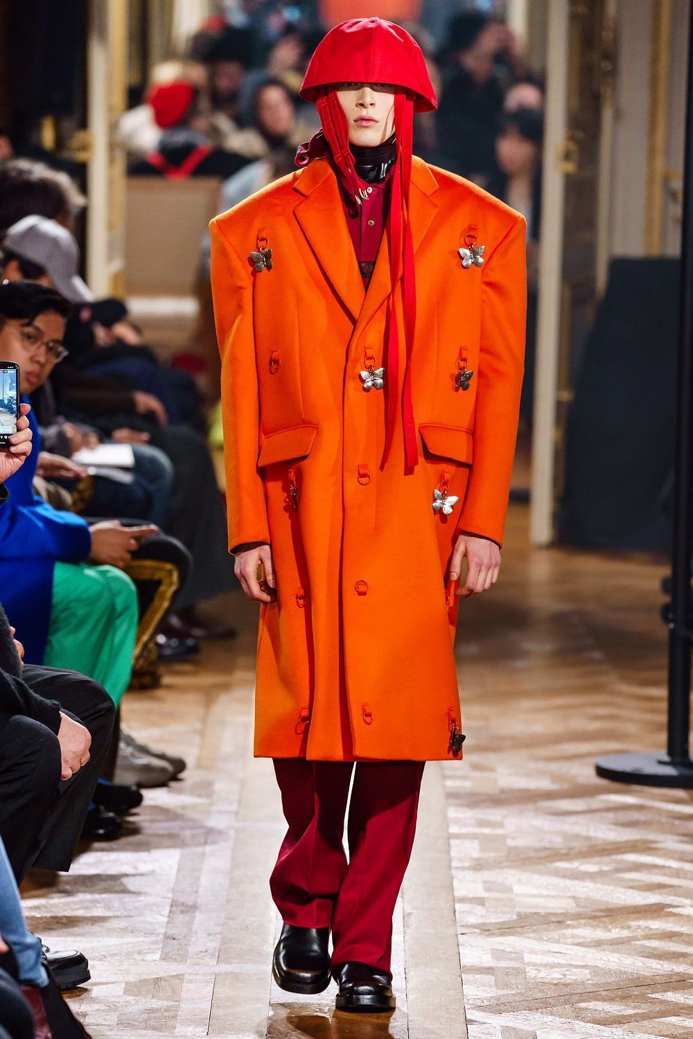
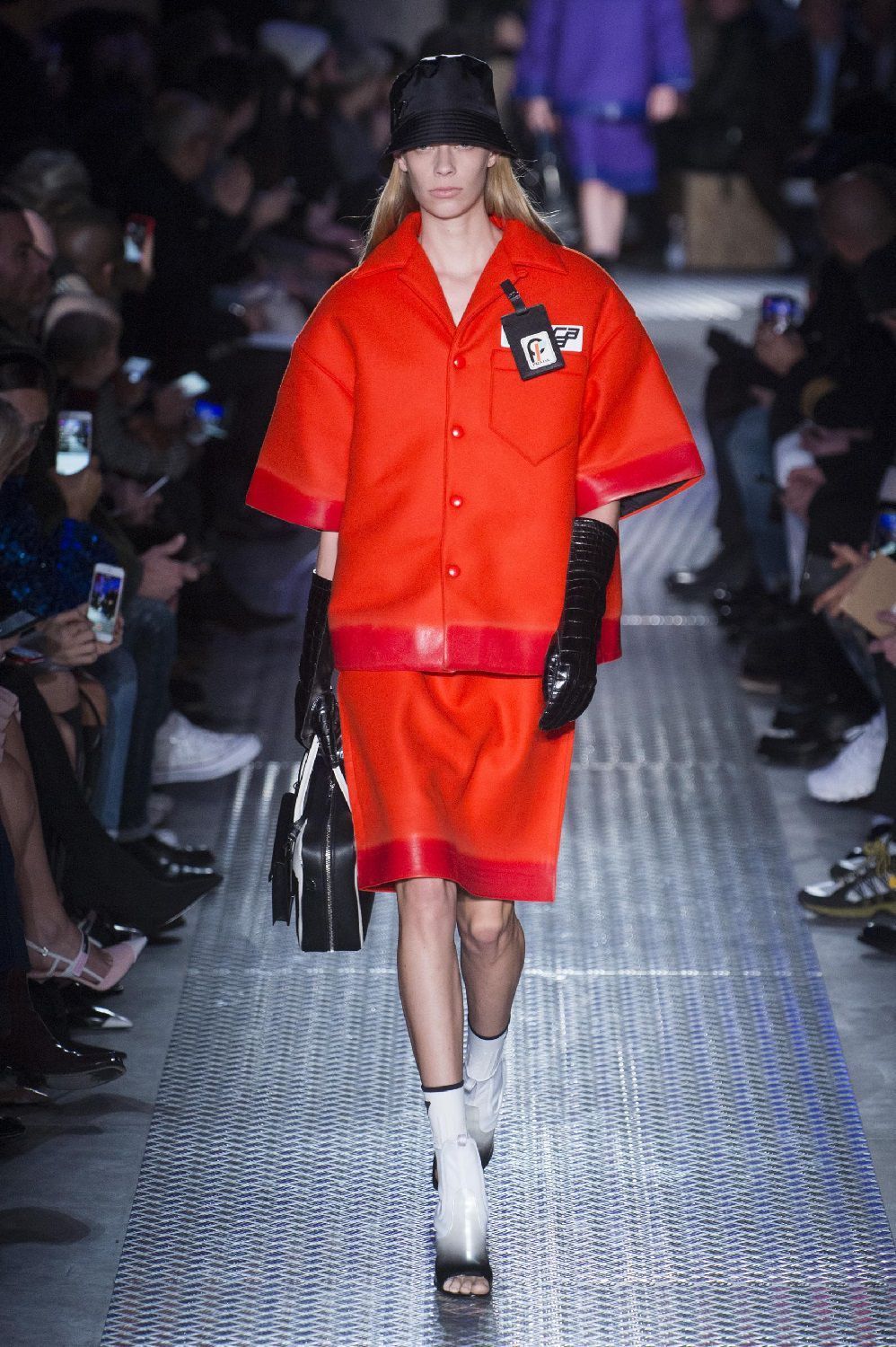
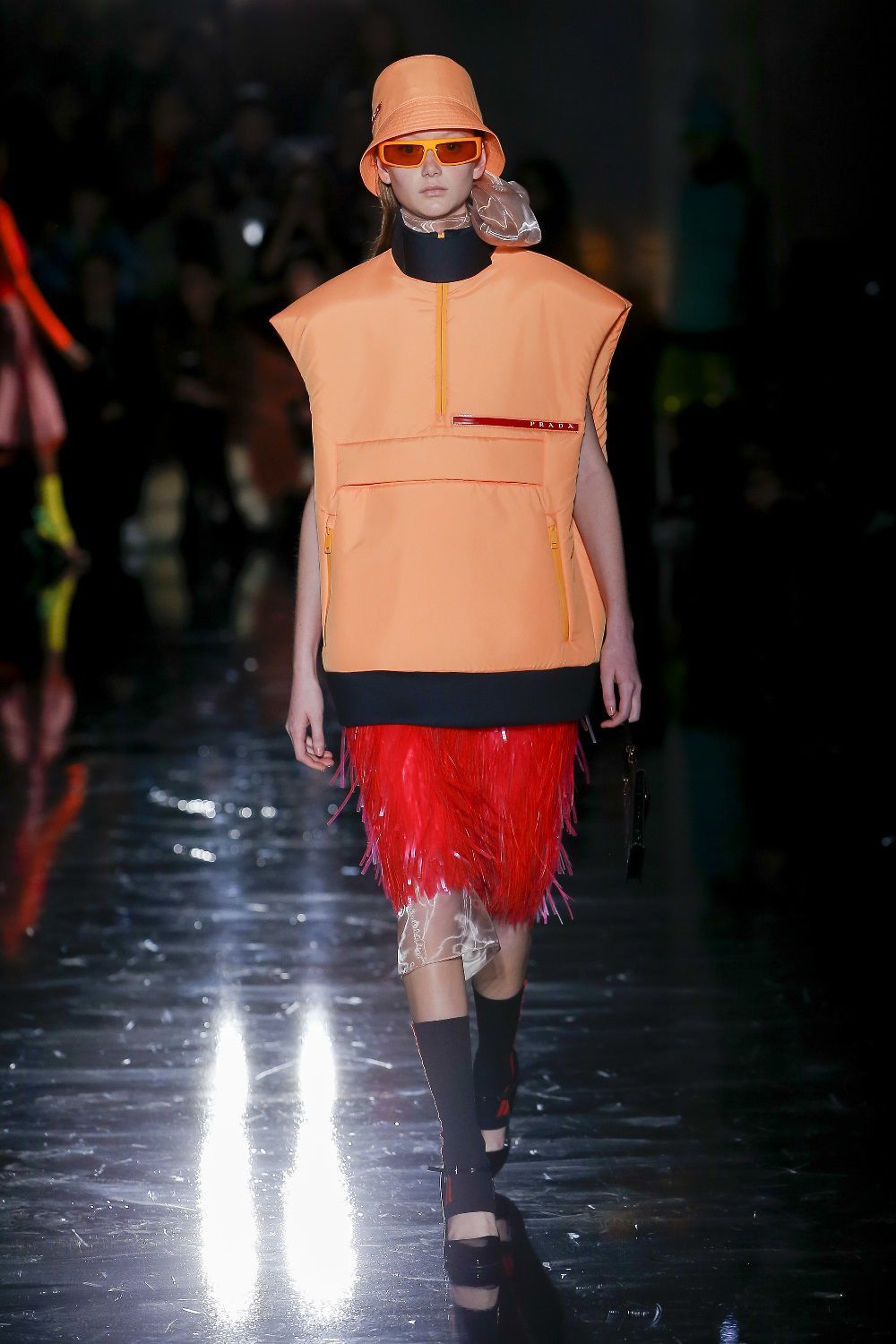
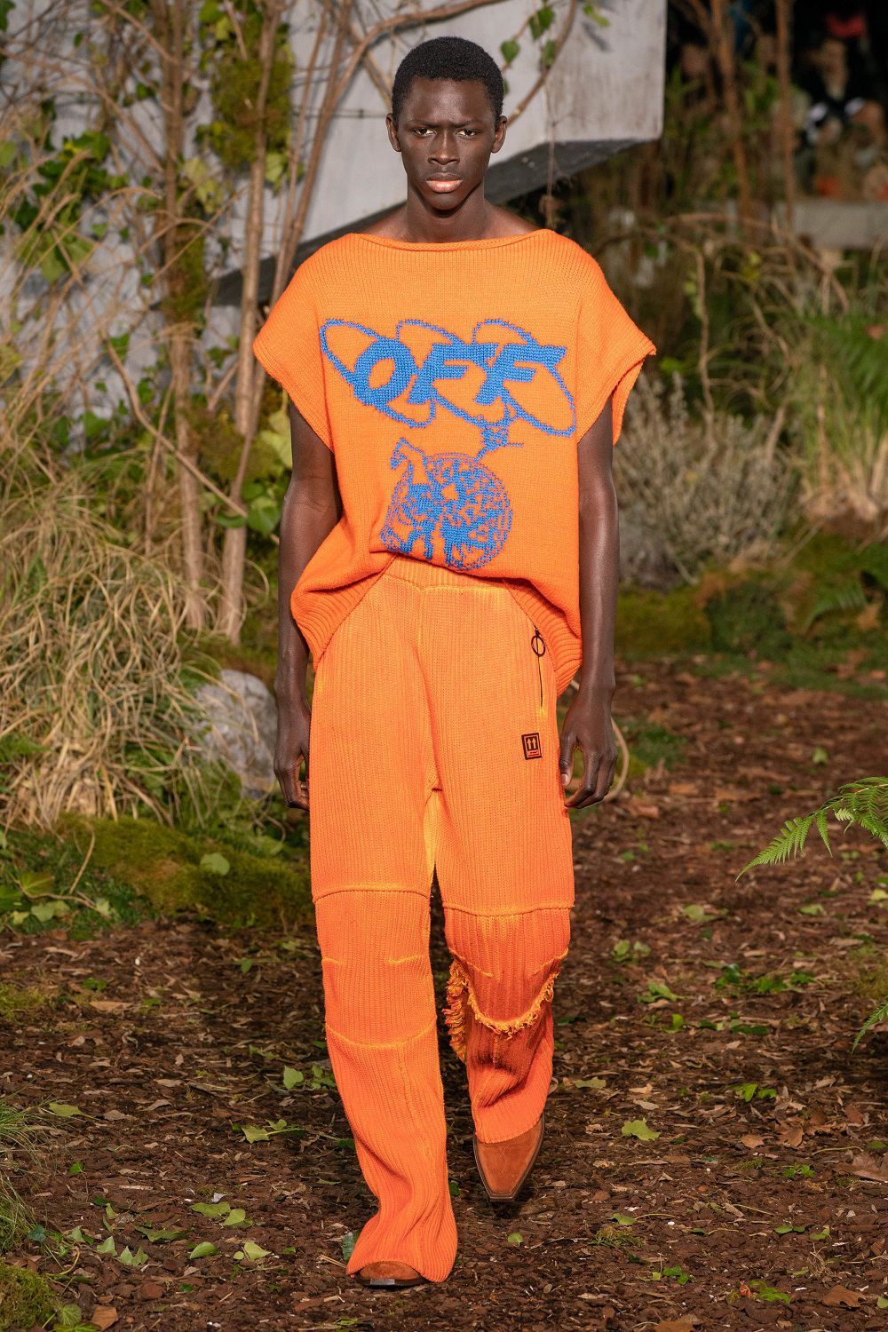
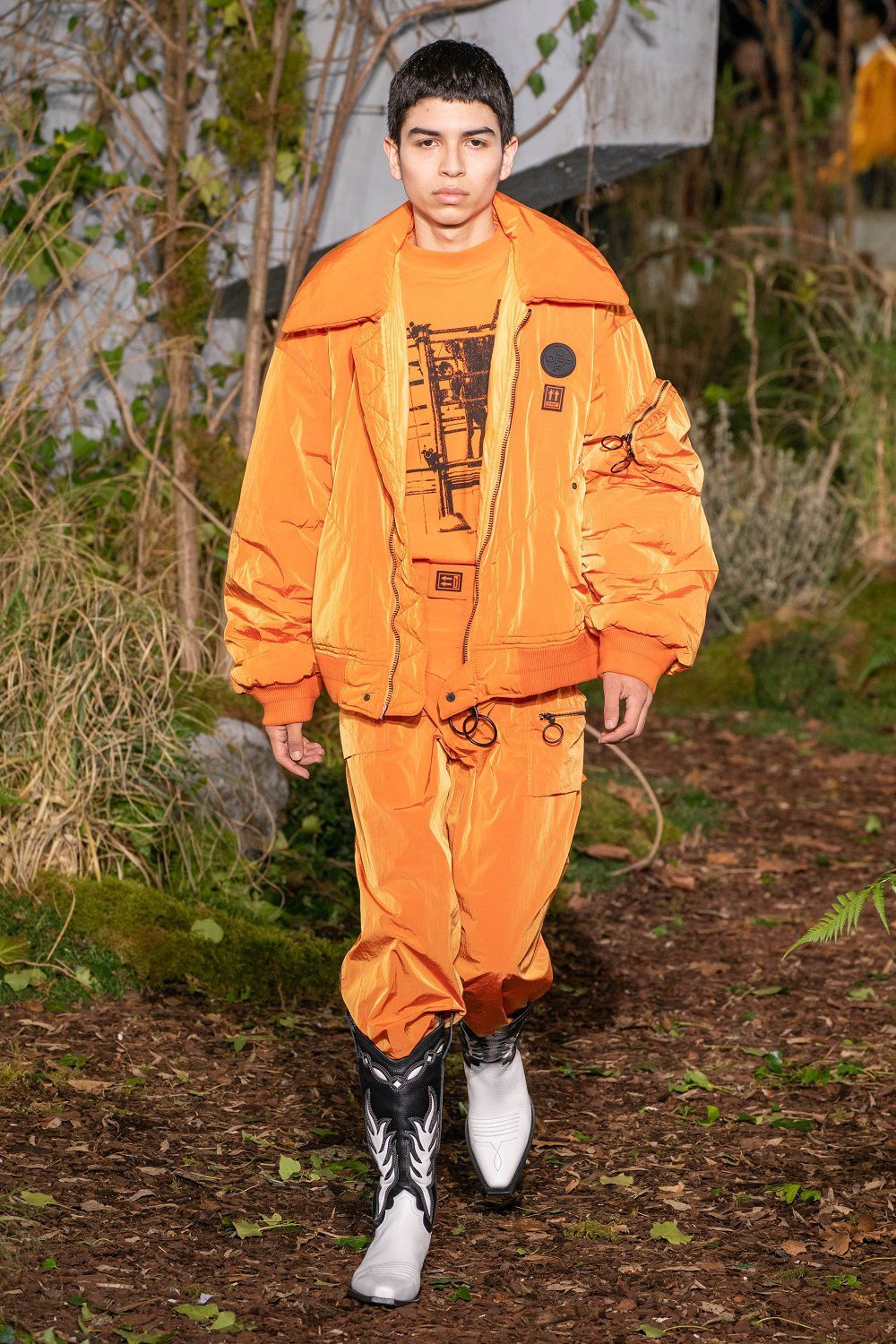
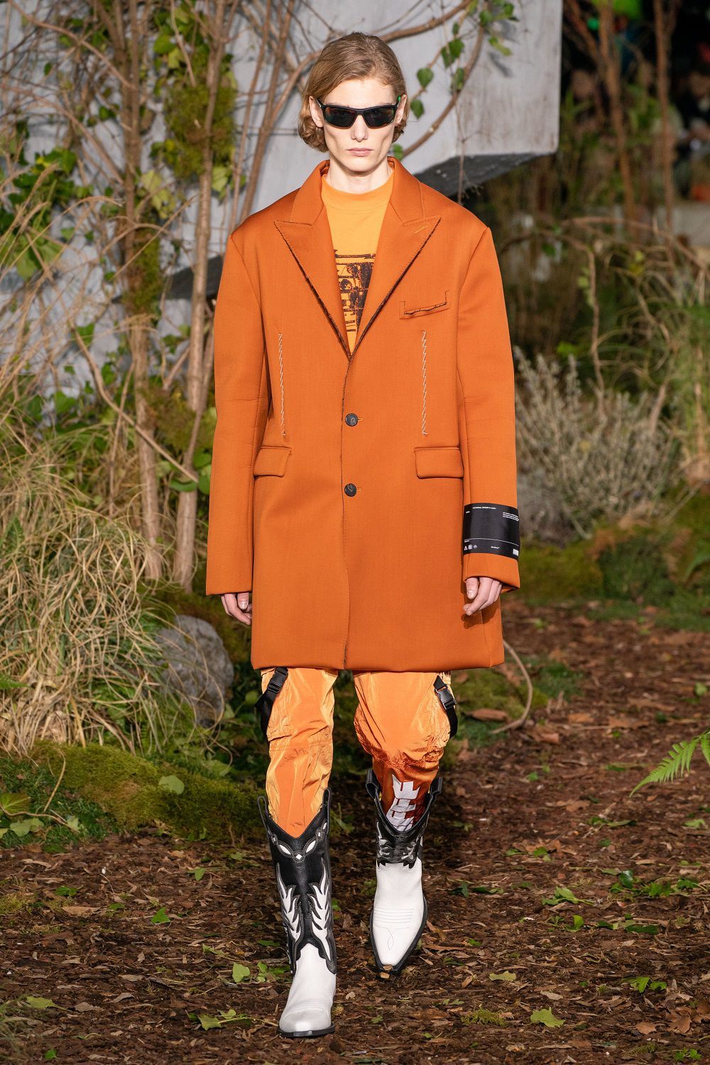
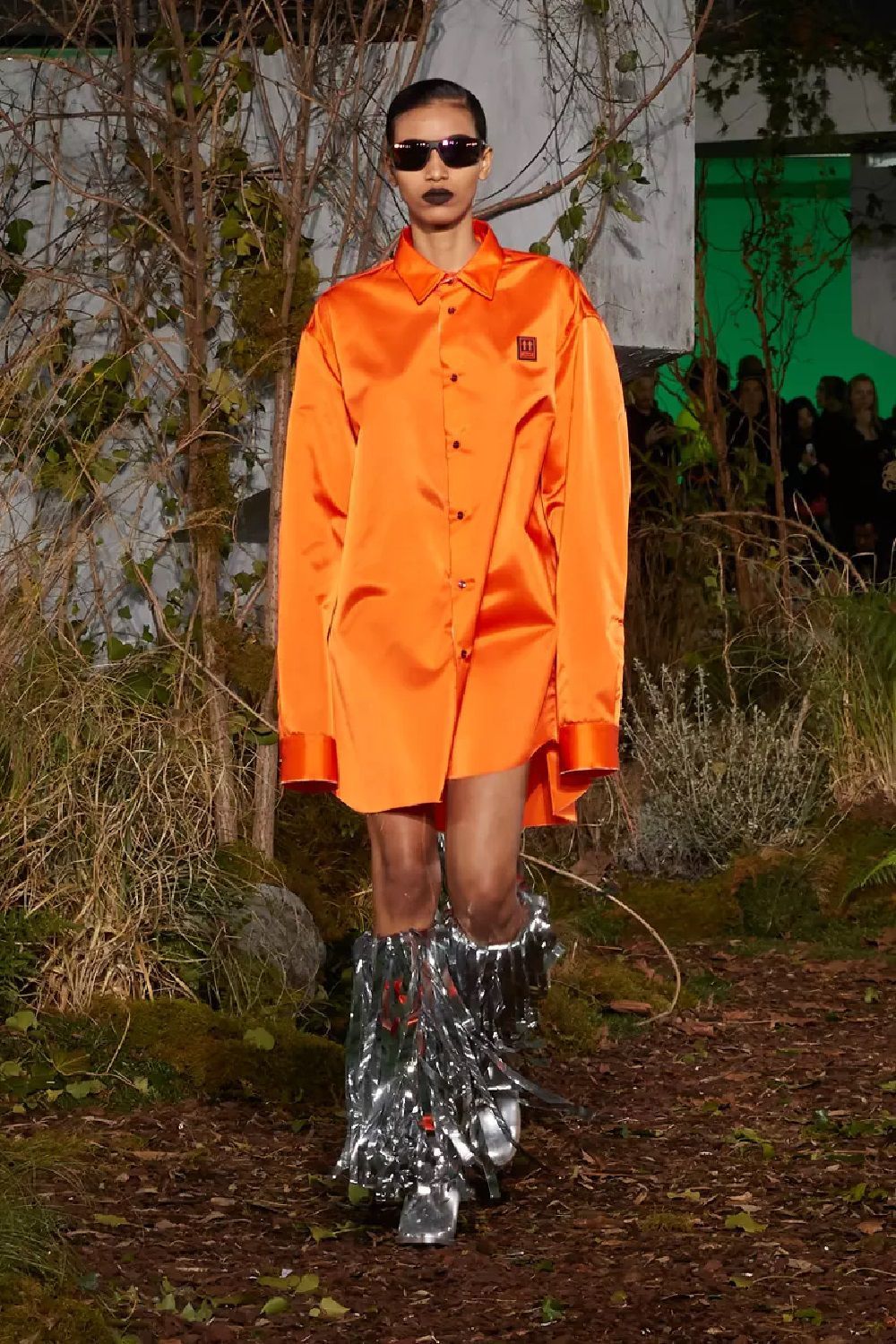
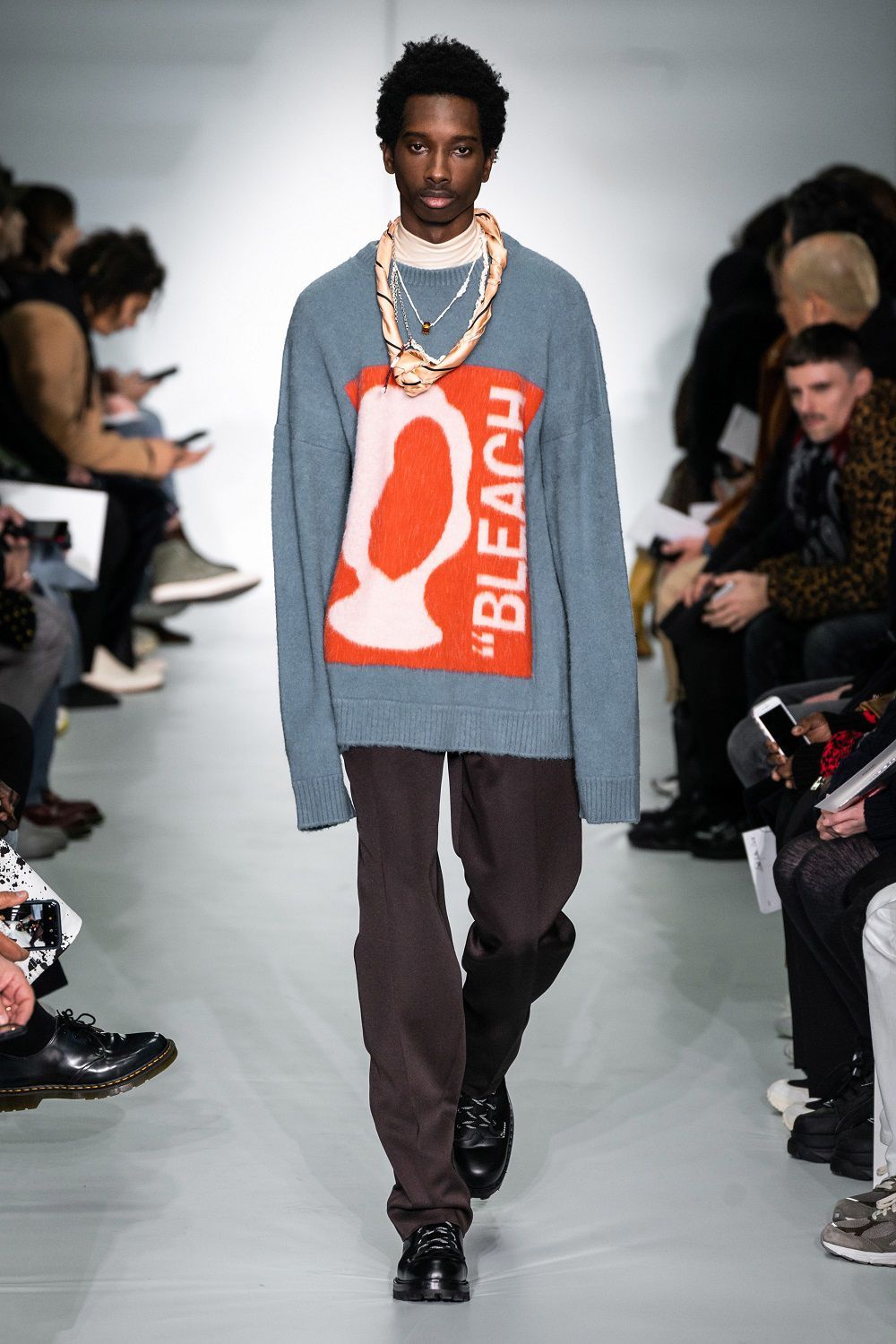
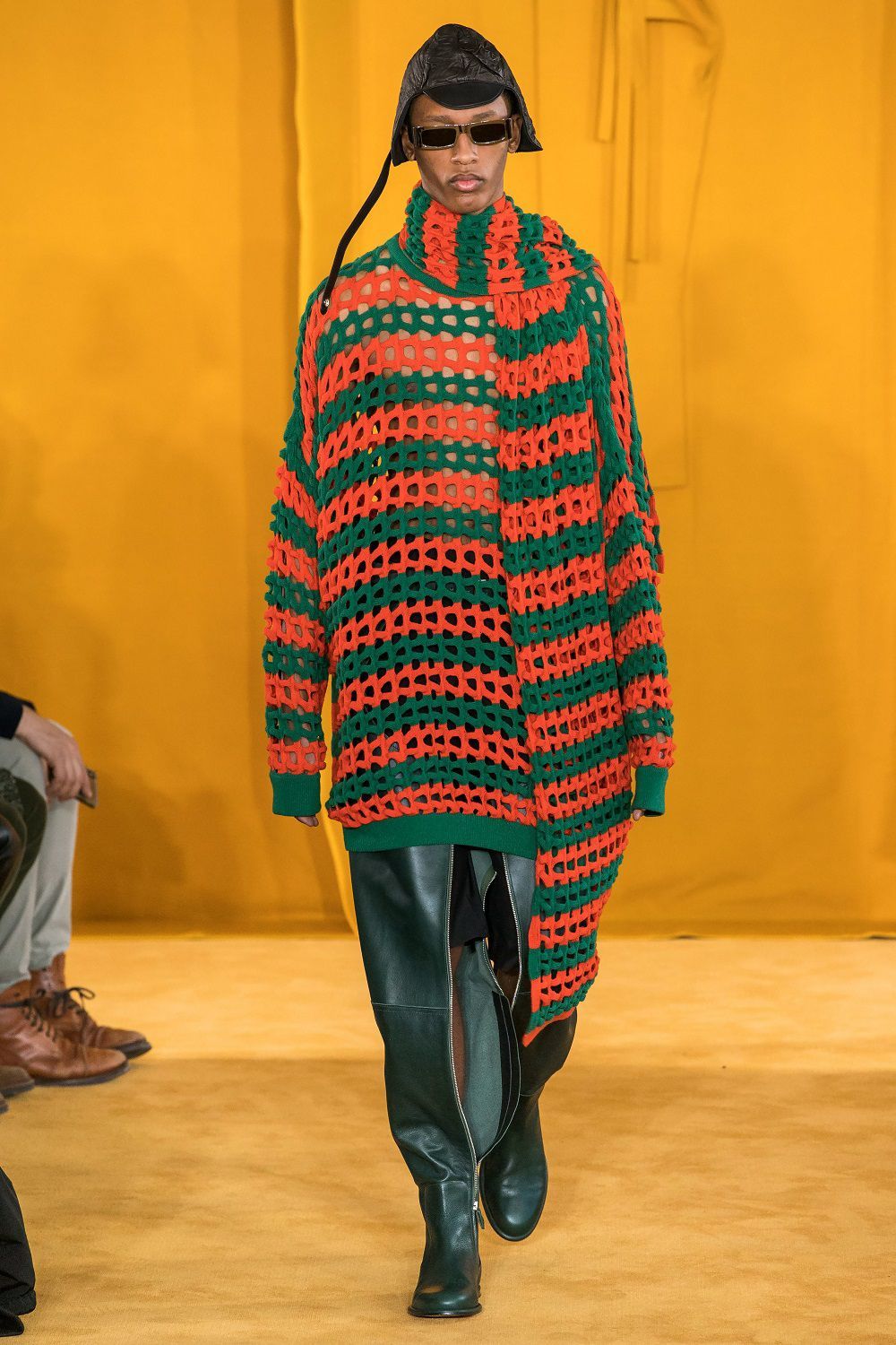
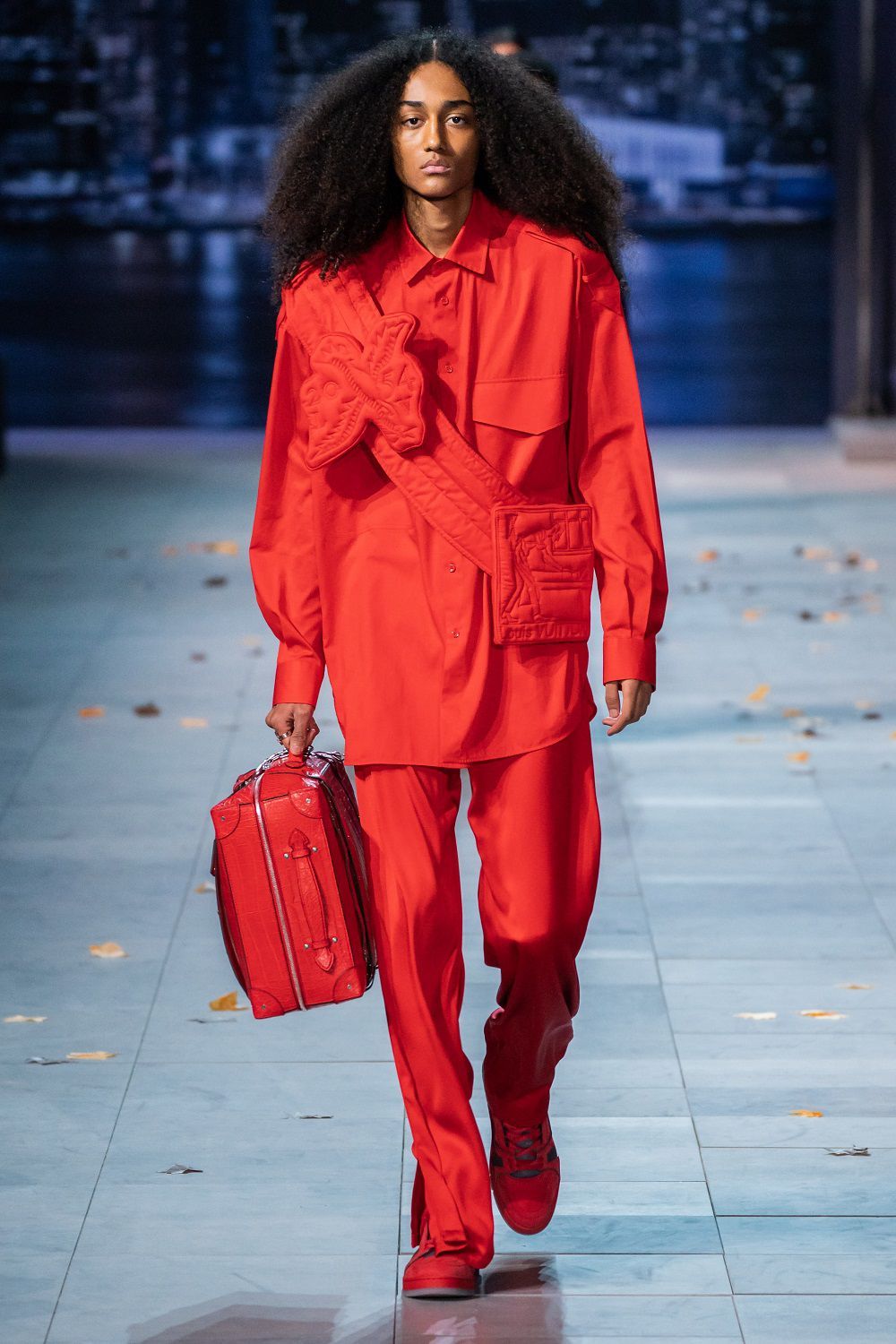
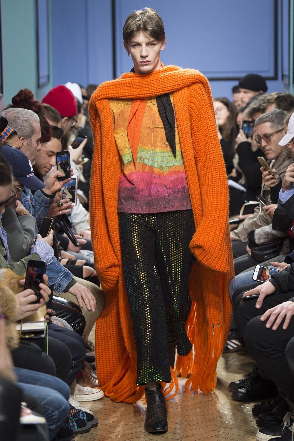
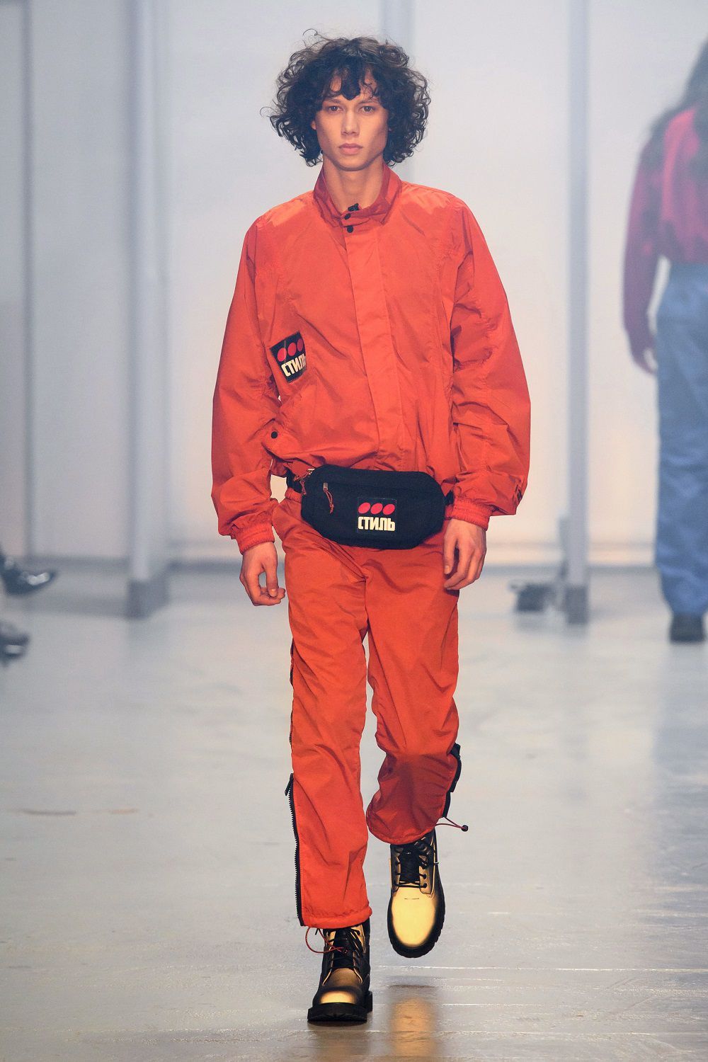
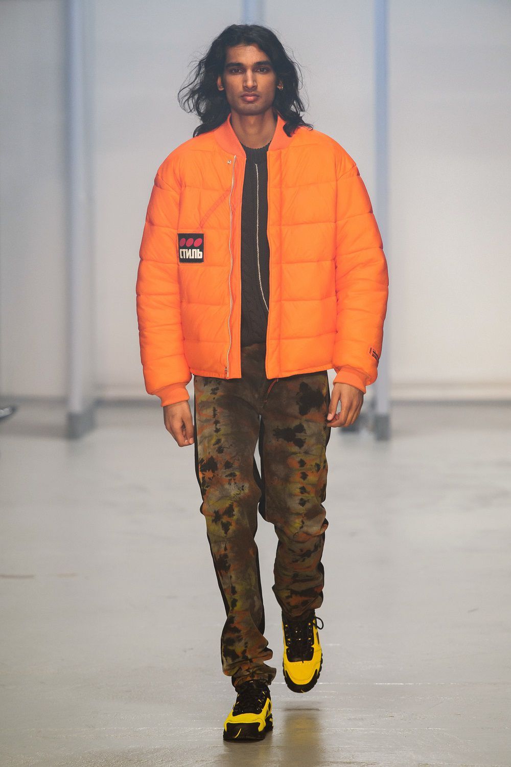
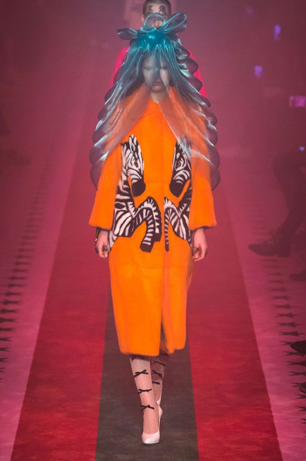
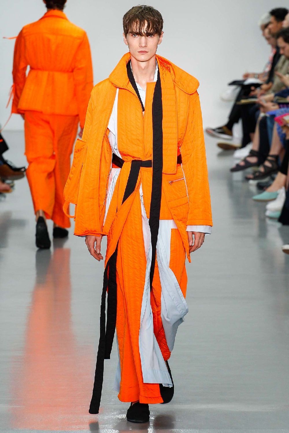
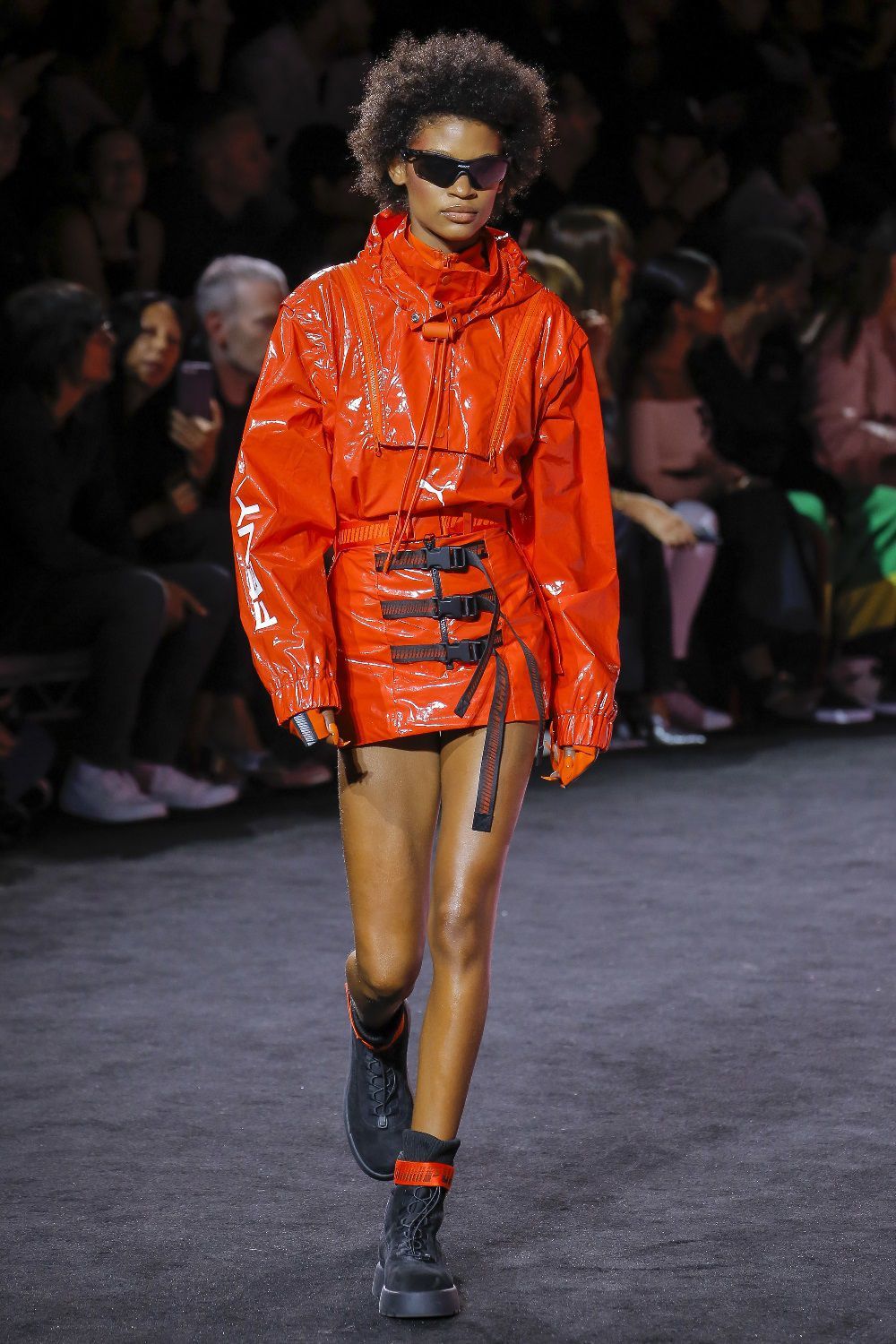
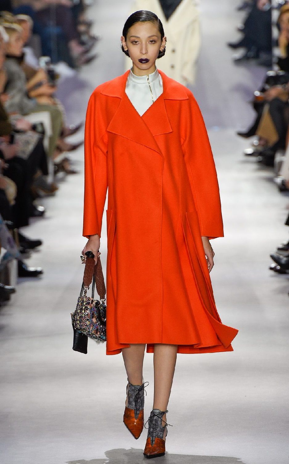
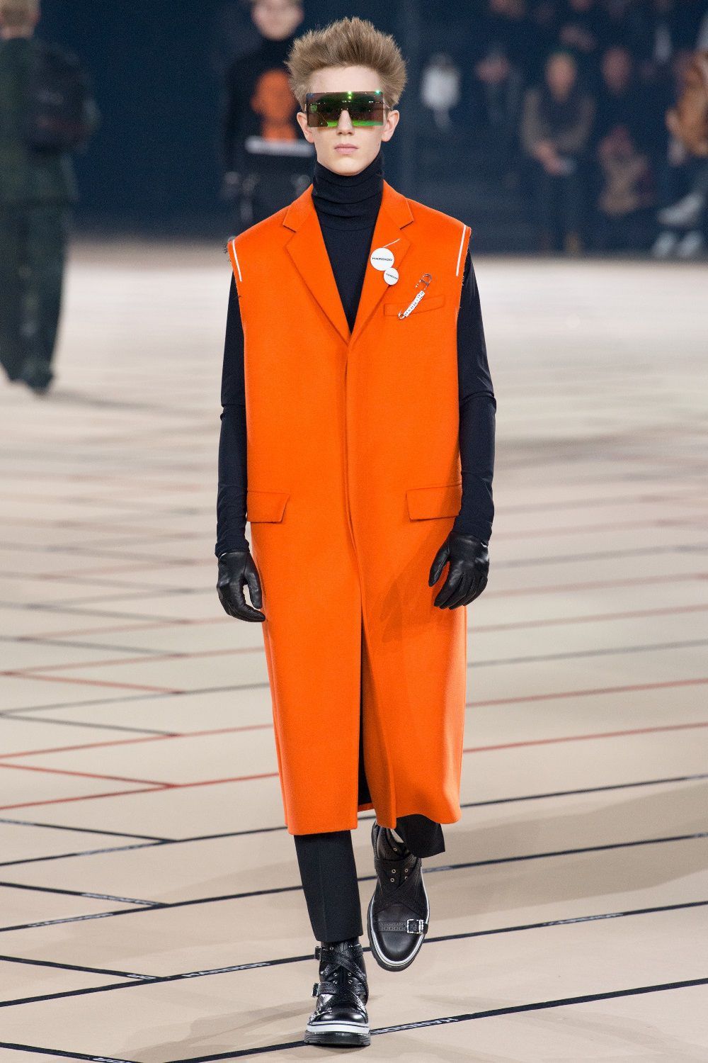
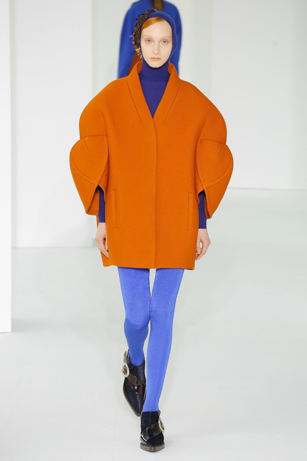
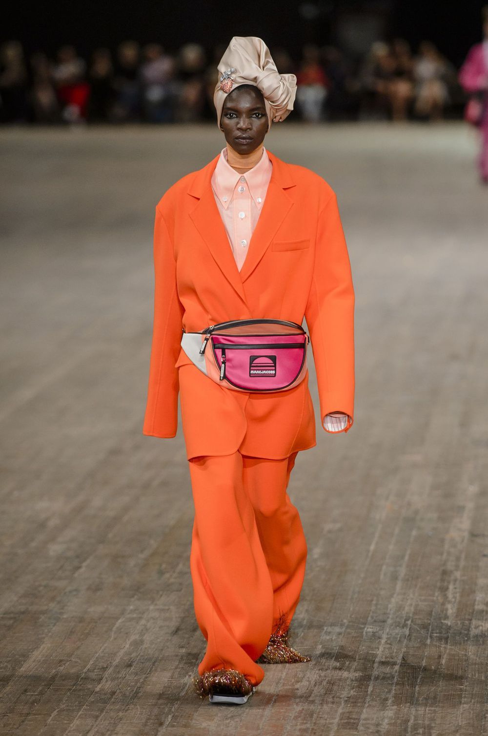
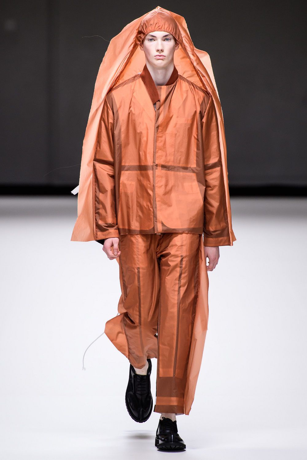
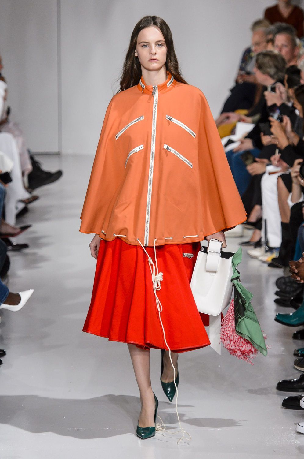
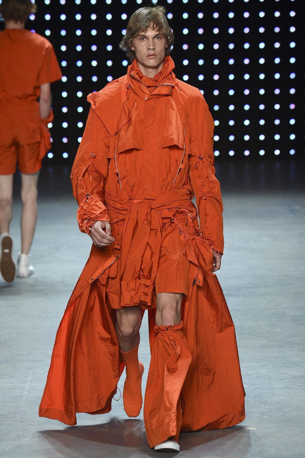
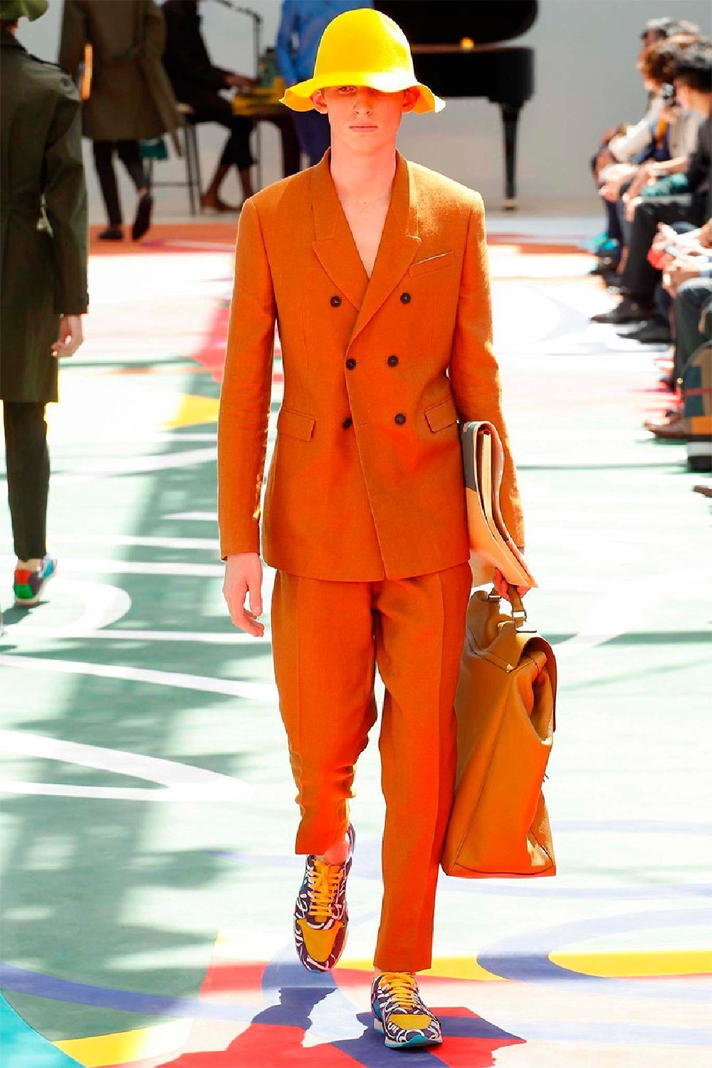
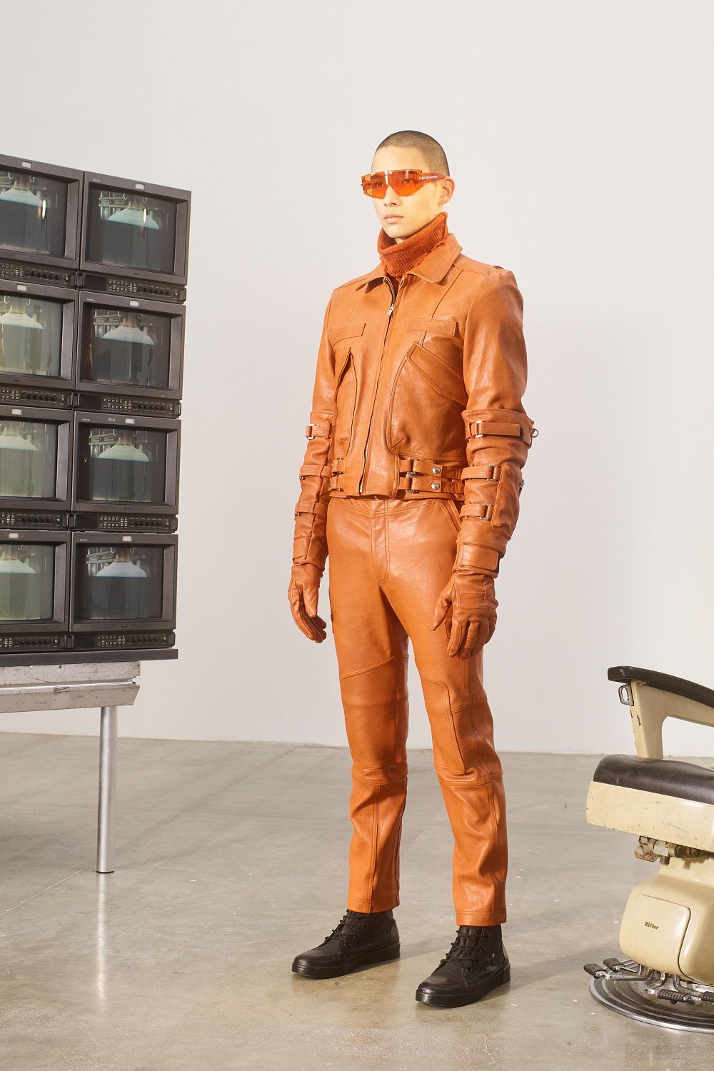
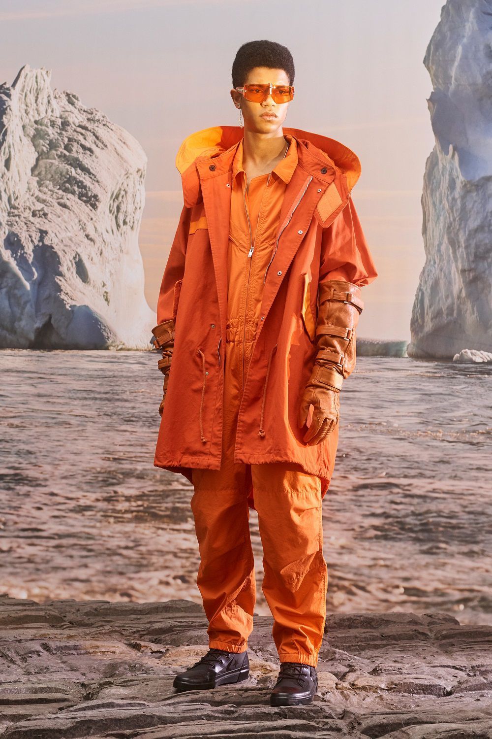
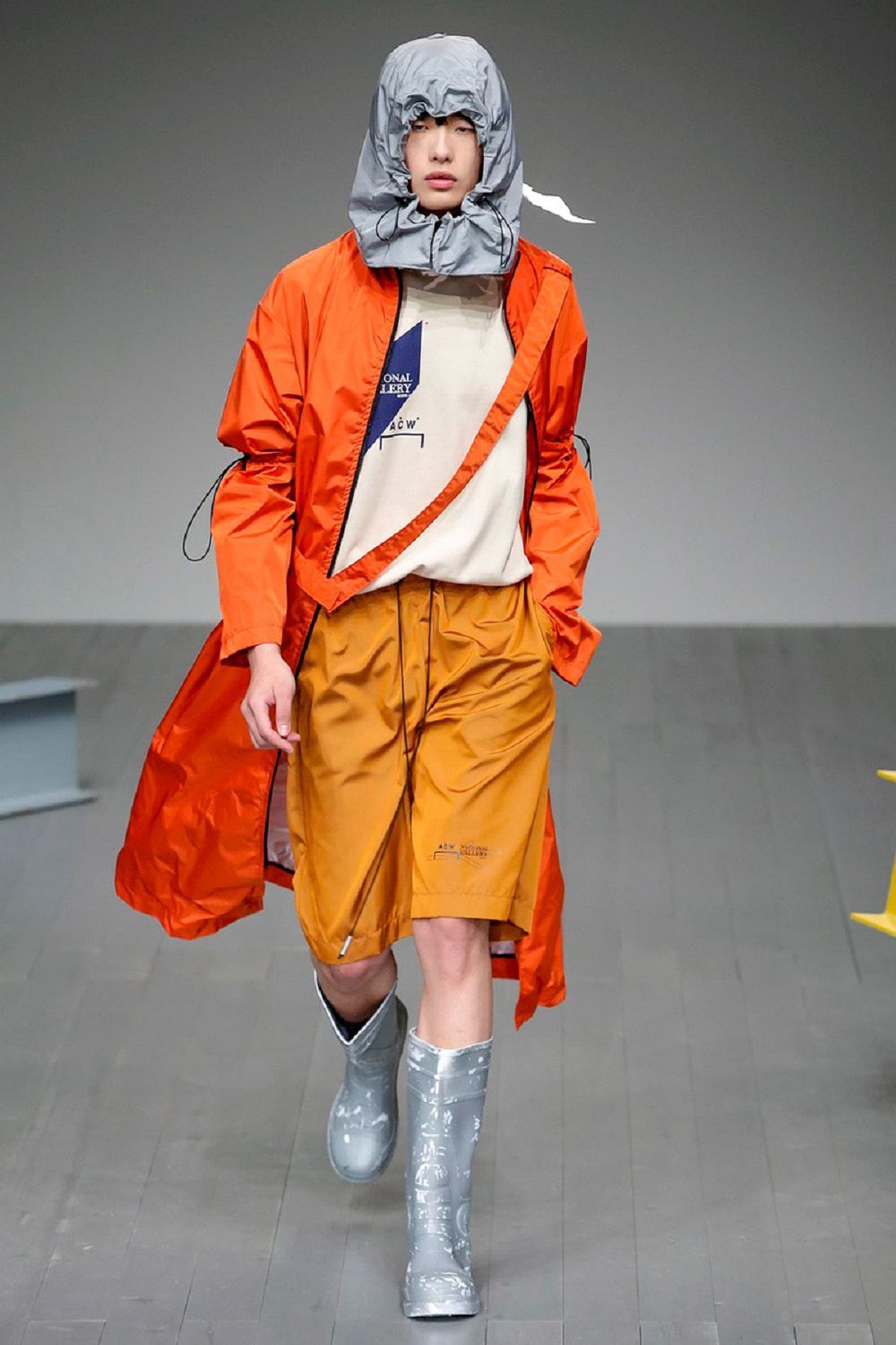
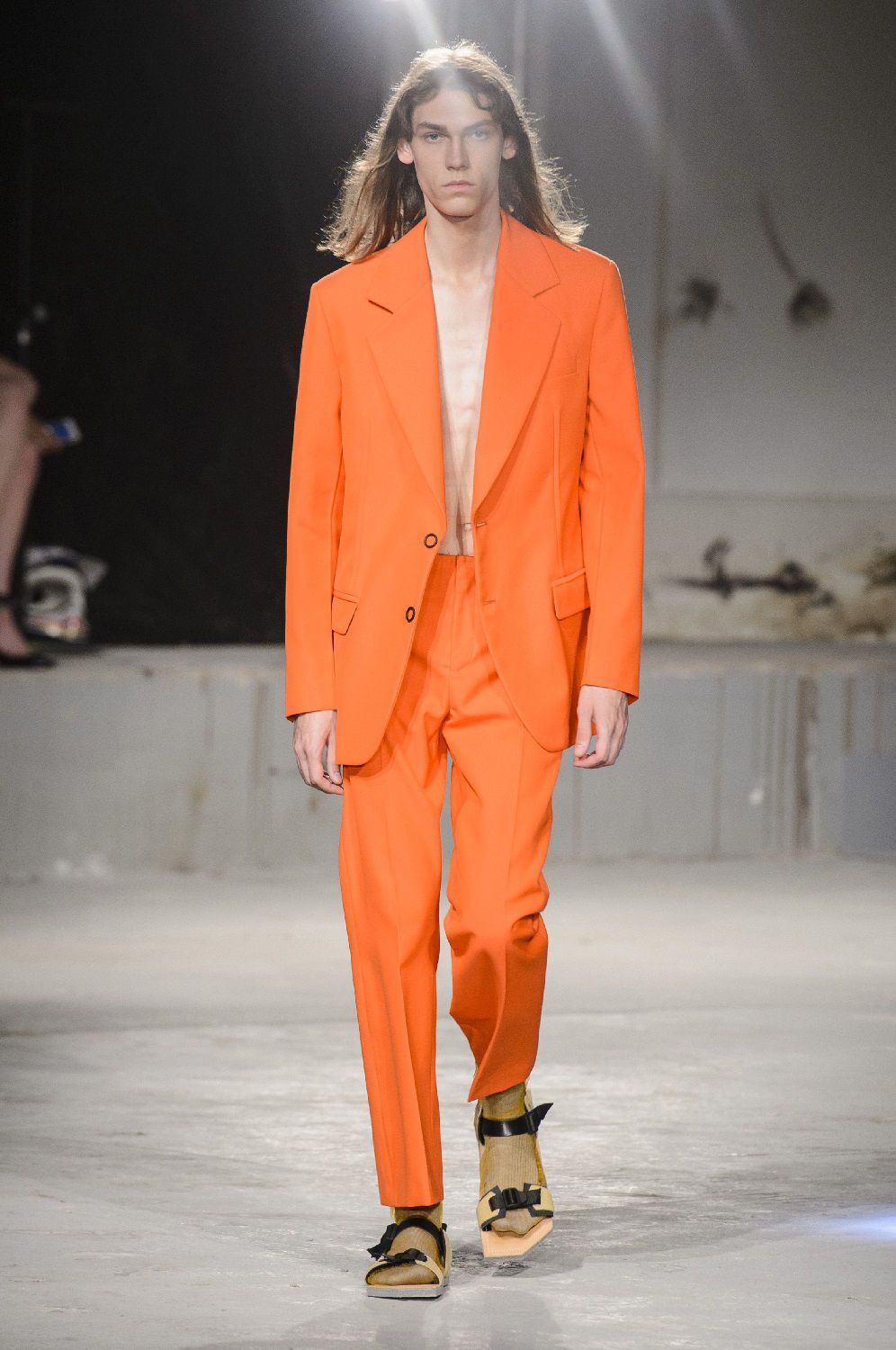
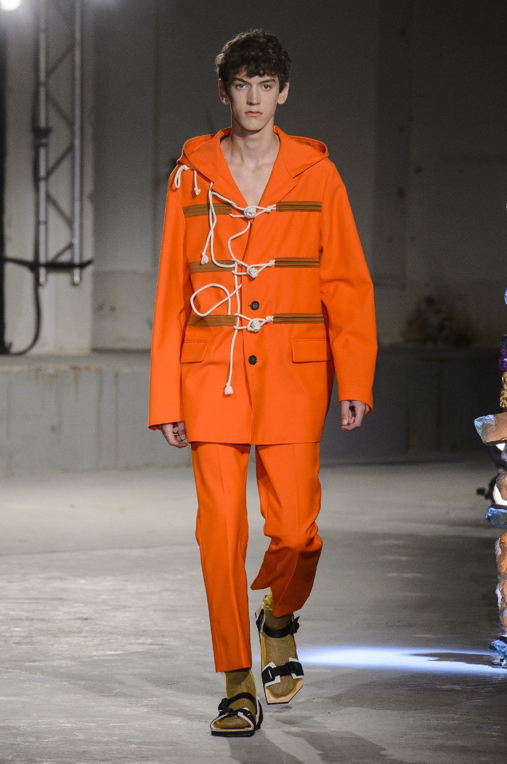
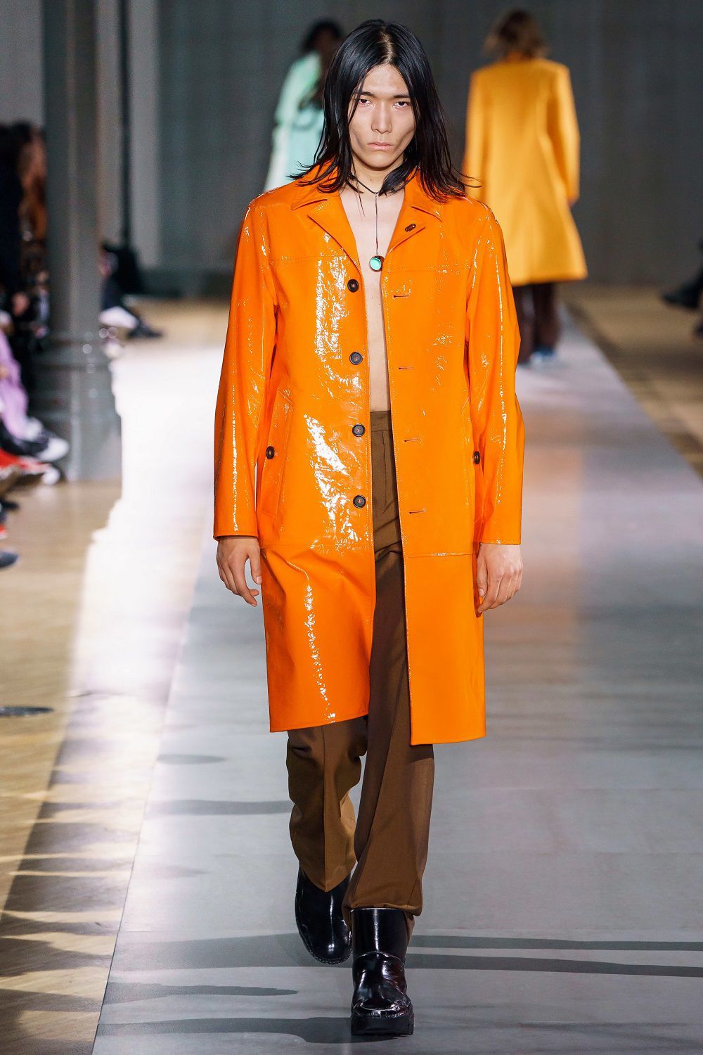
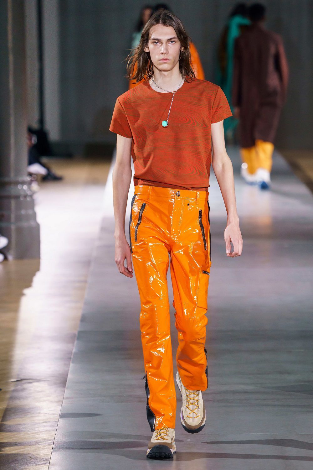
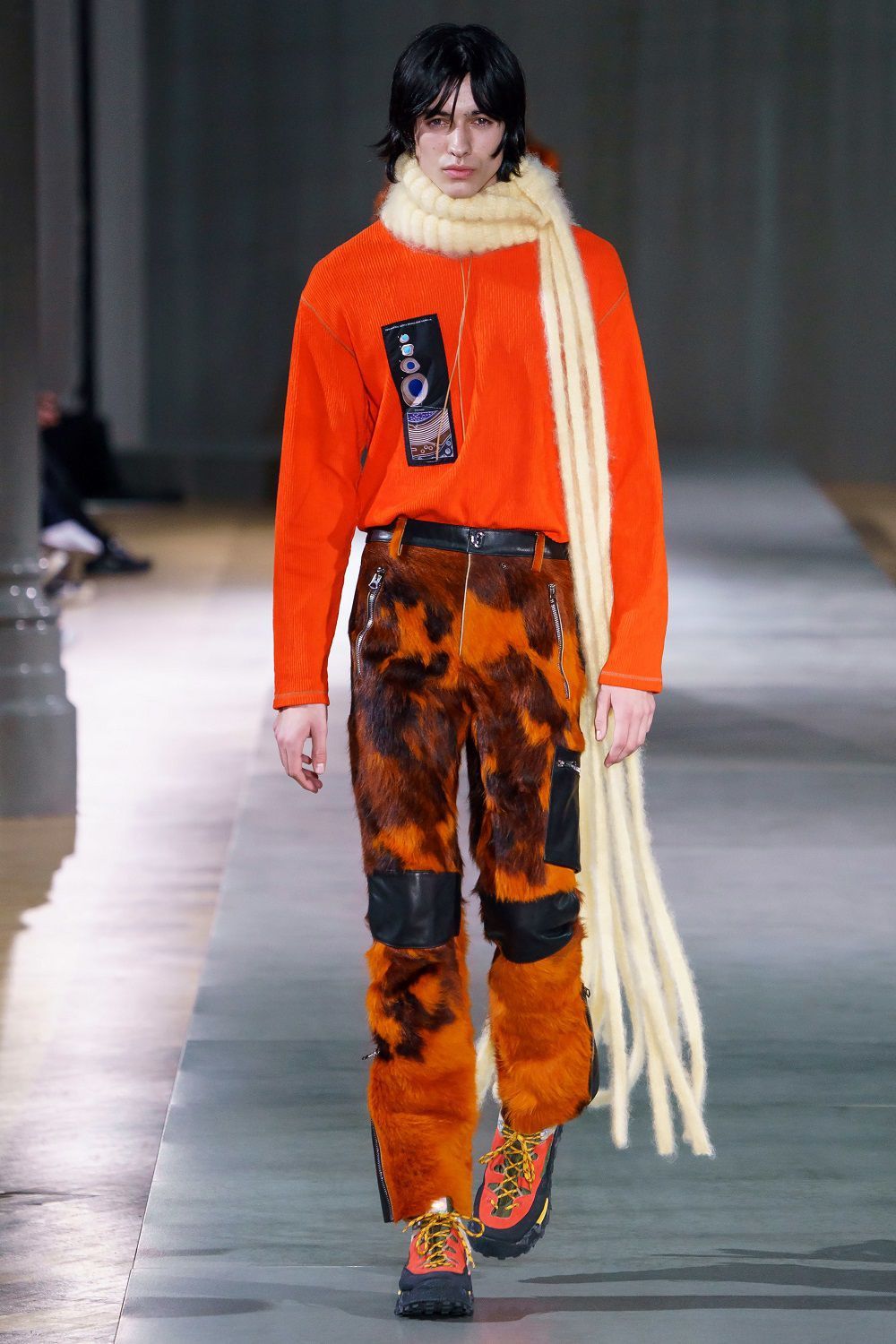
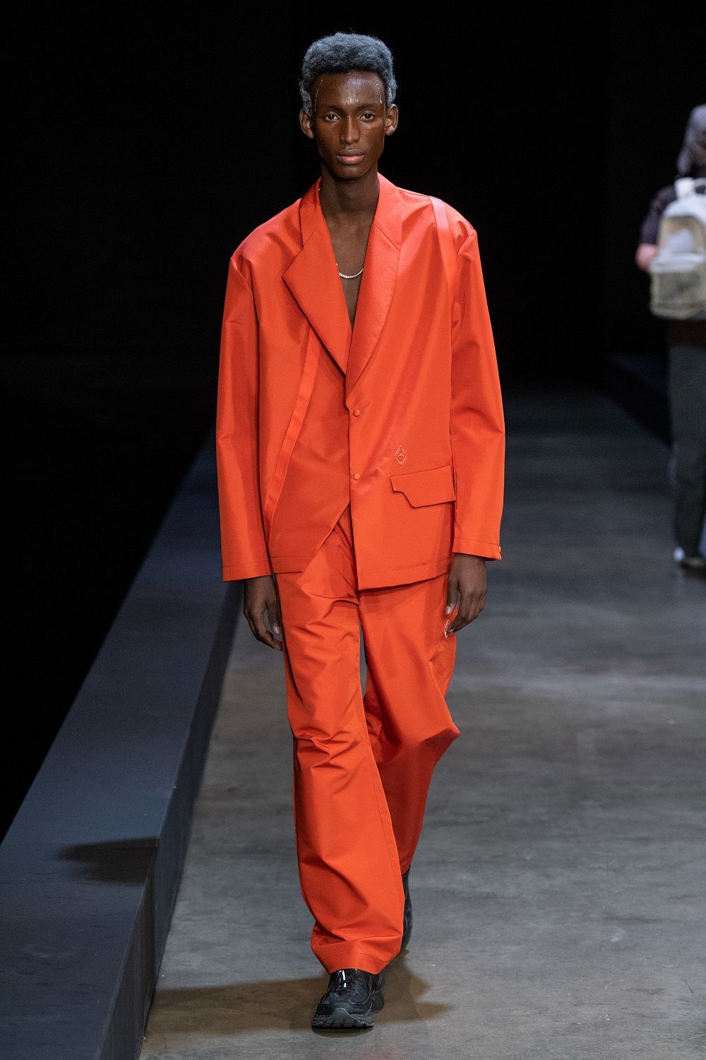
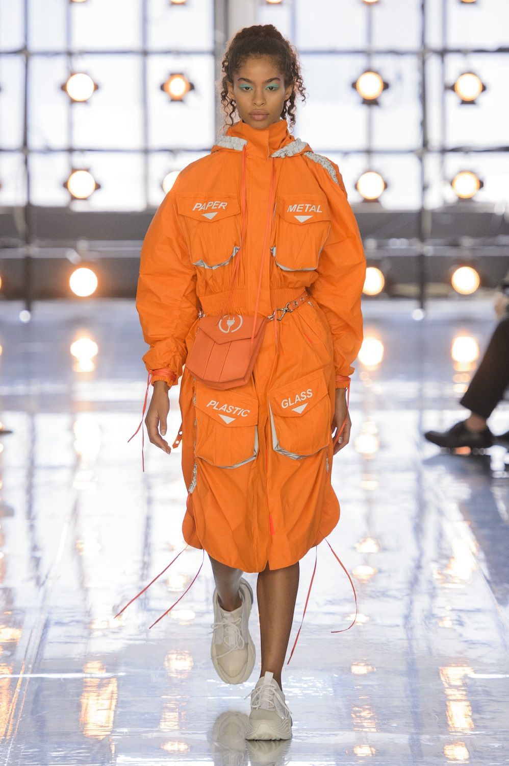
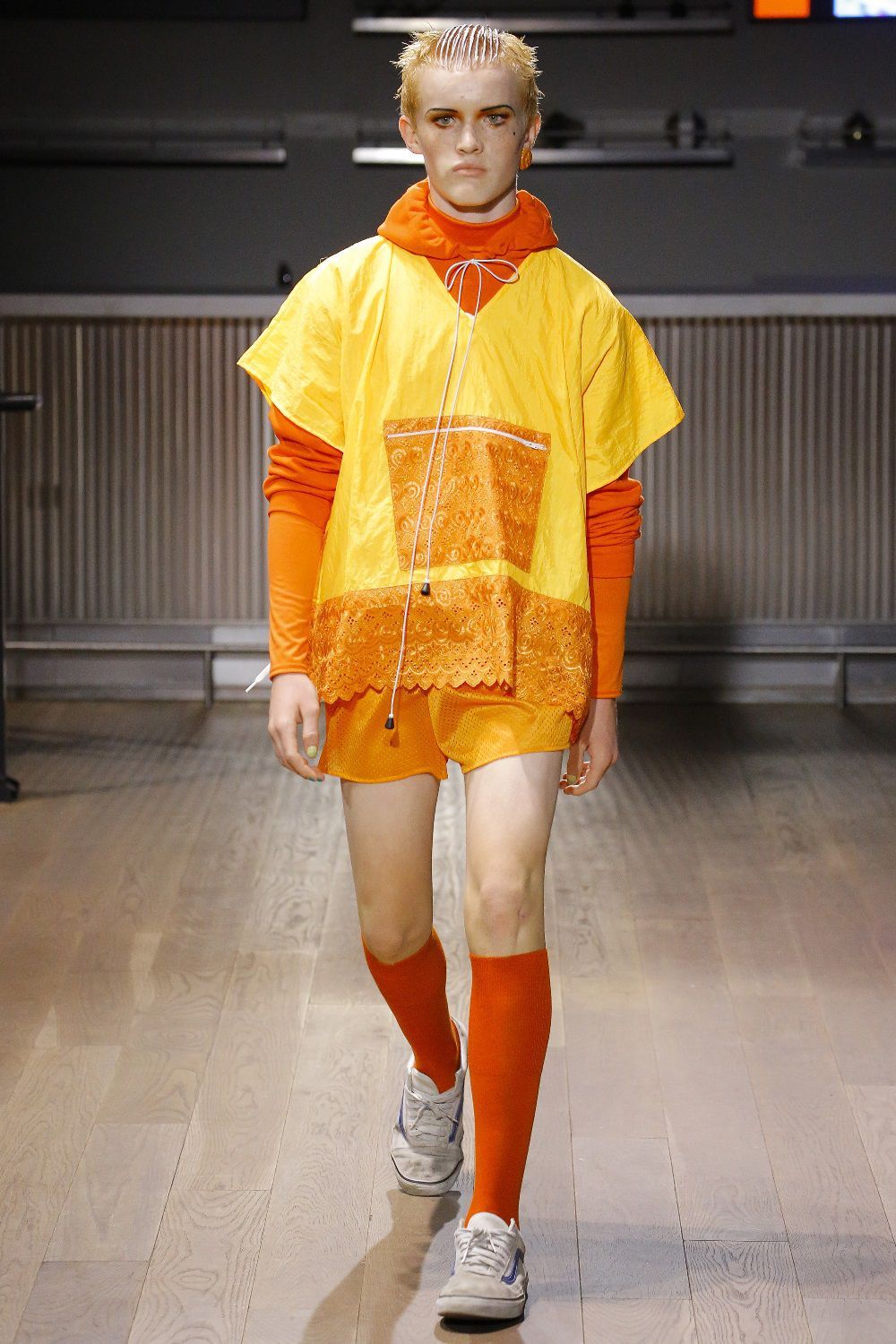
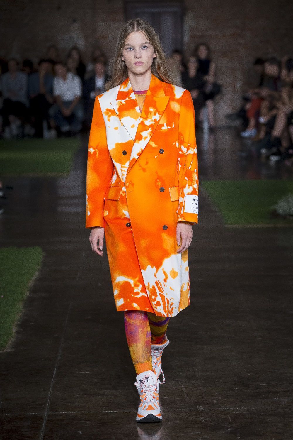
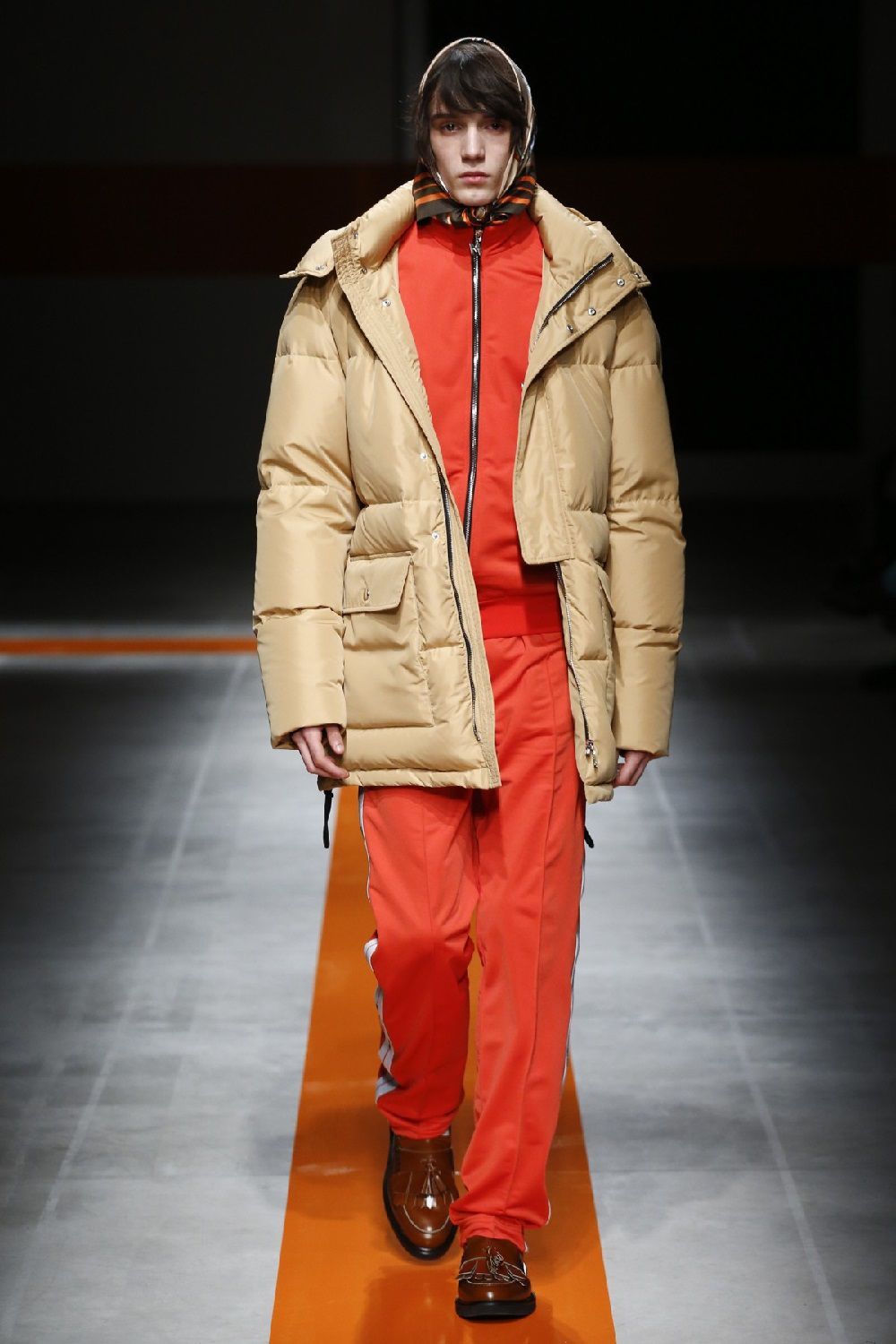
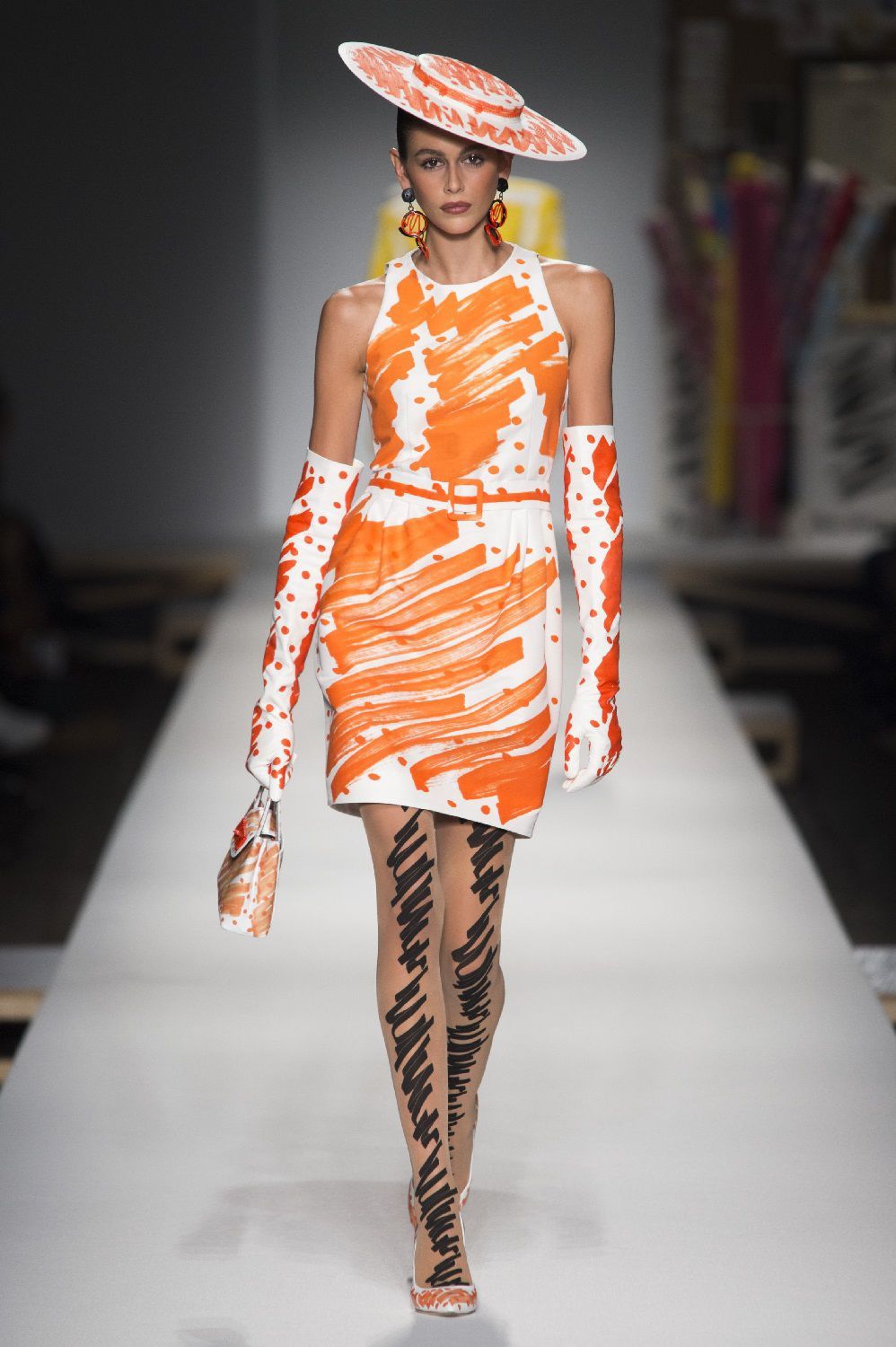
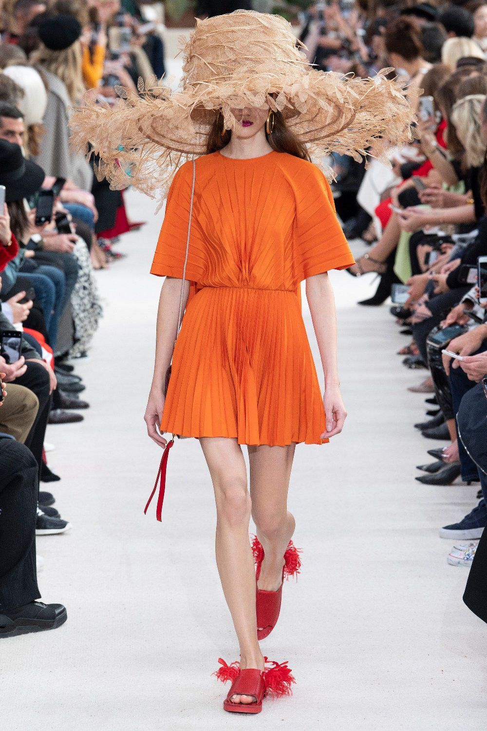
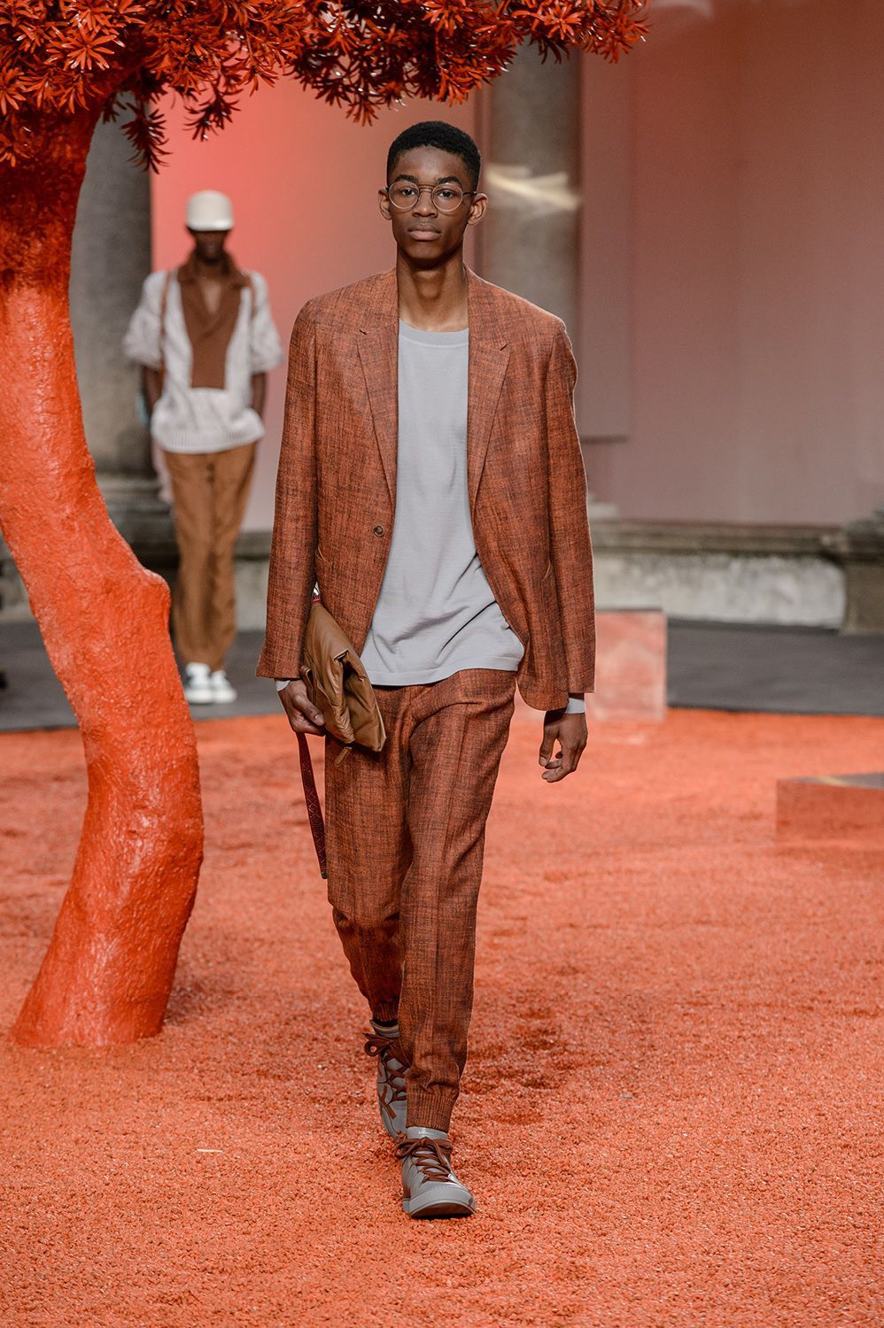
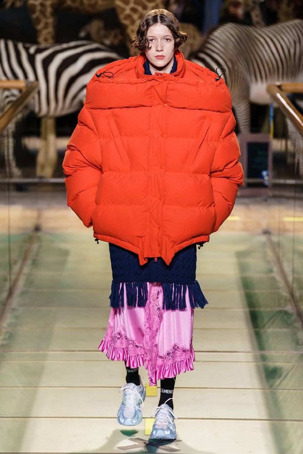
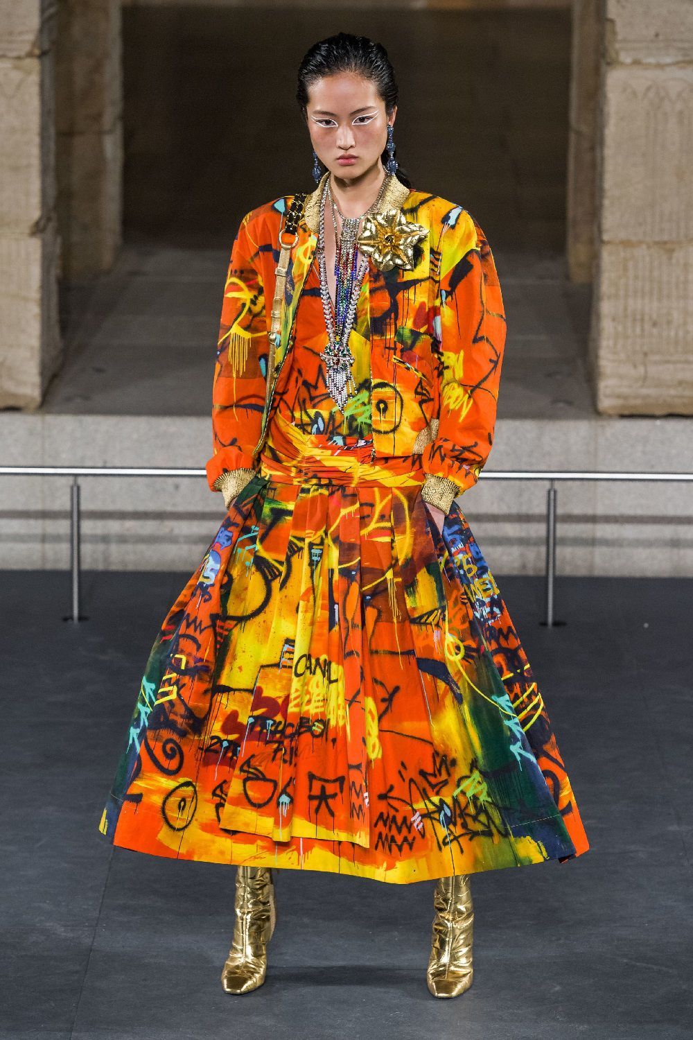
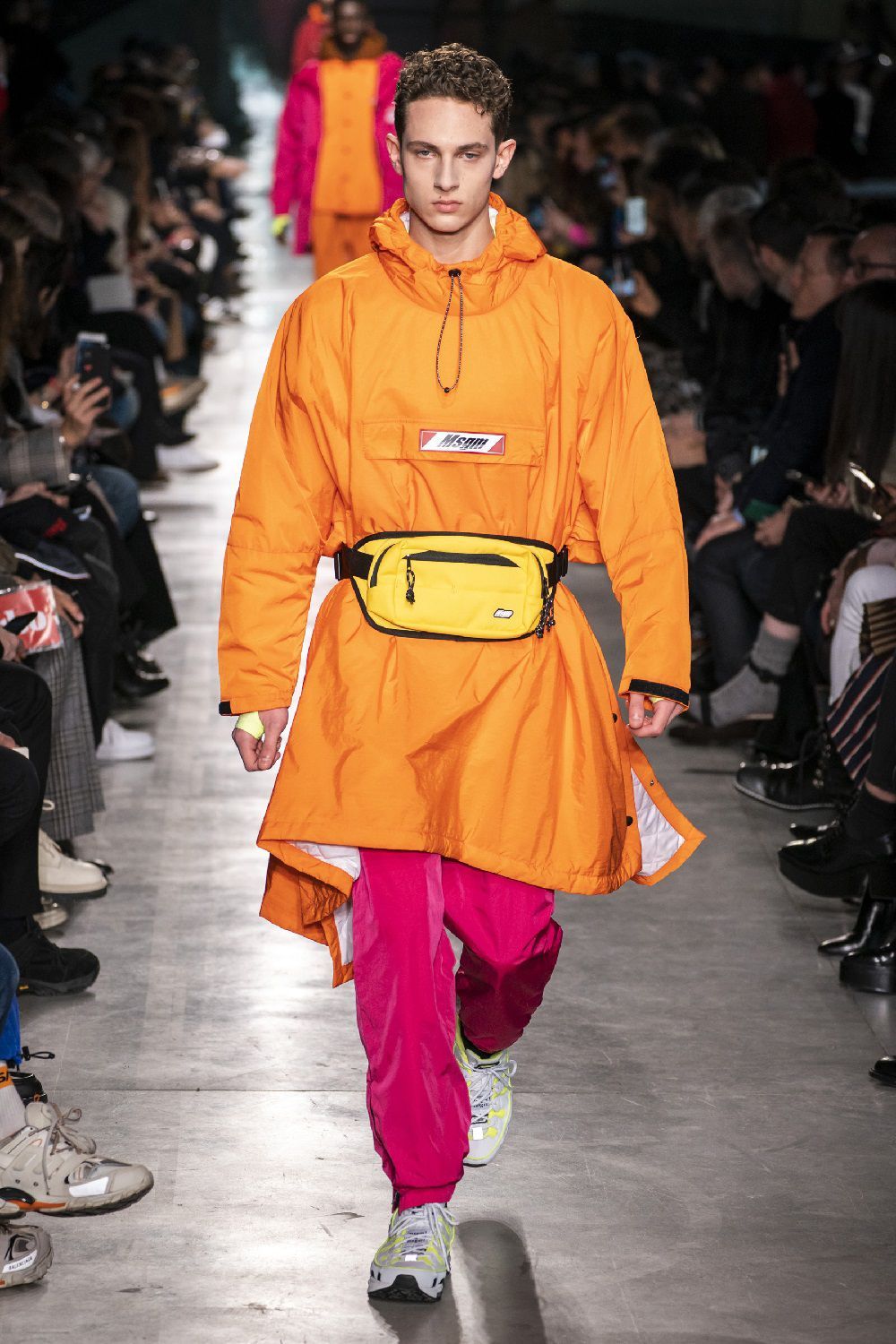


If you have taken a look at the fashion week dedicated to the FW19 menswear, it is impossible that you have not noticed: orange is the hottest color of the moment. From Off-White graphic hoodies to Heron Preston puffer jackets, from AMBUSH total looks to MSGM k-way, from Loewe oversize knitting to the sophisticated Raf Simons trench, from A-COLD-WALL conceptual workwear to leather garments lucid by Acne Studios every designer has chosen to include in his creations at least a pinch of this shade.
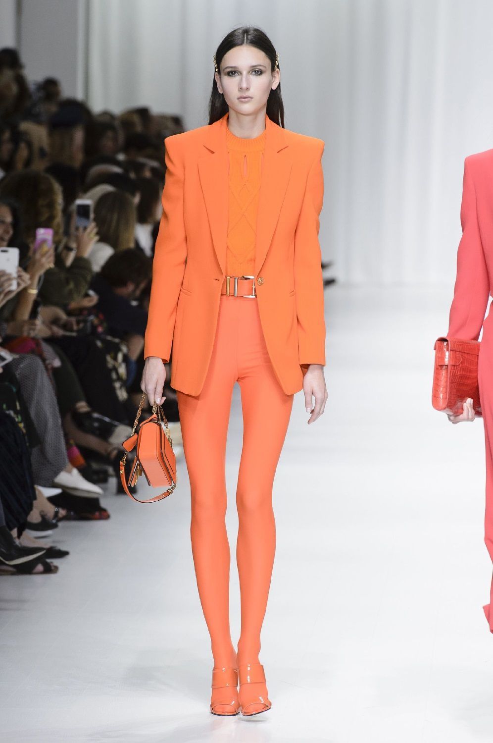
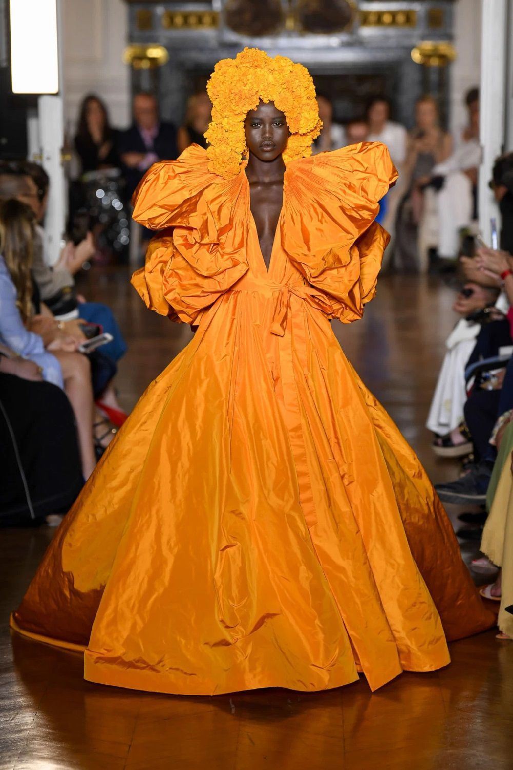
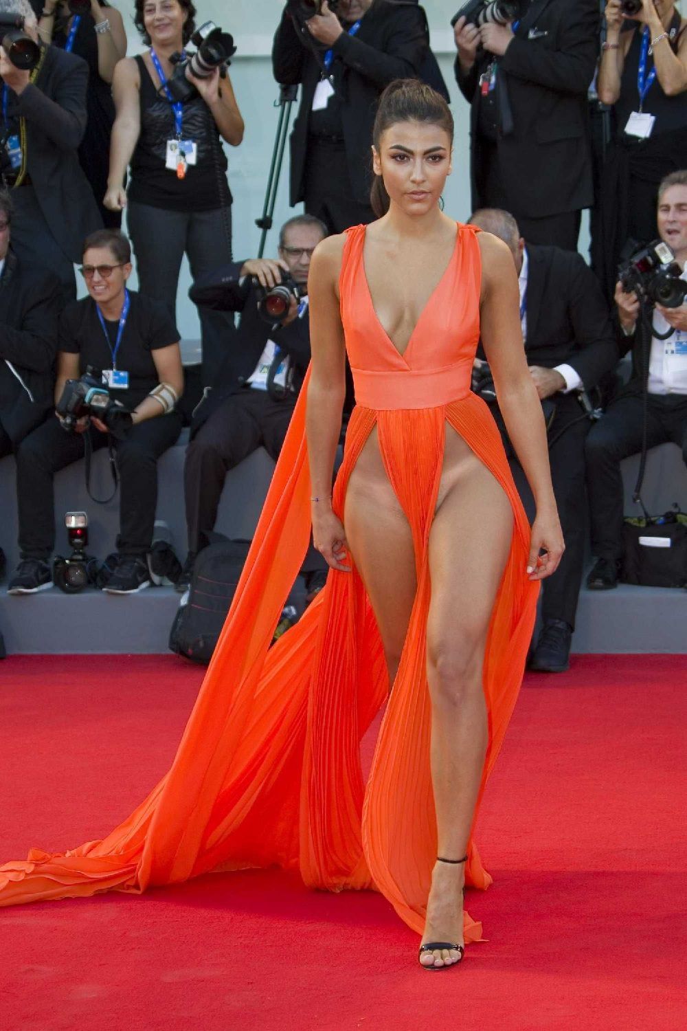
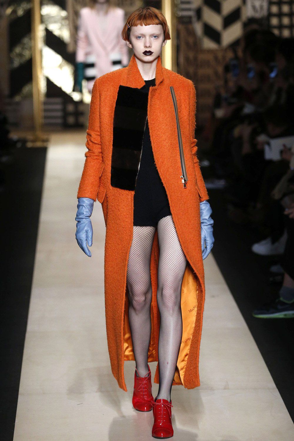
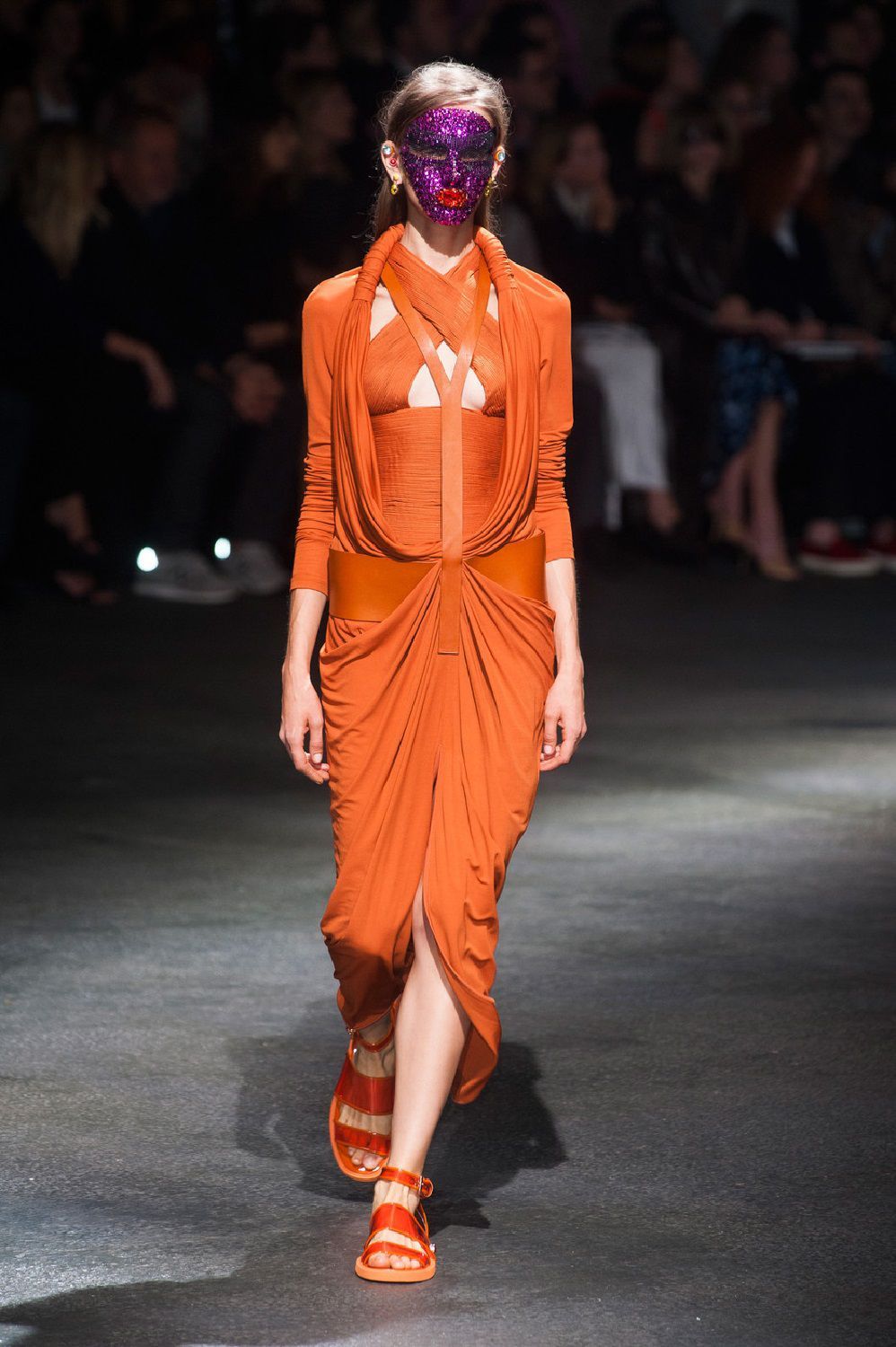
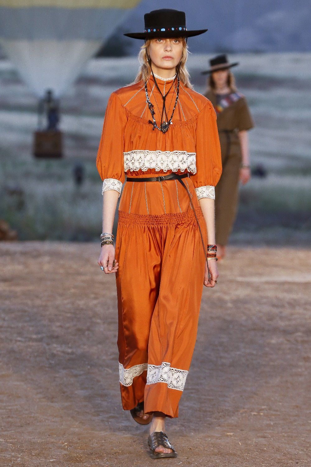
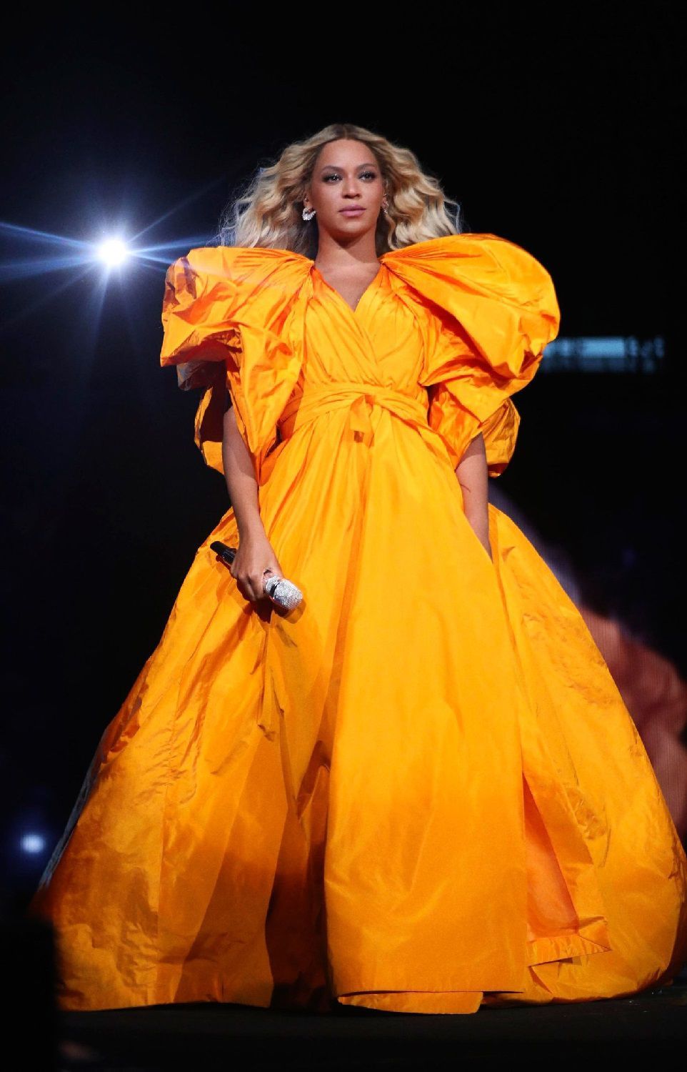
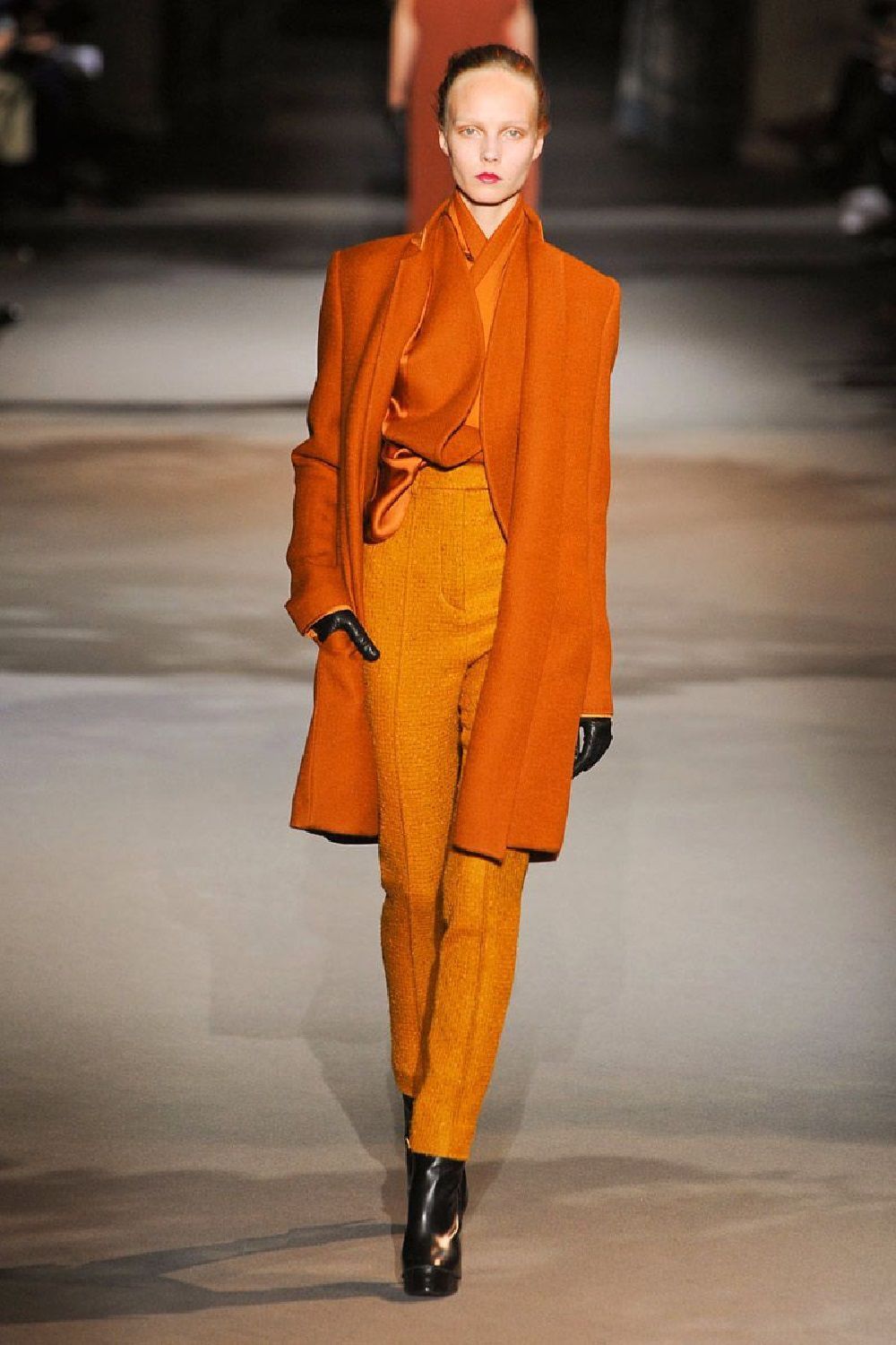
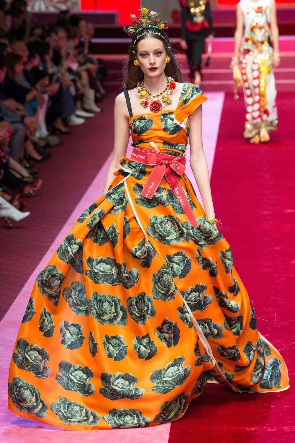
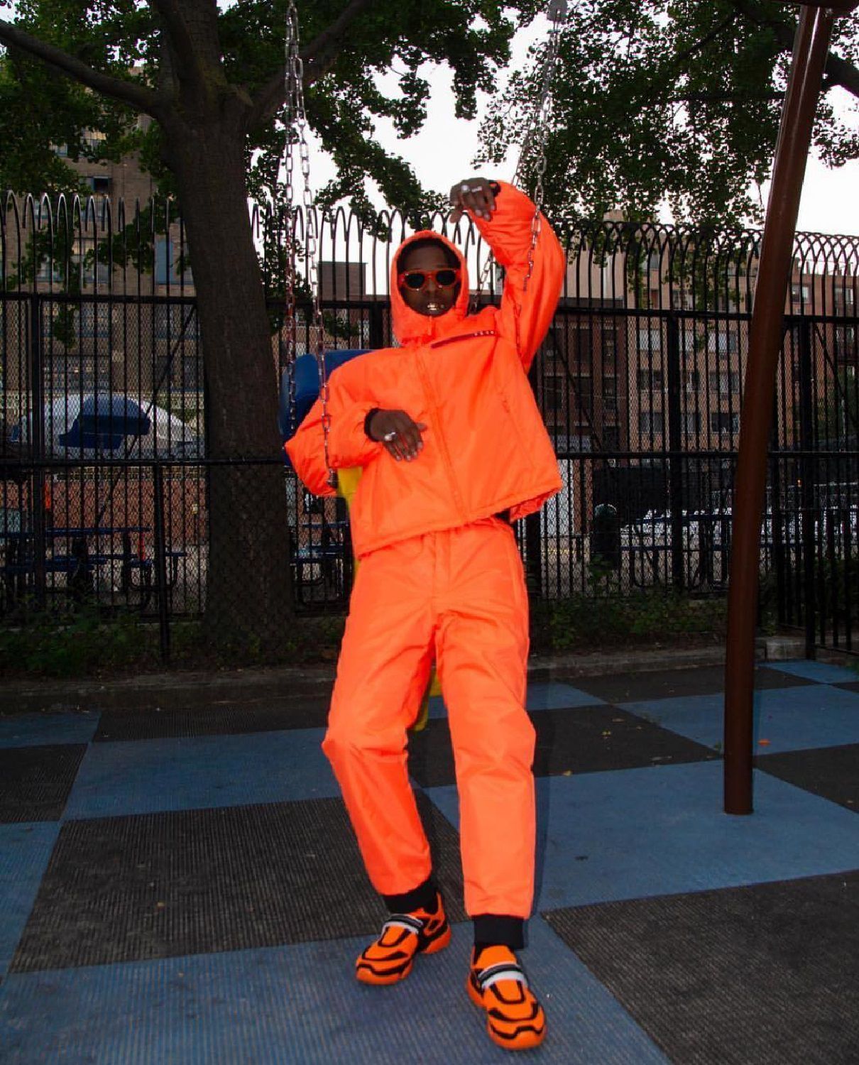
There are those who opt for the romantic shades of autumn foliage or for vitamin variations that remind the summer, some prefer the more brownish veins like the rust of PANTONE 16-1448 TCX (according to real fashionistas the true trend in the coming months, even more than the PANTONE 16-1546 Living Coral selected as official color of 2019) and those who love sweet pastel shades like peach, but the variant that nobody can resist seems to be that vibrant and phosphorescent one, the same that became the trade mark of the Heron Preston brand. Every nuance are okay if they're in the spectrum radiations between red and yellow.
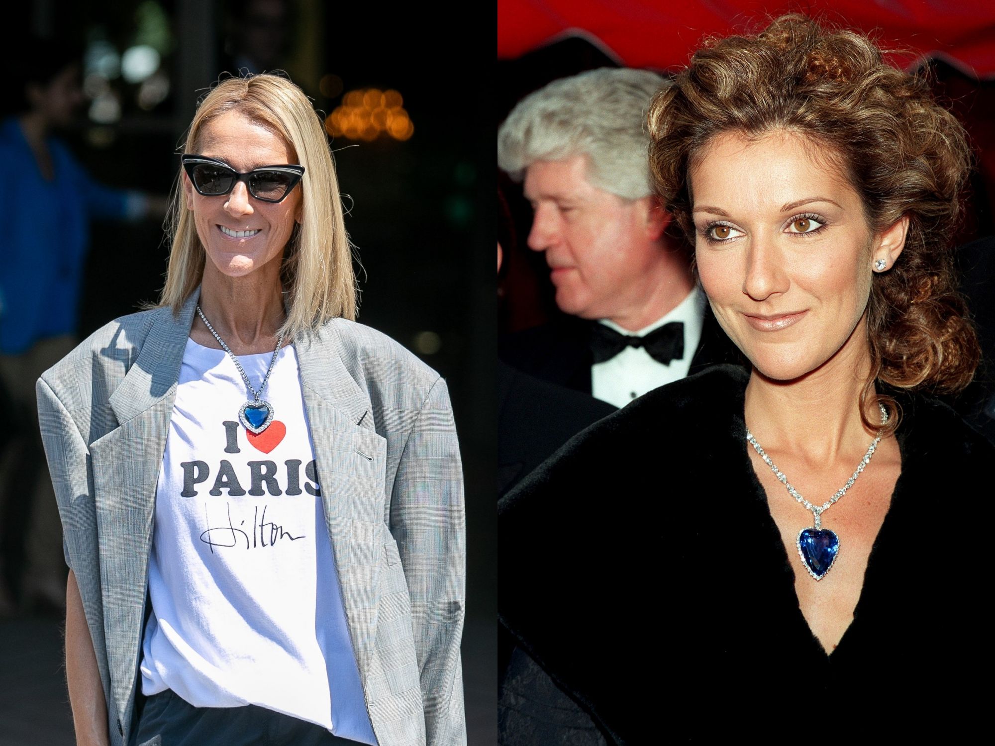
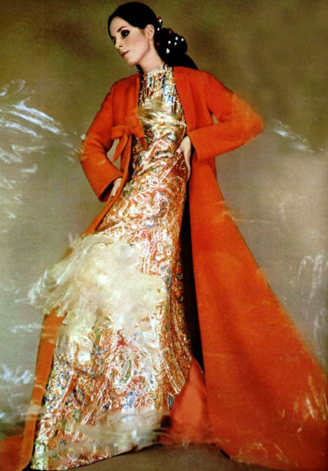
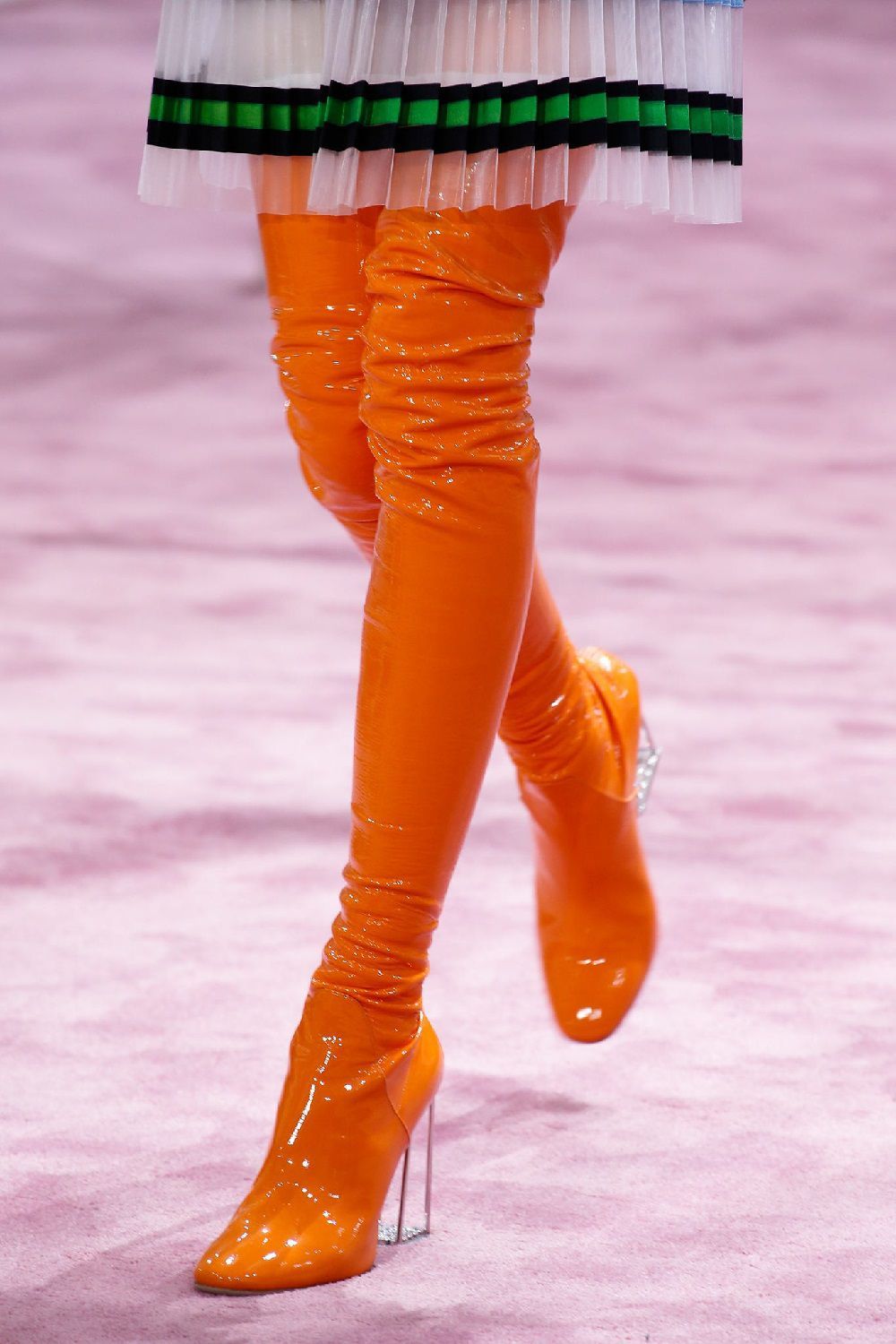
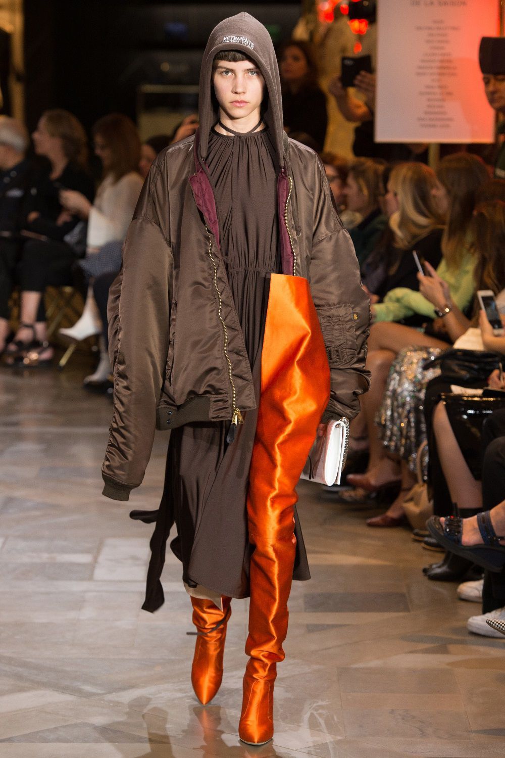
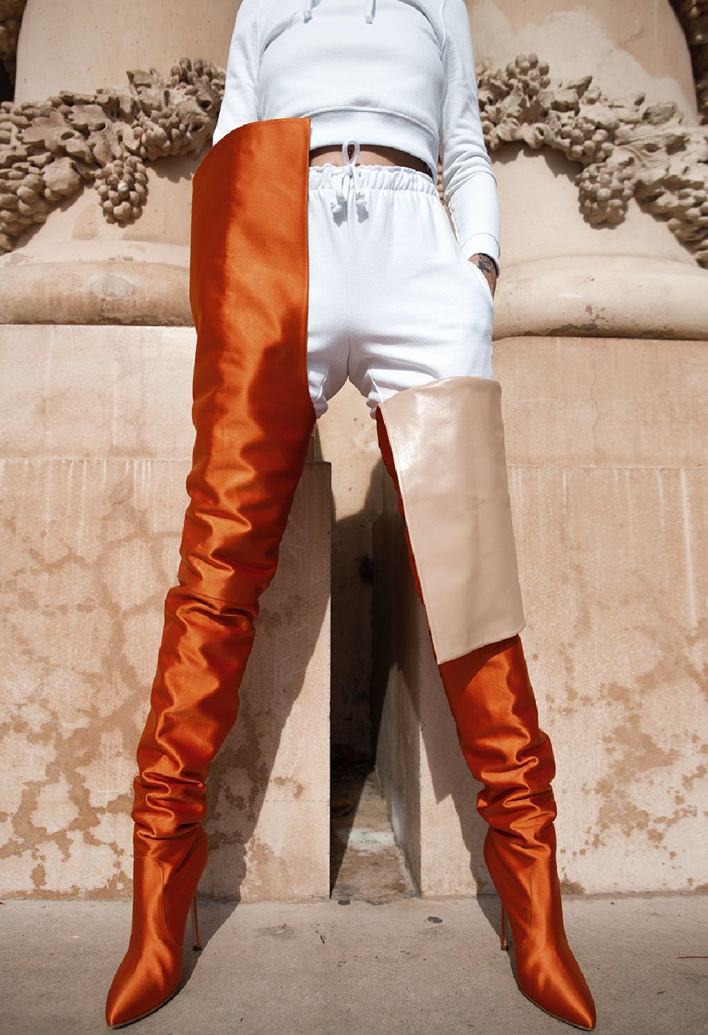
This passion that combines orange and fashion is quite recent, evidenced by items as the vinyl boots of Christian Dior Couture Spring 2015 or those in satin Vetements x Manolo Blahnik.
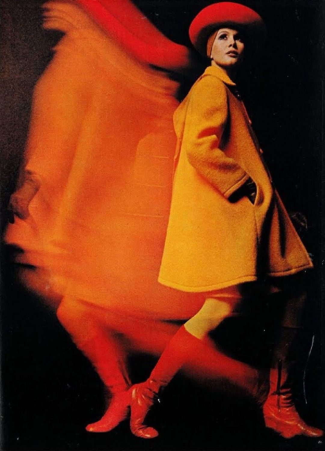
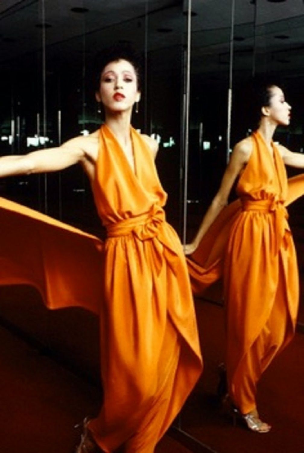
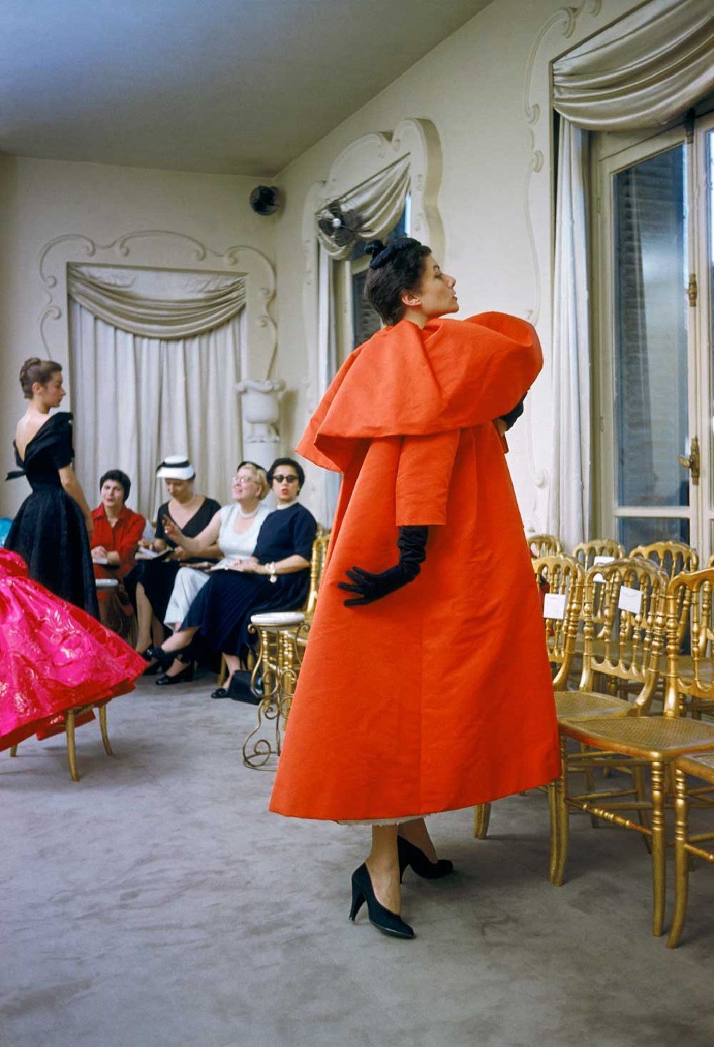
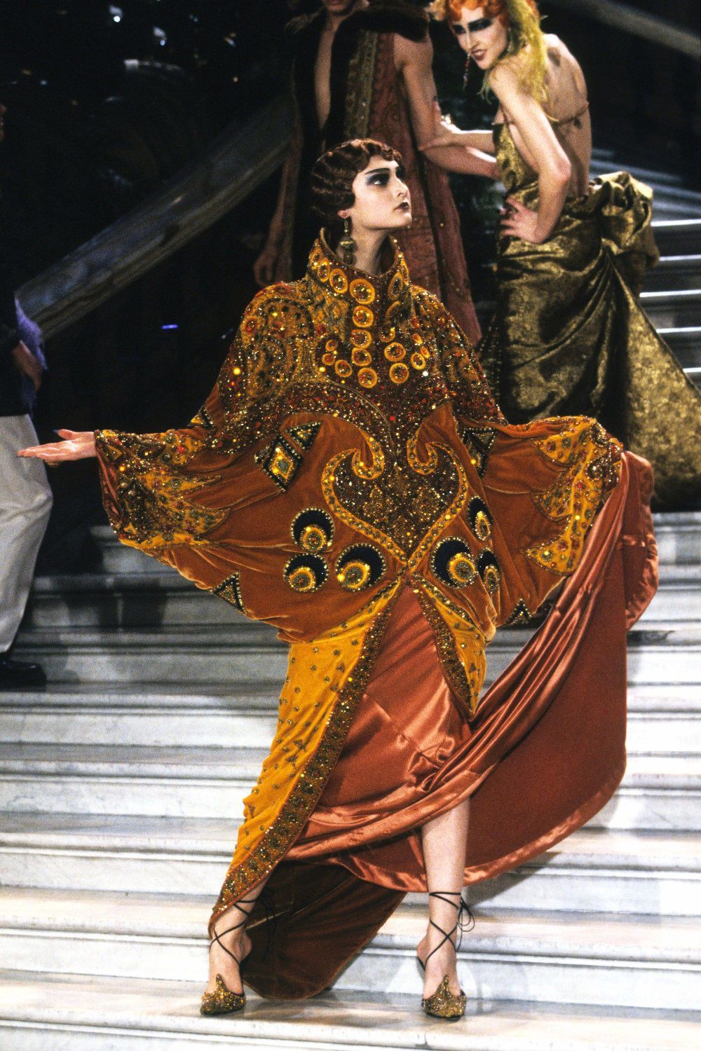
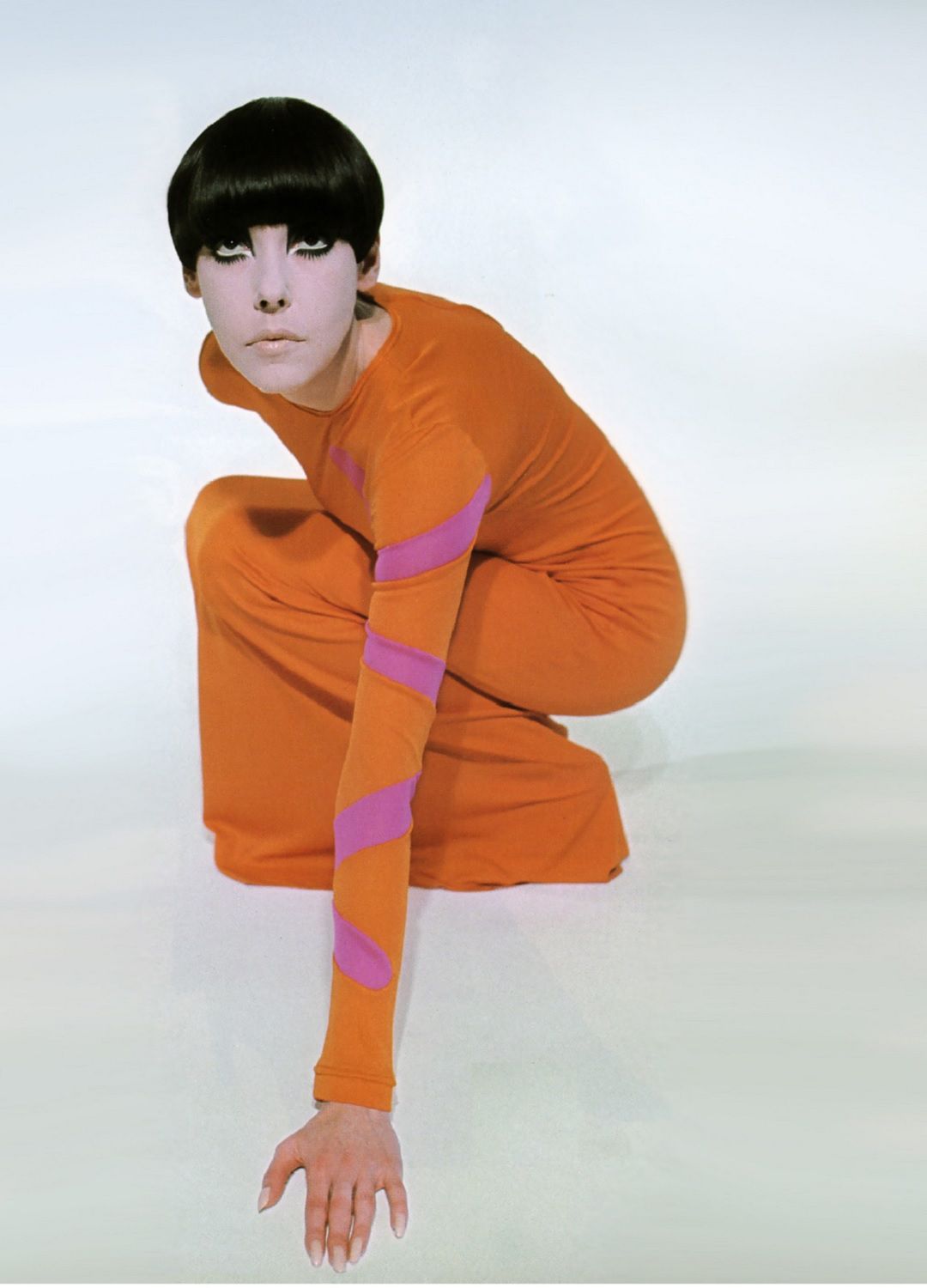
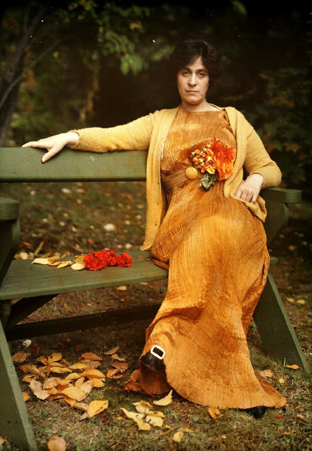
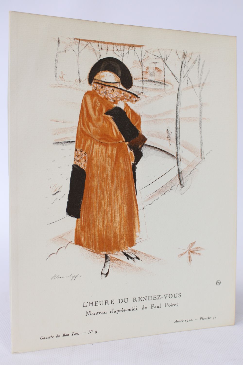
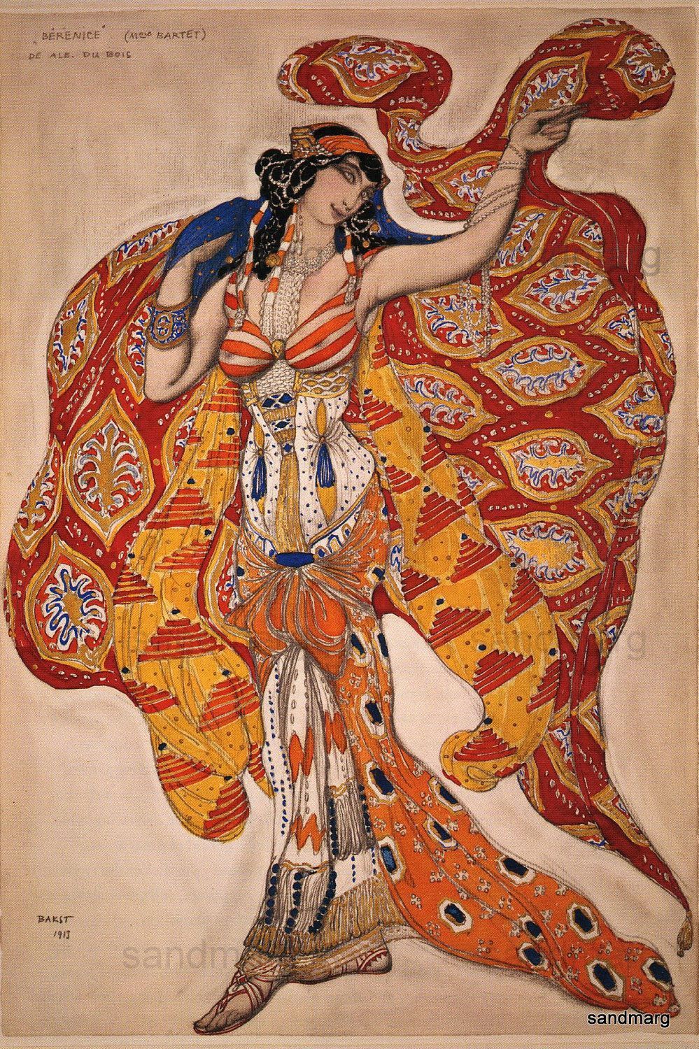
Their love story is made of ups and downs, elusive infatuations and long periods in which this tint was only a flash of light, deep and vivid, in monochromatic collections. In the early 1900s Leon Bakst inserted it profusely in his costumes for the Ballets Russes and the same Paul Poiret in the following decades influenced by oriental aesthetics that had a symbiotic relationship with this color. The first real wave of orange-mania comes with the Sixties, with the many brilliant works of designers such as the Danish Verner Panton that, transformed into objects of common use from industrial production, begin to invade our wardrobes.
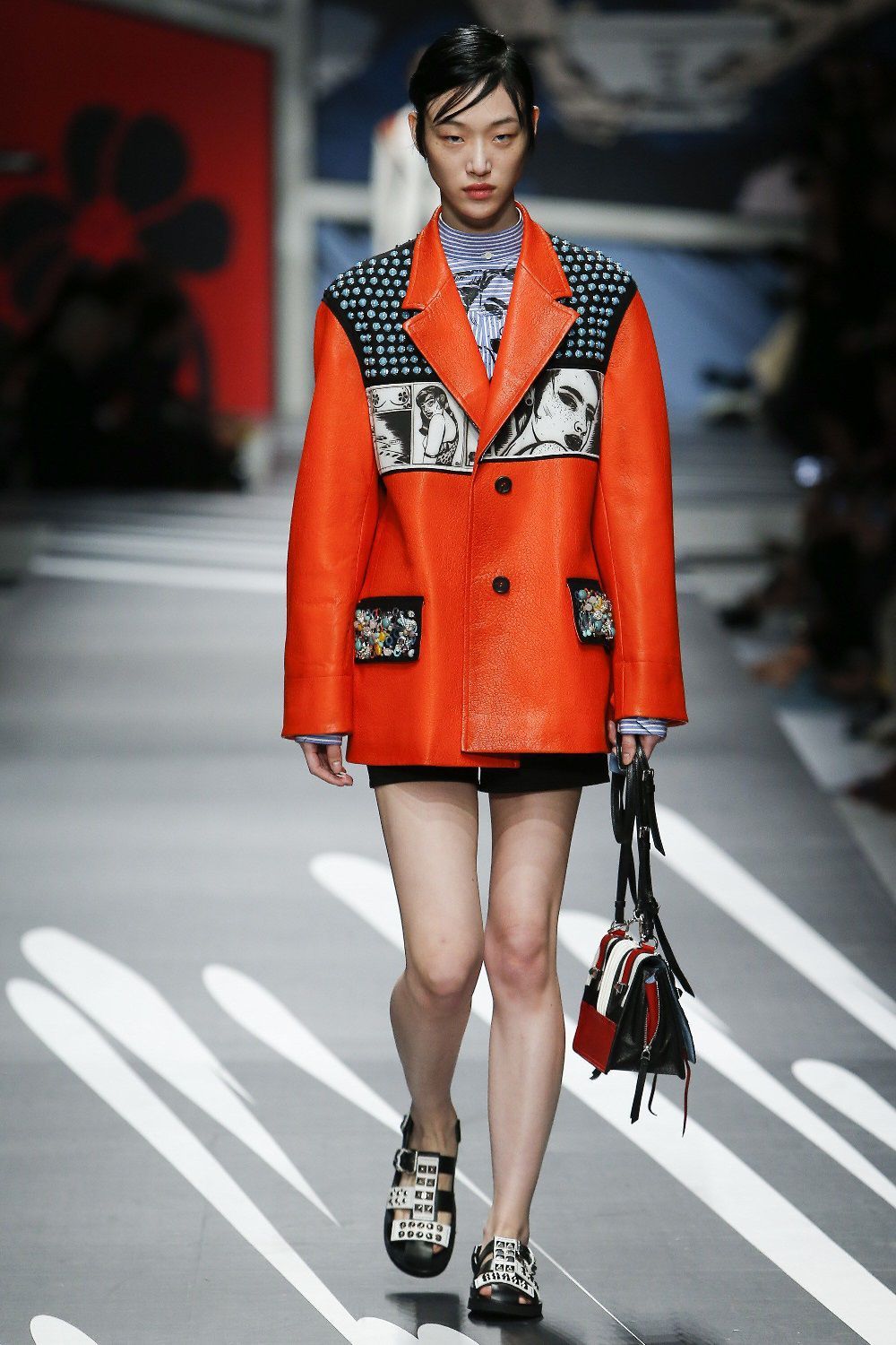
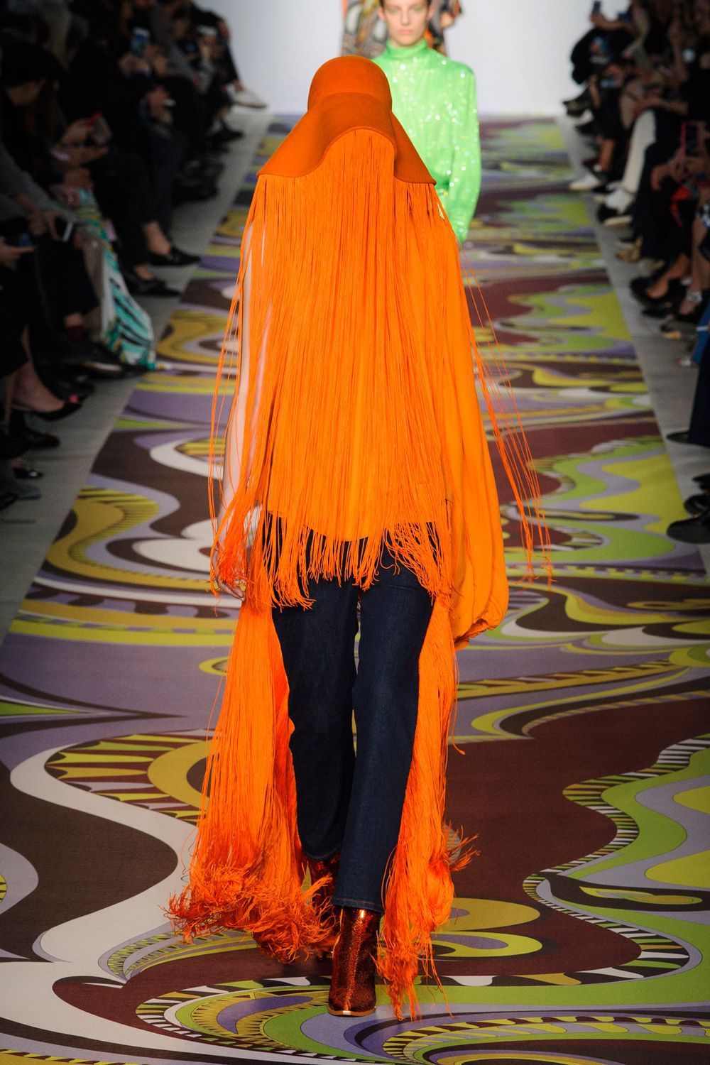
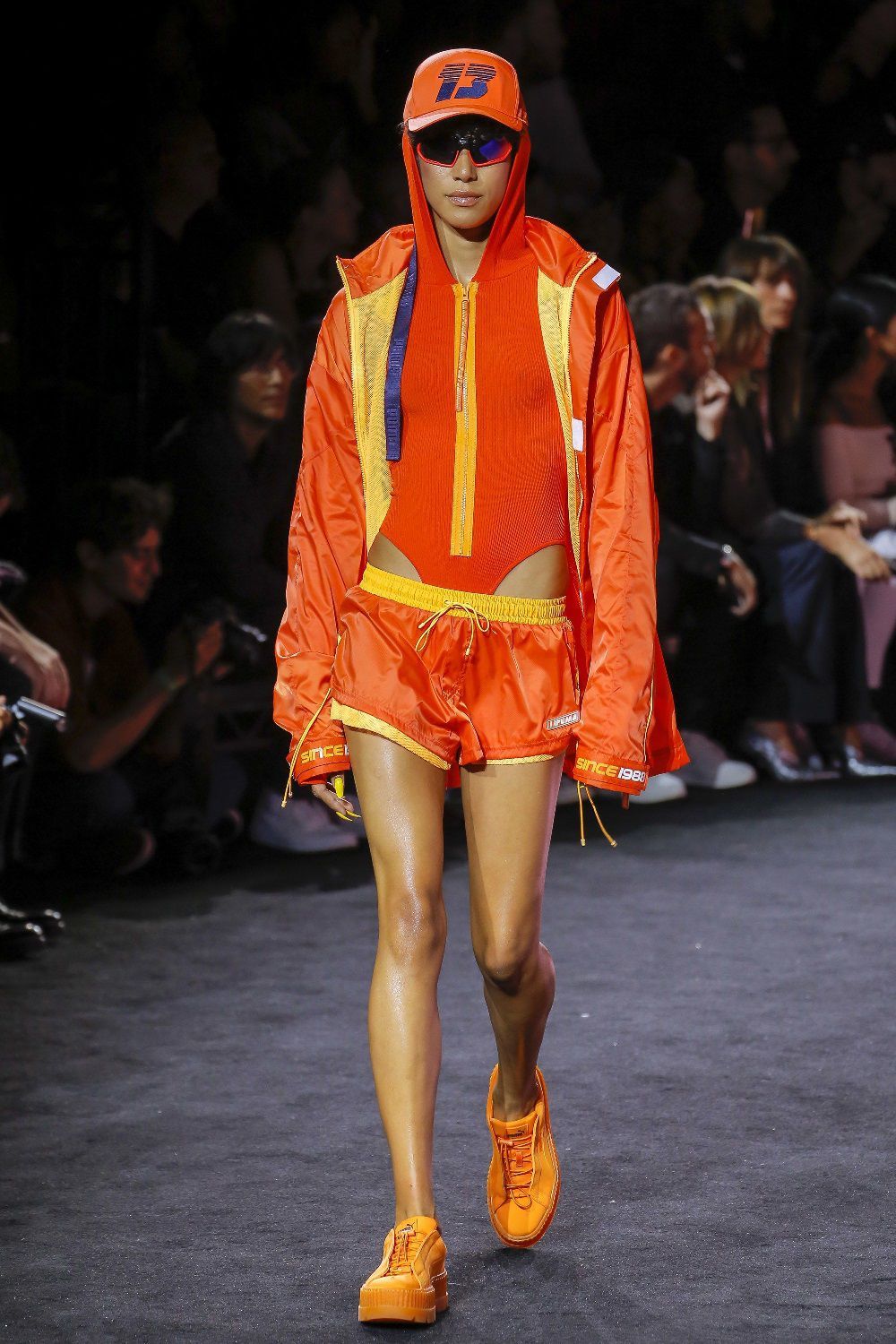
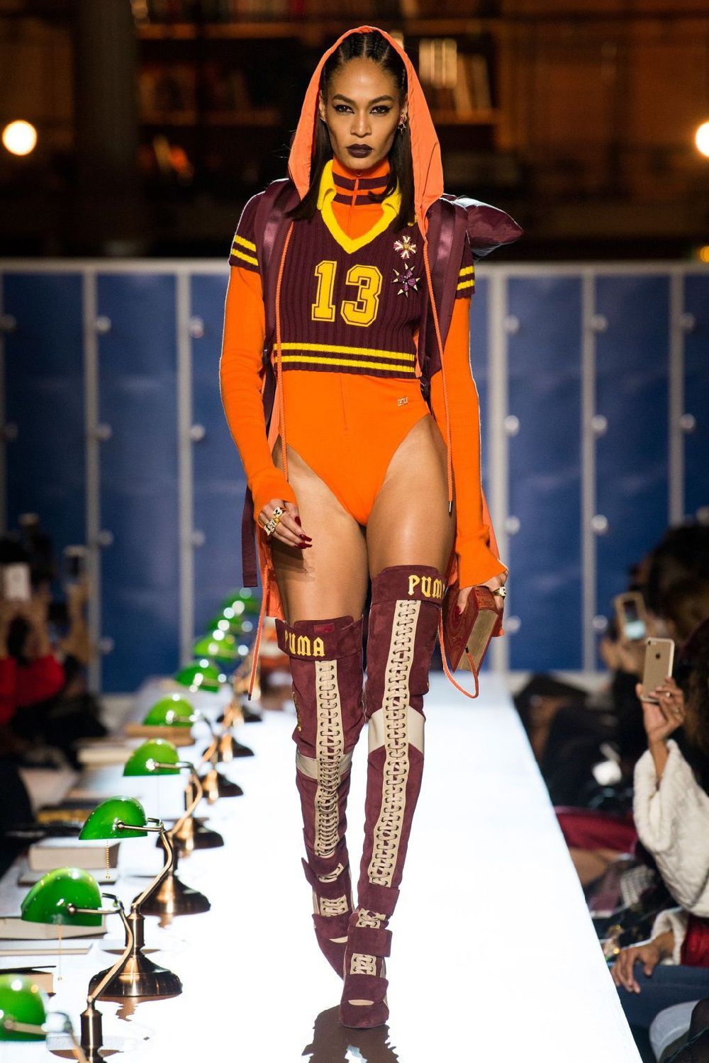
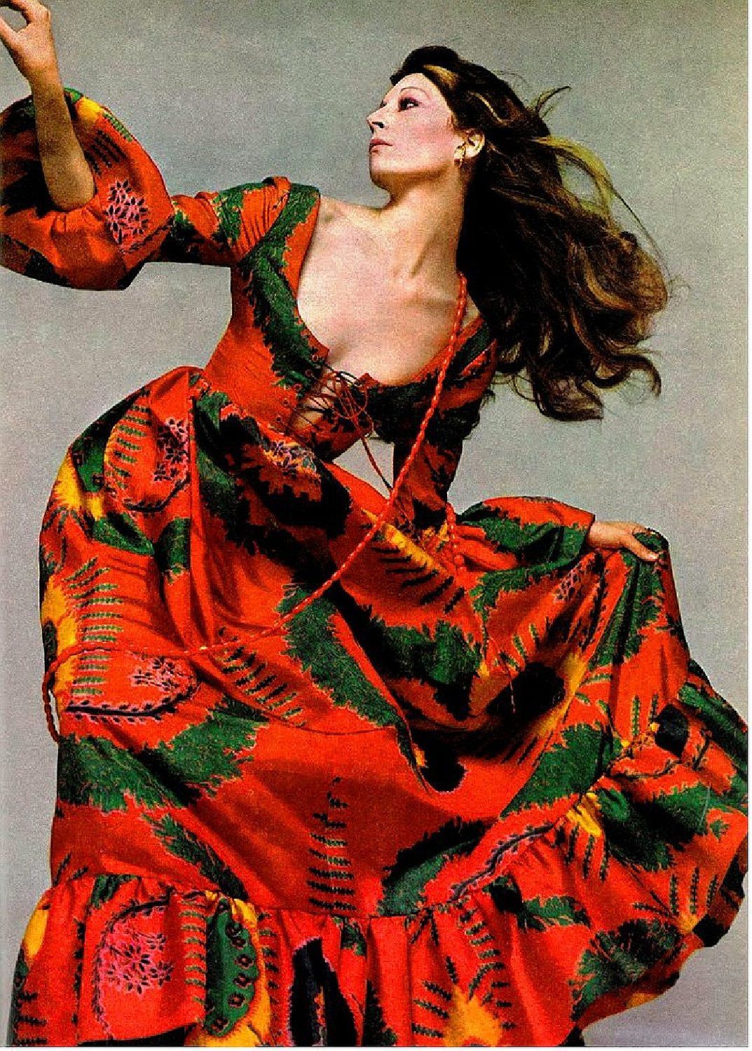
The orange invasion touches vertices so that the tint of a symbol of exoticism and then of modernity becomes synonymous with cheap. The idea remains stuck to this until the new millennium, one fashion week after another, returns to appear among the proposals of the designers: Raf Simons for Jil Sander (and subsequently for Dior and Calvin Klein), Prada, Jeremy Scott, Dries Van Noten, Gucci, Louis Vuitton, Sies Marjan or Fenty Puma.
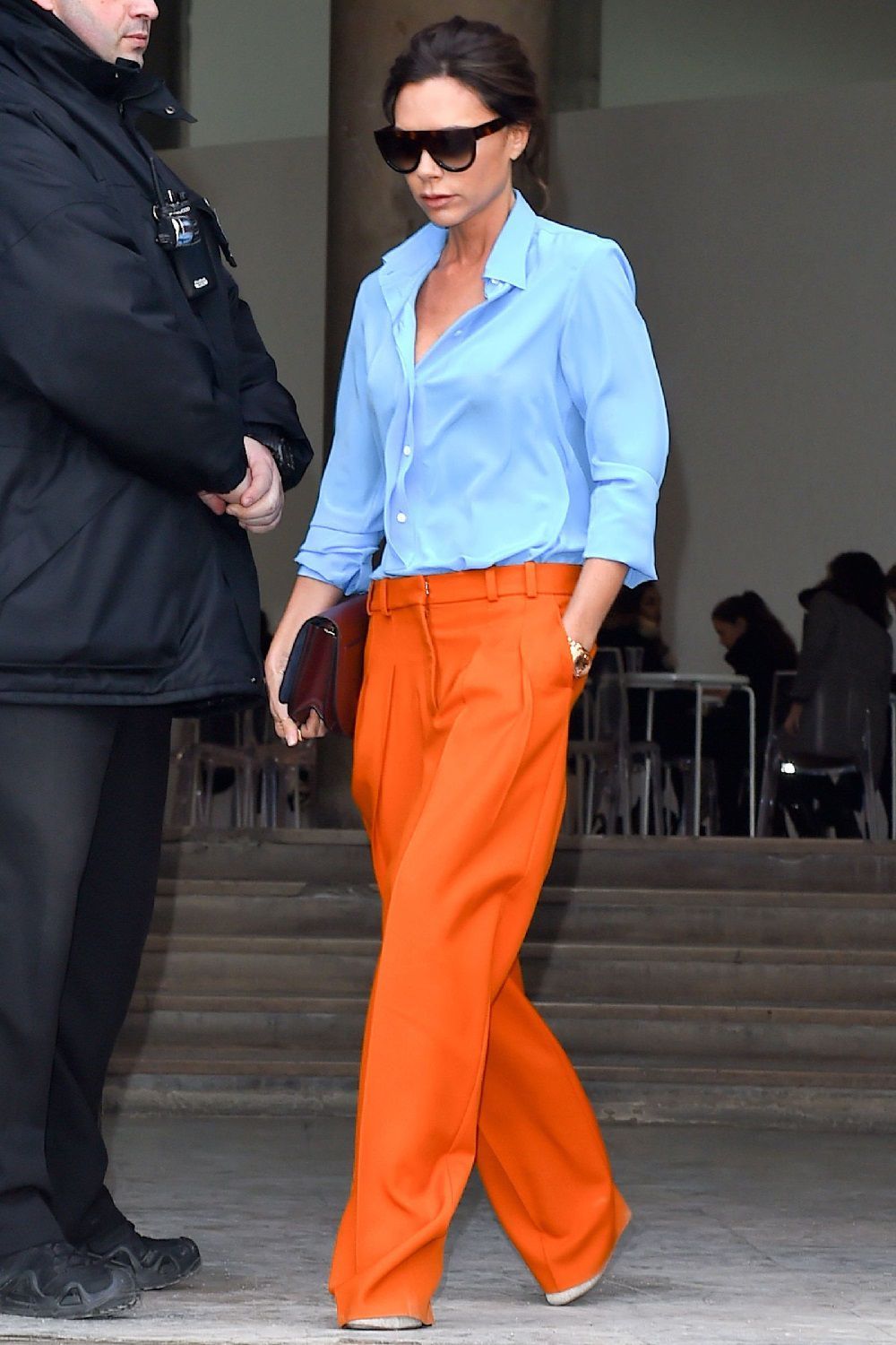
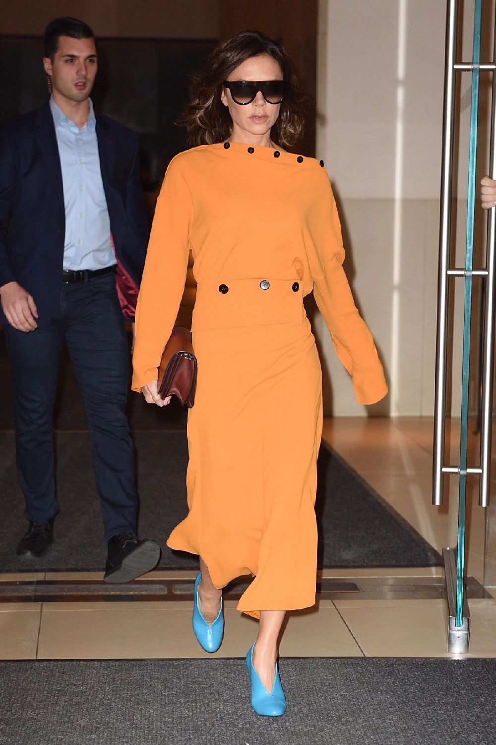
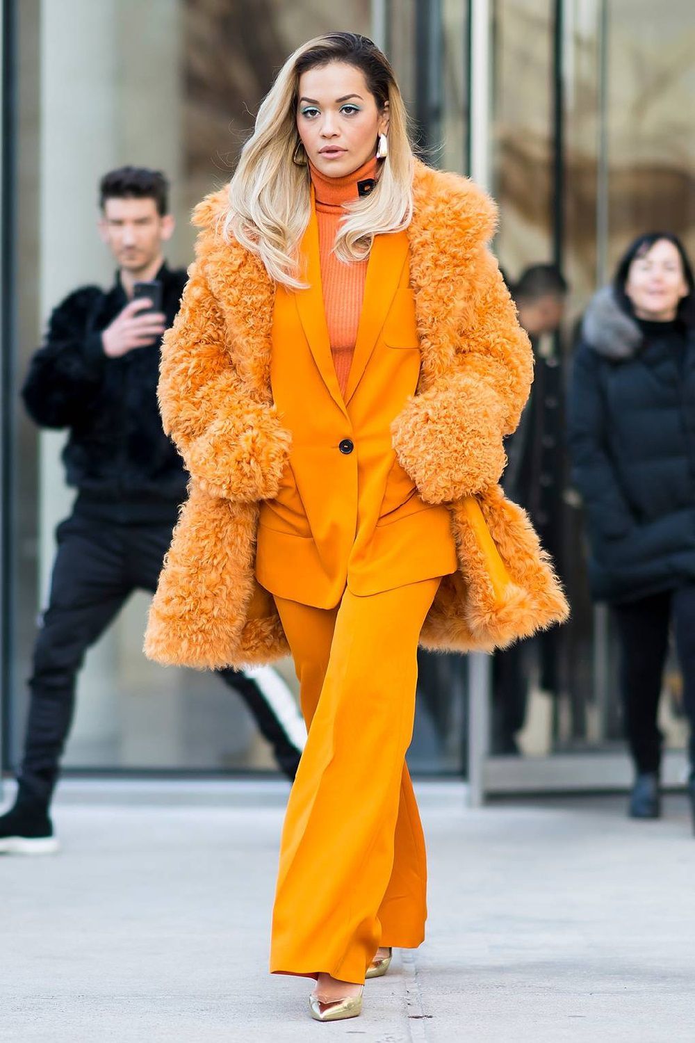
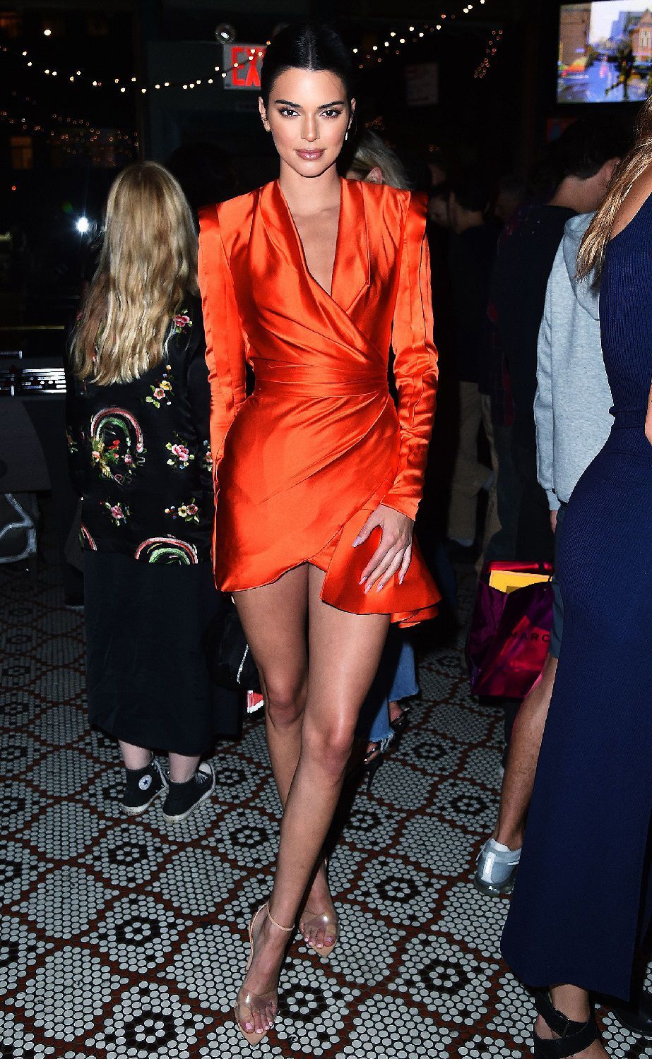
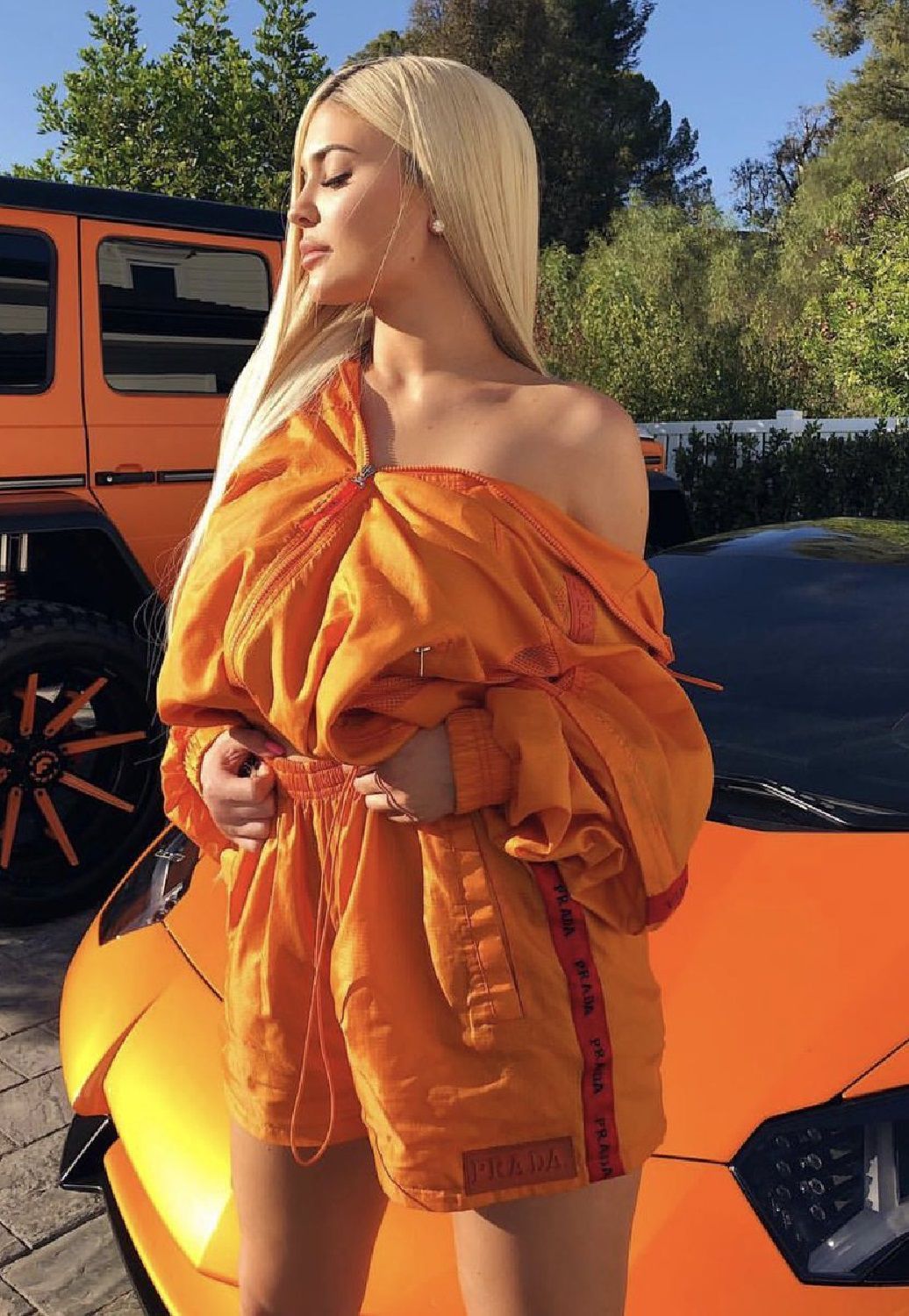
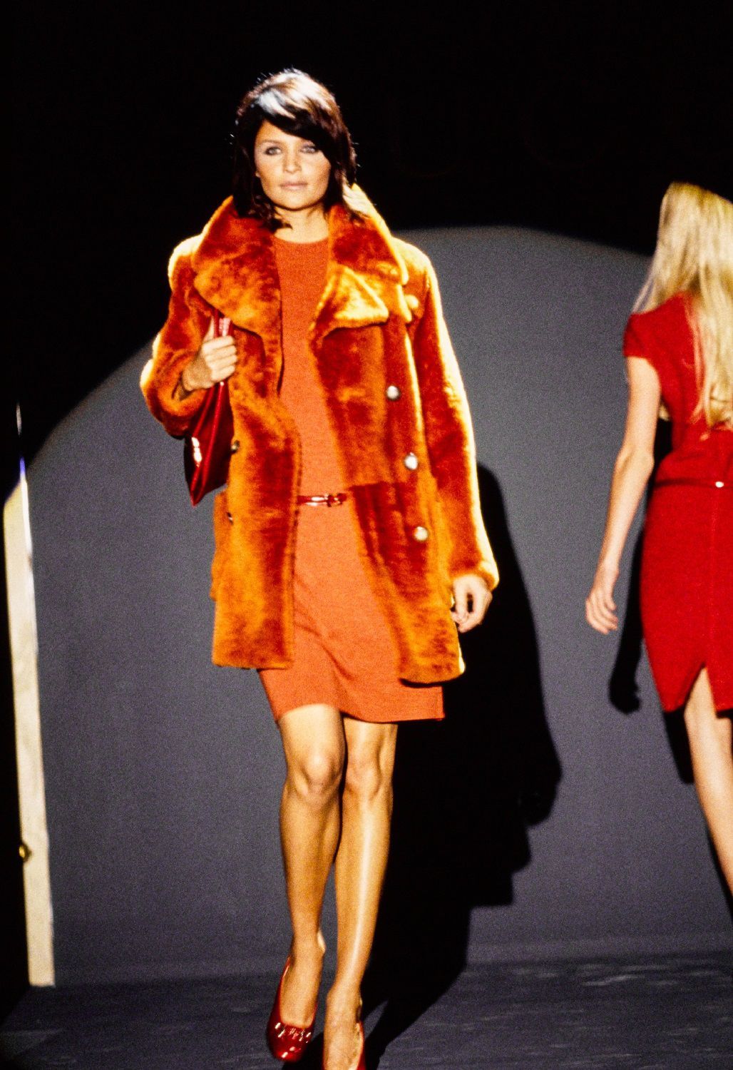
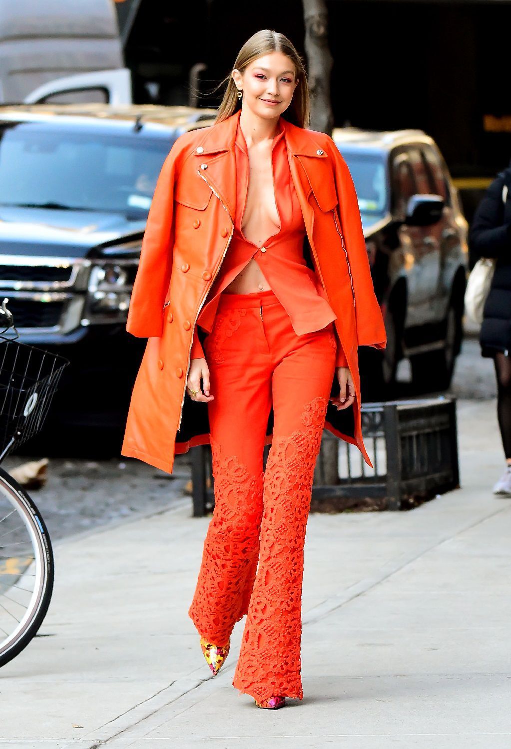
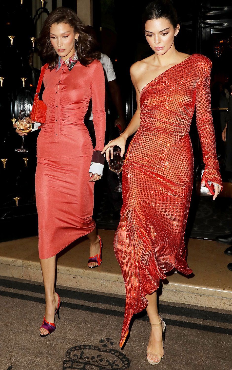
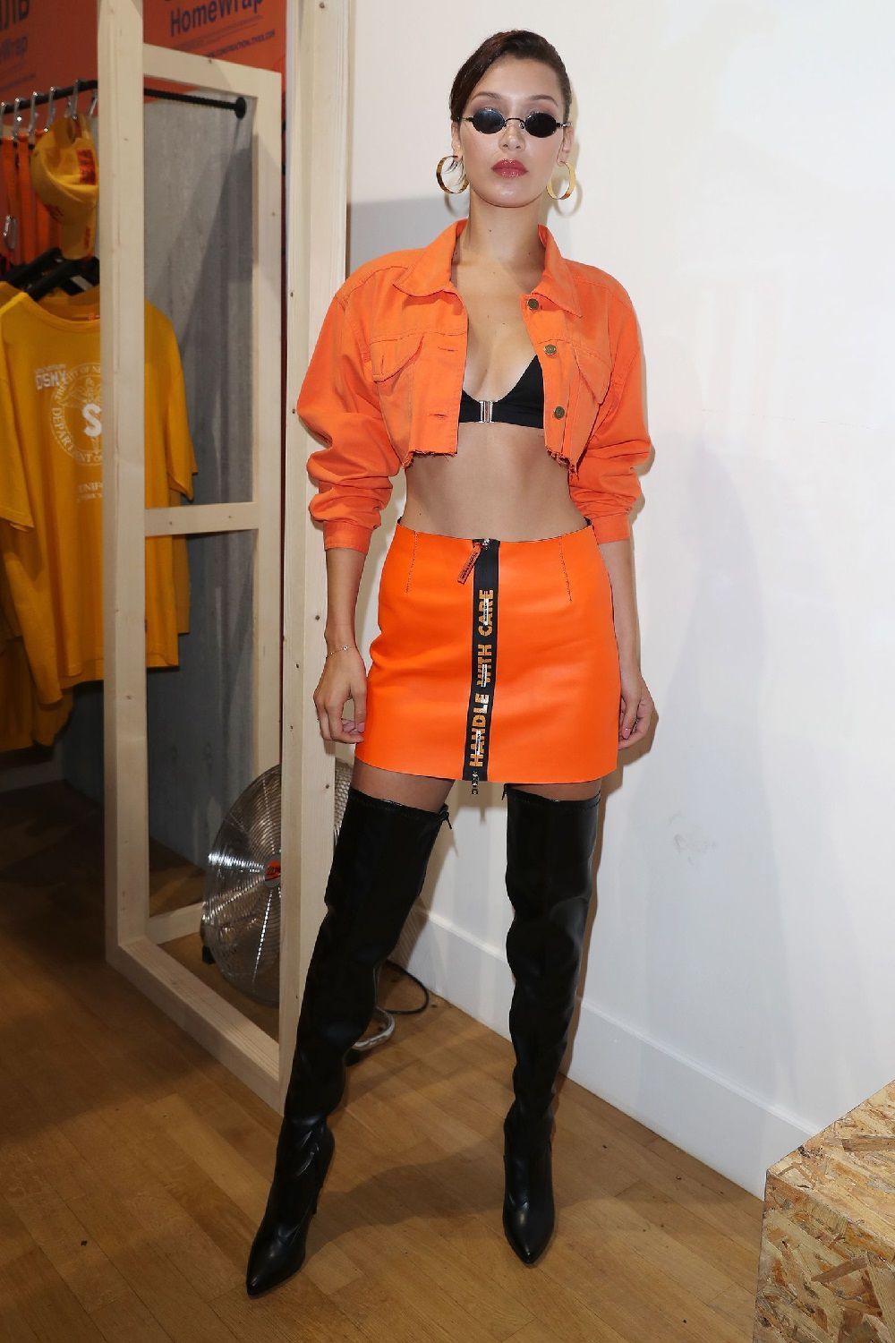
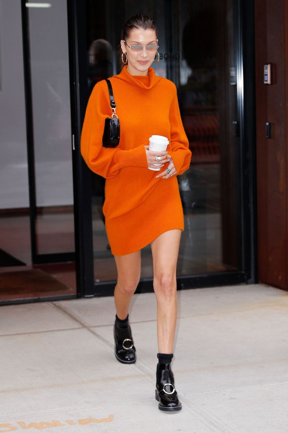
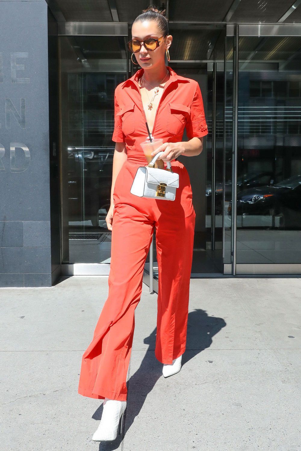
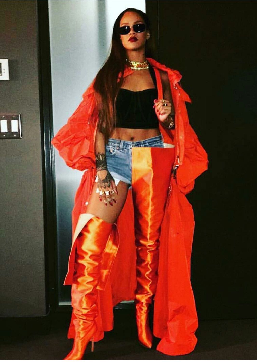
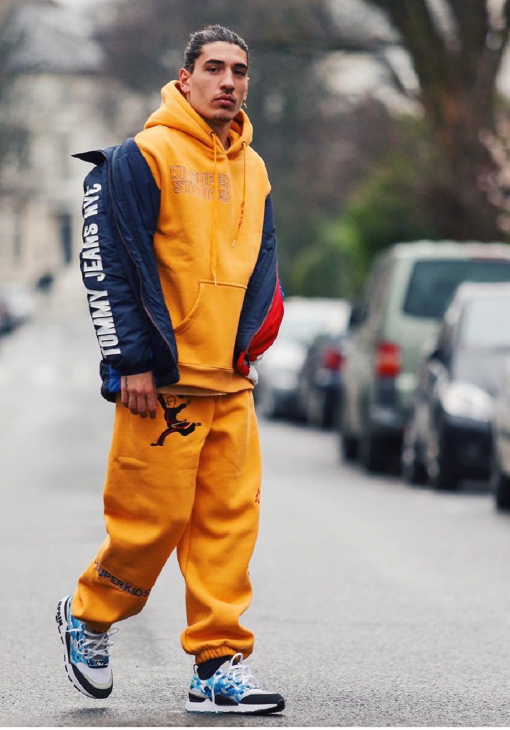
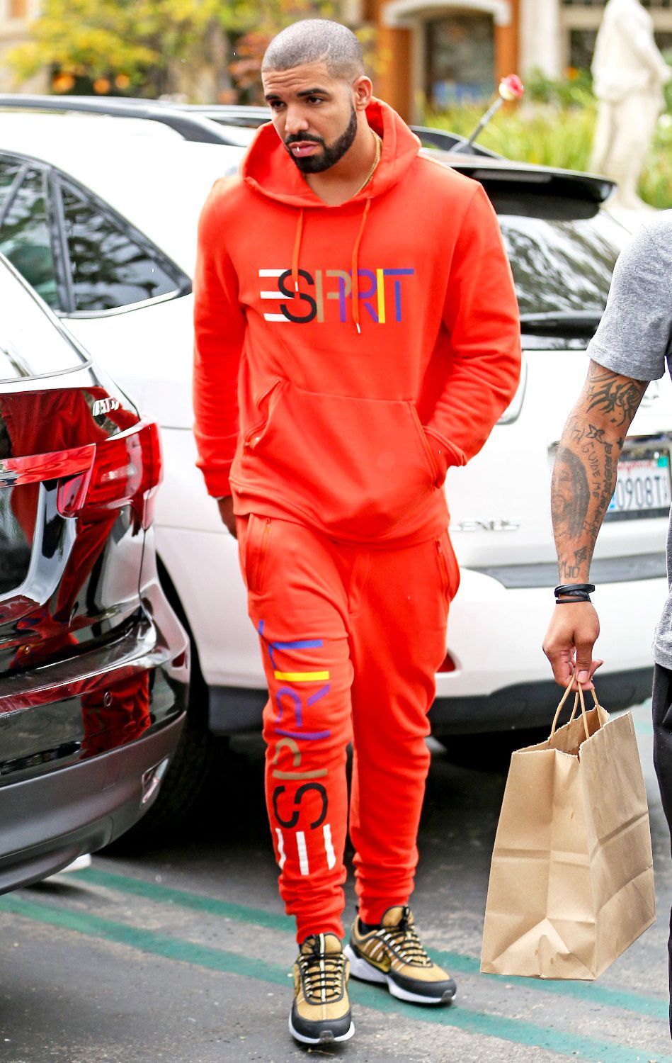
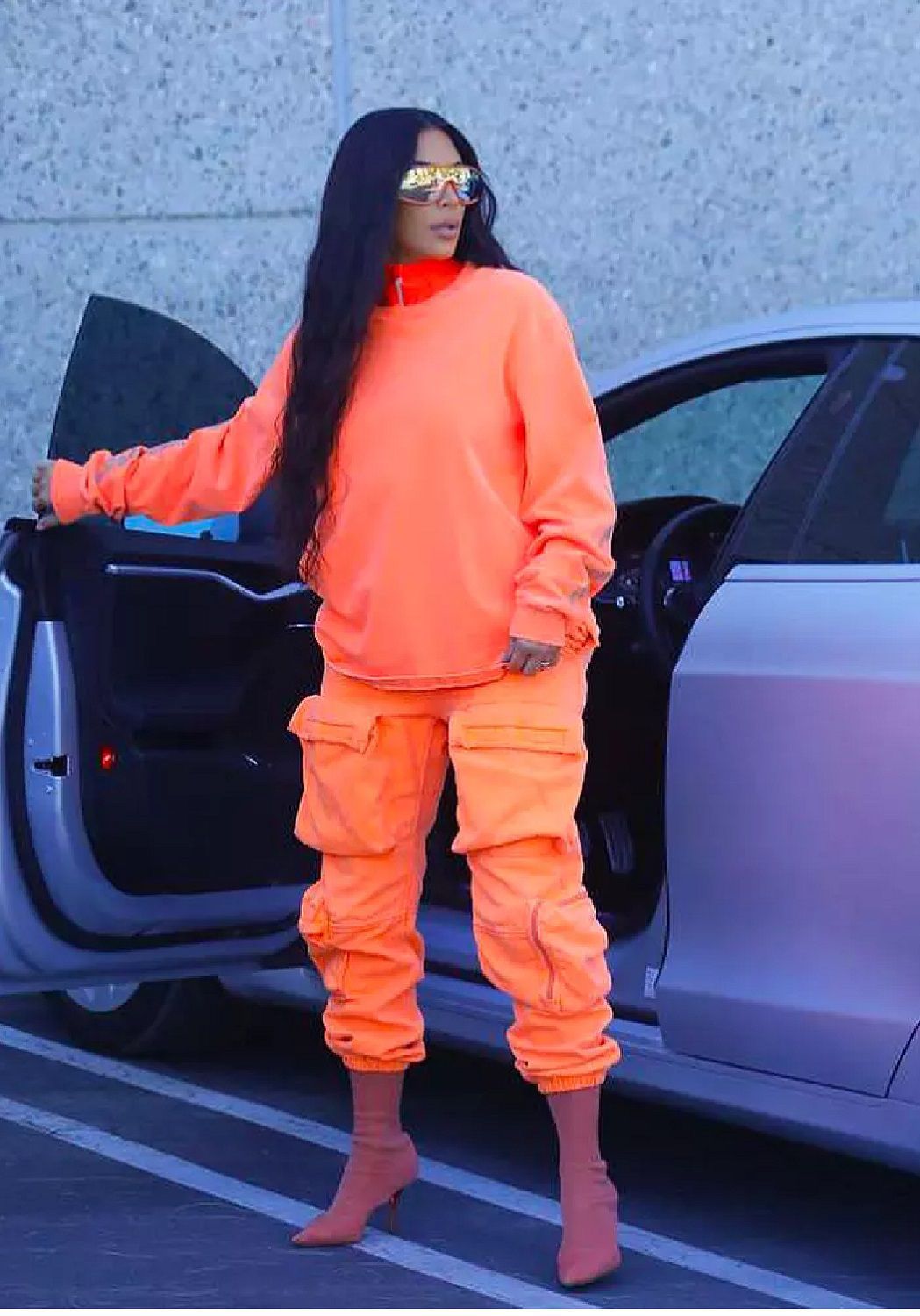
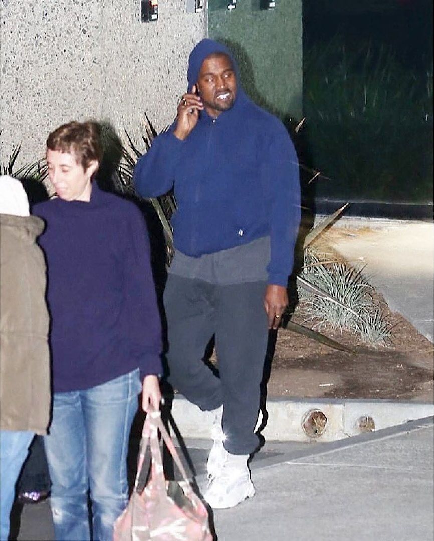
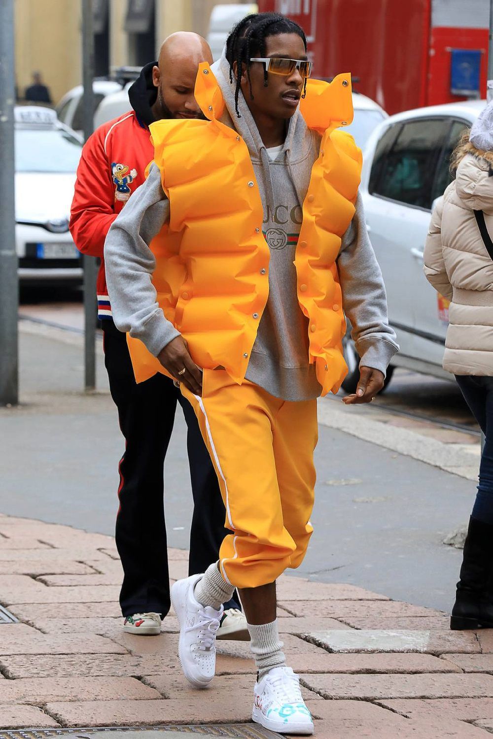
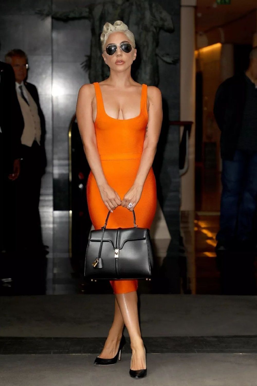
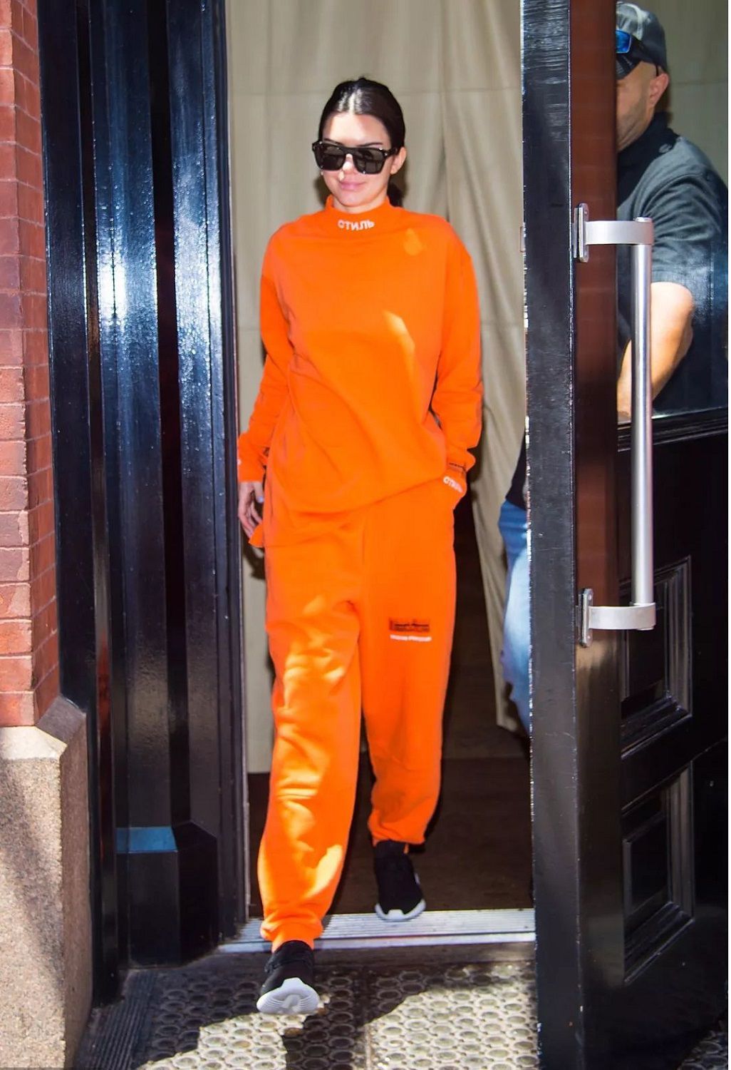
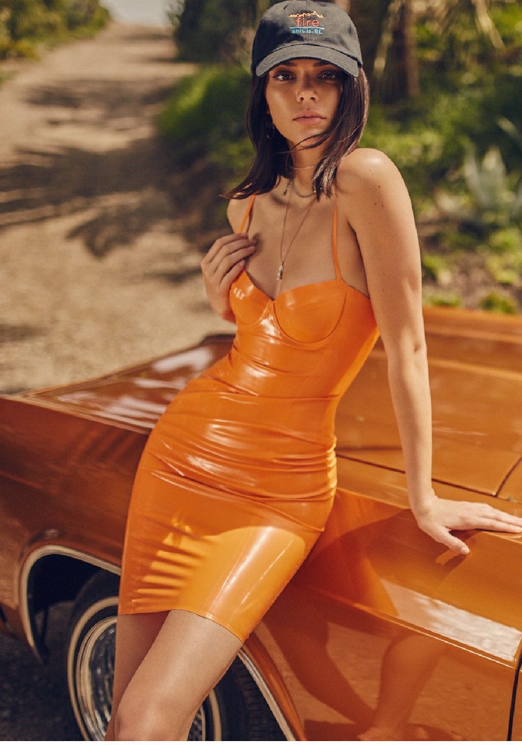
From the catwalks to the street it’s only a short step and the orange fever infects everyone, from fashionistas to celbrities, especially in outfits that mix athleisure and workwear. We can not forget the total look Heron Preston sported some time ago by Bella Hadid or the monochromatic shots of the Jenner sisters resting on their luxurious cars.
Fun fact: until 1750 in Europe this color did not even have an official name and referred to it as yellow-red. It only got one when the Islamic domination spread in southern Italy and in Spain bringing with it also the orange trees, their fruit (nāraṅga in Sanskrit, naaranj in Arabic, orange in the western languages) which gave the pigment the name that we still use today.