


The craziest football shirt presentation of Milan
We hanged out with AS Velasca and Le Coq Sportif on a tram around Milan


Reportage
September 26th, 2018
September 26th, 2018
Photographer
nss factory
nss factory
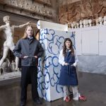
AS Velasca is more than a football team, it is a vision: a collective piece of art in continuous movement - composed of football players, football matches and jerseys - that overlaps the world of football with that of contemporary art. One of the unmissable events of the team season dedicated to the most famous brutalist architecture in Milan (the Velasca tower, indeed) is the presentation of the shirt for the current season.
As in previous years, AS Velasca uniforms were designed by an internationally renowned artist in collaboration with the sponsor Le Coq Sportif. AS Velasca and the French brand invited us to the presentation of the shirt that obviously could not have anything ordinary: the location was a public tram that brought guests and players on a romantic sunset tour of Milan, with double pilgrimage under the symbol tower of the Milan of the '70s and' 80s.
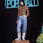
The design of the new kits bears the signature of Cameron's artist Pascale Marthine Tayou. The home kit is a red shirt with a black hole printed, while the away has a white background and an embroidery that resembles the internal organs, probably a reference to Pepites d'Or, one of the artist's works that denounced the looting by of European football for African talent. Official jerseys will be available with only 400 copies (200 home and 200 away) and numbered with a holographic dish as a true work of art.