


Gucci, Balenciaga and that logomania bet Creative laziness or iconoclastic genius?
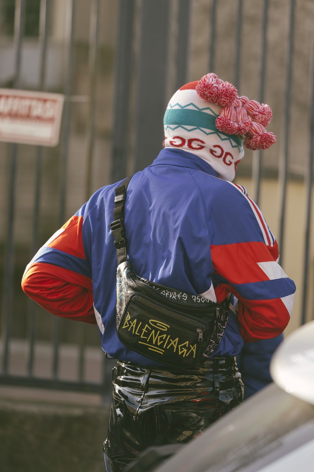
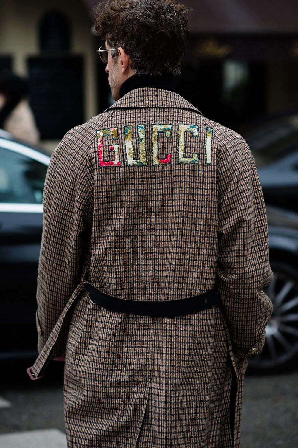
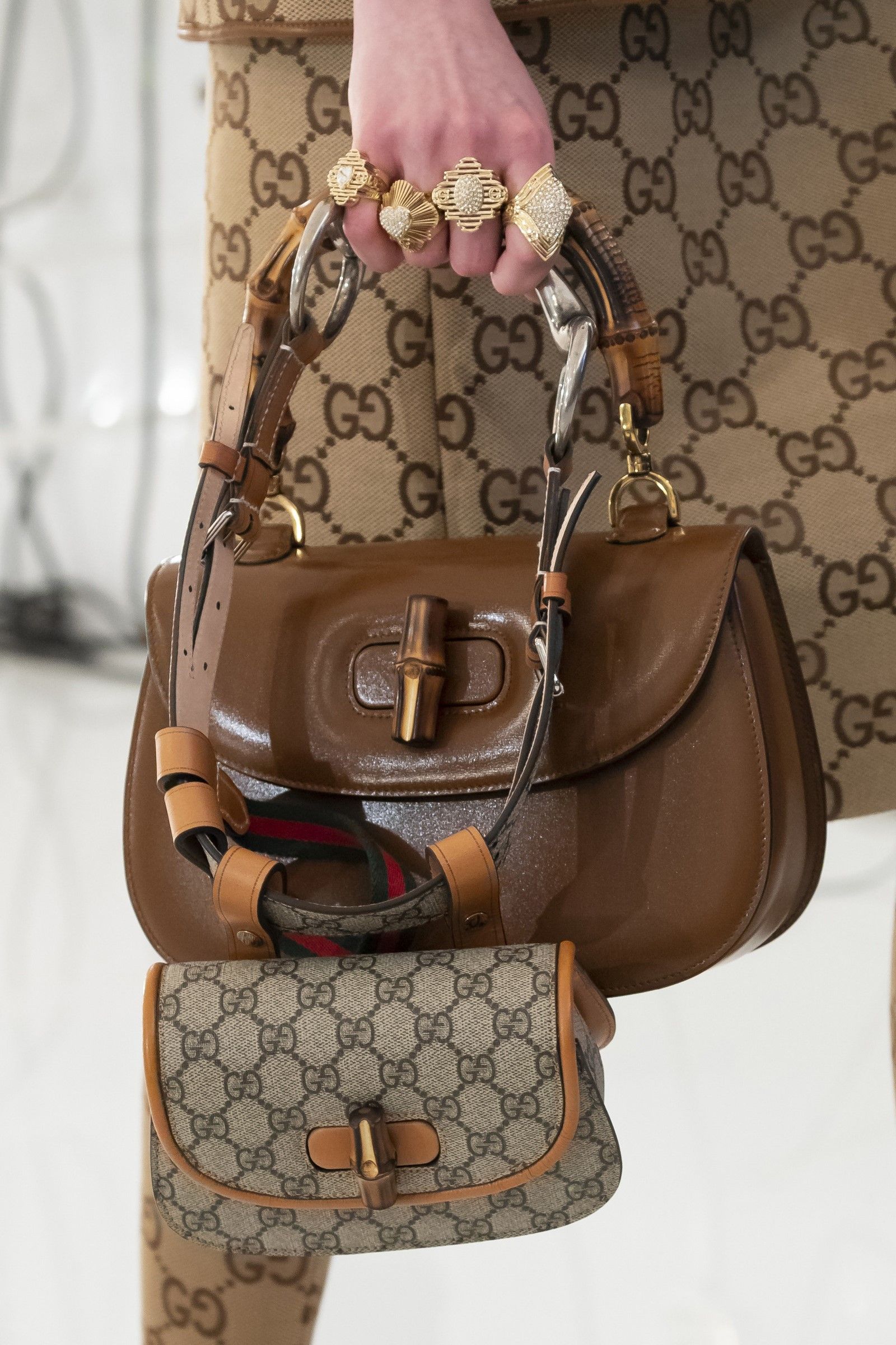
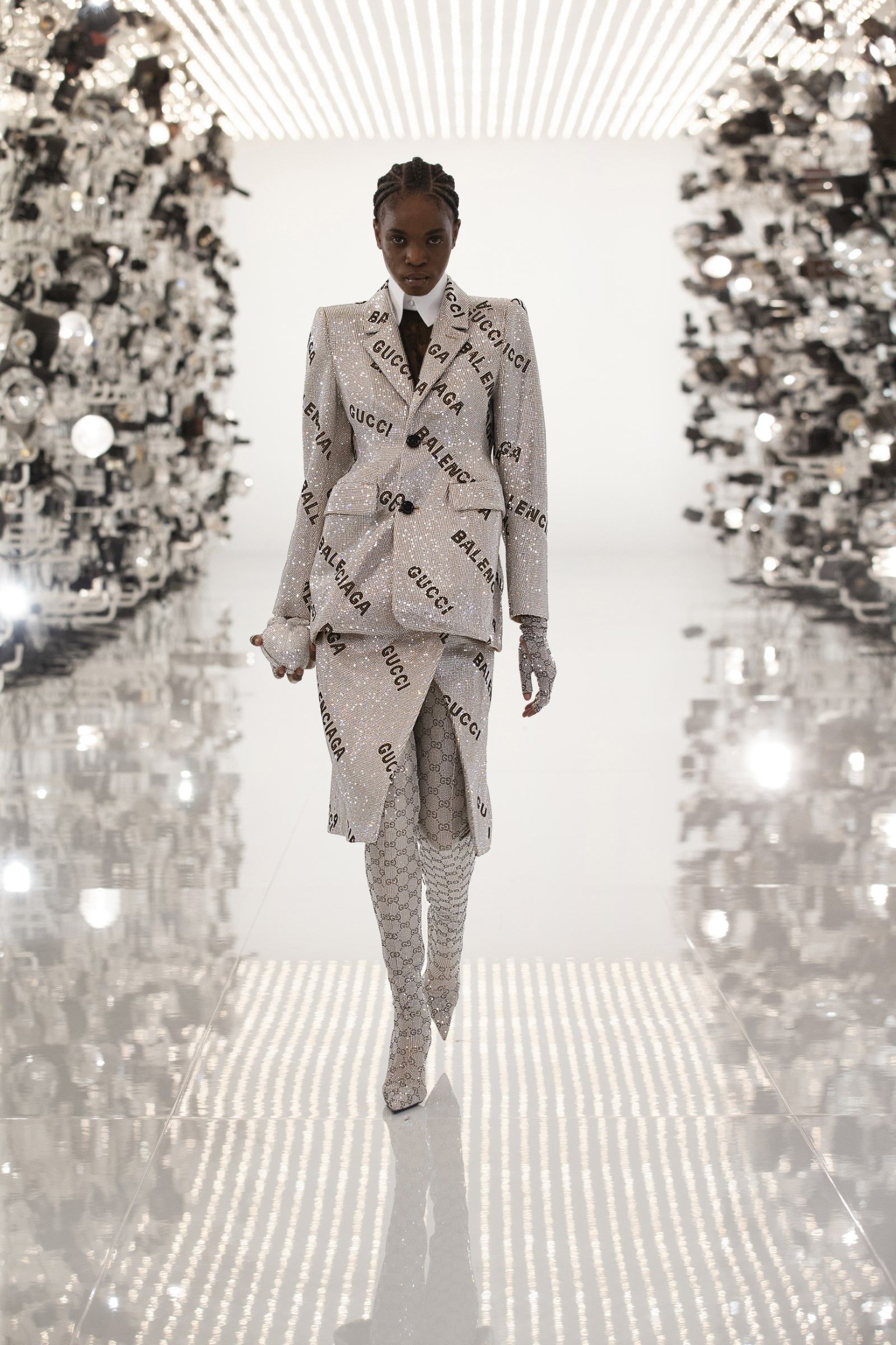
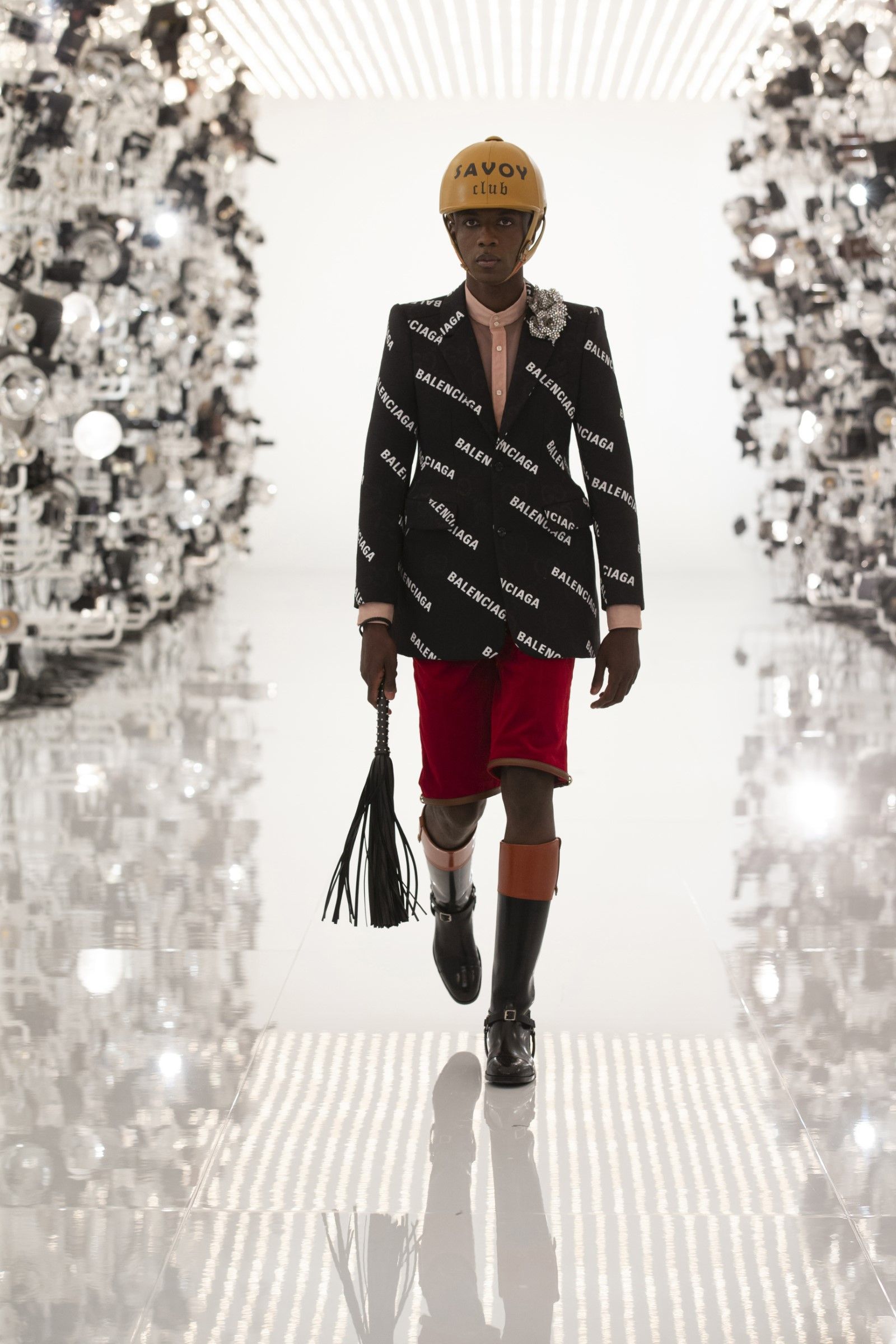
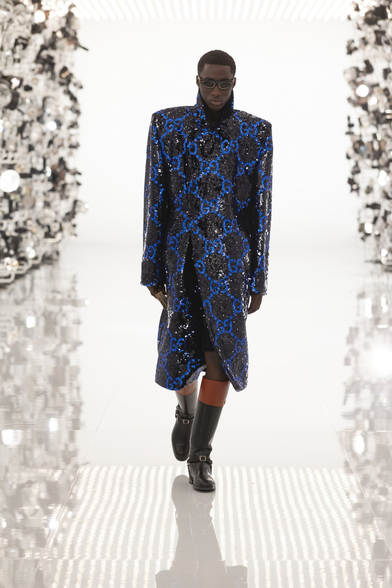
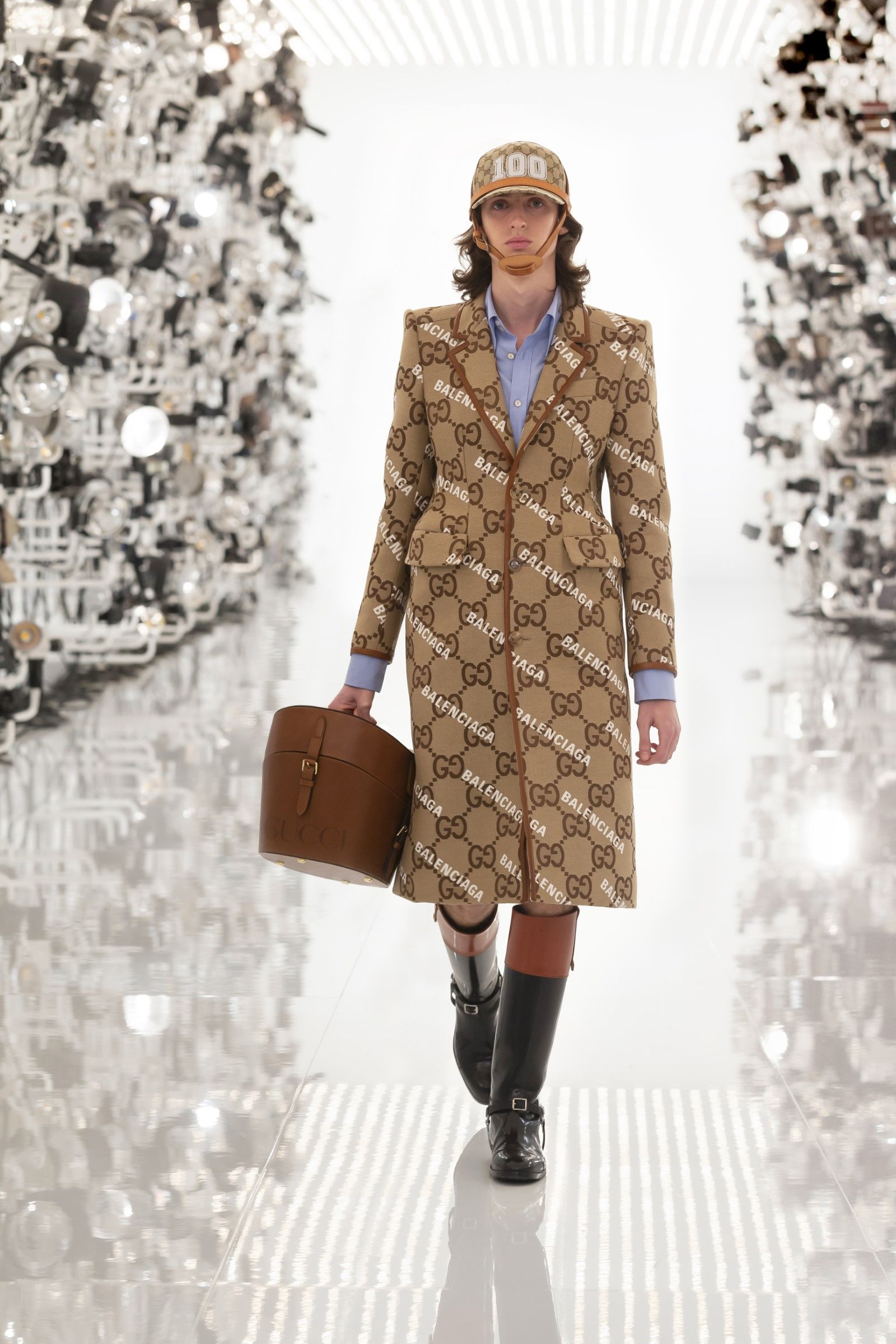
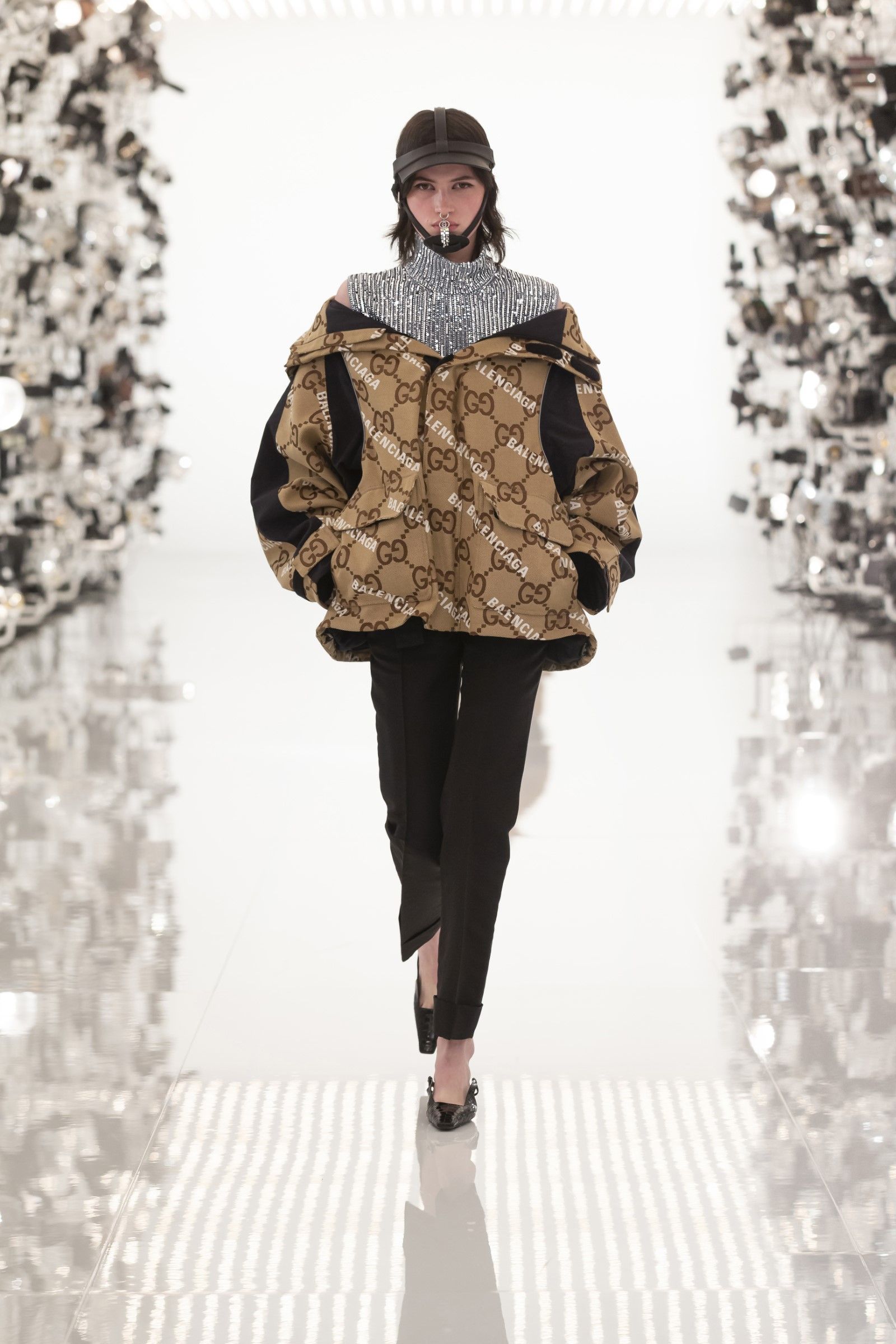
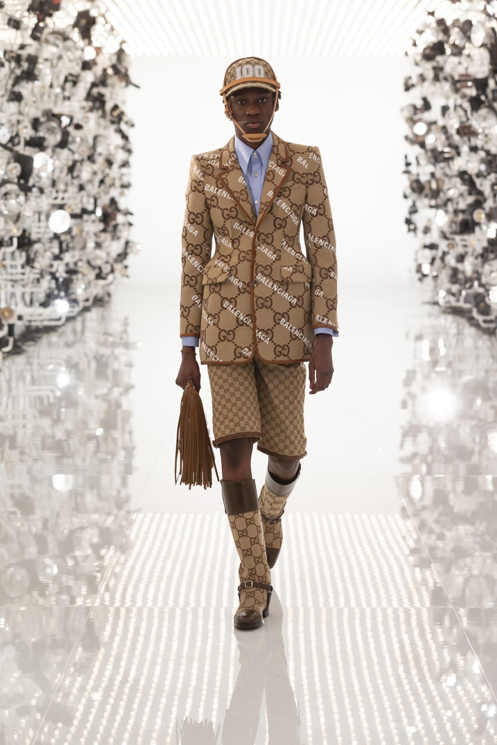
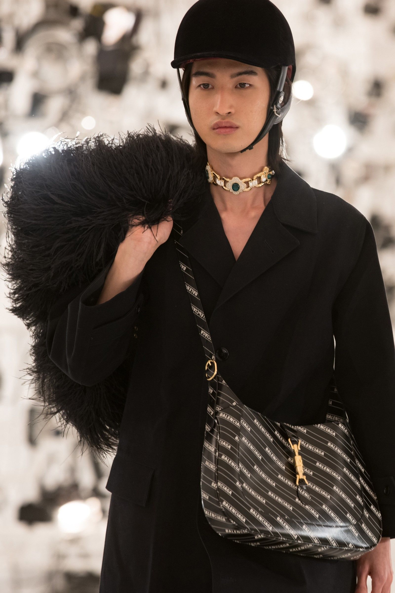
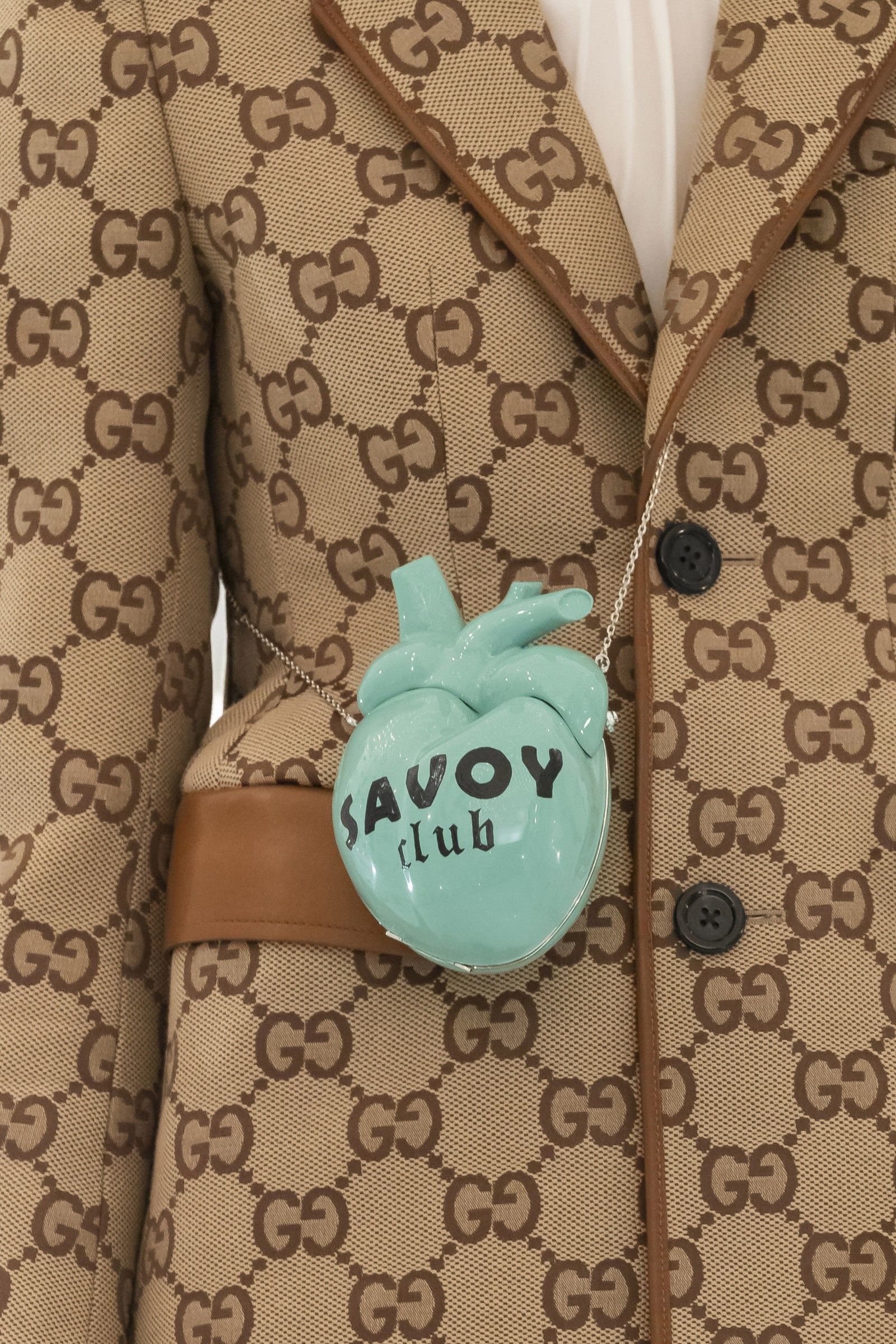
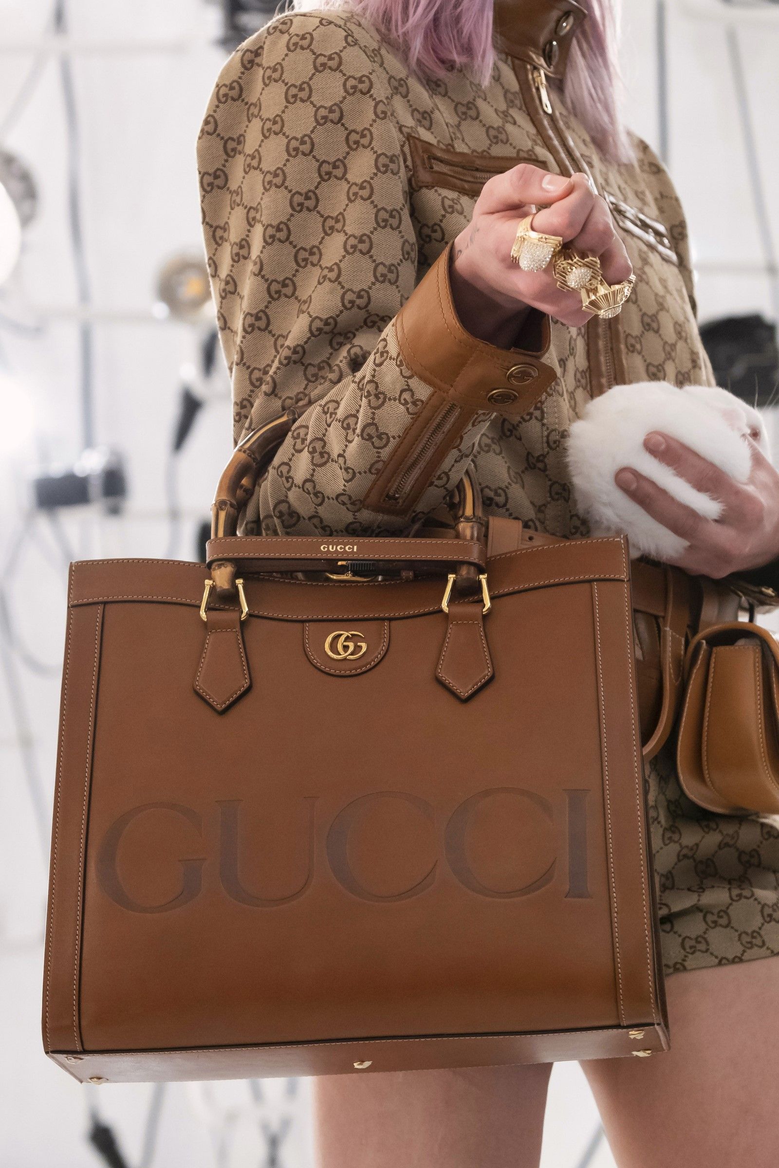
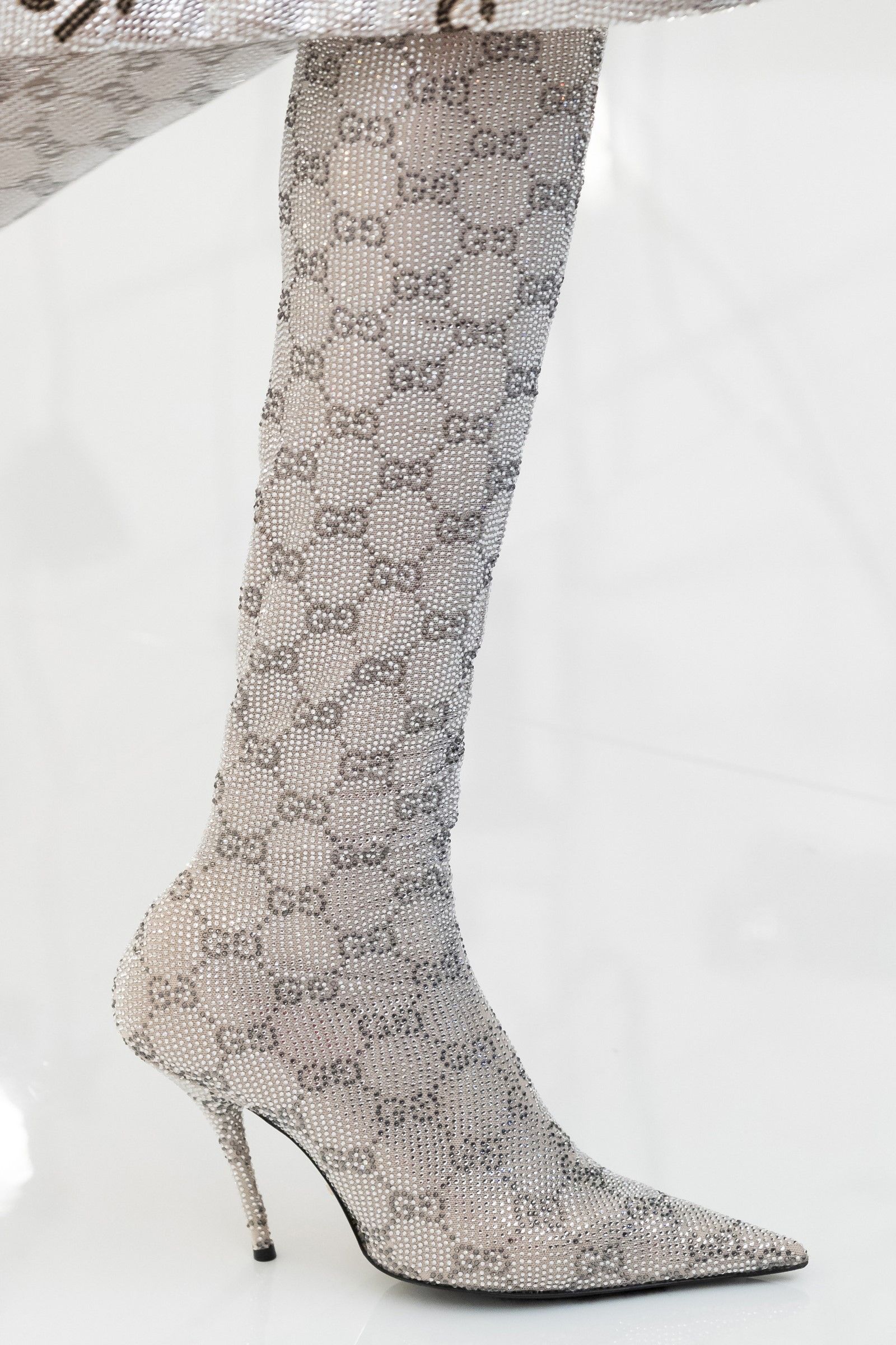
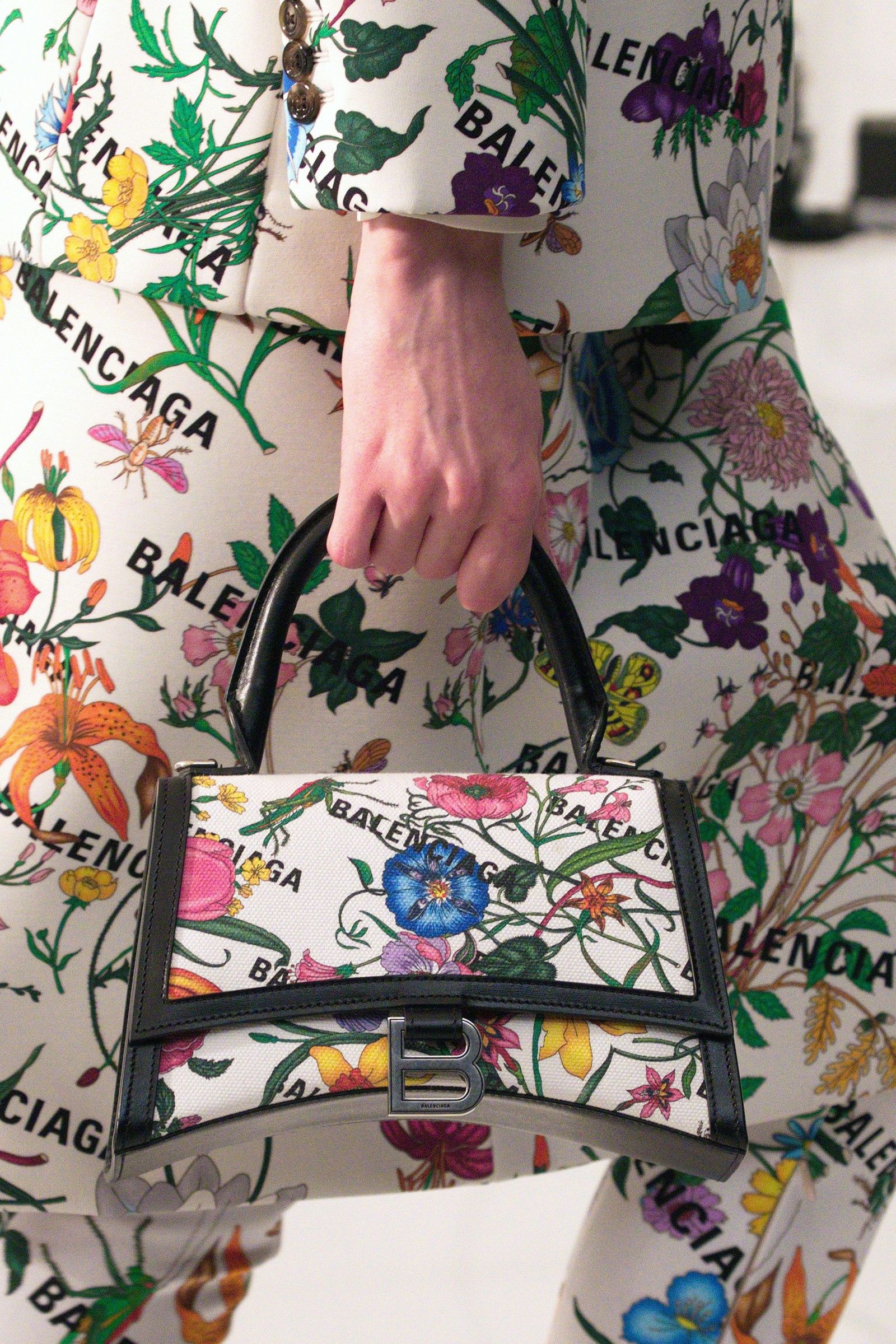
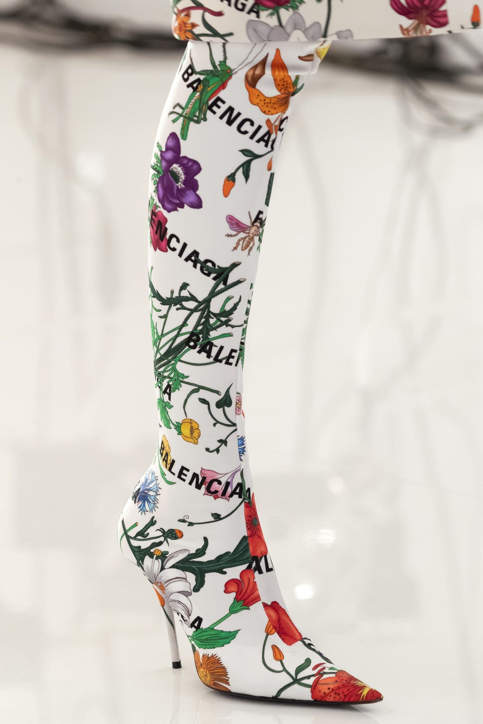
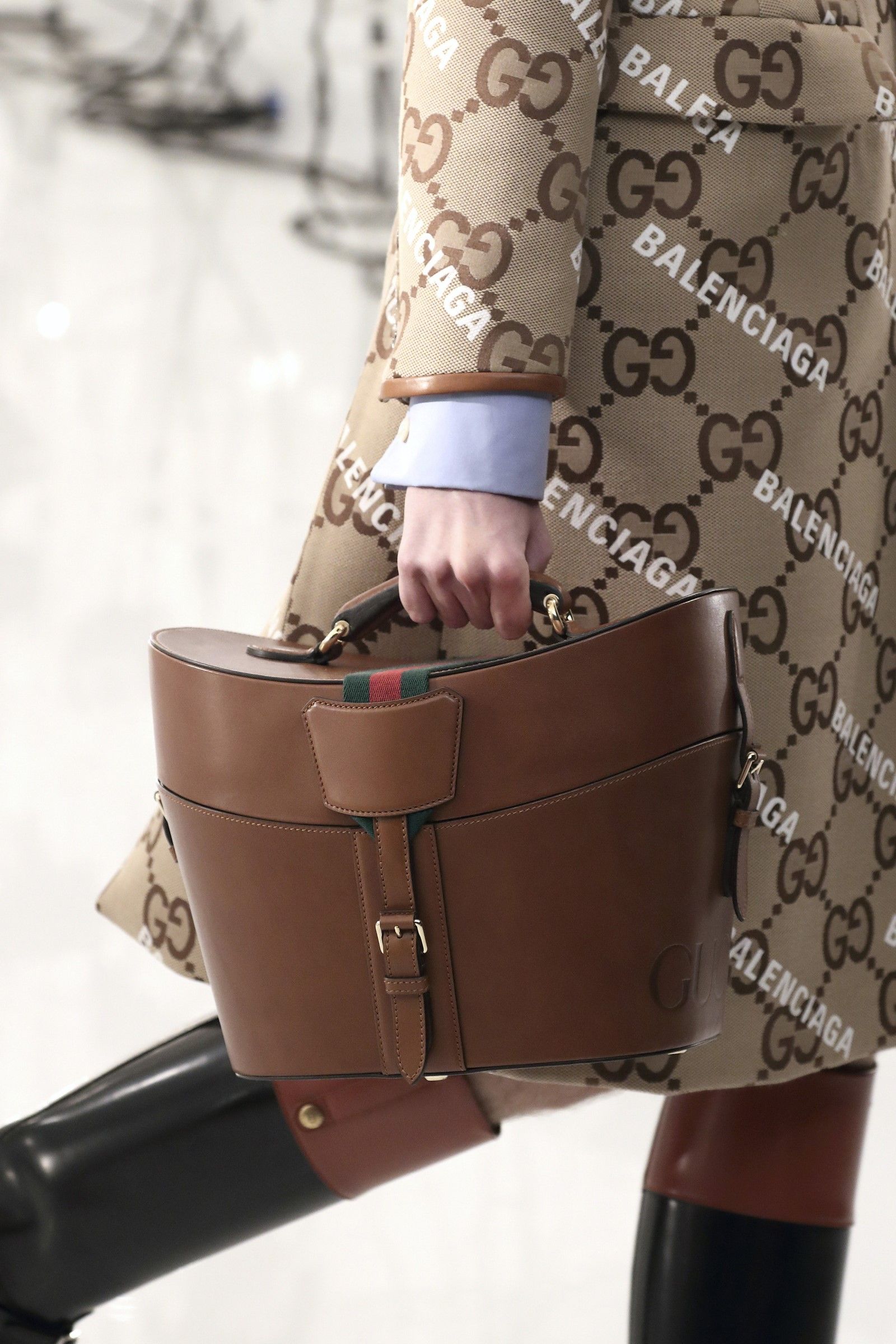
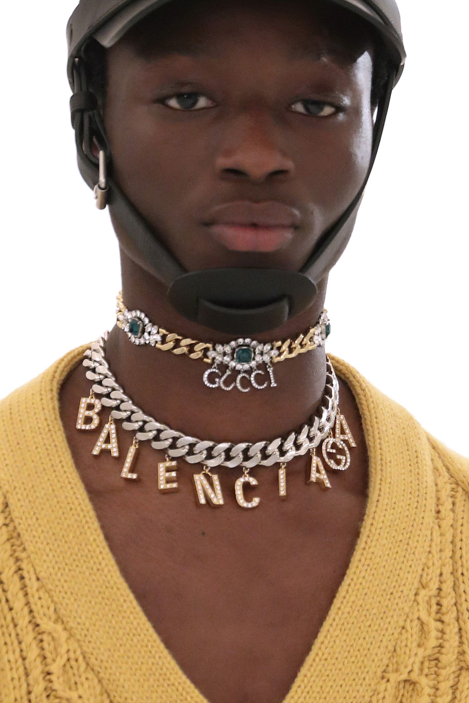
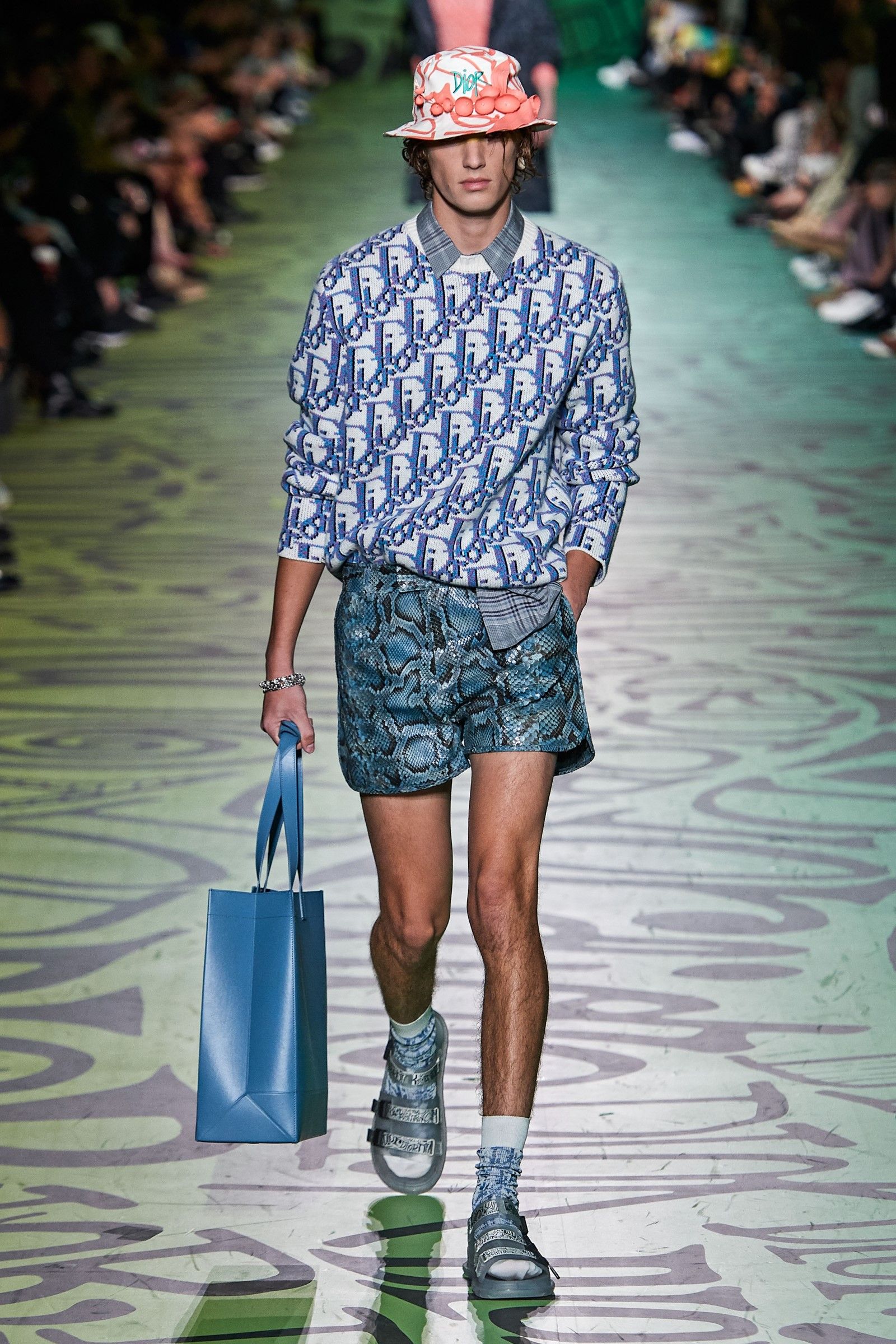
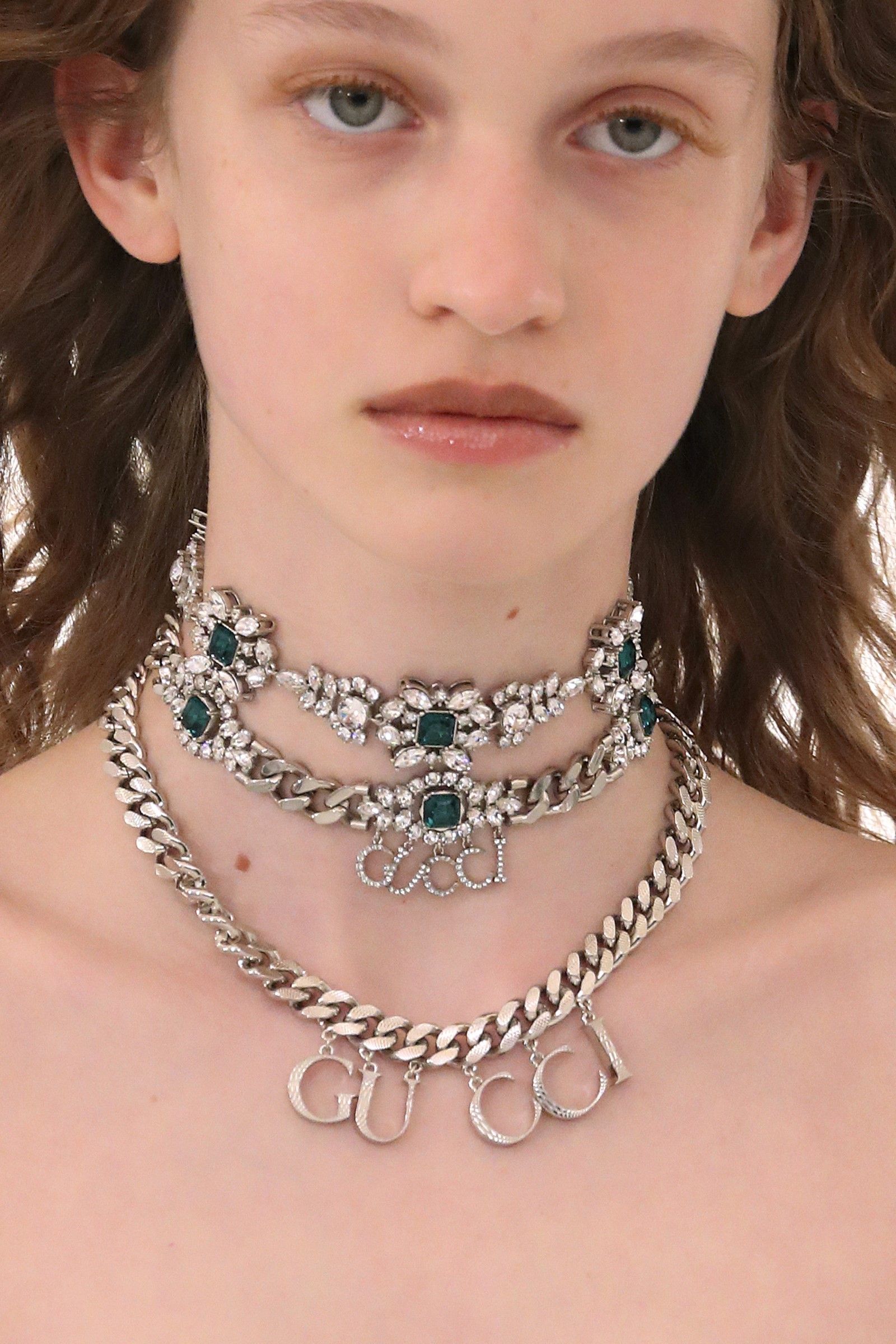
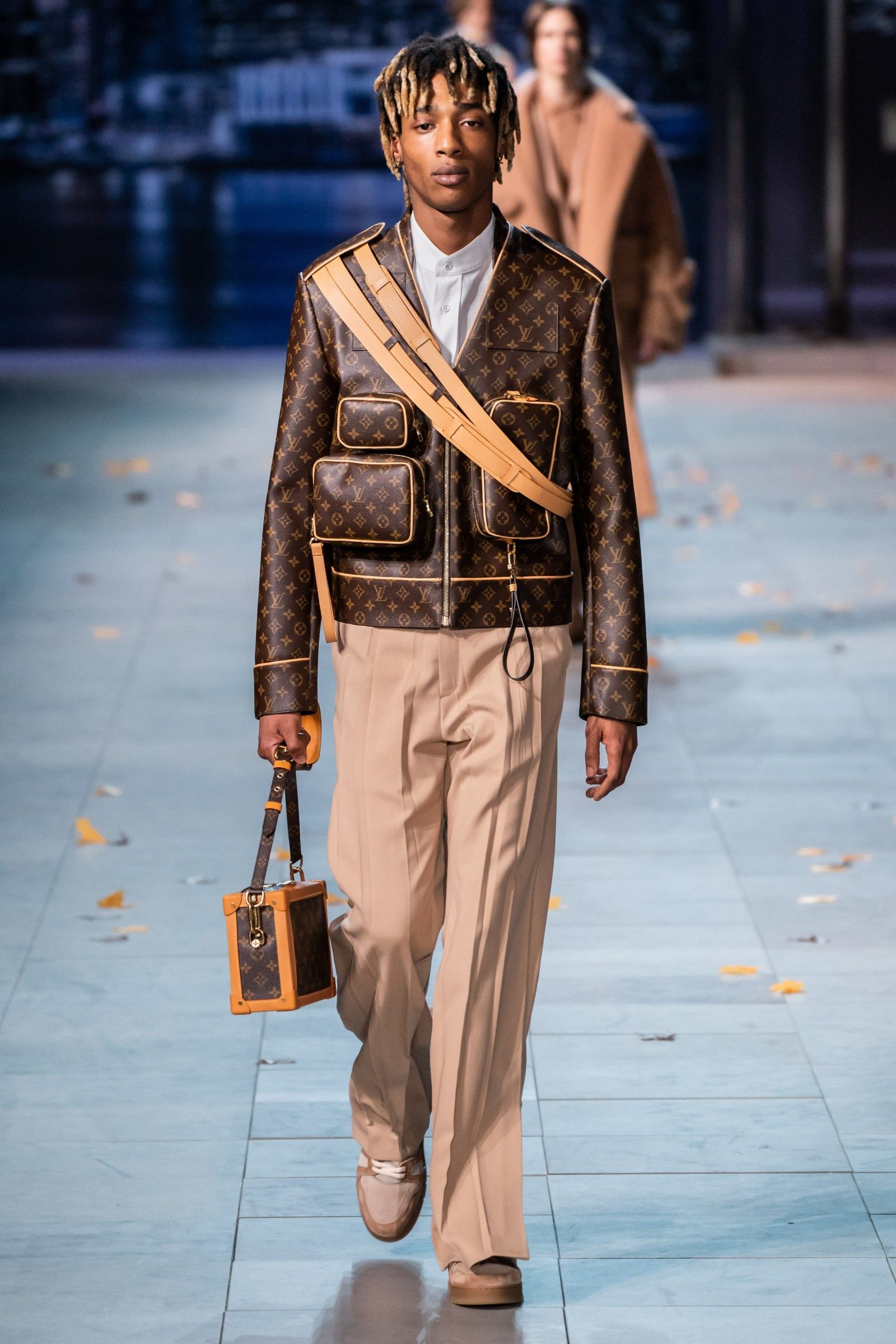
The creative hacking of Gucci and Balenciaga, seen in the recent Aria collection show, was perhaps the most important fashion moment of the season, with all its power being conveyed through a maximalist use of the juxtaposed logos of both Maisons. There was a rhinestone suit with the two logos in oblique lettering, the same lettering of Balenciaga's logo alone was printed through a second suit covered with Gucci Flora print, a third black men's coat with a very Balenciaga-esque cut was in turn covered with Gucci's Monogram in blue rhinestones and so on.
What struck, however, is that in a fashion industry where logomania seems to recede more and more every season, Alessandro Michele and Kering decided instead to rely on logos to tell this union and do the only real thing a fashion brand should do: sell. It is no coincidence that Balenciaga's "hacking" has greatly divided the audience between those who caught a glimpse of the post-ironic definition of a fashion era and those who instead considered it a simple commercial operation or, in any case, an idea too obvious and on-the-nose. The truth may be in the middle, but first, we have to bring back the hands of the clock.
Drunk on logos
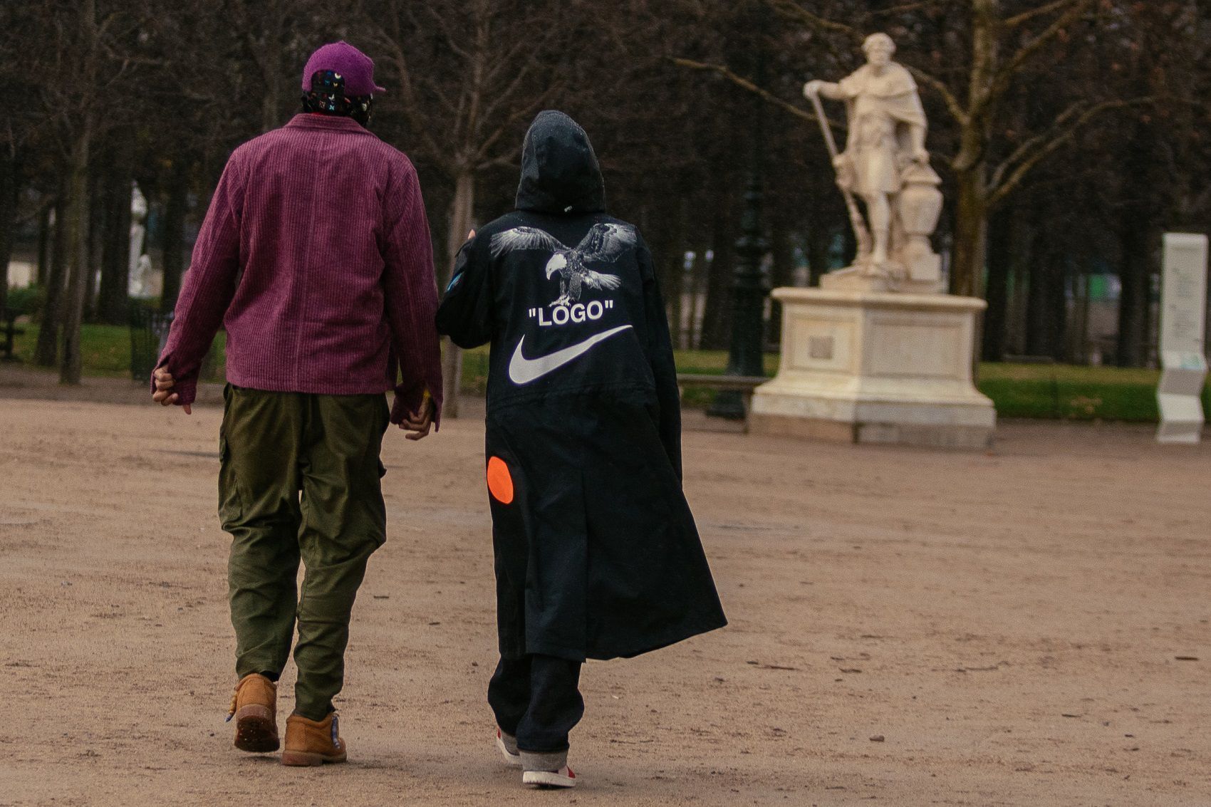
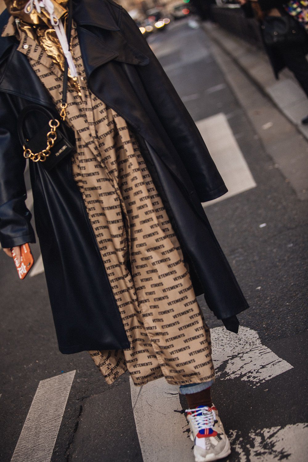
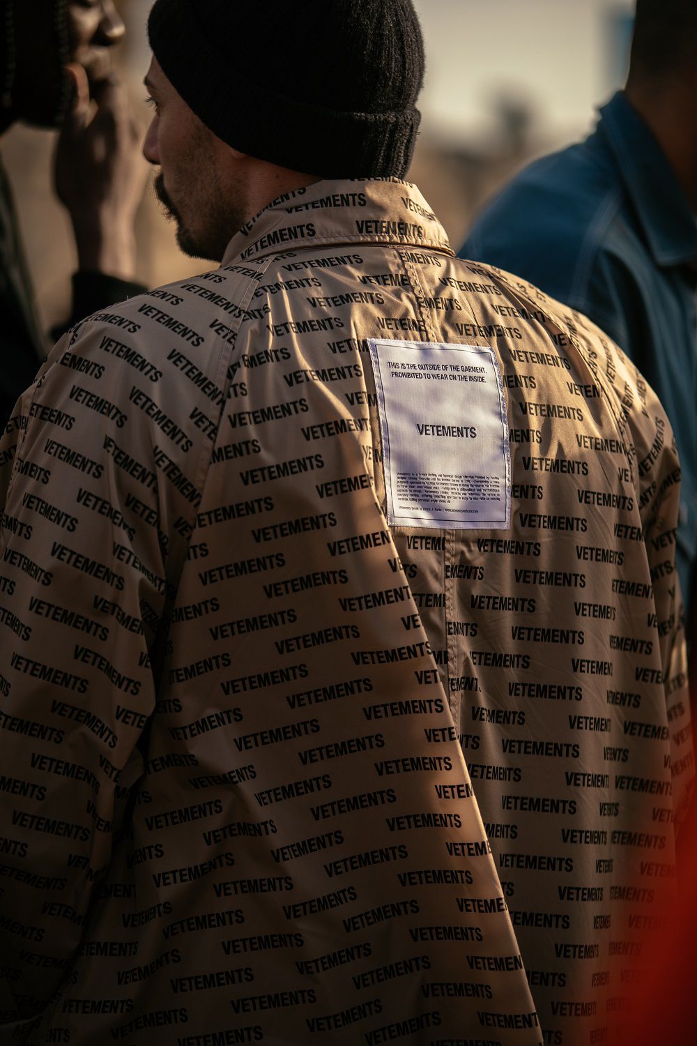
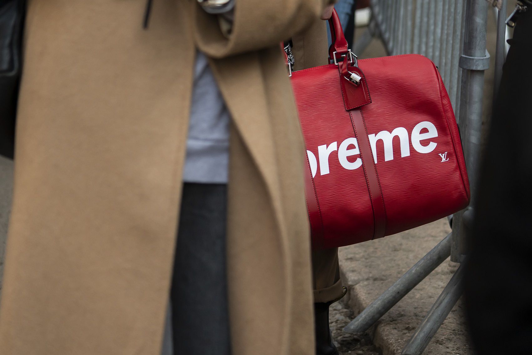
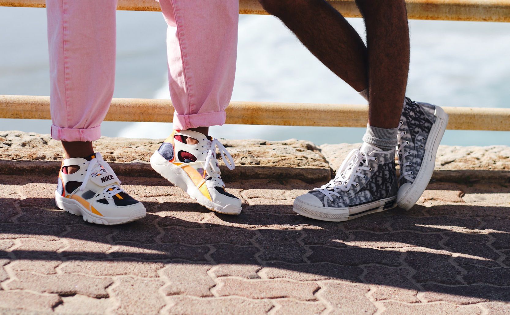
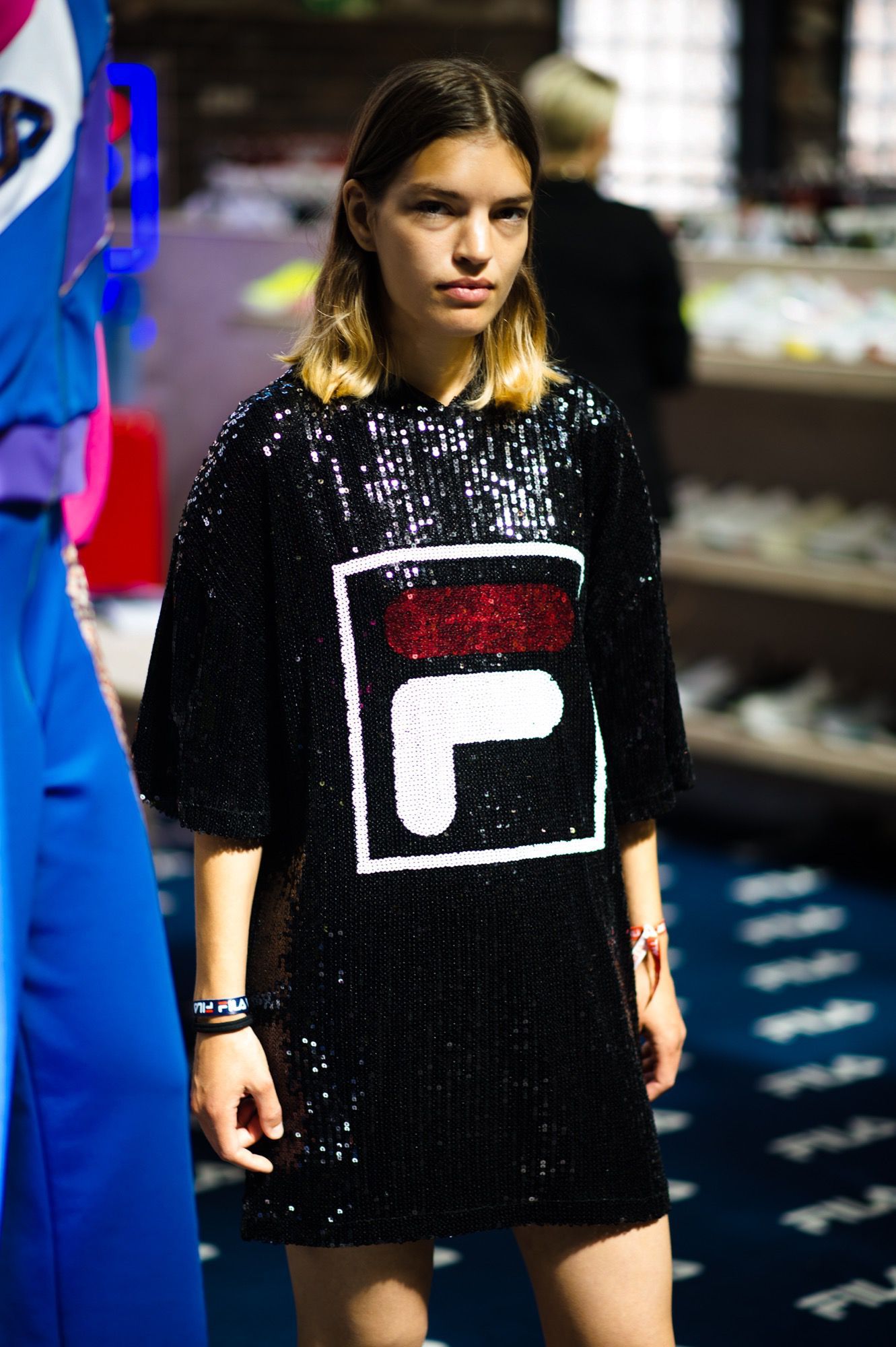
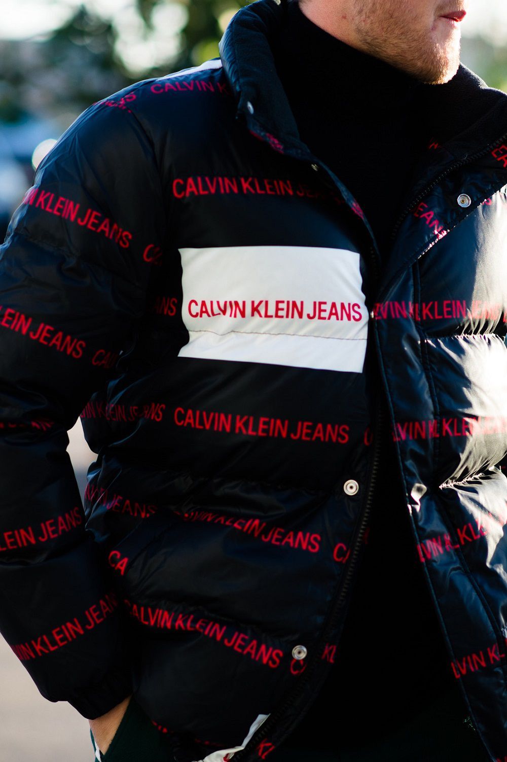
Logomania has a fairly long history in fashion, which begins as early as the 1980s, but its most recent return coincided with the second half of the 10s and the sudden popularity gained by streetwear. The growing streetwear market had filled the closets of the younger generation with simple items such as t-shirts and hoodies enlivened by a good graphic rendering of the logo, just think of Stussy, Palace or Supreme – they were pop products to buy cheaply, recognizable, easy to match and enough currents and newspapers to wear on every occasion. A good starting point of the trend could be the collaboration between Supreme and Louis Vuitton in 2017, whose all-red items were heavily covered with a mixed monogram that reported the logos of both brands. But the real roots of logomania lay in hip-hop culture with creatives like Dapper Dan who had sensed years in advance the power that fashion logos have and their unreteathed symbolic value capable of lending themselves to the most interesting decontextualizations and reinterpretations.
In general, however, with the successful contact of streetwear codes with luxury fashion and following the extraordinary success of Virgil Abloh, the designers realized that a good graphic rendering of the logo printed on a hoodie or accessory was worth elevating that item to fashion status – but even more: by dressing legions of young people of logged items, brands could turn customers into unaware walking billboards , without wasting time and resources on intricate and expensive designs, drawing on the huge appeal of streetwear and capitalizing on the nostalgia of the 90s of a generation in love with Instagram. It was the perfect cocktail: little effort and maximum yield. The democratic appeal of streetwear made these garments "easily digestible" for a young and very young clientele who had little interest in the technical construction of a fabric or the cultural significance of a garment, preferring rather a hoodie or a pair of sneakers that told the whole world (and in capital letters) where their money had gone.
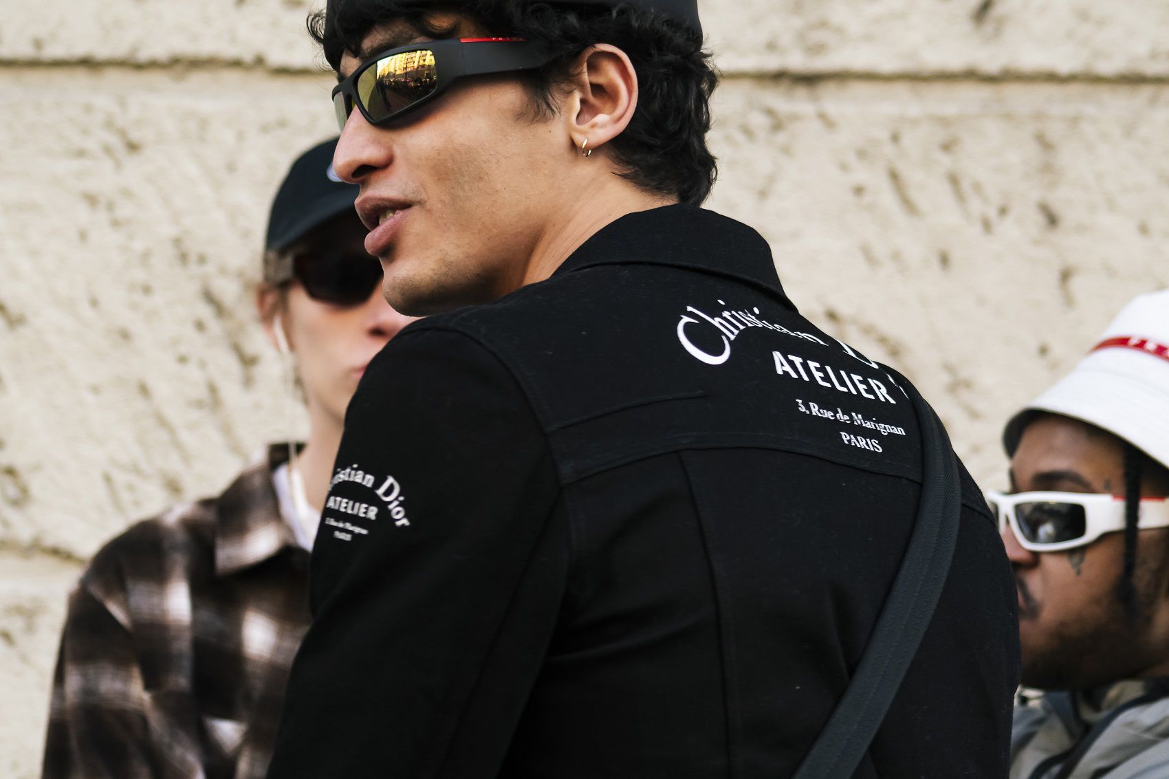
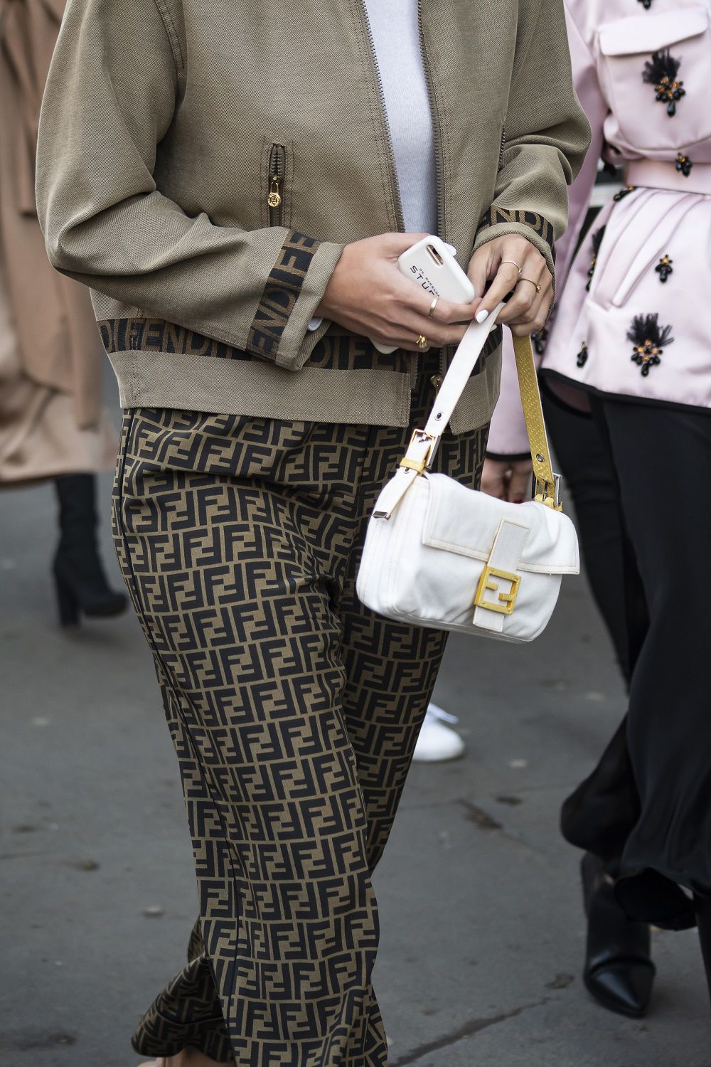
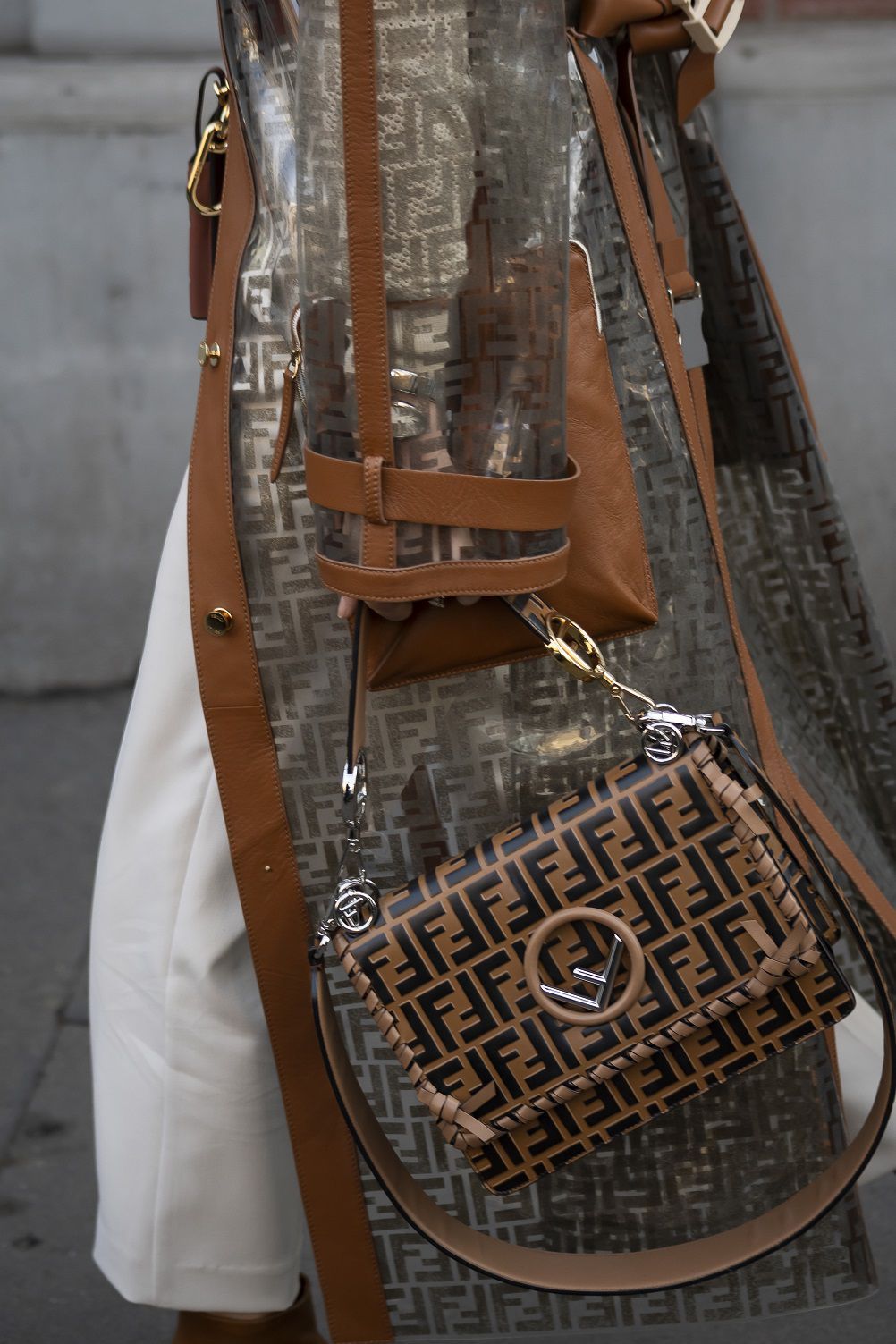
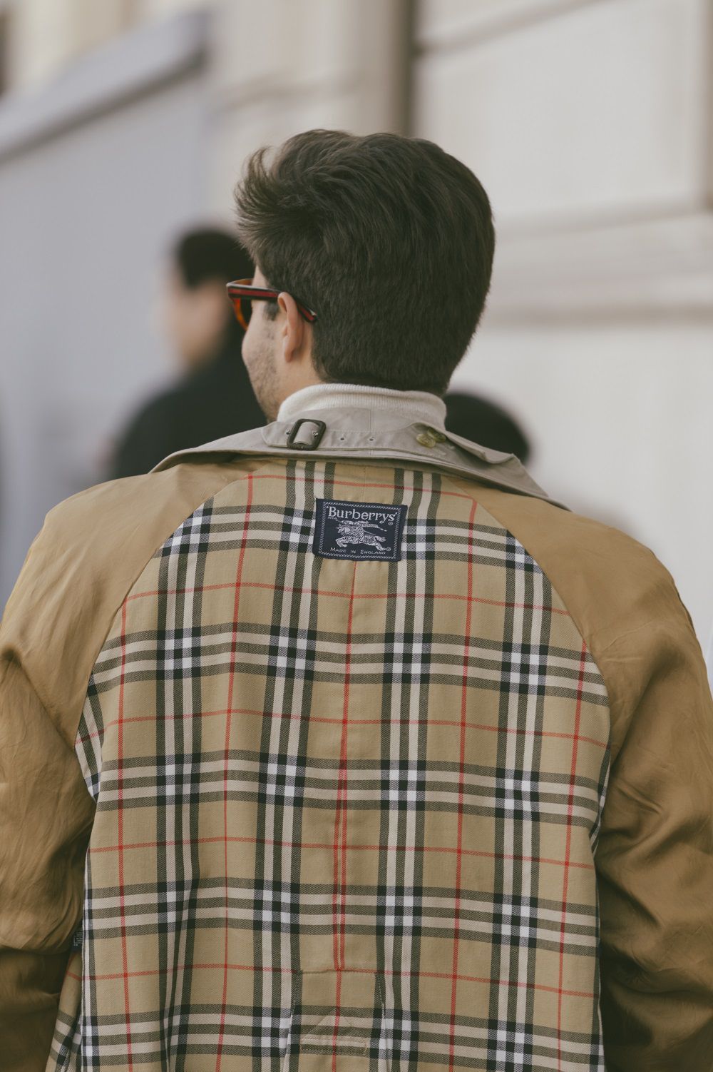
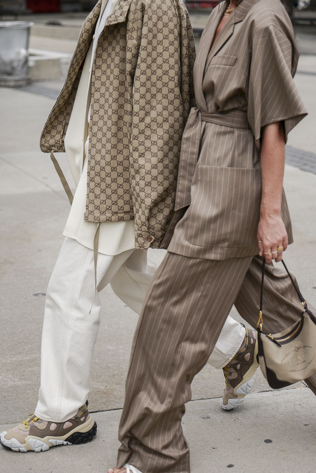
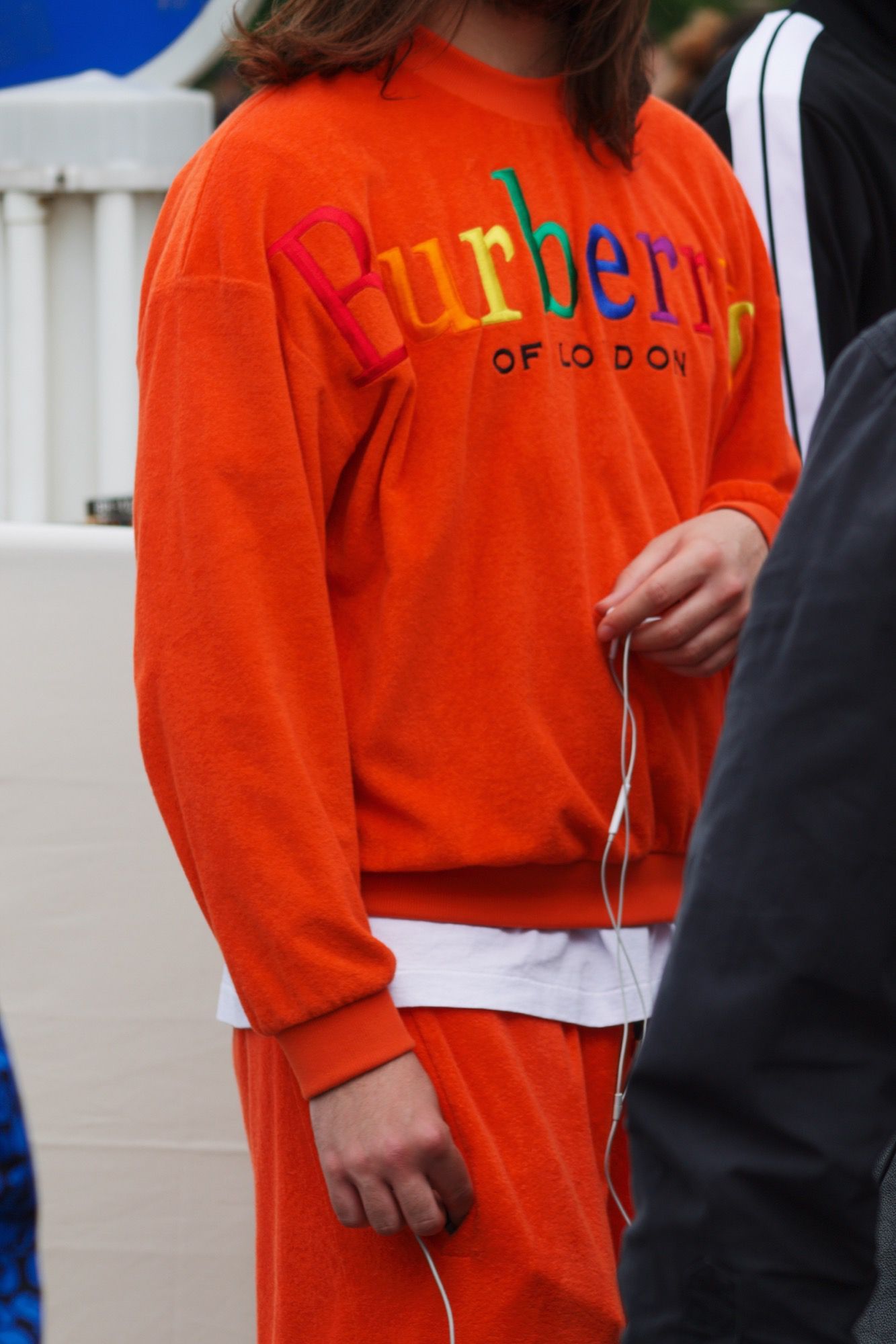
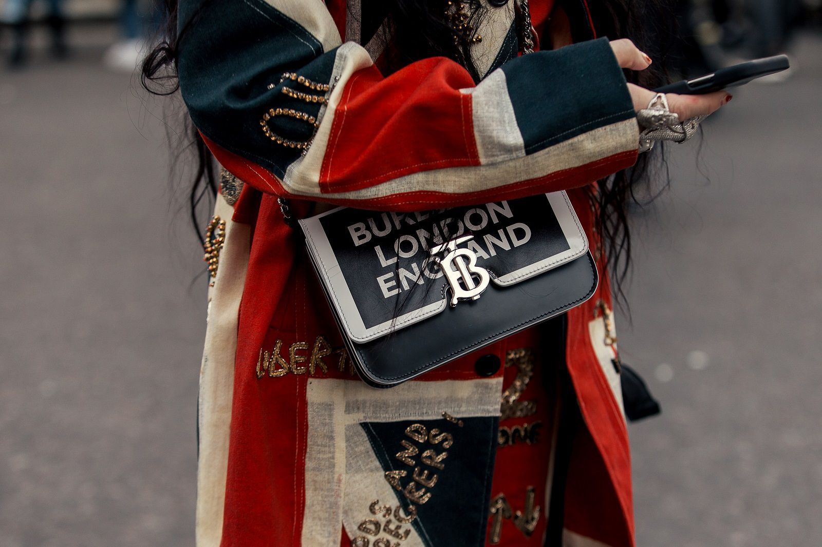
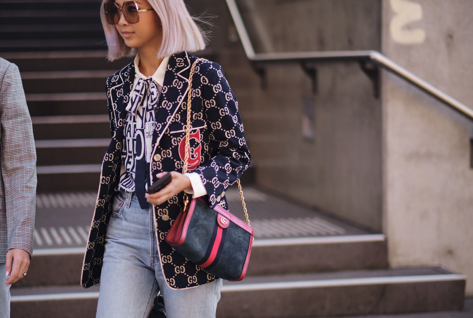
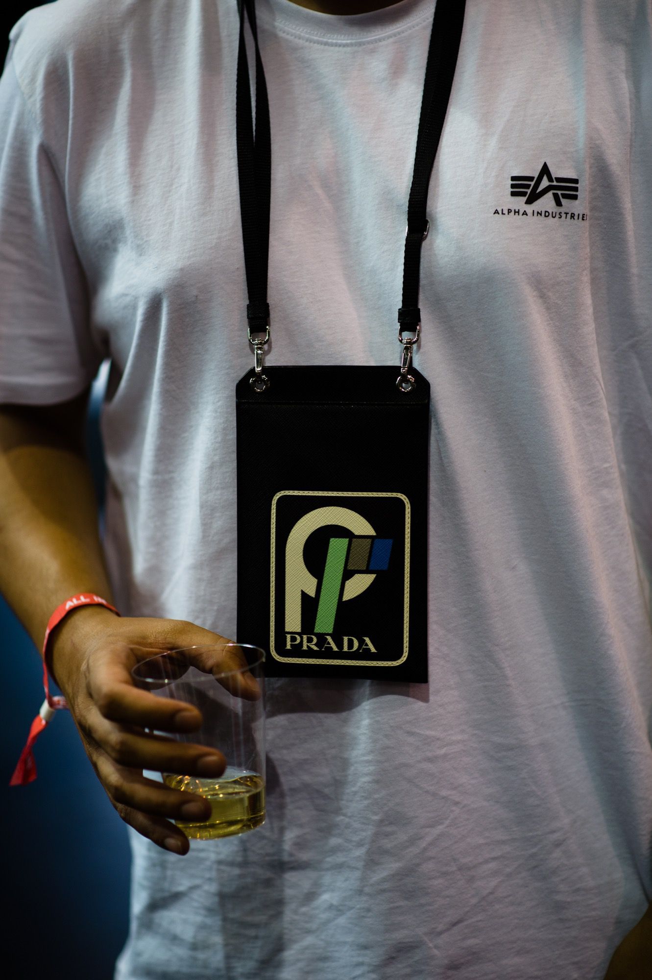
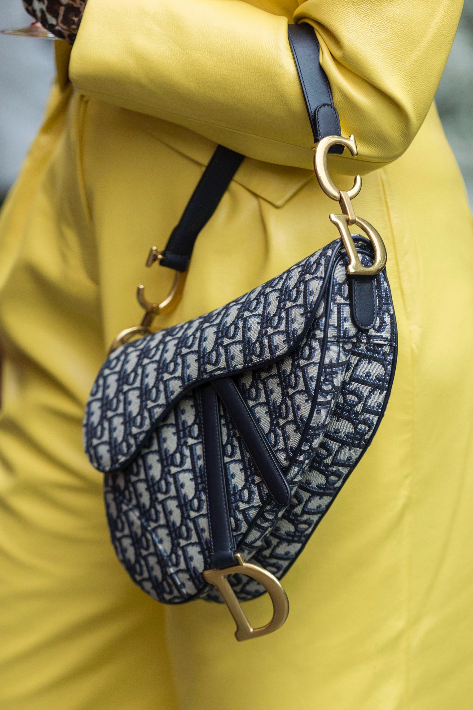
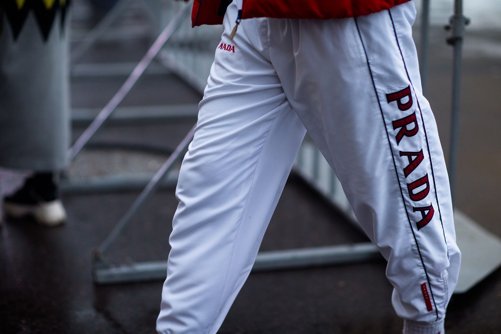
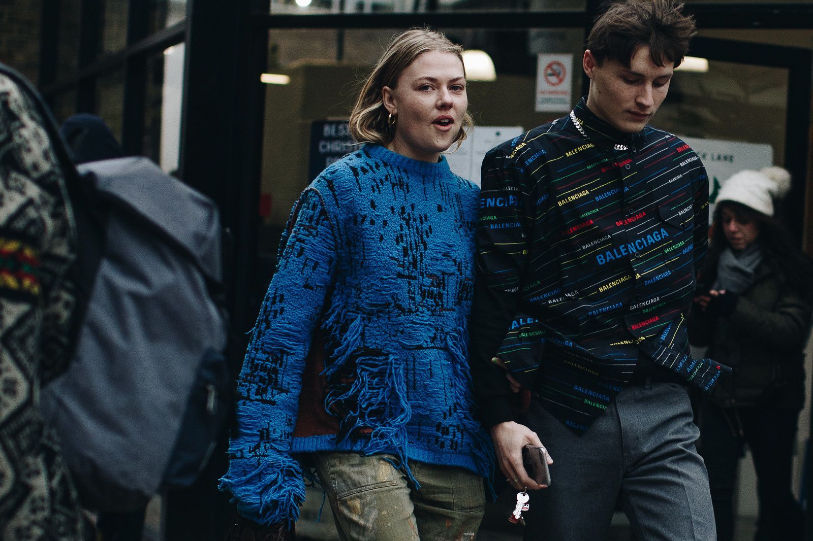
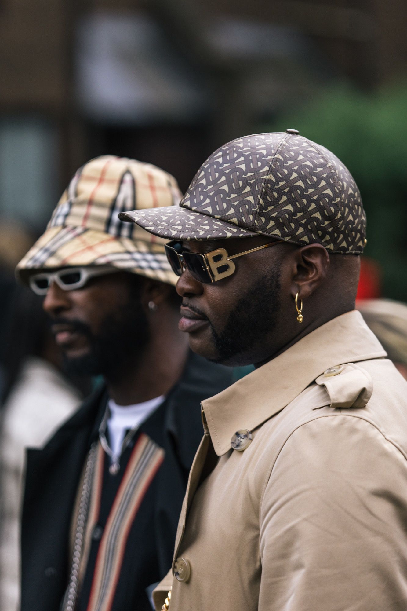
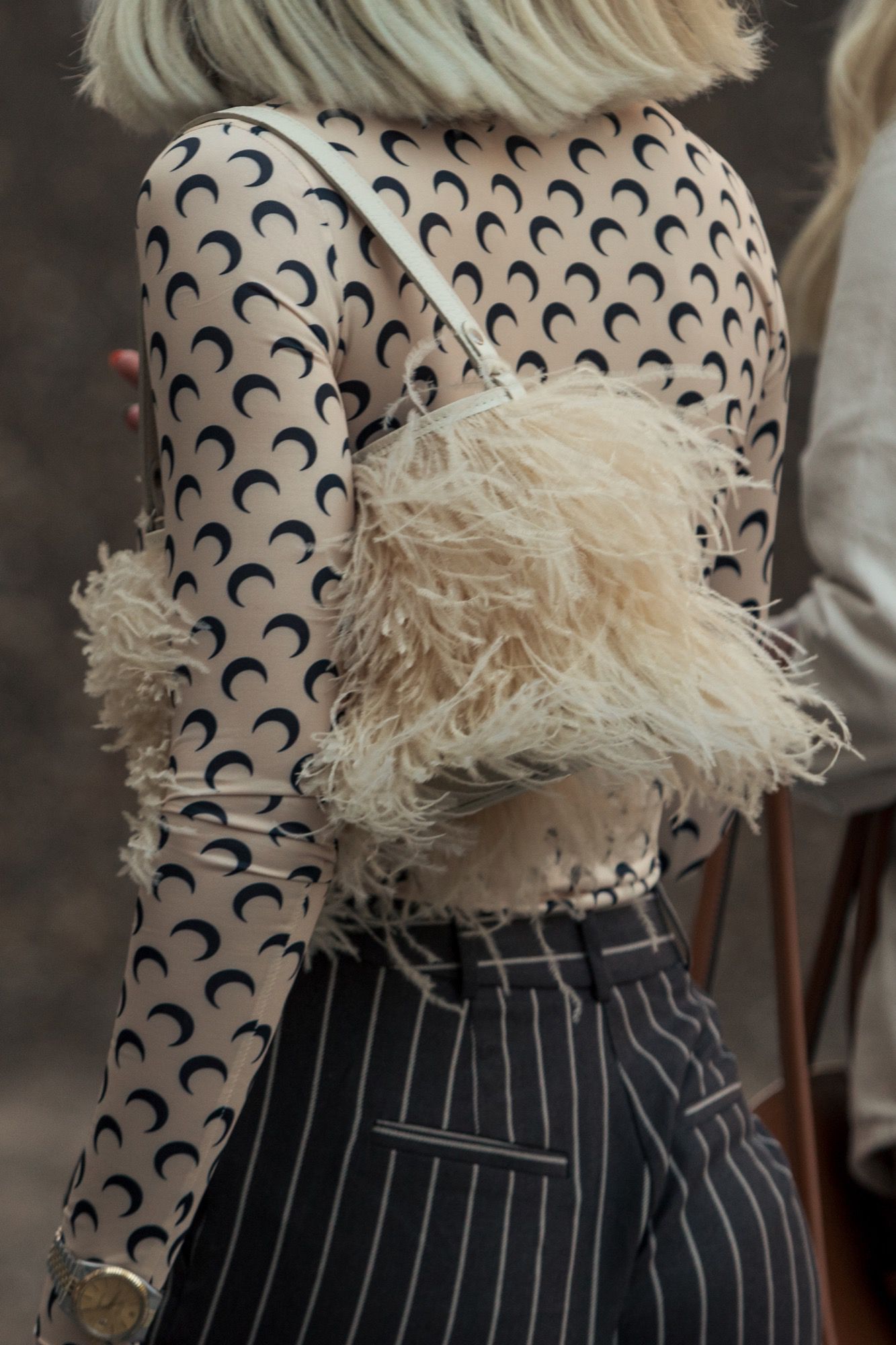
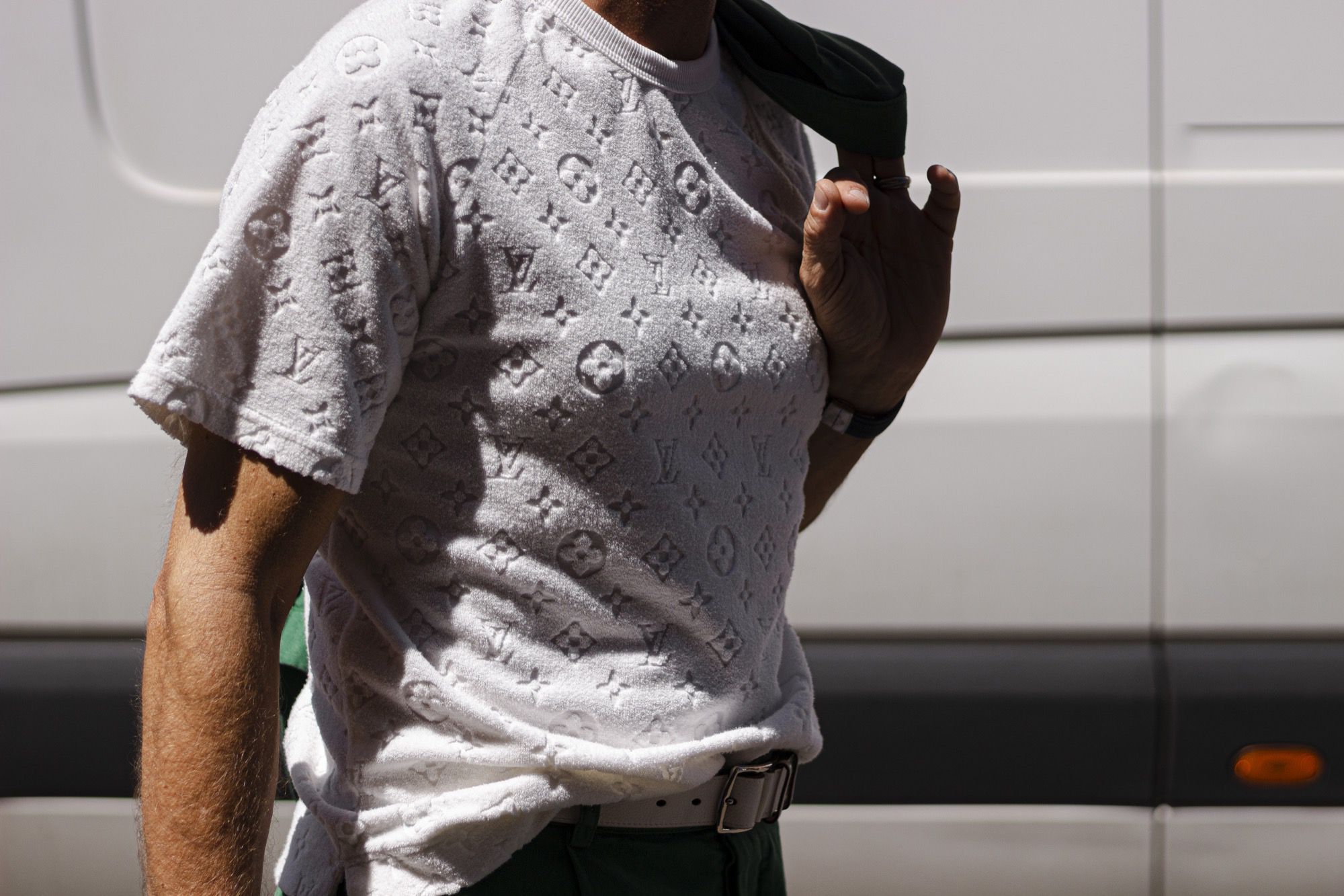
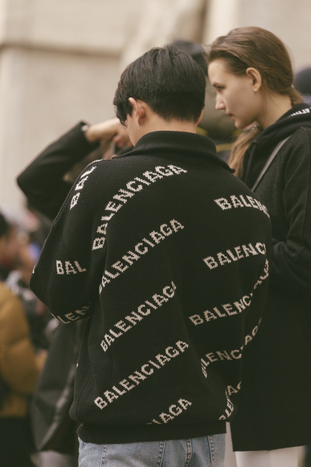
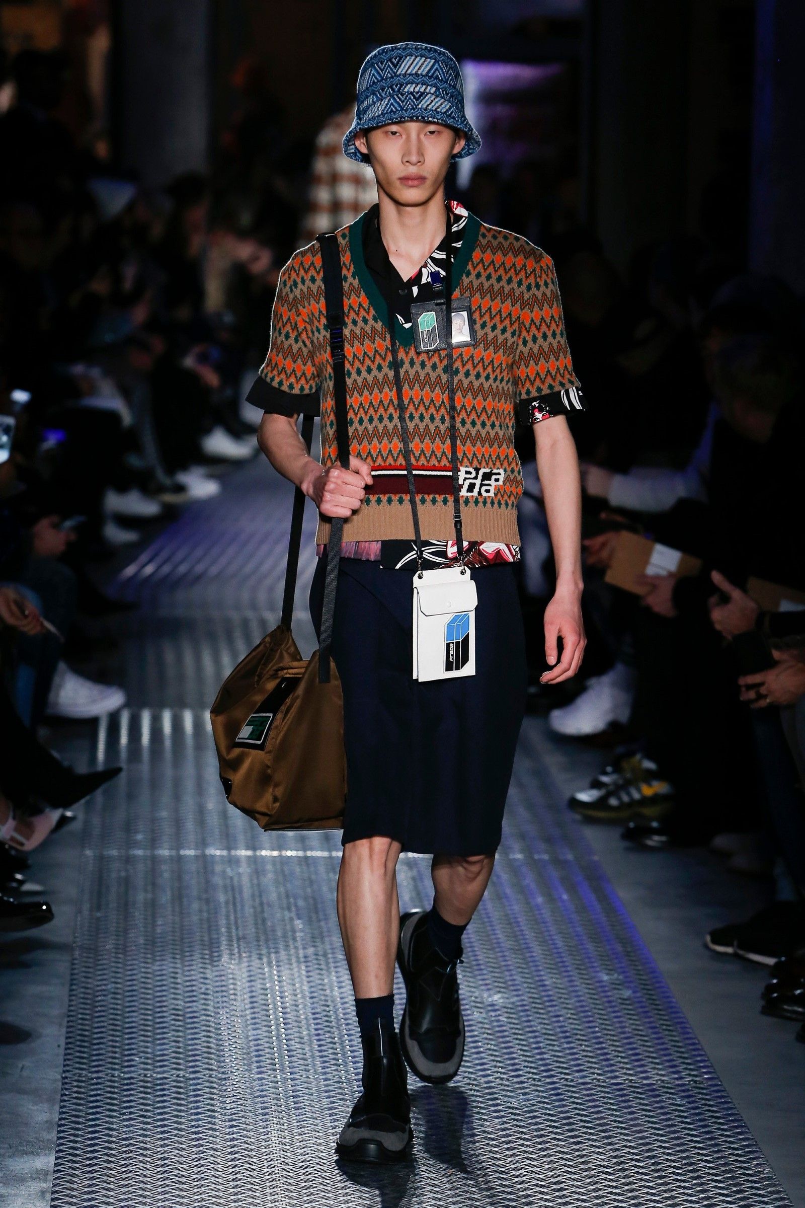
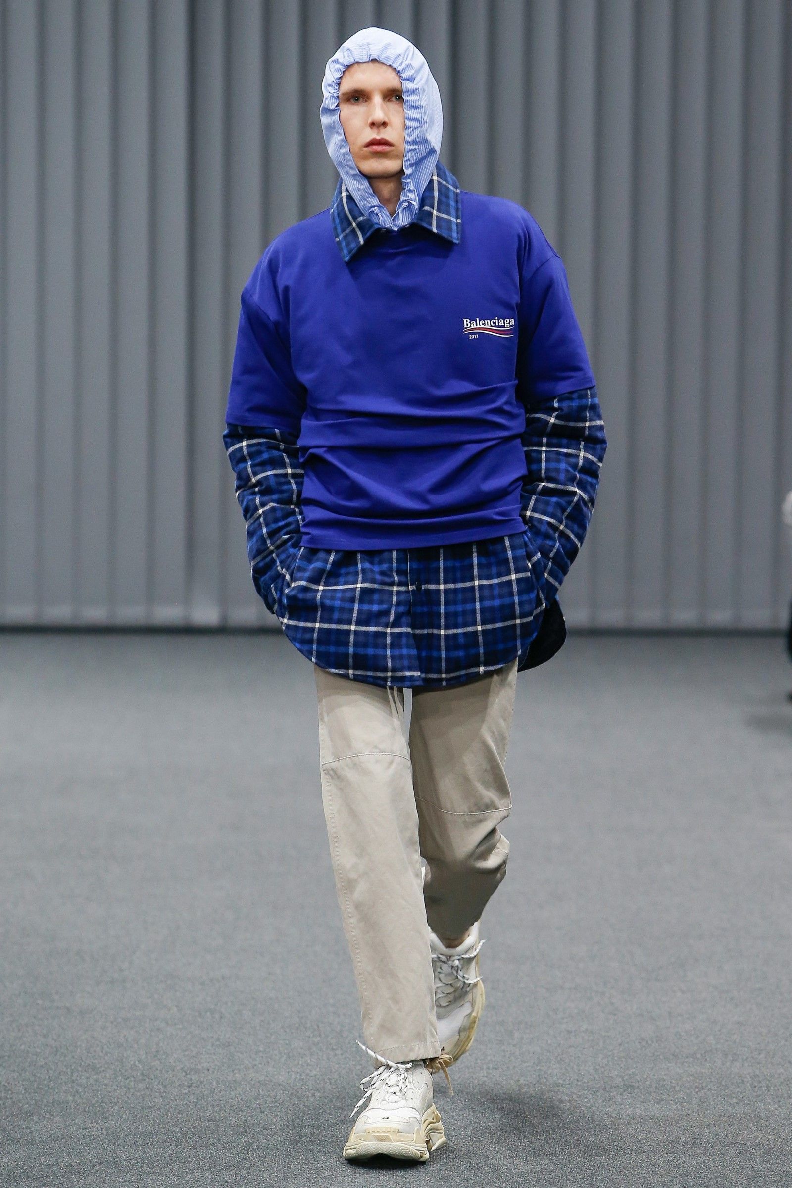
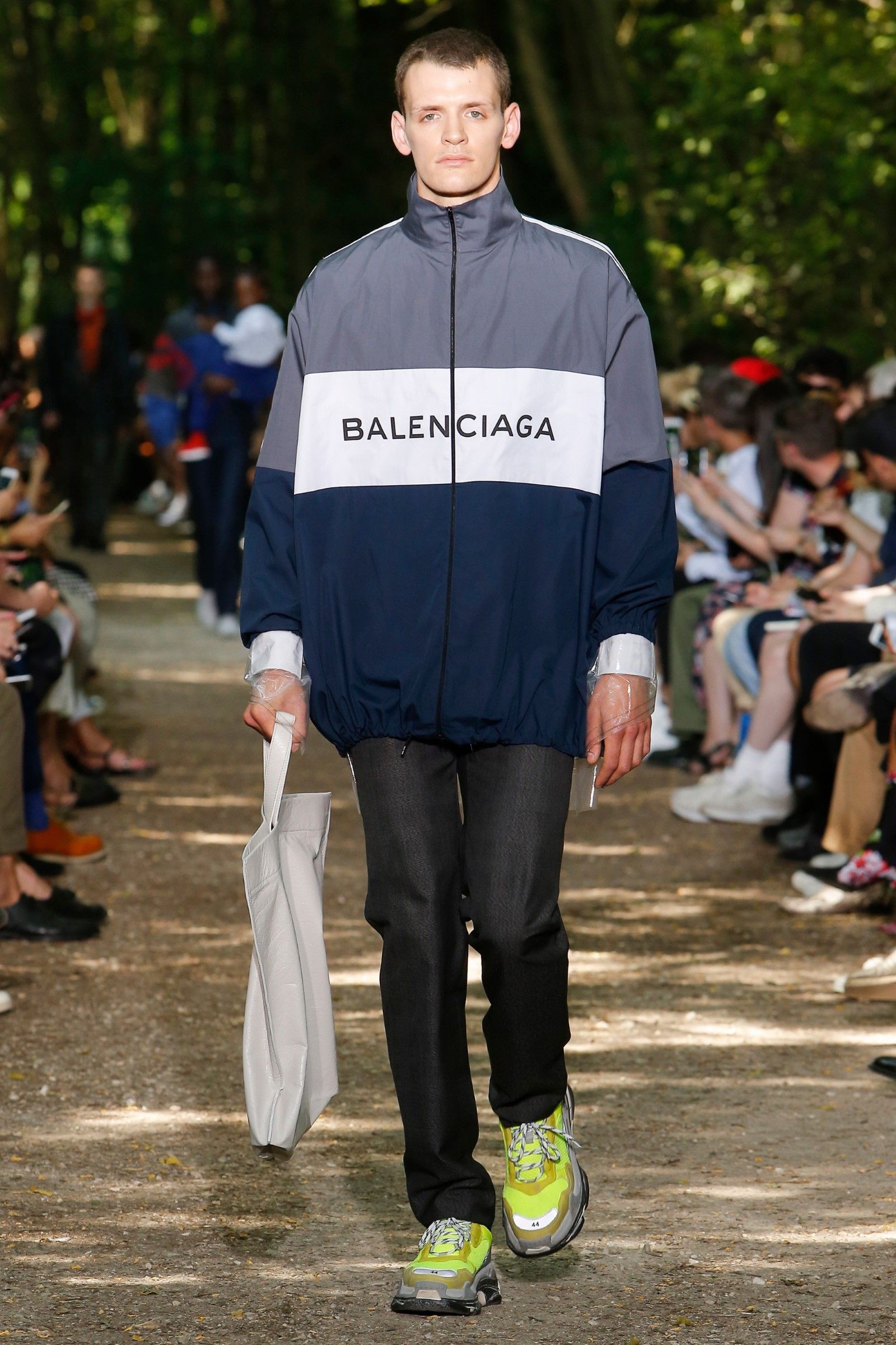
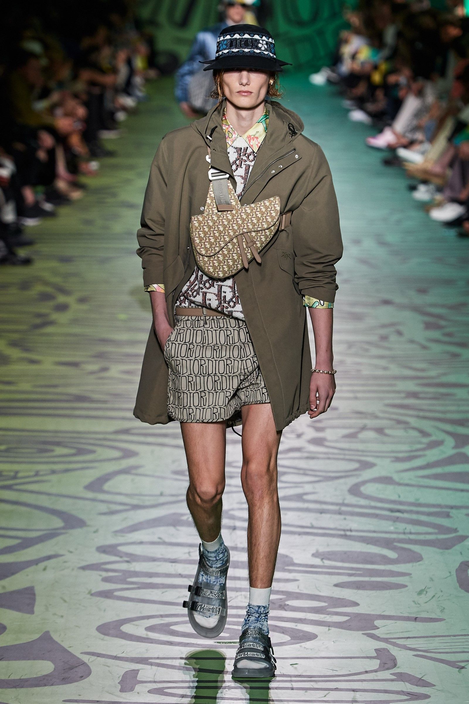
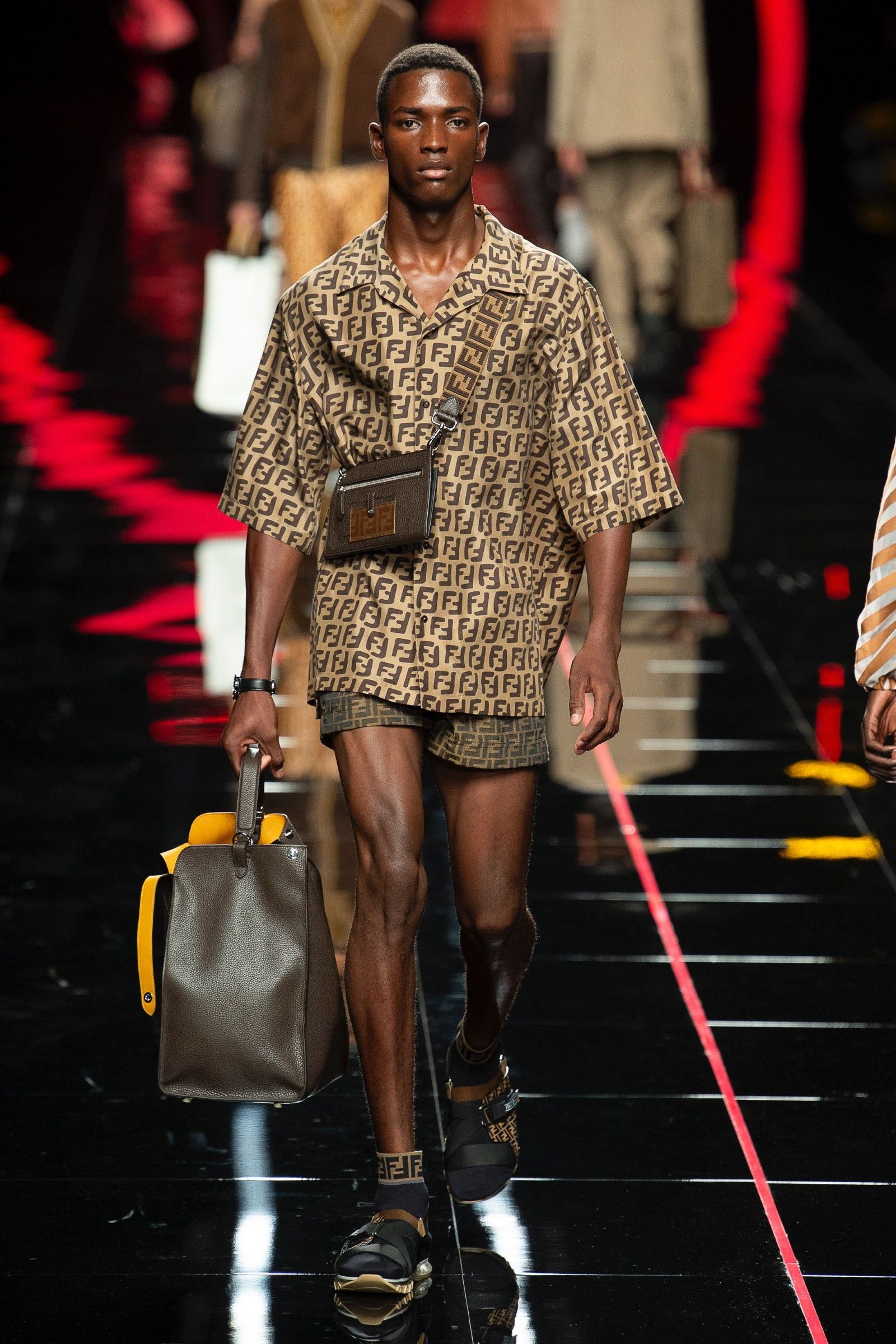
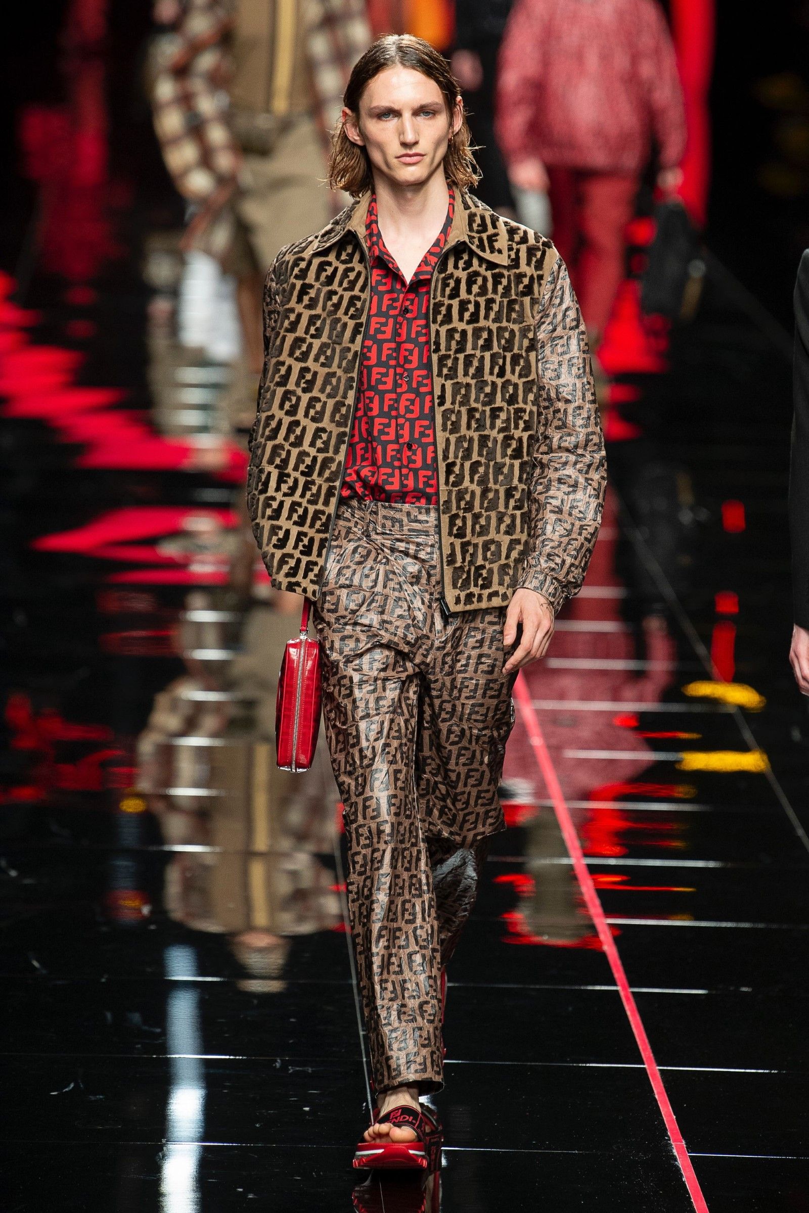
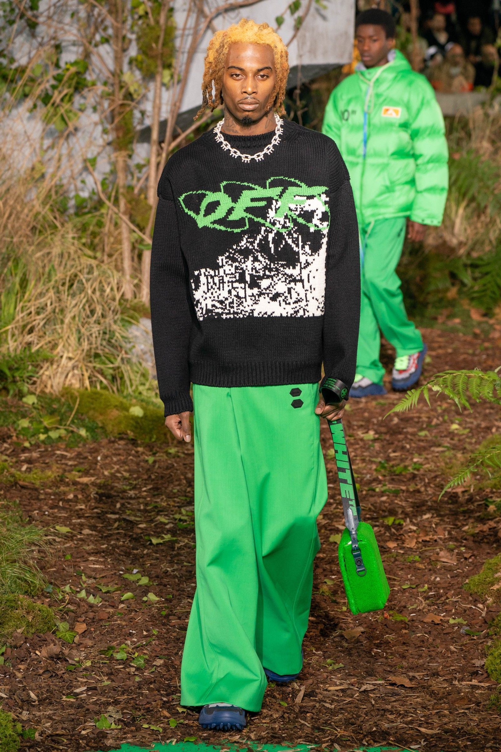
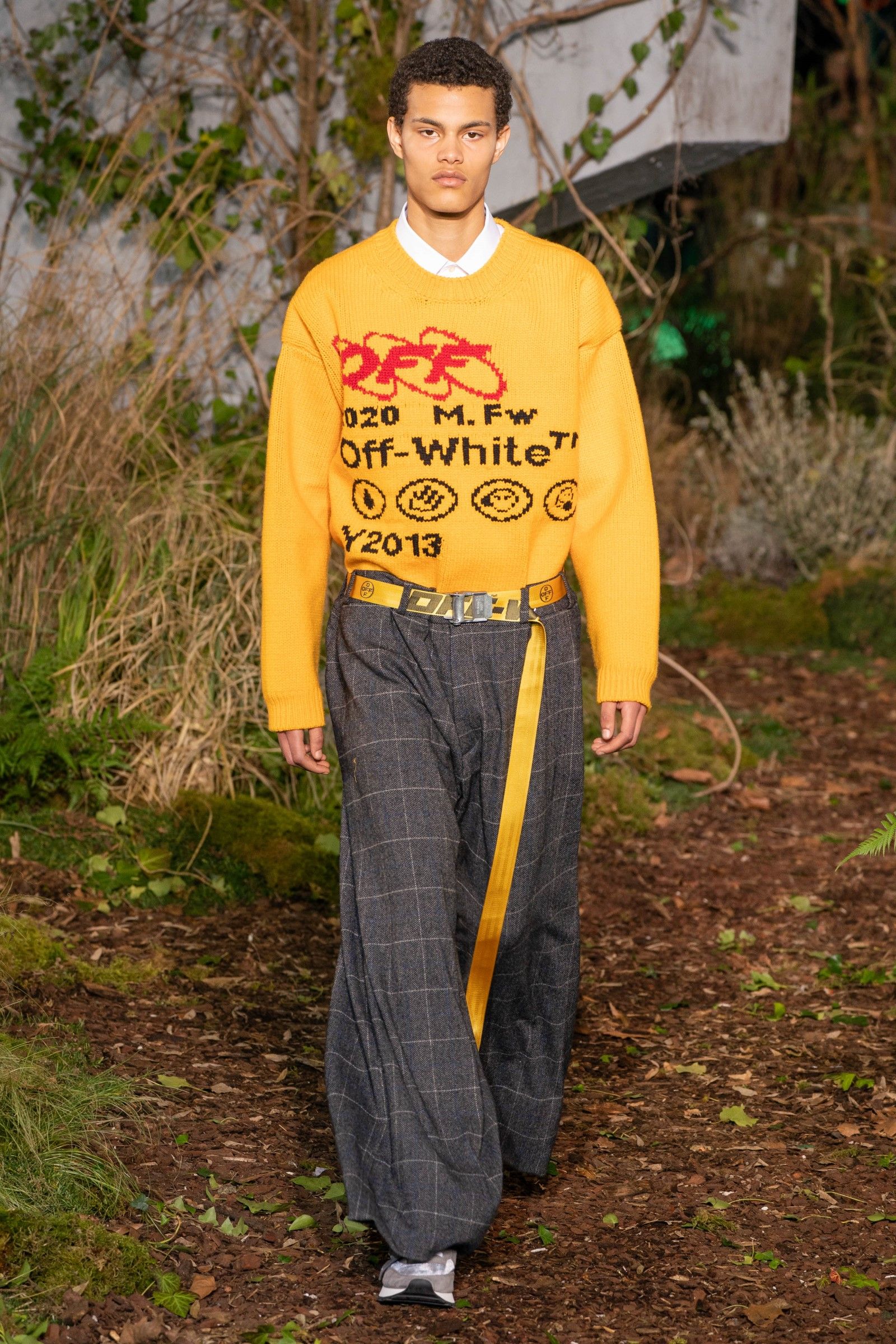
For years logos and monograms thrived. The Dior Oblique motif, already resurrected illo tempore by Galliano, returned in all strength to Dior's men's collections; Riccardo Tisci at Burberry de-aged the Check Pattern, changed the lettering of the logo and created a new monogram; Comme des Garçons covered shoes and t-shirts with hearts; Balenciaga sweatshirts and T-shirts popped up every fashion week and even the irreproachable Prada began to launch a series of sweaters, shirts and t-shirts with logos well visibile. The trend is certainly not exhausted: for a few seasons, Celine has created hoodies with logos and items covered by its monogram, the same has Saint Laurent with a new model of bags that reproduce the acronym YSL while a brand like Marine Serre has become famous practically only for its crescent monogram. The setback came in 2019, however, with the harsh words of Virgil Abloh, perhaps the main designer who had driven logomania, who announced the death of streetwear in a now hyper-saturated market of hoodies and t-shirts with graphics. Suddenly branding began to become increasingly discreet while fashion inner circles realized that logomania was simply basic and the mere presence of a logo did not justify the astronomical prices of hoodies and T-shirts.
And now?
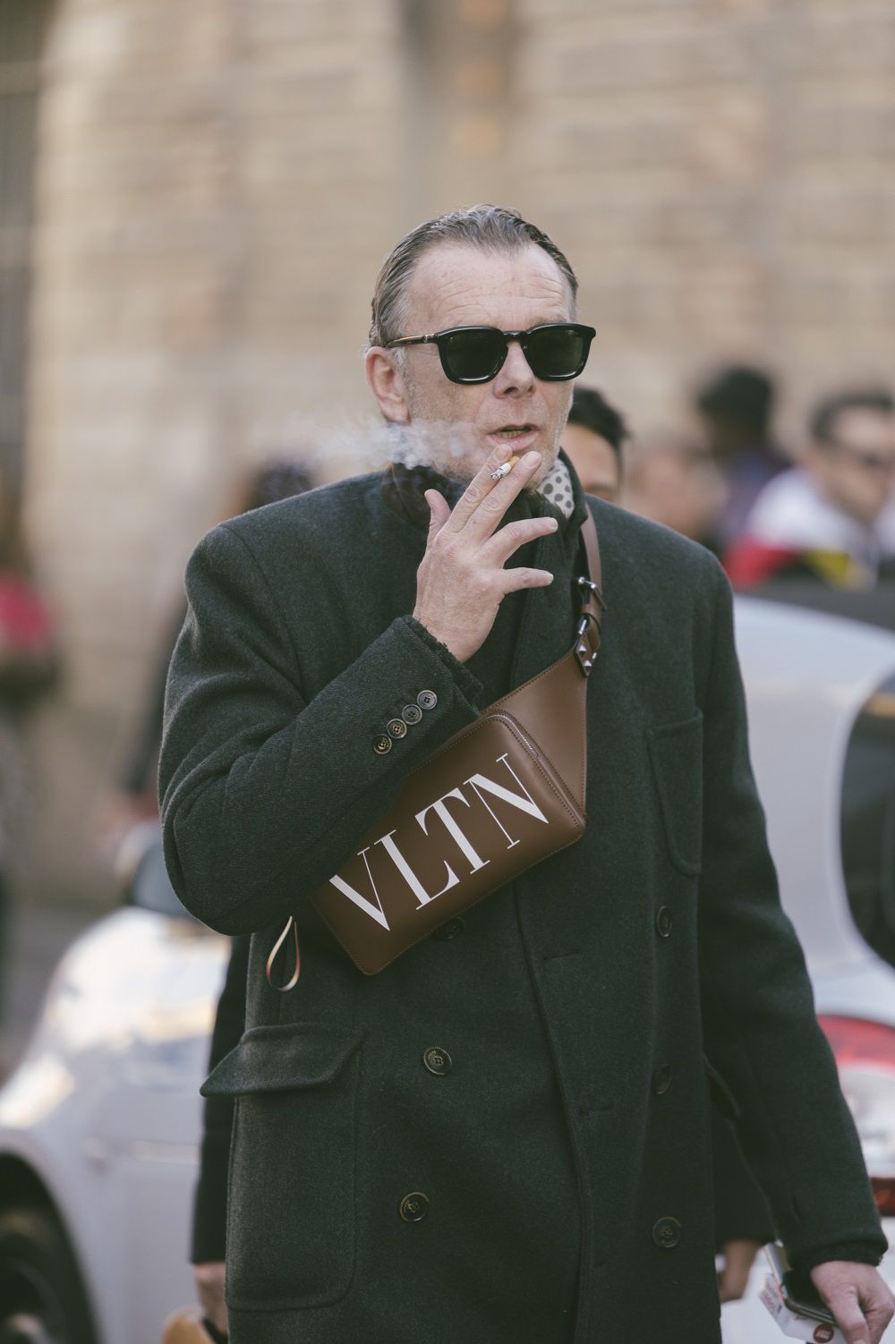
Today we live on the edge: on the one hand, it can be said with greater ness that the aggressive branding of certain products is now much outdated; on the other hand, it is obvious that anyone who buys a luxury item wants to feel part of the idea of luxury and show it to others as well. Moreover, the idea of "logo as aesthetics" has remained, but declining on the level of the vintage logo or discreet decoration, that is, without its presence becoming totalizing and invasive - think of the "Gucci Orgasmique" labels on the sleeves of Gucci SS20 jackets or those of Raf Simons FW21, small but clearly visible, but also to the logos of the latest Prada collections, tiny but paradoxically showy because they are placed in key positions. Today we are closer to an era of the "recognizable product": an item must tell where it comes from but with ease and, above all, the logo must no longer be a symbol of economic status but of cultural belonging. Everyone would recognize at first glance a Rick Owens garment, a Celine boot, a Bottega Veneta bag or a Prada print shirt – the visual identity of certain brands is so strong that the logos are superfluous. At the same time, there is a strong difference between products that find the consent of critics and those that drive in-store sales.
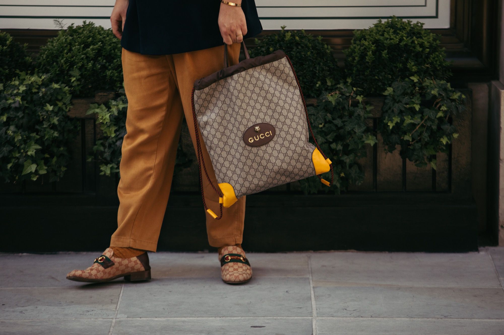
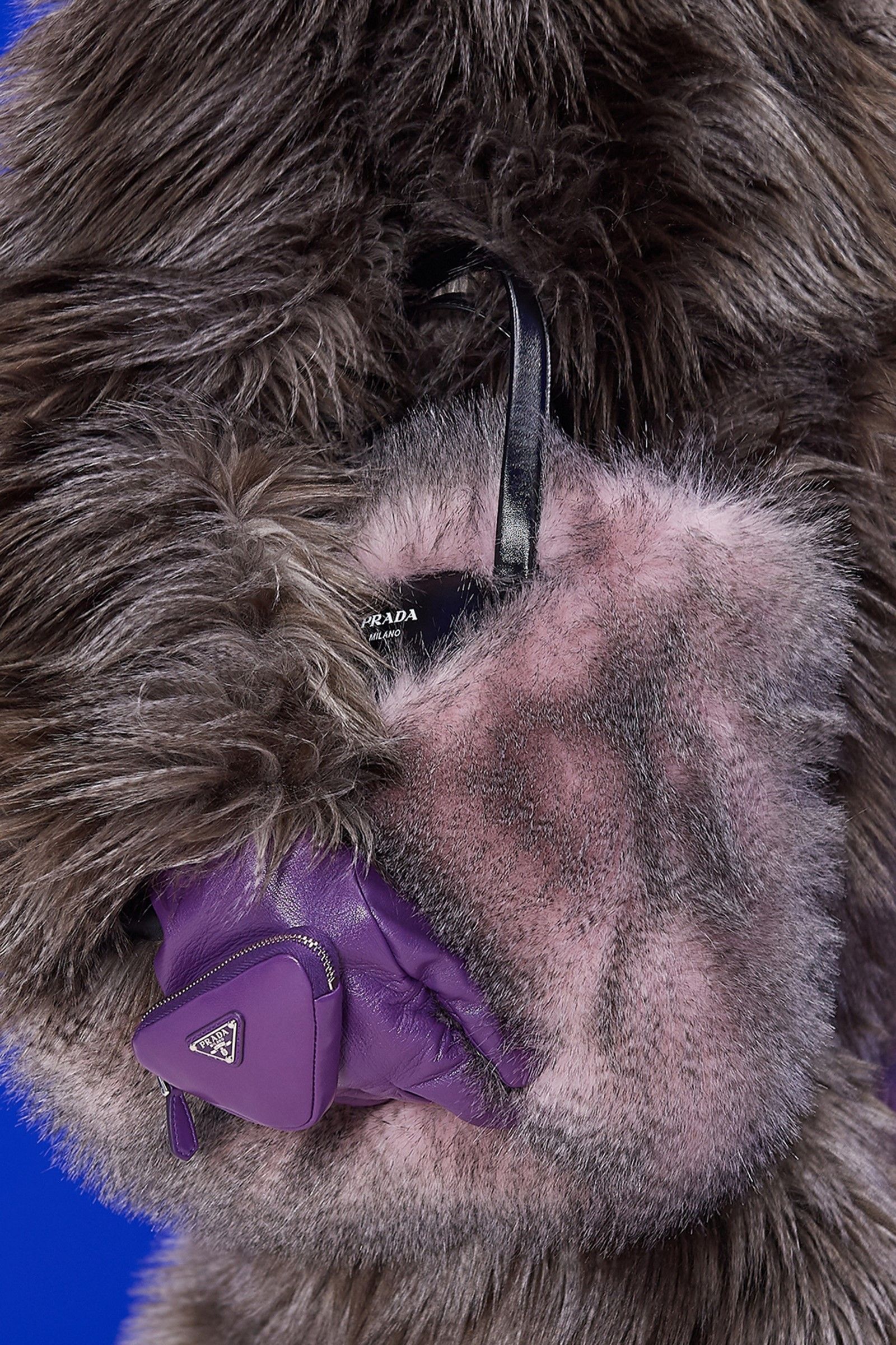
So why does Gucci insist on logomania? Firstly, it should perhaps be said that Gucci's most classically logo-covered garments have disappeared from the brand's collections for years. Michele likes vintage-flavoured patterns, it is true, but one could certainly not accuse him of laziness also because he has demonstrated and continues to demonstrate that the patterns with which to tell his Gucci can be the most varied: the Overture collection for example sees a strong recurrence of creative monograms, with the most explicit logos present only on classic accessories such as belts and bags, while the name of the brand is clearly written only on some t-shirts. The strong use of "double" monograms and logos in Aria is perhaps more a reaffirmation of the strength of the logo as a cultural pillar of the strength of both brands and, why not, also a desire to push on the market already profitable categories of products that could be even more so. It's certainly no mystery that Monogram lines are the daily bread of a fashion house's sales, and if these lines have such widespread public success that lasts for generations, why deny it? Alessandro Michele has embraced him but it is still difficult, now, to say who will want to follow him.