


The 5 most iconic shades of color of the fashion world From Dior to Jacquemus


Before it's tactile, fashion is a visual experience. And over the decades, many designers have gone for a particular shade of color by exploring it and interpreting it in a thousand ways over the years. As well as prints and patterns, in fact, colors can also come to identify a specific brand and in the cases listed below, ranging from the most historic to the most modern, designers have been able to exploit and tell the charm of a color that has ended up symbolizing the aesthetics of an entire brand over the years and creative directions.
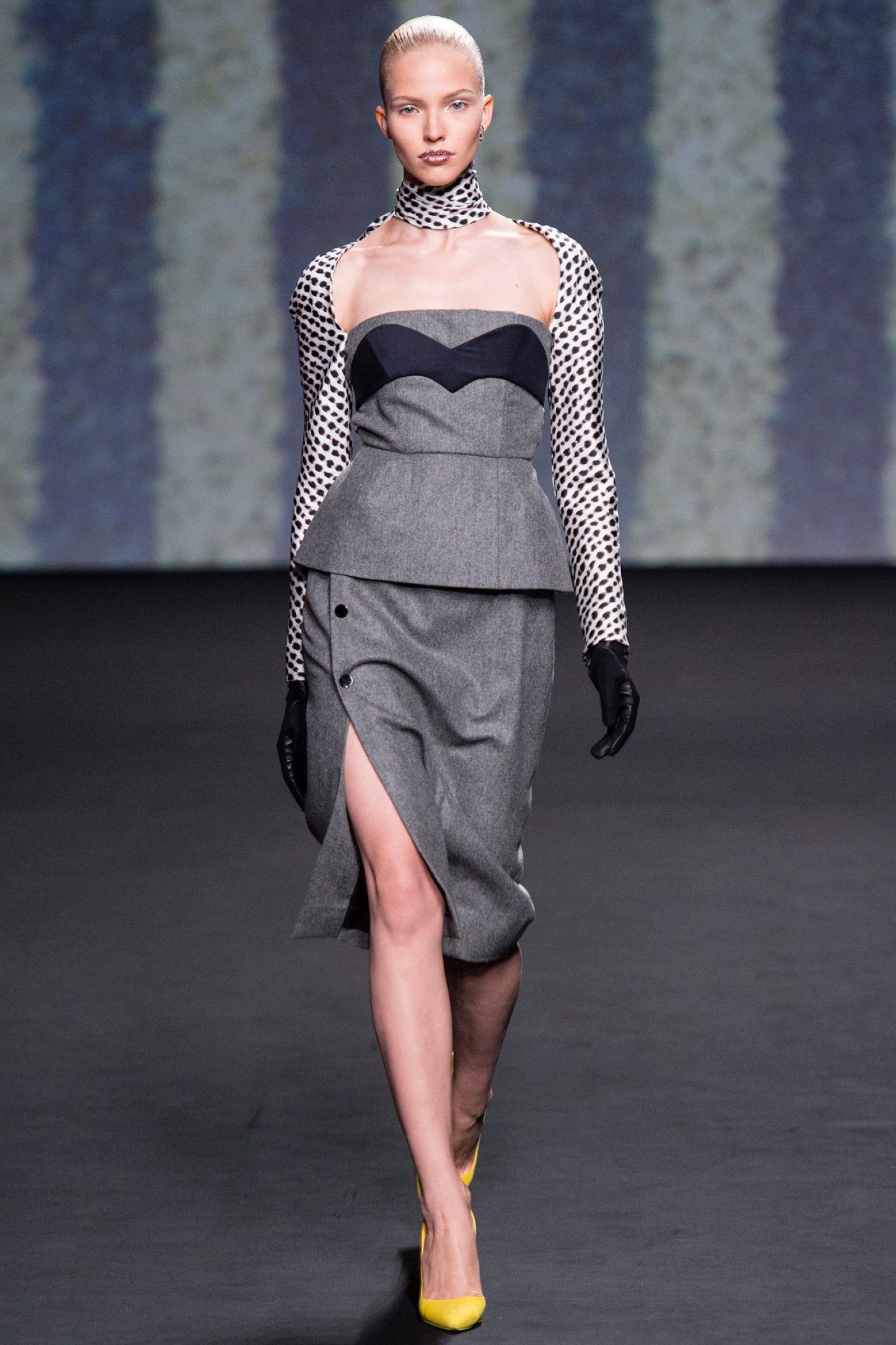
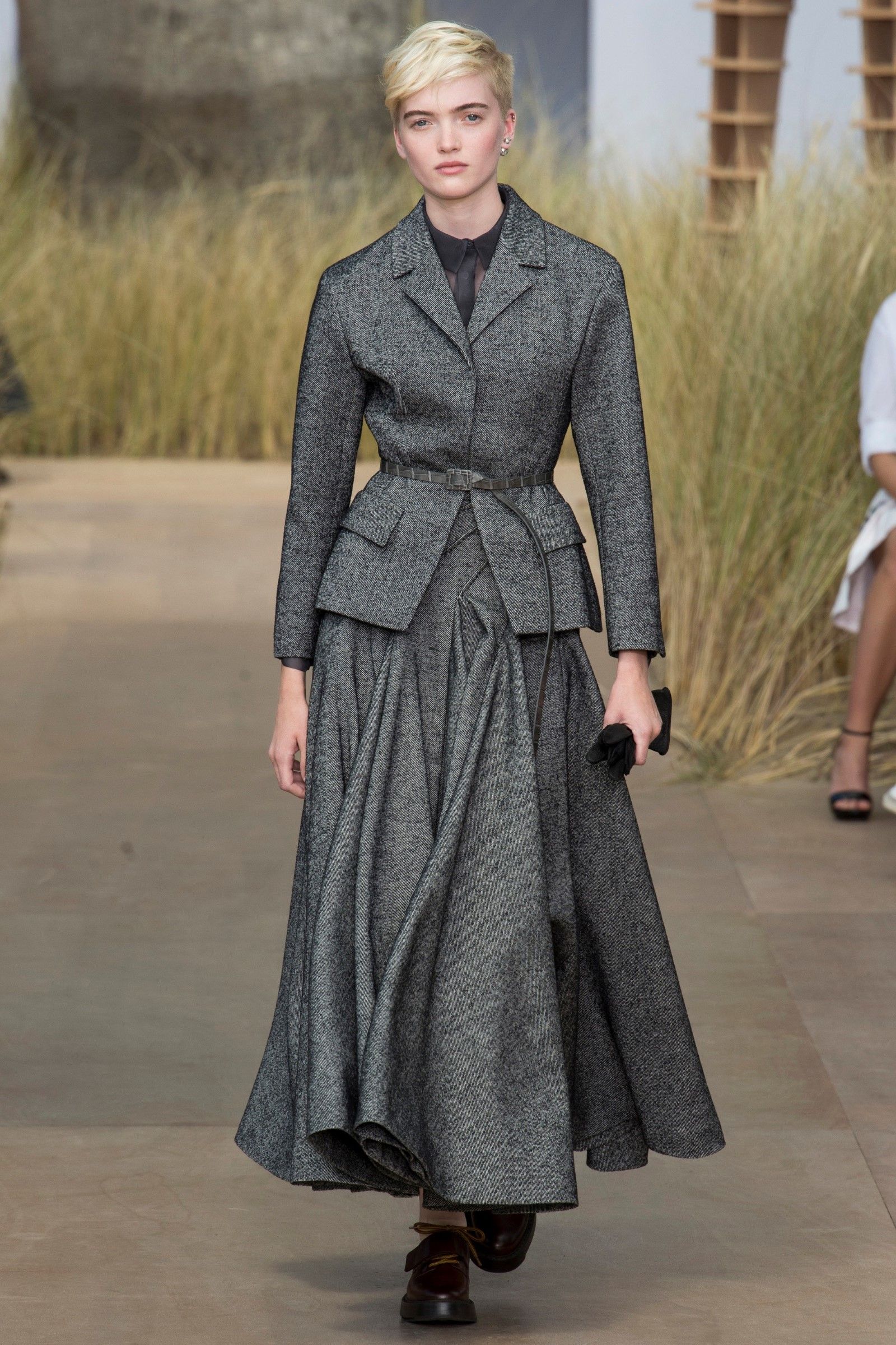
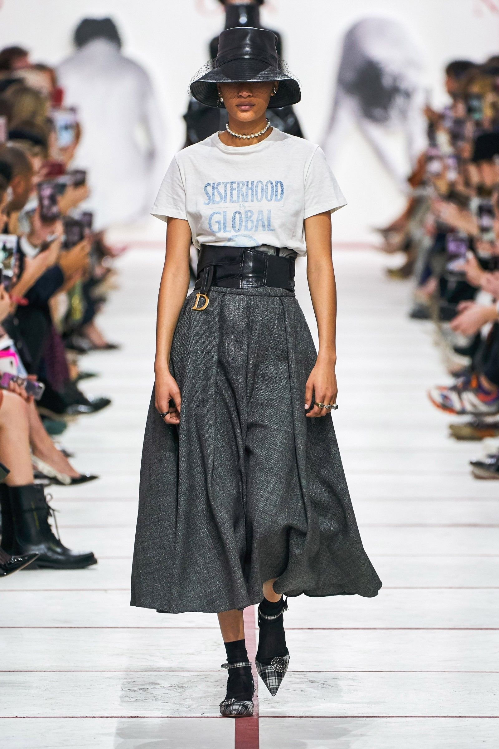
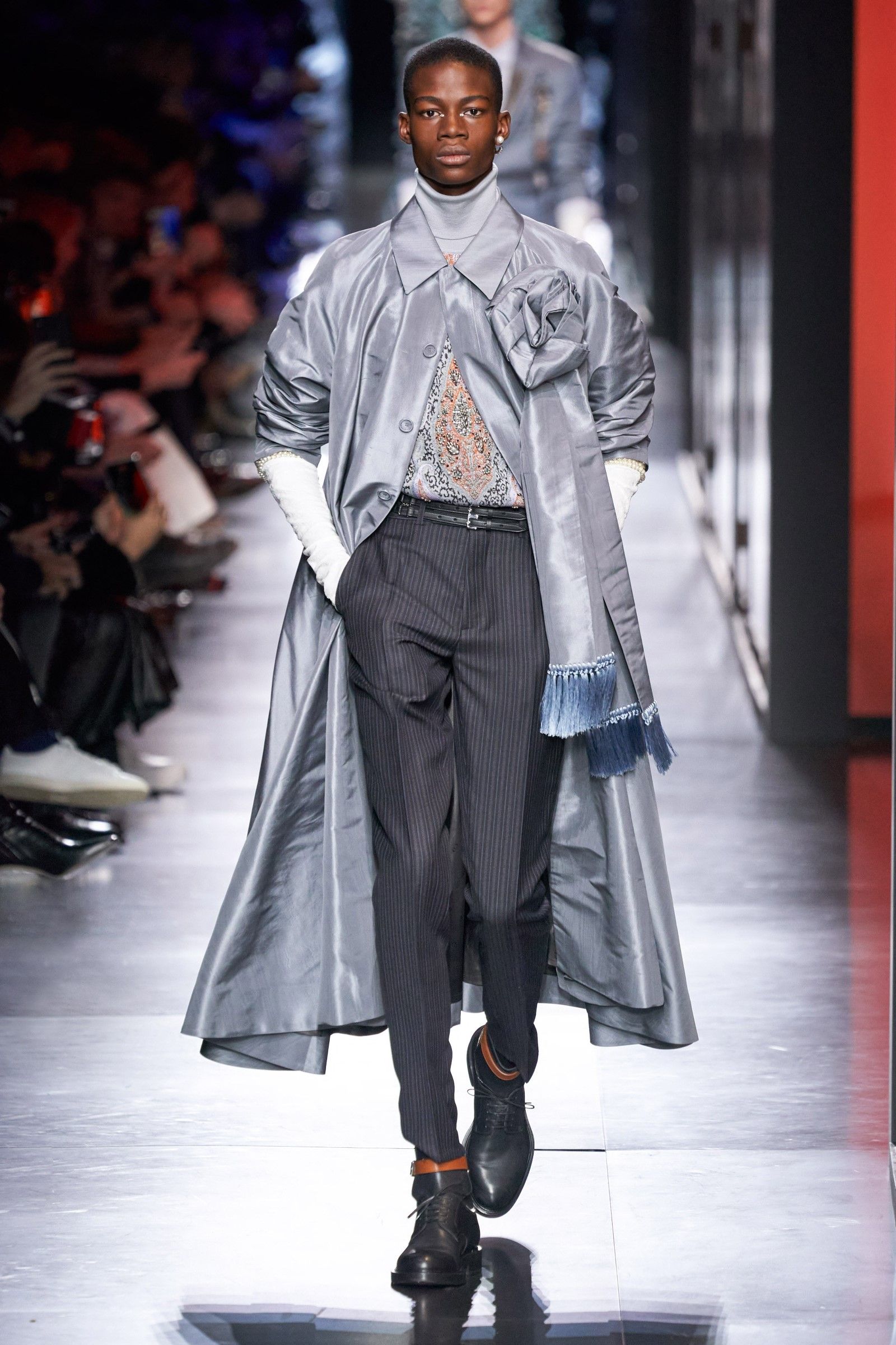
The grey of Monsieur Dior
The shade of color that Christian Dior loved above all else was grey – a practical and neutral color that expressed the discreet preciousness of the designer's style. The love of that color dates back to his childhood: Dior had fallen in love with it for the first time in his summer house in Granville, Normandy, whose main colors were precisely pink and grey. That grey became the first color of the walls of his atelier and, after the presentation of the Miss Dior perfume, in the 1950s, it was recorded as Grigio Dior. The designer once said: «Everything goes well with grey, so it is the recommended color for accessories.».
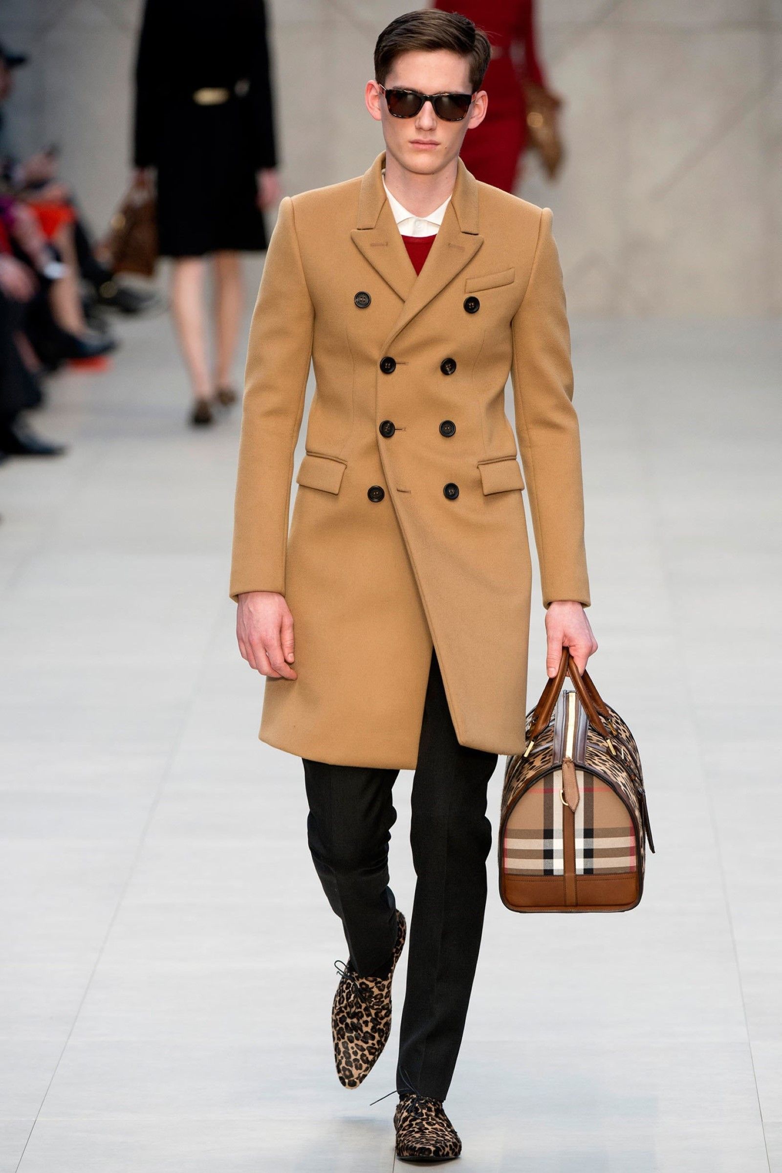
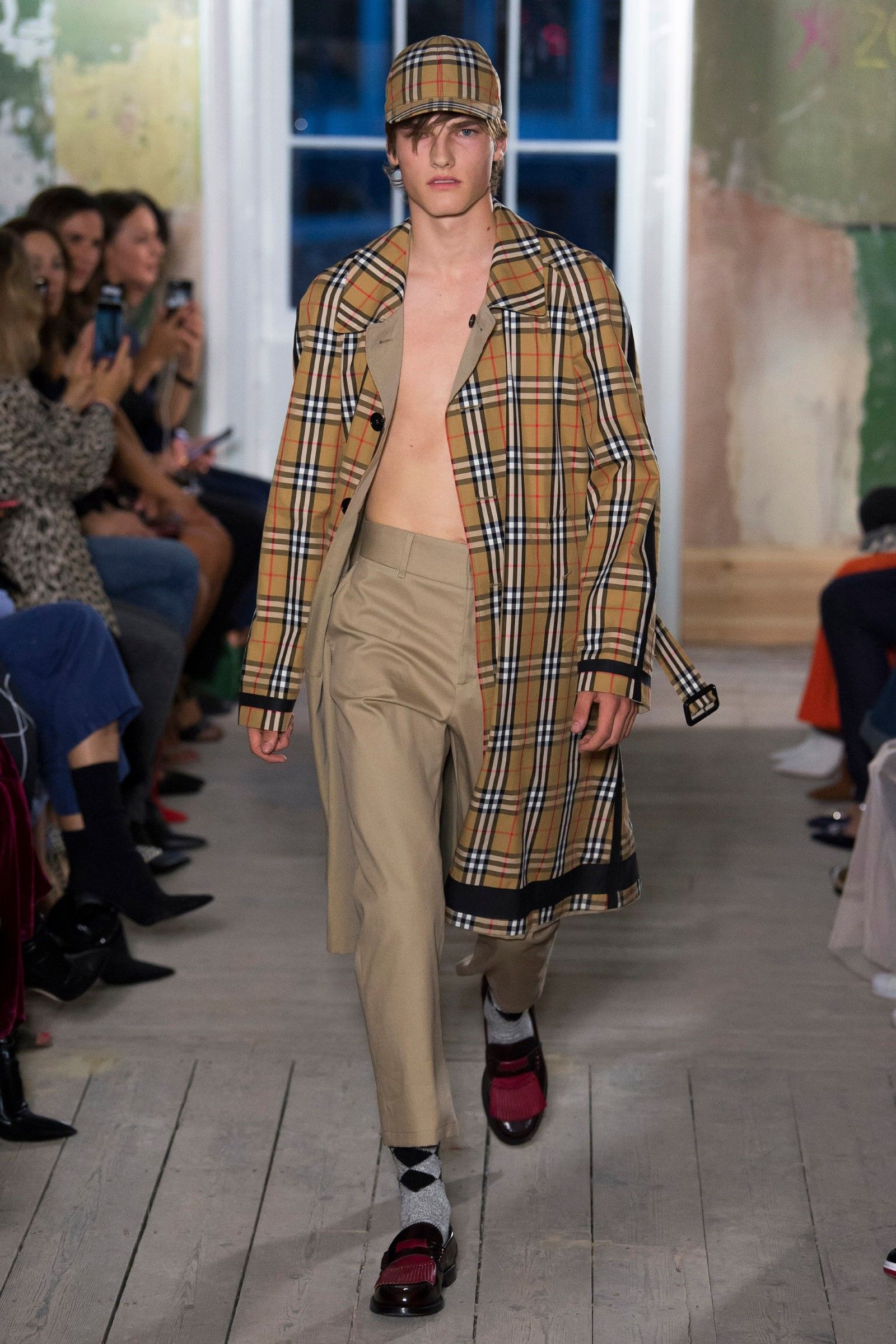
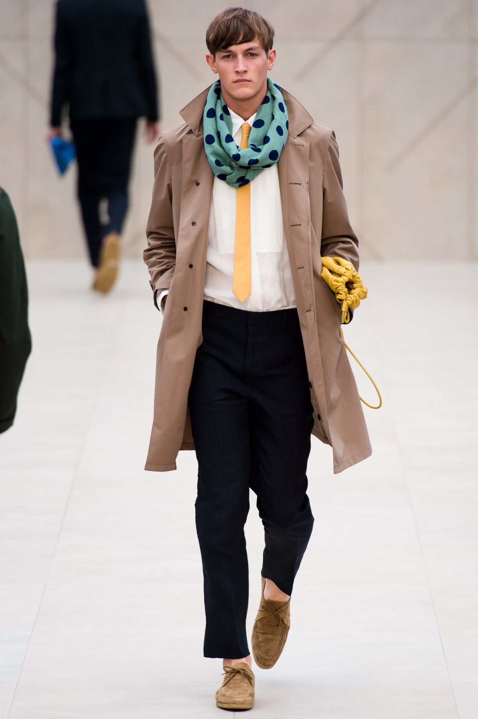
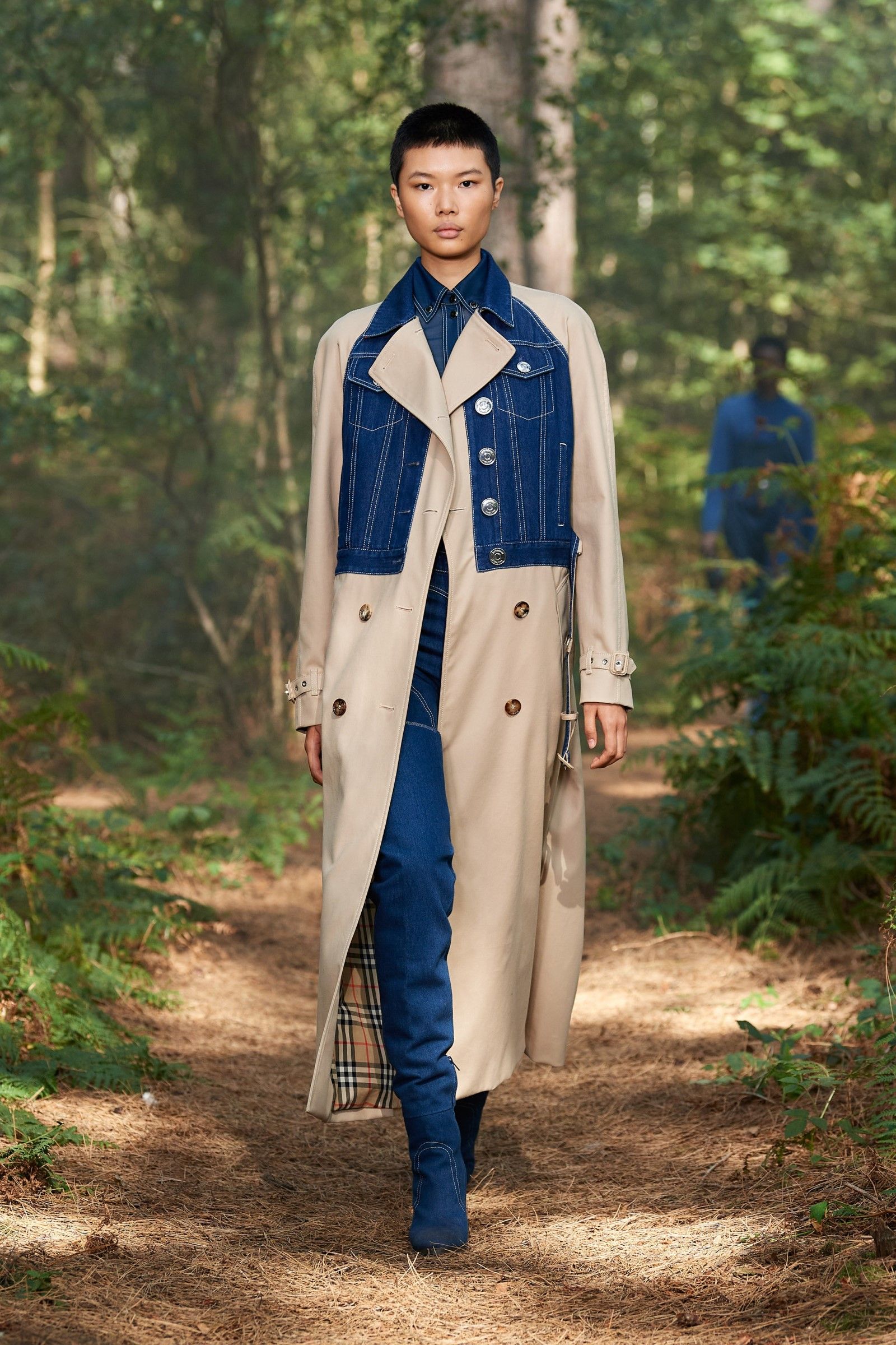
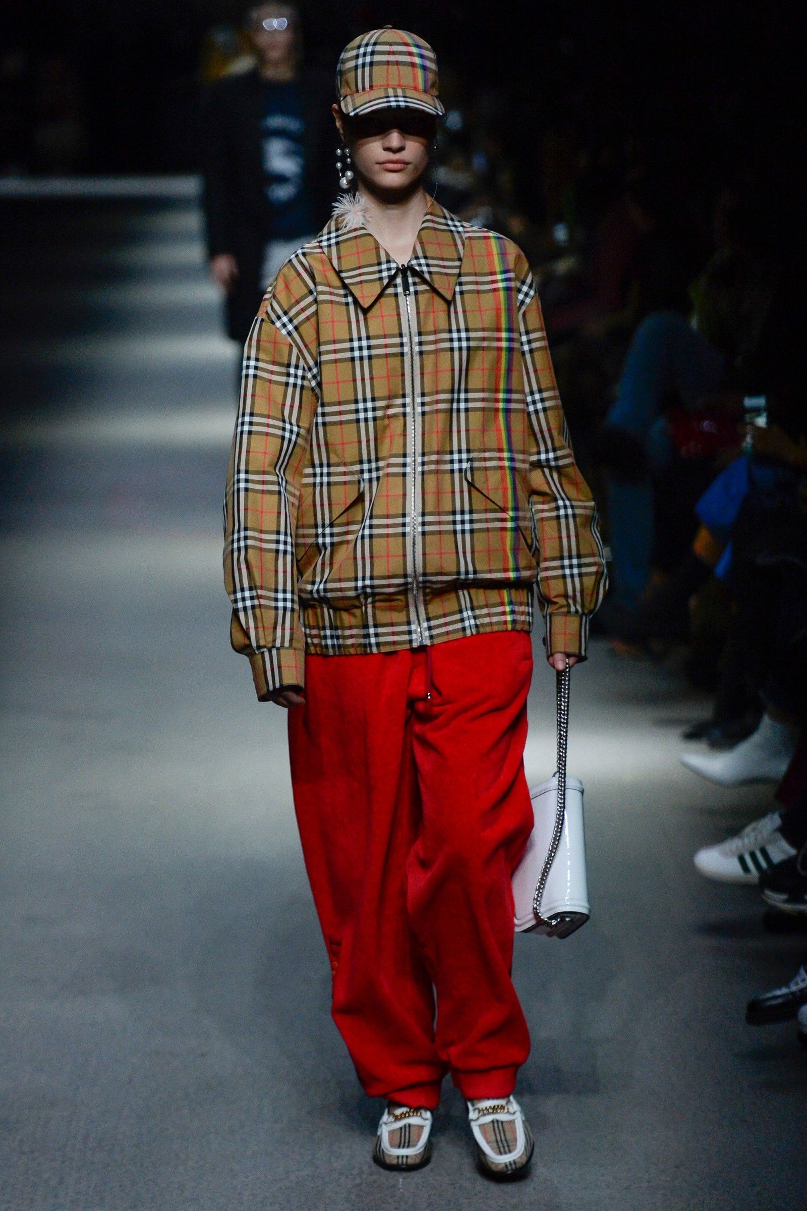
Burberry's tan
As a historical and over 100-year-old brand, Burberry has numerous trademarks including that of its famous check pattern. Although over the years the key pattern of the Burberry house has been declined in numerous different colorways, it can be said that a shade of beige known in English as tan is a constant presence throughout the history of the brand, so much so that beige is the main color of its trench coats – the gabardine coats invented by Thomas Burberry to protect itself from the English rains that kicked off the entire creative story of the brand.
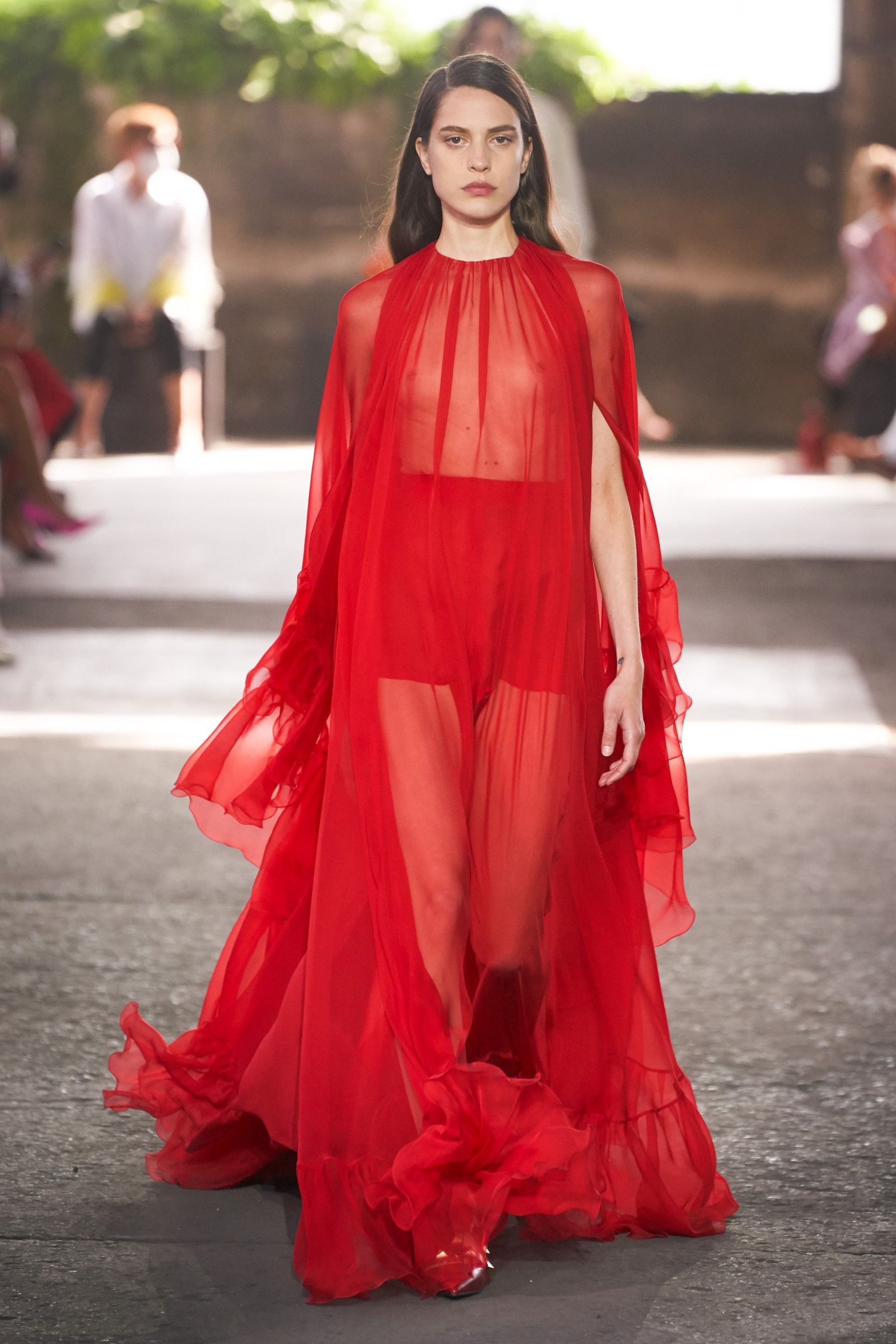
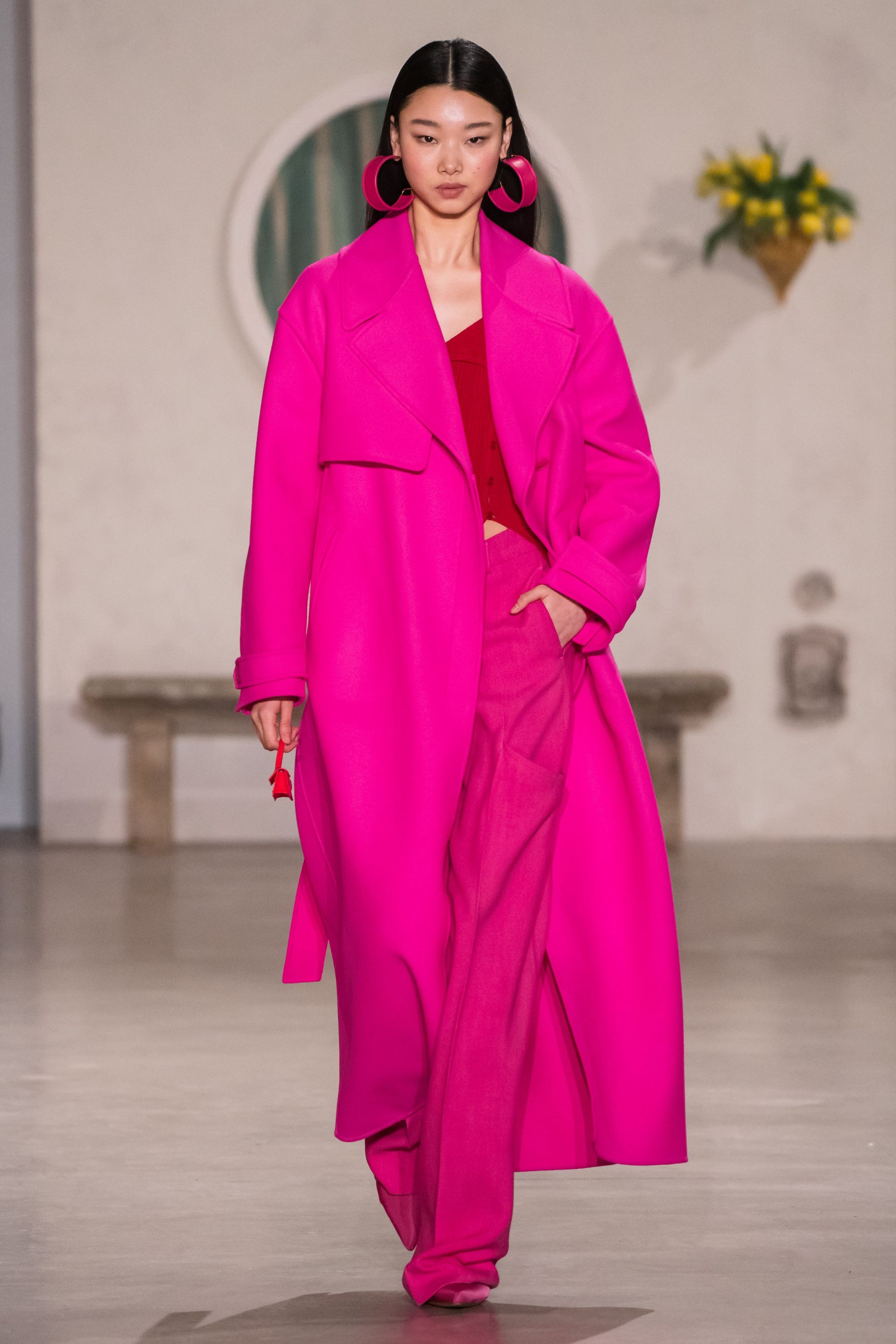
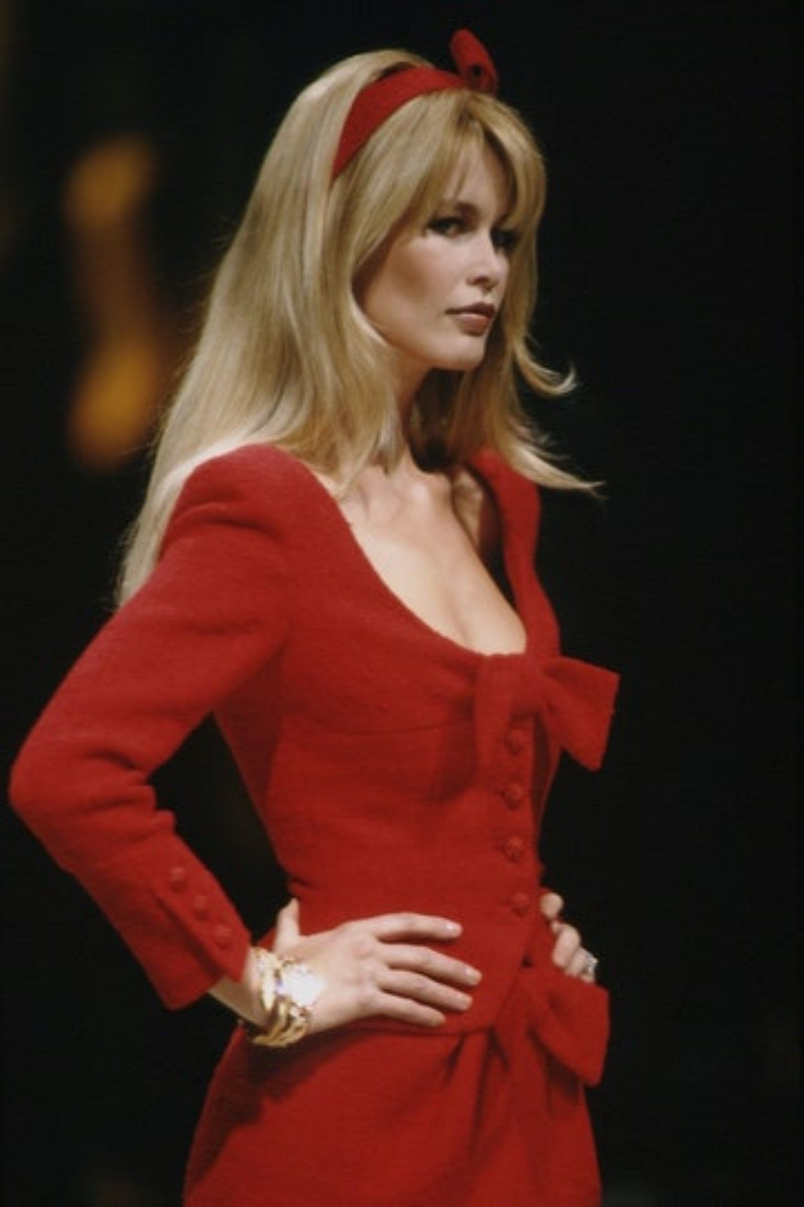
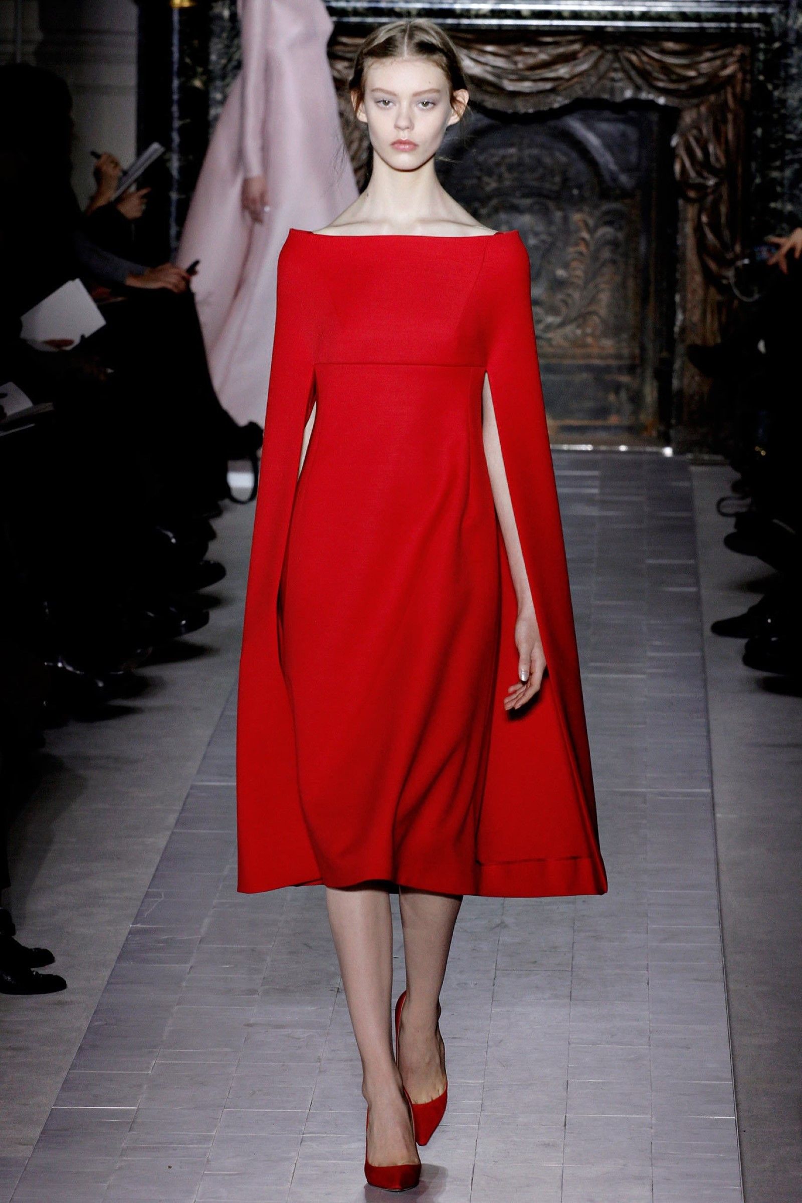
The Valentino Red
Two Italians gave their name to a shade of red: one is Caravaggio and the other Valentino Garavani. The inspiration for this particular nuance, which is found between scarlet, cherry and coral, came from a lady seen by Valentino still a student at the Barcelona Opera. Without suspecting it, that woman had planted a seed in the designer's mind that blossomed when he opened his atelier in 1959. The final shade that is recorded was extracted from an extremely pure pigment of red, free of micro-interference of other colors, and hence its "average" quality that makes it visible but never ringing. Since then that red has appeared in practically every single Valentino collection from its foundation to today.
The green of the new Bottega Veneta
Daniel Lee's triumphant entry from Bottega Veneta has raised the fortunes of the entire brand, leading him to one of the most successful aesthetic revolutions and respectful of the previous tradition never seen in recent years. Since the beginning of this new phase, the packaging of the brand has been covered with a shade of grass green that is found with some variation among the many green items that appear in the collections signed by Lee. Although English has still been at the helm of the brand for a few years, the absolute recognition that the nuance has achieved is a testimony to the rapid cultural predominance assumed by Bottega Veneta.
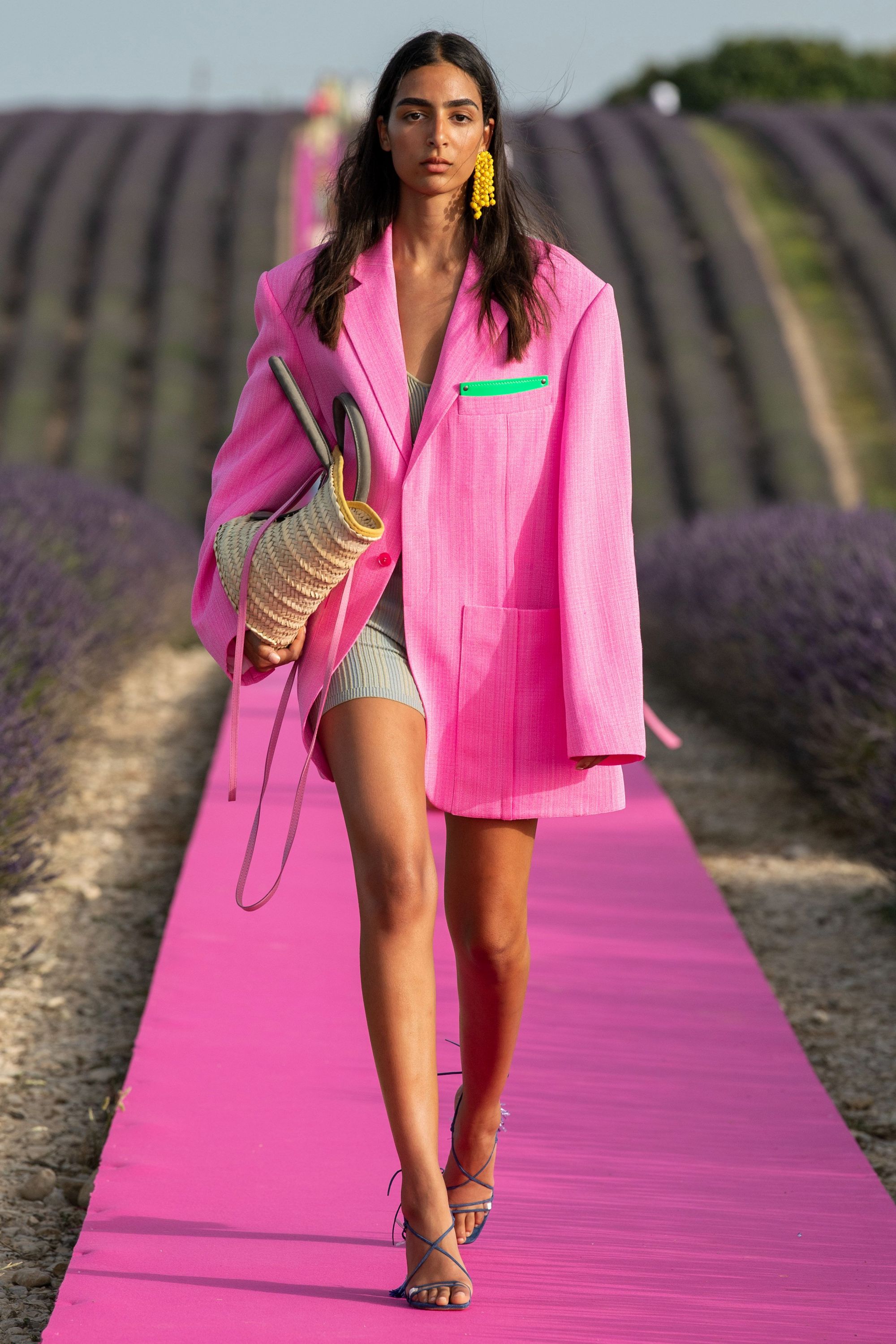
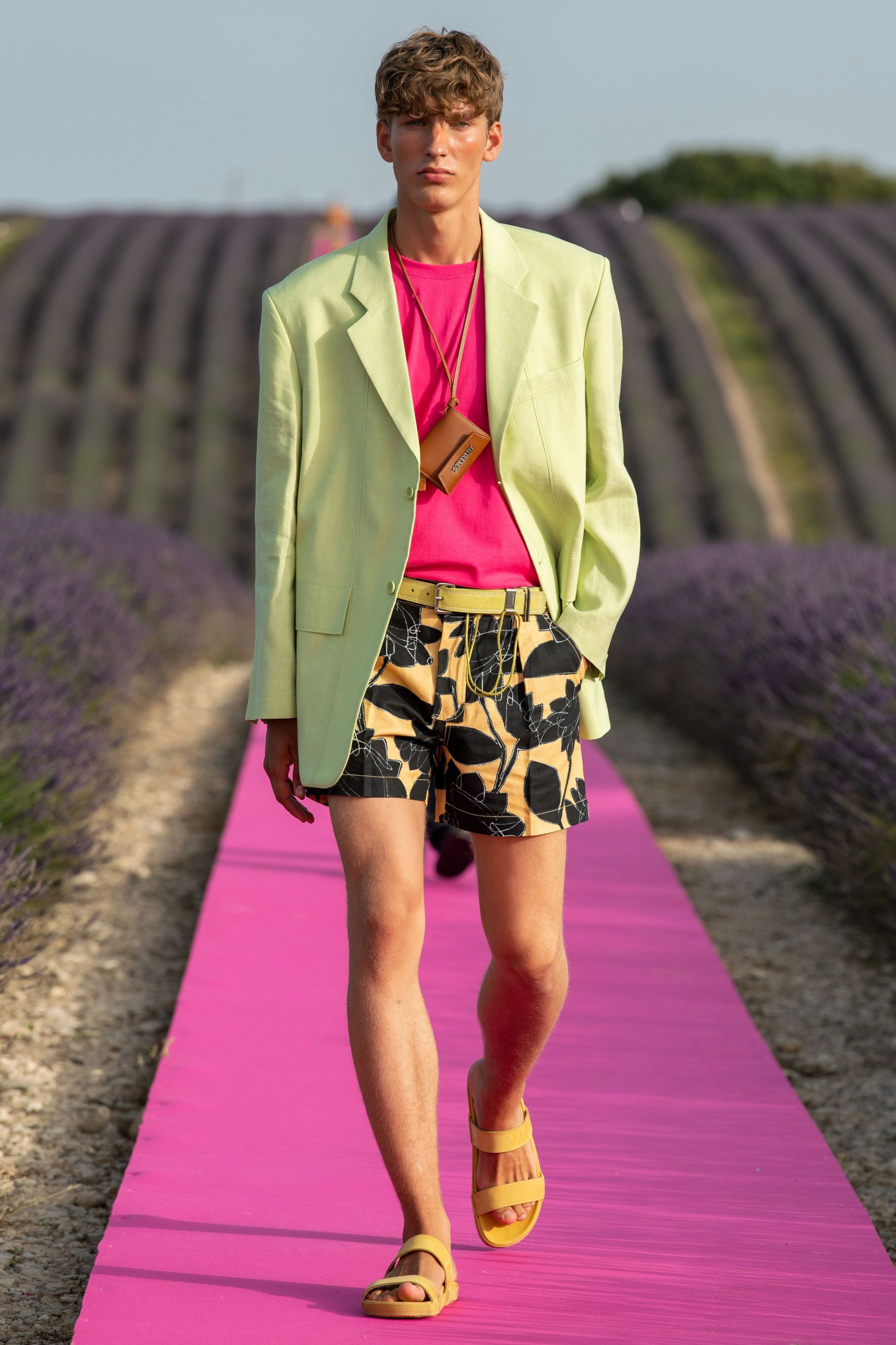
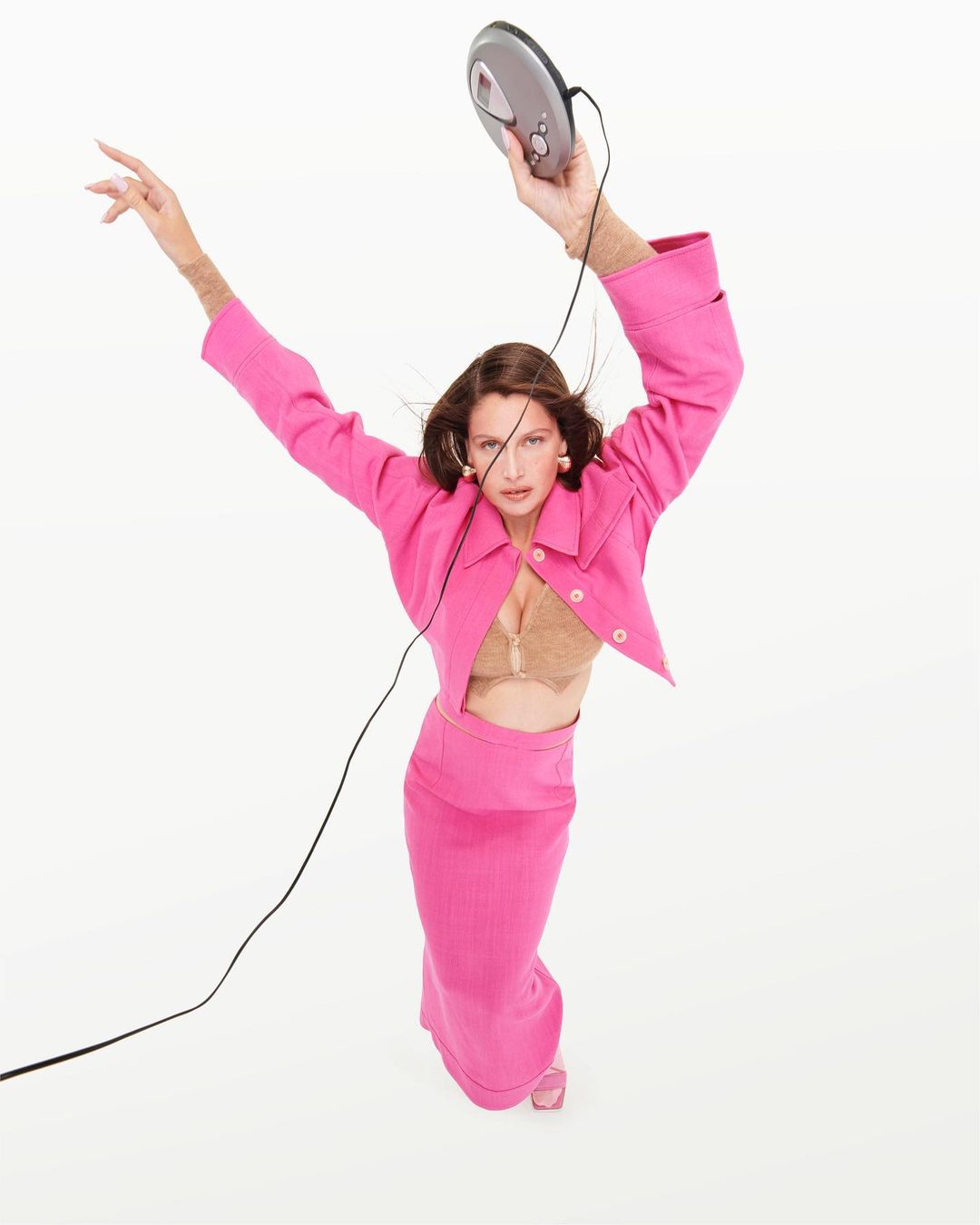
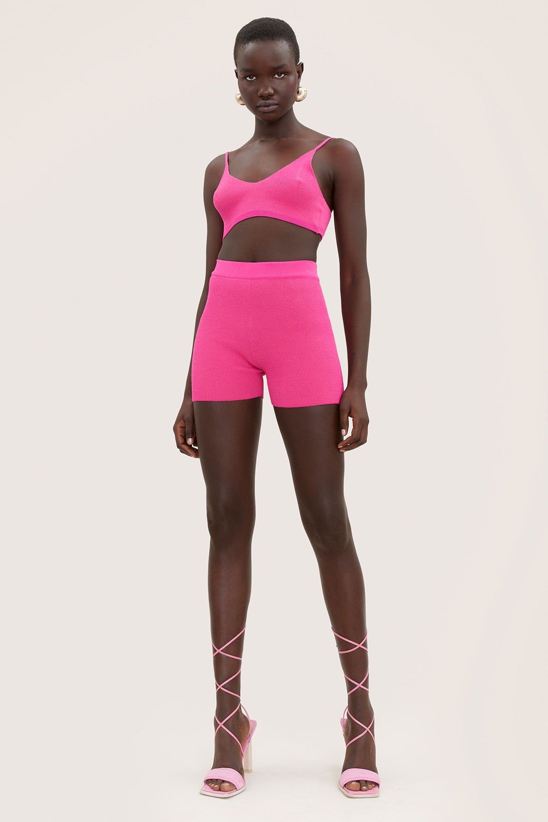
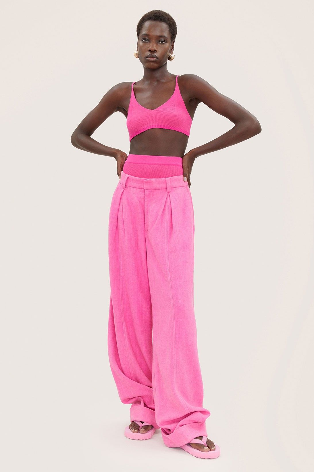
Jacquemus' French rose
The nuance that Simon Porte-Jacquemus has chosen for his Holiday Collection, distinguished by an all-over pink color, comes very close to the French Rose – a name very appropriate to a designer who has made almost every collection a love letter to his native country. The color had already appeared in the designer's collections for the first time in 2014, with increasingly frequent appearances over the years until reaching the catwalk in the iconic SS20 fashion show between the lavender fields and the last campaign "L'année '97" with Laetitia Casta. The collection demonstrates the lucidity of Jacquemus's intuition which, in creating a relatively simple range of clothes, has been able to condense the solar mood typical of his more "summer" creations into a single note of color that, at the same time, makes the collection extremely recognizable.