


Why all big brands are changing their logos They say you change your taste every lustre

Sometimes it happens to go and buy your favorite products at the supermarket, pharmacy, or bar, and not find the label of the brand that until a few moments ago you were sure you knew like the back of your hand. From the signature on the milk you use to lighten your morning coffee to that of the cola the bartender adds to your Saturday night rum, the logos of major brands are changing. For better or for worse? It cannot be determined. What is certain is that the new generations do not like cursive, so brands more attentive to marketing initiatives are collectively changing fonts.
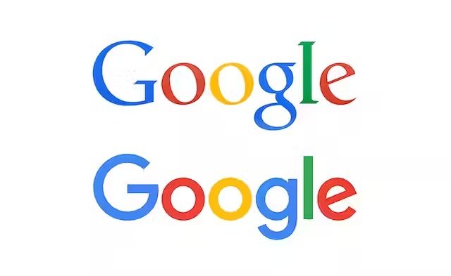
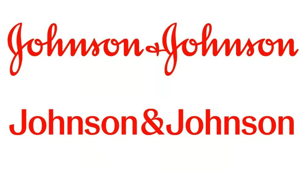
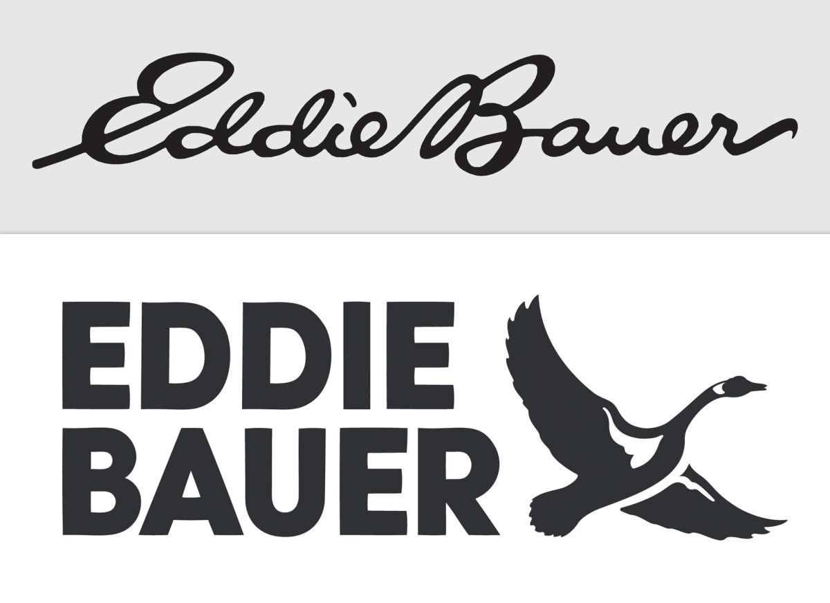
In an article on The Atlantic, Drew Giplin Faust tells that the American Gen Z is unlearning cursive, removed from the standard education of the country since 2010. As keyboard writing lessons increasingly replace handwriting, knowledge of the script has begun to disappear. And the brands most loved by young people are slowly adapting to this new measure: last month, the pharmaceutical company Johnson & Johnson unveiled the new logo, a modernized version of the iconic red script - which was 137 years old - with letters distinctly separated. In recent years, Google, Spotify, and Pinterest have suffered the same fate, and while this week the signature of the clothing chain Eddie Bauer has also joined the list, some users on X (which just a few months ago was still called Twitter) joked about the possible rebranding of Coca-Cola, transforming the iconic elaborate cursive into ultra-minimal lowercase print.
Proud to finally announce our work for @CocaCola, in collaboration with @MrCraigWard, to re-imagine their iconic logo for the next 131 years. Coming soon to a can near you. #branding #typography pic.twitter.com/LClEGdMMHw
— Jules Ehrhardt (@ezyjules) September 27, 2023
Despite the trend being highlighted both by recent changes in marketing and in schools, it is possible that cursive is not ready to leave us forever yet. While some emphasize how, over the centuries, technologies have influenced our writing and comprehension skills - think of the arrival of the typewriter and the disappearance of the ink quill - others are moving to bring cursive teaching back into vogue in American classrooms, promising its revival. According to a Wall Street Journal article, more and more states in the USA are implementing additional "vintage" writing lessons. Waiting for the trend to reverse, one wonders which will be the next logo to change face and shake up consumers: some bet on Instagram, which, despite revolutionizing the icon, has remained faithful to the same font, or on other mainstream names like Kleenex, Kellogg’s, or even Disney. Indeed, the D of the animation company looks quite a bit like a G.