
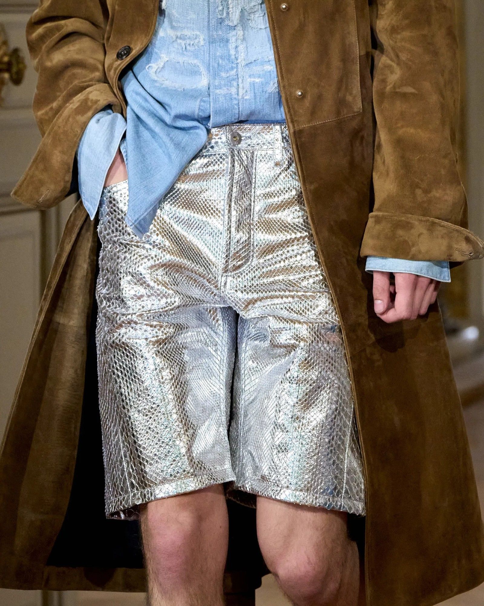


All the ways Pantone chooses the colour of the year Remember Very Peri?
For over twenty years, every December, Pantone announces the Color of the Year. It's a forecast on the hue that will have the most influence over the next twelve months in the world of fashion and design, among other realms. But it's also, and above all, an attempt to grasp and synthesize, in a single shade, the mood of that specific historical moment. "What we do is try to feel the zeitgeist," explained Leatrice Eiseman, the person in charge of selecting the Color of the Year, to the New York Times. "For us, it's not necessarily about trends but the expression of a way of feeling, an attitude." The initiative has been ongoing since 1999 and over the years has transformed into a popular phenomenon, eagerly anticipated and widely covered on social networks and in newspapers. Its invention has also been a brilliant marketing strategy that has brought success to the brand – today, Pantone is not only an institution in its field but is also widely recognized worldwide.
Choosing the color of the year requires extensive work by Eiseman and her team, who spend twelve months analyzing what's happening in fashion, cosmetics, urban planning, architecture, and design, among other things – traveling, reading, and meeting designers, artists, stylists, and trend forecasters. Similarly, they examine the color palettes of movies and TV series released in the last year and keep track of the most relevant current events, as well as topics discussed on social networks. In the end, Pantone synthesizes all this information and impressions into a single color capable of fully representing them. The Color of the Year 2021, for example, communicated the integration between the real and virtual, referring to the early widespread discussions about the Metaverse and Web3.
The History of Pantone
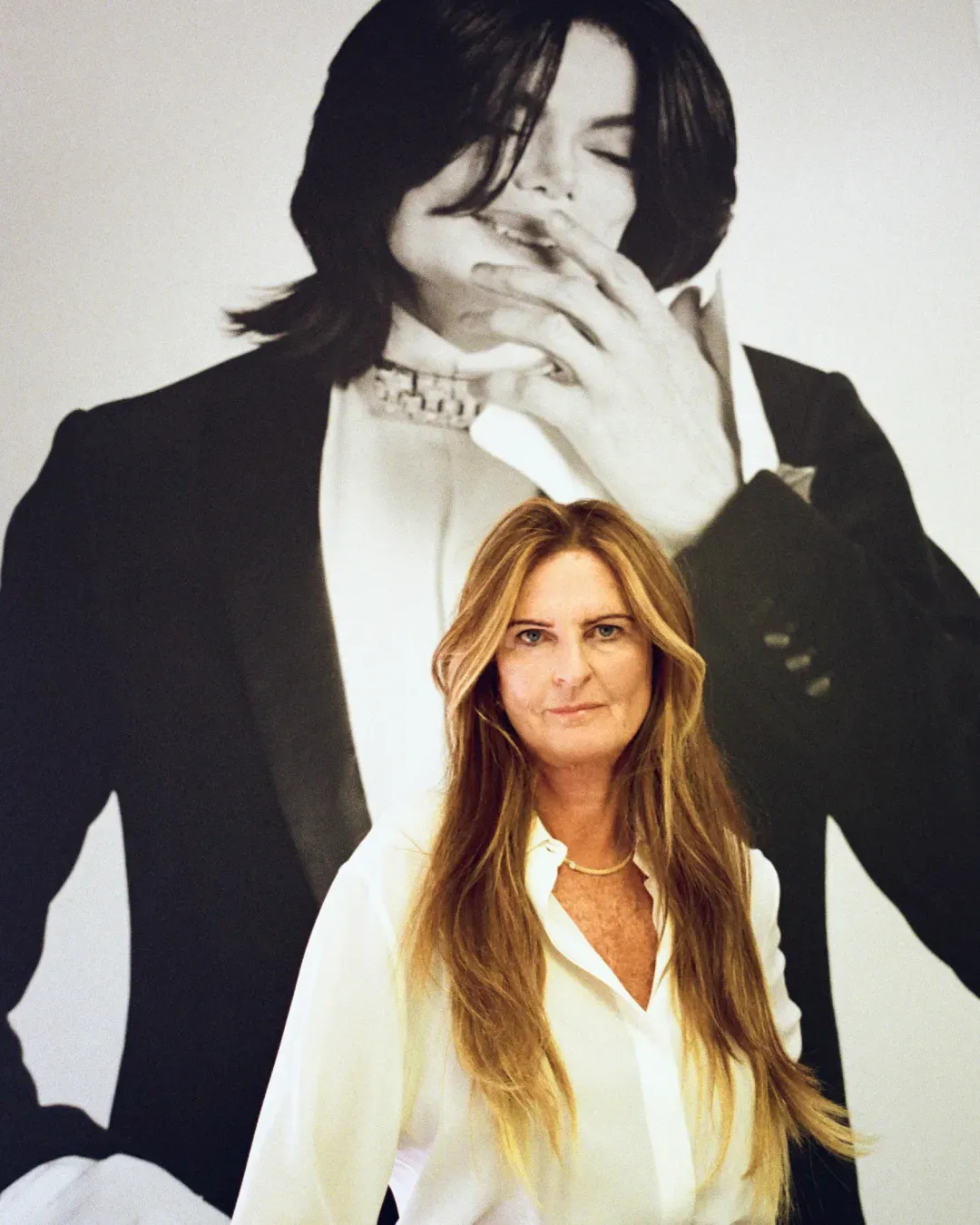
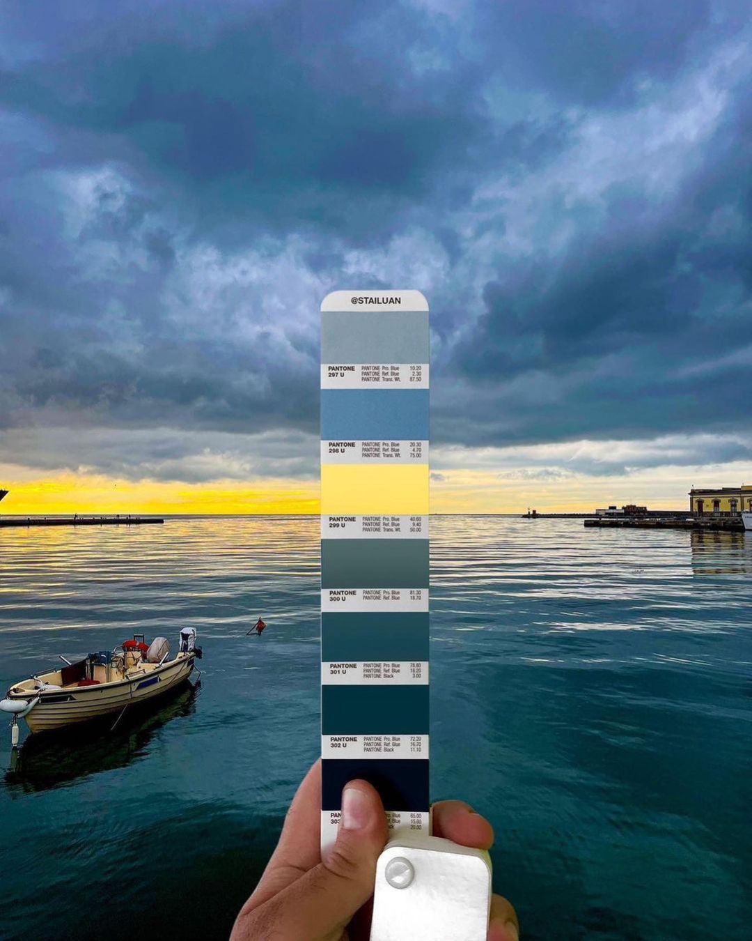
What is now known as Pantone was born in the 1950s in New Jersey and was initially a common company producing colored pigments. In 1956, chemist Lawrence Herbert was hired, who streamlined the company's ink production and later acquired it. After renaming it Pantone, in 1963 Herbert introduced the Pantone matching system, where each color was identified by a series of numbers, all presented together in a fan deck – which later became famous and easily recognizable. This solution helped the company gain recognition outside the United States: designers and companies from different countries could easily and quickly agree on which color to use, making Pantone a reference point for industry professionals. In 1985, the company hired color expert Leatrice Eiseman as a consultant and appointed her to lead the Pantone Color Institute, a section of the company that predicts colors, advises brands on choosing colors for their products, and currently selects the Color of the Year. Eiseman still leads this division at Pantone: in the meantime, she has written several books on colors, becoming a true authority on the subject, and has collaborated with various highly esteemed brands, helping them capture the exact hue of their brand – for example, we owe her the Tiffany blue and Hermès orange.
How Pantone Chooses the Color of the Year
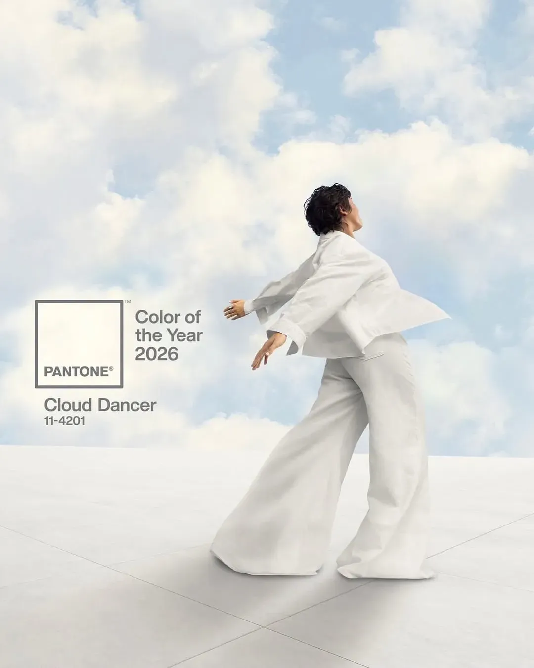
In 1999, approaching the new millennium prompted Pantone's founder to ask Eiseman to select a color to look hopefully towards the future. For its ability to instill calm and a sense of peace, cerulean (specifically Cerulean Blue 15-4020) was chosen, a pastel blue reminiscent of a cloudless sky. The choice was also a response to the dominance of dark colors in those years, including black and brown. The announcement of cerulean as the first Color of the Year unexpectedly met with great enthusiasm from the media, to the extent that the company decided to launch and repeat this format every year. Notably, cerulean is the same color as the sweater worn in a famous scene from The Devil Wears Prada, demonstrating how decisions made at the top levels of companies – in this case, in fashion – end up influencing small aspects of people's lives, often without them realizing it. Similarly, the choice of the Color of the Year has concrete – and sometimes indirect – repercussions on the fashion and design industry, among other areas. Pantone deserves credit for successfully strengthening the initiative, making it stand the test of time thanks to numerous collaborations. In 2013, the Color of the Year, Emerald, ended up in a beauty product collection created with Sephora. In this sense, the company has also opened a division, Pantone Lifestyle, which produces design objects whose colors are indicated according to the numbering that has made the brand famous and serves as an additional megaphone to communicate the Color of the Year.