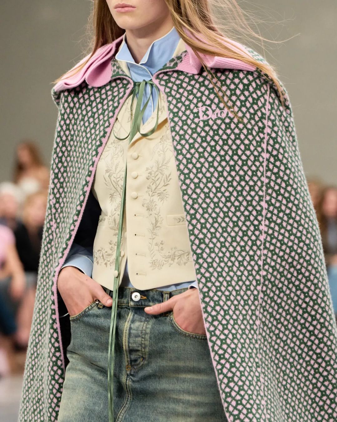


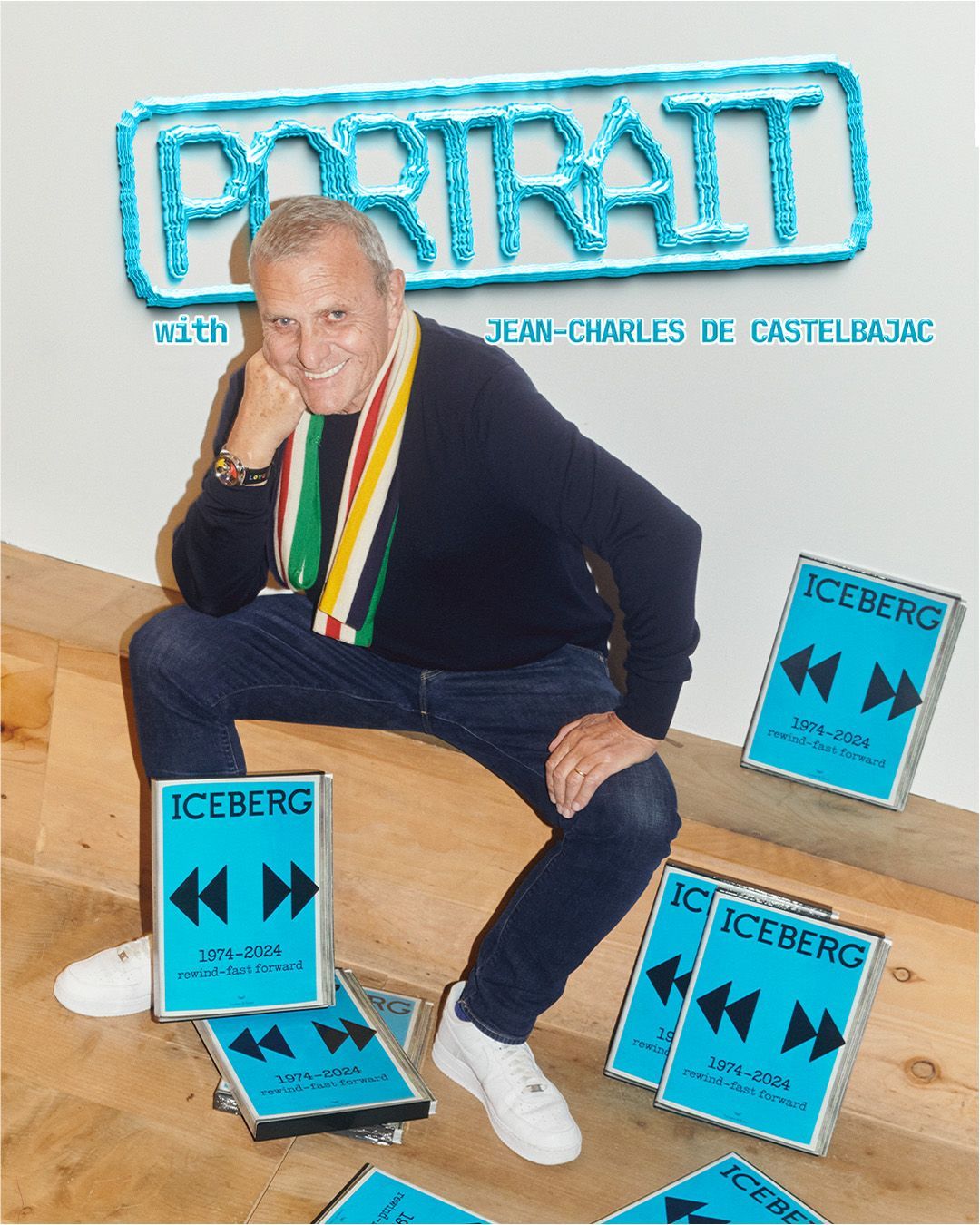


Why brands are standardizing their logos Simplifying can be bold
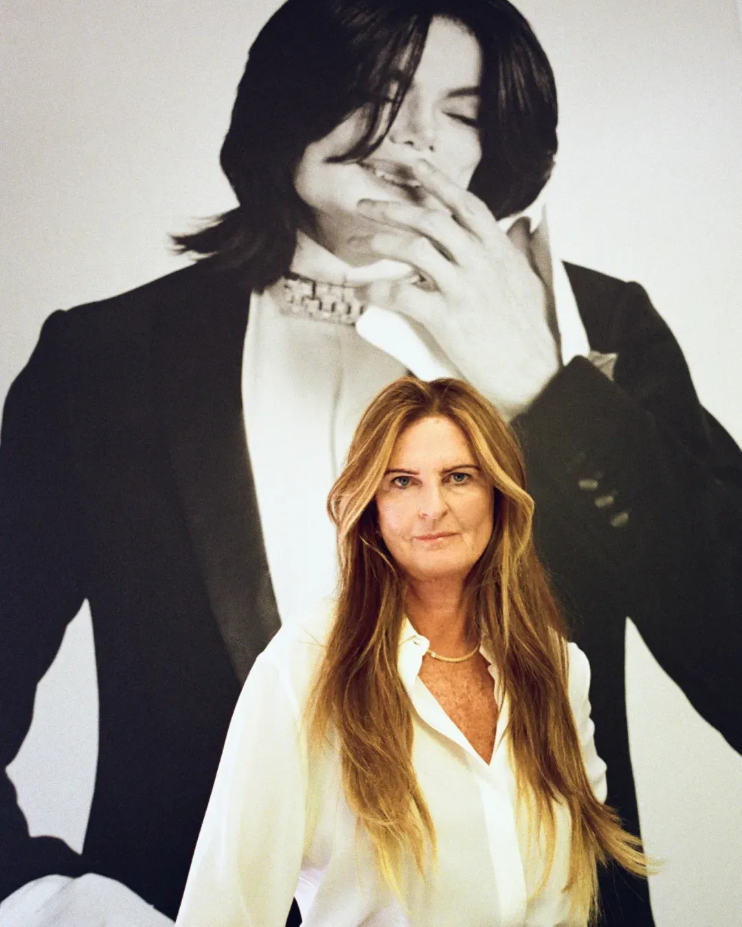
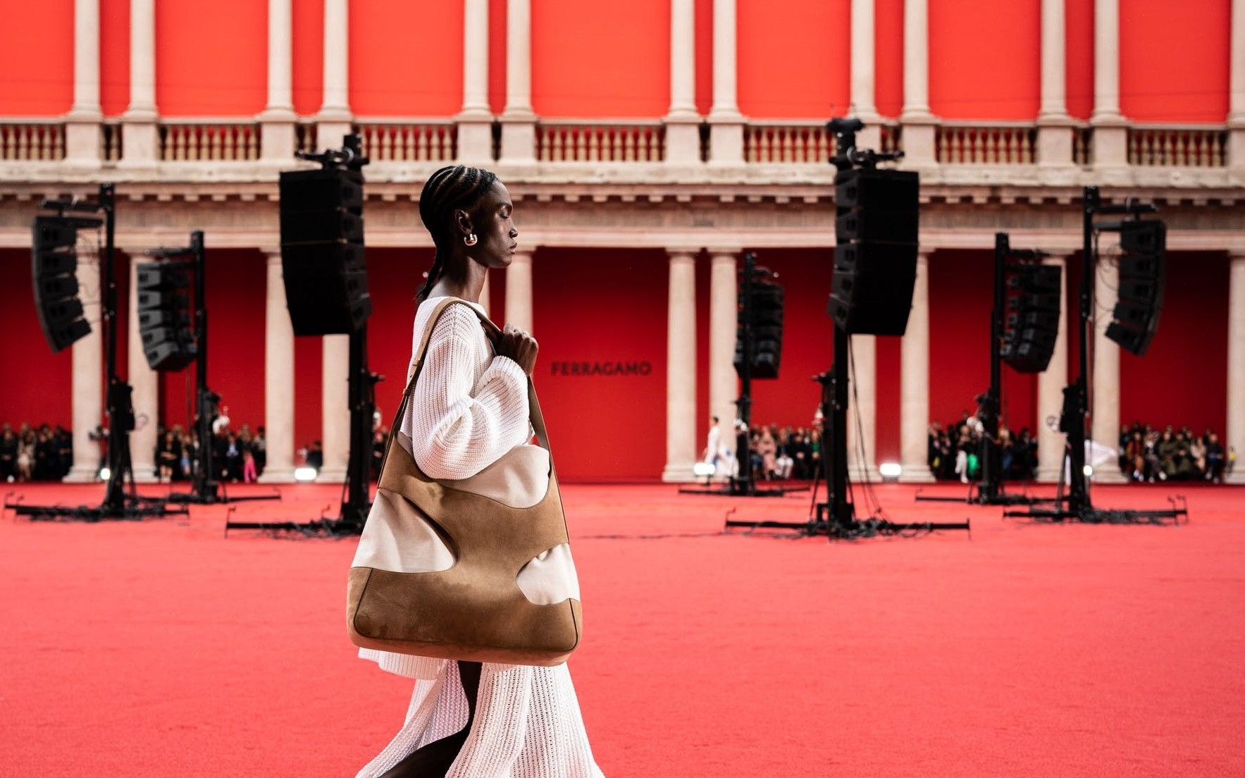
When Hedi Slimane had been appointed creative director of Saint Laurent in 2012, he had decided to remove the Yves name from billboards, campaigns, and clothes. He had deliberately lightened the logo's complexity by initiating a process of simplification (understood as transition and transformation and not as a debasement of heritage) that had not gone unnoticed in the eyes of a public devoted to the sinuous intersection of the three letters at the base of the French brand founder's name. In those years, indeed, the internationalization of fashion was something clear to everyone: the creative director of a brand could no longer coincide strictly with its founder, but rather be appointed by the board of directors of a multinational company grappling with globalization and the need to create an increasingly engaging storytelling. Recently Ferragamo announced via Instagram that it would dispense with its stylized cursive font containing the full name of its historic founder: Salvatore Ferragamo will henceforth be Ferragamo. The decision to resort to a brick-red hue in partnership with Pantone, not surprisingly, coincided with the appointment of new creative director Maximilian Davis.
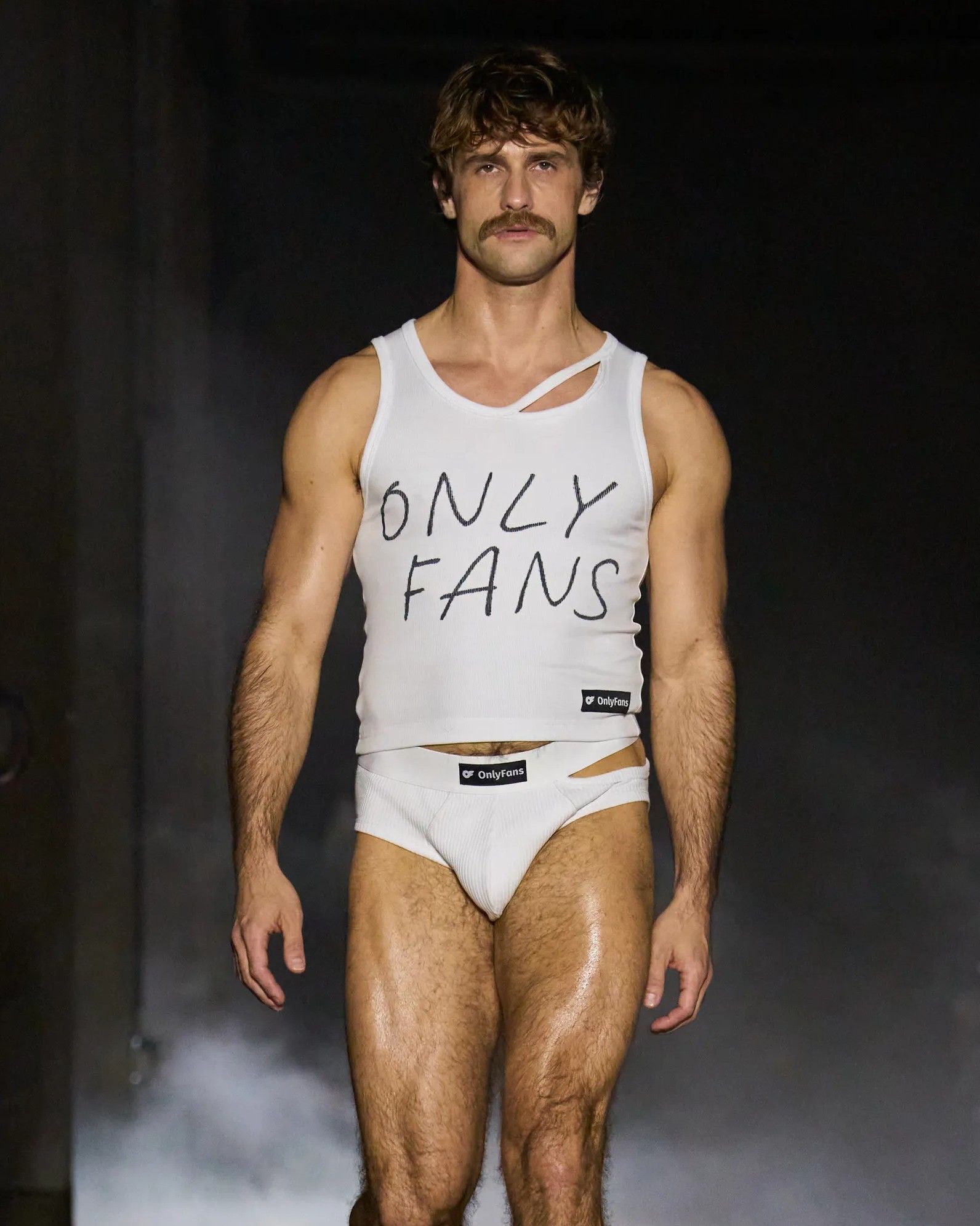
The discourse falls within a more complex scenario that is trying to redraw the contours of branding: if eye-catching and immediately recognizable colors become the first element of decoding a logo, it goes without saying that lettering ends up obeying a logic of general flattening that does not affect a brand's heritage. It was only a year ago that Balestra announced its return to the scenes, unveiling a new electric blue font, a clear signal of its inextricable connection with the brand's heritage. If Valentino and Bottega Veneta have built an entire narrative on the colors of pink and green, and the logos appear rather unified, it is precisely the idea of immediacy that is driving what has been called blanding internally within the industry. Scenario in which, moreover, there are to be added the names of Boss, the German brand went from having two separate and distinct brands HUGO and BOSS, and Zegna, formerly Ermenegildo Zegna. Whether it is a true rebranding operation or the more radical de-branding, the desire to give a new creative and managerial direction - often the unveiling of a new logo coincides with the appointment of a creative direction or with the goal of exploring a new market niche or to signal new initiatives-responds to the need to bring hype and draw the media spotlight on itself instantly, activating conversations transposed across multiple online and offline dimensions.
Having thus ascertained the fact that companies are much more willing to experiment with their branding than in the past, all branding operations have become a sure way to signal to the world and to one's community that a change is taking place. Beyond the need to create a recurring resonance in a crowded luxury market largely driven by the evocative power of images, changes in branding are a way for companies to adapt to a growing number of markets and media, which have increased further with the rise of Web 3.0 and the metaverse. In addition to seeking maximum impact across the mediums in which brands communicate simultaneously-from smartphones to billboards - there is the need to have to align on the same visual and textual imagery to reach a global audience. Not to mention the fact that, logistically, printing simplified, all-capital lettering on sweatshirts and t-shirts constitutes a simplification in the manufacturing process that suits the marketing department. While for brands whose heritage has nothing more to do with the family or the initial founder, rebranding constitutes a chance to explore new dimensions, for the rest of the brands looms the risk of not bringing value to their history. And that, finally, luxury will be reduced to a commodity.