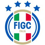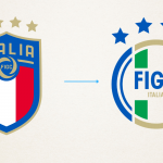
The new FIGC logo
A symbol drawing inspiration from the past designed by Lapo Elkann's agency
October 5th, 2021
The new logo of the Italian federation, designed by Independent Ideas, Lapo Elkann's agency, was unveiled yesterday evening in Milan. The image of the Federation has been renewed, flanking the shield with a modern and authoritative logo that graphically depicts the process of innovation desired by President Gravina. The inspiration comes from the first footballs from which it takes the circular shape and the vertical graphics of the new look with a clear and deep reference to the origins. The acronym of the FIGC becomes the protagonist, reaffirming a strong presence, while the colours naturally recall those of the national team jersey and the tricolour.
With this choice the FIGC aligns itself with other European Federations such as Belgium, Germany and Spain, distinguishing the symbol of the game jersey from the 'corporate-institutional' one. Another revolution after that of 2017, where the brand had become even more modern with an undoubtedly slimmer silhouette and the choice to bring back the stars outside the logo. In one of the happiest moments of the Azzurri's history crowned by extraordinary successes, the FIGC has an emblem inspired by some iconic elements to best represent the activity of the Federation in everything that is not football played.


