


How Valentino created its "couture" uniform The colors and monogram of Valentino
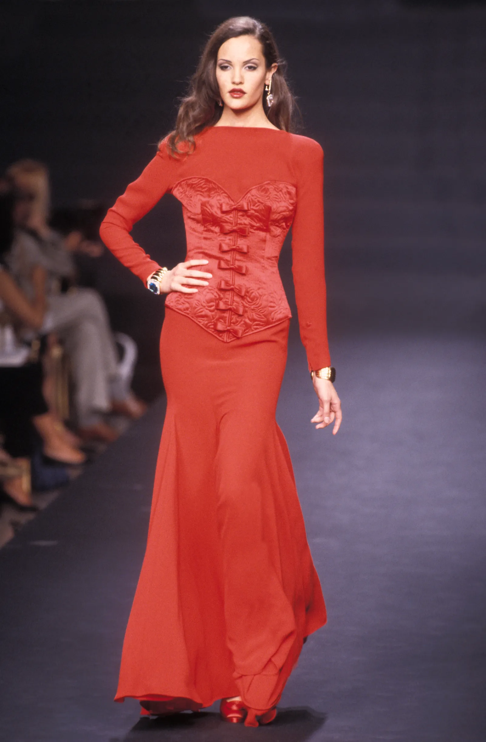
Valentino FW 92-93
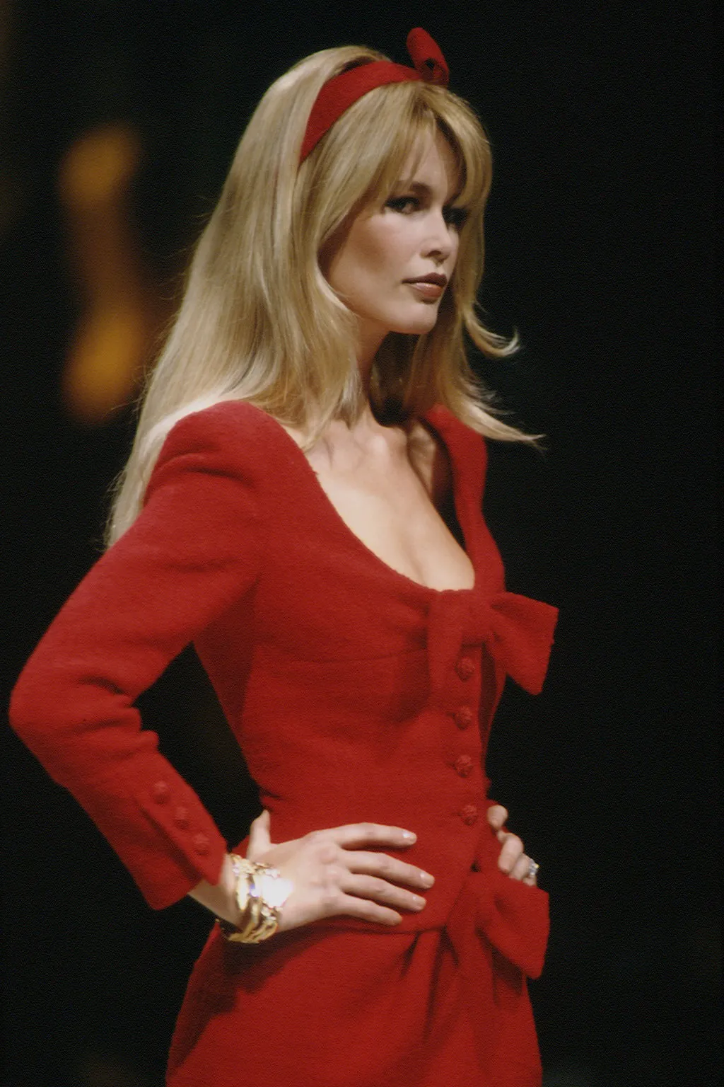
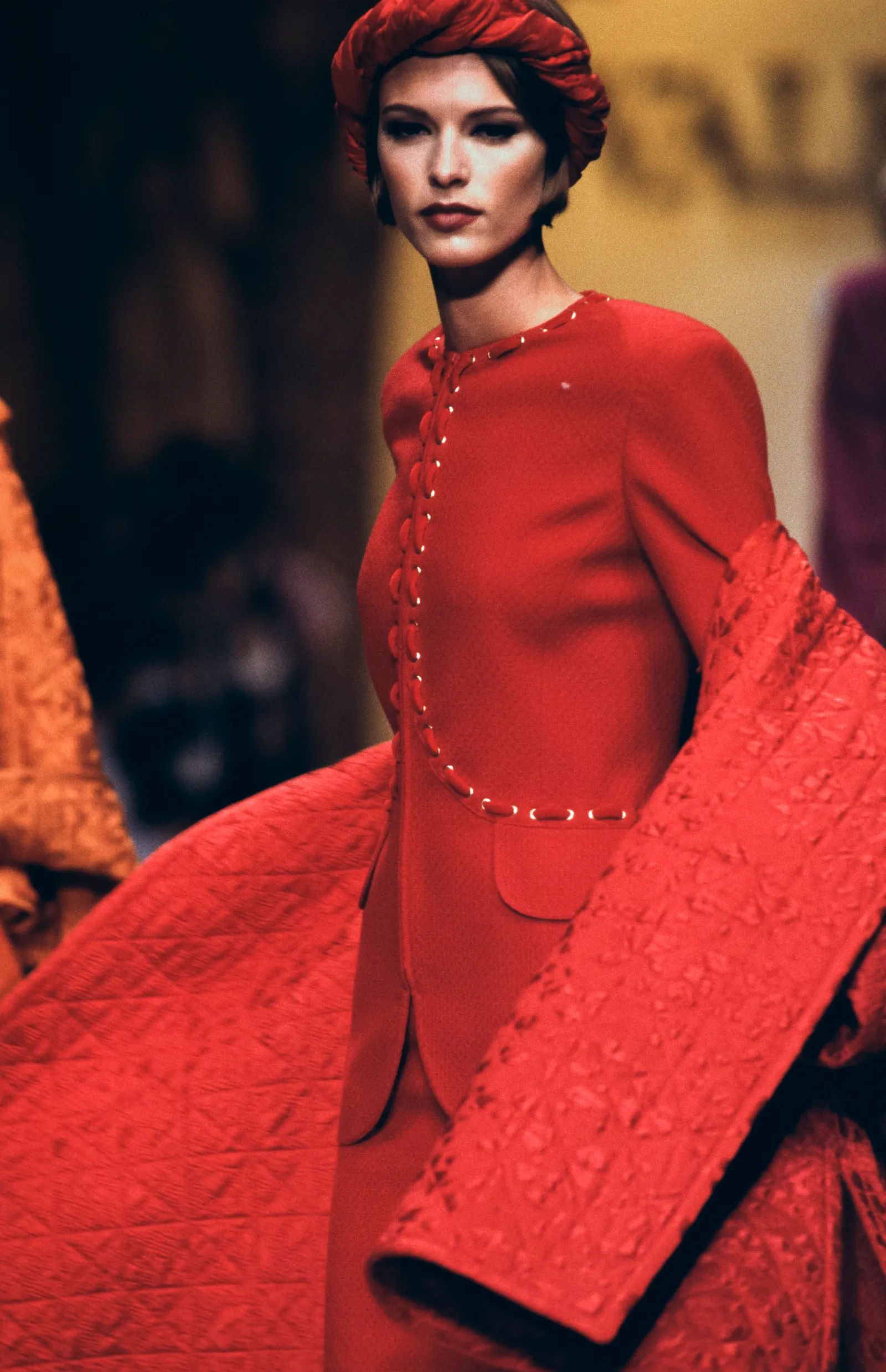
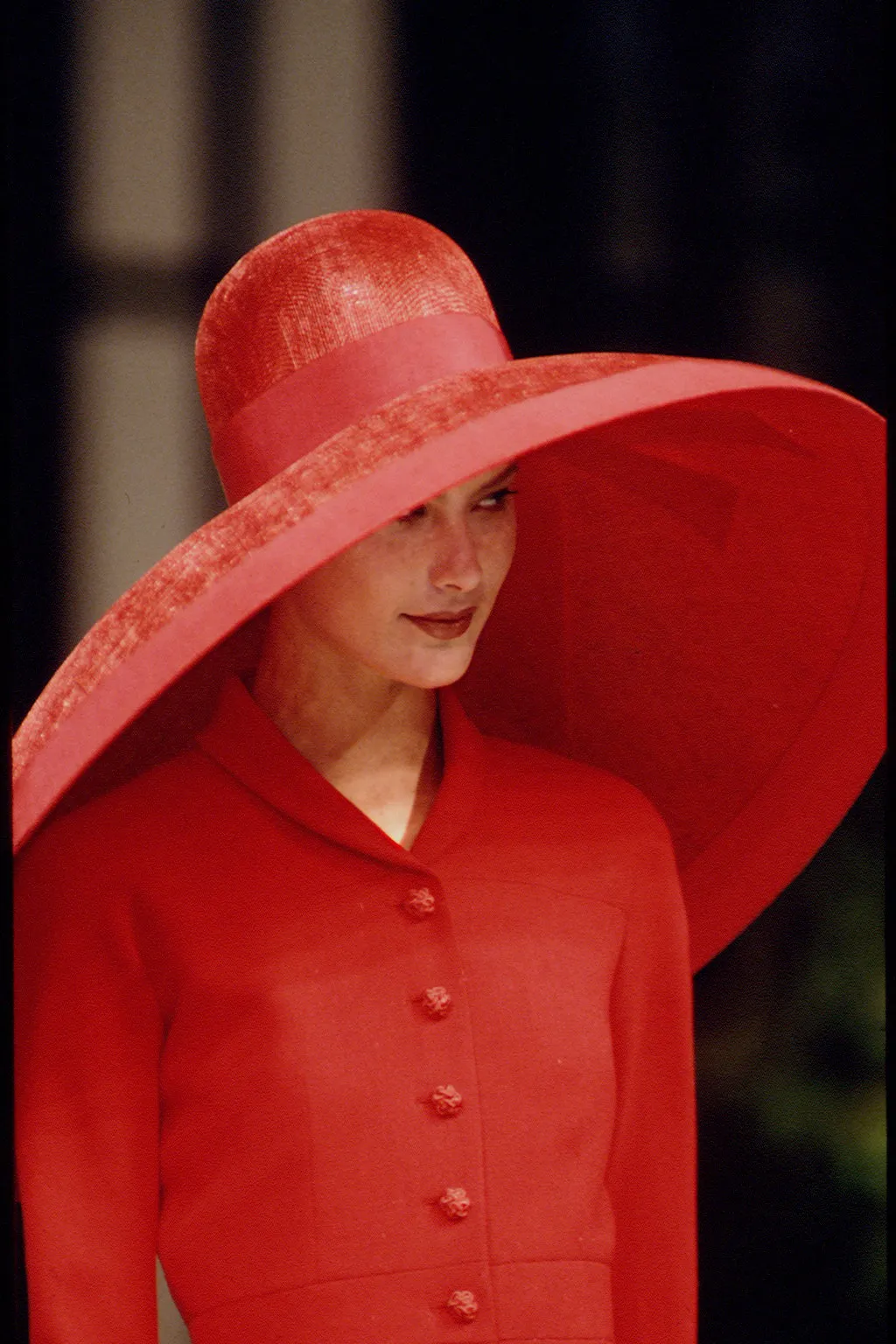
Valentino SS95
Valentino SS94
Valentino FW96-97
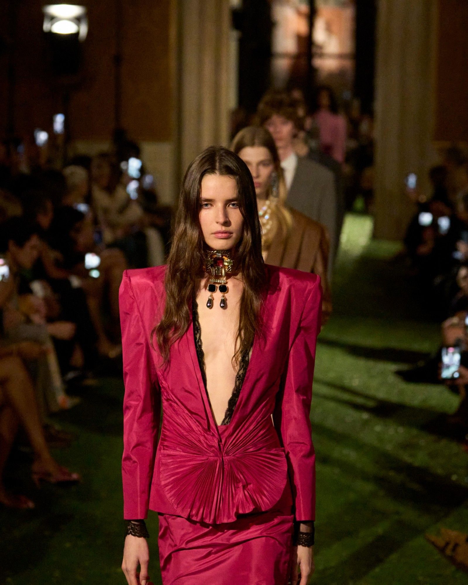
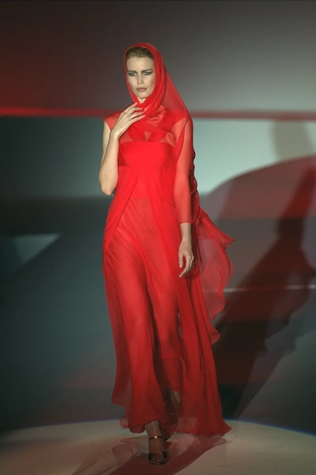
Valentino FW92
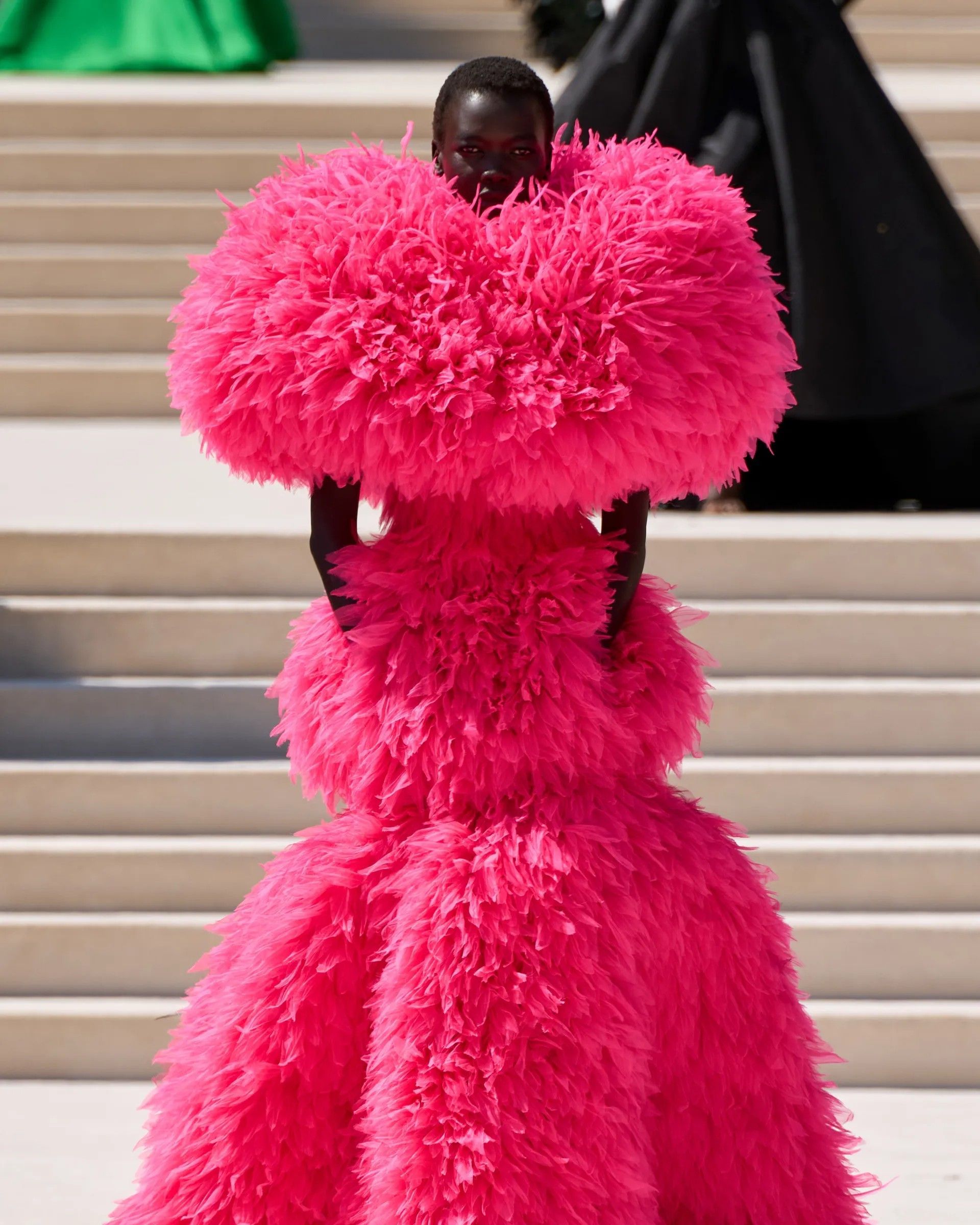
Valentino Garavani has gone down in fashion history as one of the last emperors of the system. Mythologized - the process not only invested his figure, but is to be framed in a historical and cultural context that made a designer at the head of a fashion house on a par with a more or less enlightened monarch - and promoter of an idea of timeless glamour colored in an imperial red that still bears his own name, his design has marked much of the imagery of Italian and other high fashion.
Valentino FW92
Valentino FW 92-93
Valentino SS94
Valentino SS95
Valentino FW96-97
Whether poetic seal or chromatic manifesto, the idea was that that specific shade served to make an already established fashion house in Italy and abroad even more identifiable. Feeding on the same sap that, for centuries, had shaped the iconography of Roman emperors, Valentino red had nothing to do with the idea of a dress uniform that sprang from the Italian prêt-à-porter revolution. Valentino was not - and perhaps would not have wanted to be either - familiar with the codes of a more immediate language, which was gradually becoming more and more aware of a profoundly different way of conceiving clothing. At a time when the fashion system was confronted with the complexity of the internationalization phenomenon, Valentino's creative direction underwent a series of reshapings: after Valentino Garavani himself bid farewell in 2007, Alessandra Facchinetti was the brand's creative director for only two collections. The same year Maria Grazia Chiuri and Pierpaolo Piccioli, already embedded since 1999 in the maison's accessories department, became the tutelary duo of the historic Piazza Mignanelli.
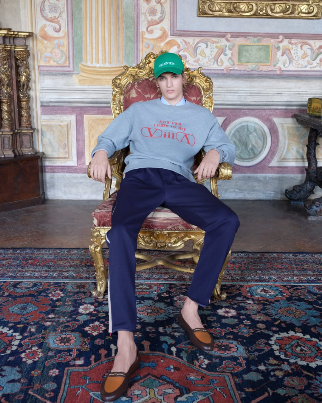
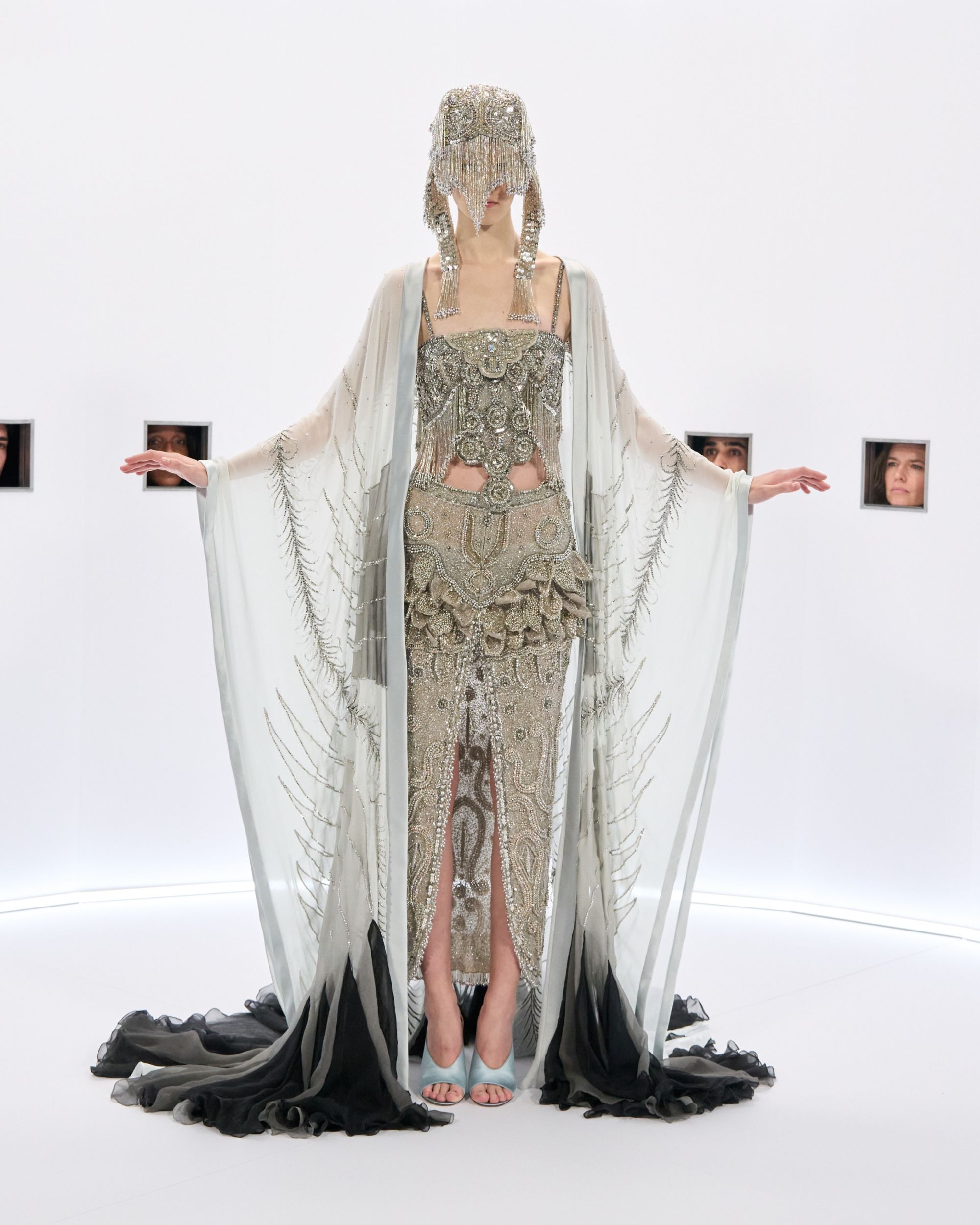
The two have been collaborating for a good eight years on the Maison's collections, finding themselves in the position of having to create a bridge between couture and prêt-à-porter without neglecting an unavoidable premise: Valentino was born and will continue to be a maison de couture. Valentino's essence has been amplified and fragmented by opening up to labels such as Red Valentino - a label that will be permanently closed in 2024 under the creative direction of Maria Grazia and Pierpaolo. «We are very proud of the iconic codes of the brand, but we live in our time. In ten years the world has changed radically: tastes change so fast, communication even more. If you really live your time, you can't help but feel it, assimilate it and convey it in what you do» Maria Grazia Chiuri had told Vanity Fair Italia." 2016 marked the real parting of ways: Maria Grazia Chiuri left Rome, invested in the role of creative director of Dior. It is Pierpaolo Piccioli who inherits the entire heritage of the Roman maison. With his absolute vision, Valentino transformed imperial codes into a humanistic, enlightened project. The maison has created and is creating a multi-dimensional narrative in which clothes go hand in hand with support for emerging talents, The Narratives, celebrity culture. A process that reached full maturity when the brand presented the PPP Collection: starting from the deconstruction of the guiding color associated with the maison, Pierpaolo devised a monochromatic microcosm in the form of a shade of pink developed in partnership with Pantone.
Valentino's pink has not only become the doppelgänger -though clearly distinguishable-of its red counterpart, but has established itself as a true macro trend in the industry. The virality of the project became evident the moment a shot was posted on the fashion house's Instagram account. The shot depicted a Place Vendôme flooded with people in full PPP look after the show that featured the presentation of the SS23 collection. A collection that, in a process of reappropriation and aesthetic simplification of the brand's heritage, found in the monogram the narrative device to give life to a heightened communicative dimension. Space, as infinite as it is restrictive, becomes the blank canvas on which Pierpaolo Piccioli has built his story of obsession and creative liberation. The logo becomes a grid, an act of radical poetry that Steven Meisel has transformed into powerful and timeless shots. He captures the faces of Kristen McMenamy immersed in iconographic Valentino toile, Cas pictured with a bag that becomes a headdress and monogrammed stockings, Alaato depicted in his stunning statuesque classicism, and Sora Choi draped in red Valentino toile. And then there's the translation into products: on neutral beige canvases of clothes, bags and accessories, the Valentino Toile Iconographe pattern is coloured in red and black. What is surprising (or perhaps not) is the fact that Pierpaolo Piccioli was able to respect the aesthetic codes of his predecessor by presenting creative projects without ever taking their cornerstones to extremes. On the other hand «Fashion is fashion, art is art. Art is when you make something for yourself, fashion is made for someone else», are his words. And colour tones and monograms make perfect sense in this discourse.