The graphic avant-garde of the Torino FC crest
How Torino FC Set the Bar High for Minimalist Badges
Sports
December 14th, 2023
December 14th, 2023
The commodification of football is not a new phenomenon, although it’s a process which has been accelerating particularly rapidly since the turn of the century. Today’s professional clubs started life as sporting entities with ambitions of winning titles and bringing glory to their communities, but have gradually transformed into brands with aspirations of attaining global recognition and maximum profits. One of the most visible signs of this transformation is the prevailing trend in club badge redesigns. Minimalism and simplicity have been the key elements of almost every crest update over the last six years or so. Historically, these qualities are much more typical of corporate logos than they are of football club crests.
It’s unsurprising therefore, that many of the badges resulting from these minimalistic design briefs have received heavy criticism, with the main bone of contention being their lack of personality, and their rejection of the clubs’ history and existing identity. Take a look under any social media post unveiling a new badge and you’ll likely find an abundance of comments rejecting the design and calling for an end to this minimalism trend. That, however, would be throwing the baby out with the bathwater. Minimalism can have spectacular results when applied correctly, with the finest example of its usage in badge design not coming from this modern era, but from the 1980s.
Torino FC Logo History
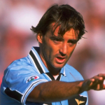
Torino FC is a club with a rich history, tinged with tragedy. For most of that history, they used some variation of an oval shield split into two halves – one maroon and one white – as their club crest. The Turin coat of arms occupied the left side, with the club’s initials on the right. While this was their official badge, their shirts from the 60s through to the early 80s bore different versions of a plain bull insignia, without any surrounding elements. It was usually white and in some cases looked regal, but in others, decidedly cartoonish.
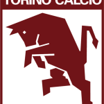
In 1983, president Sergio Rossi had only been in the role for a year when he commissioned design agency GBM Italia to come up with a new badge for il Toro. This redesign was an early precursor to the creative agency-led rebrandings that are commonplace today, and came at a time when clubs were only starting to consider how they were perceived from the outside, and how their badge could play a part in portraying their identity. Creating a recognisable symbol was part of the brief, but what was more important was representing their identity, and forging a clear link between crest and club. The resulting badge, designed by Gianfranco Mantello, was an instant success. Its minimalist style made it an outlier among the more heraldic club crests of the time, and also gave it an element of novelty.

The bull has always been a symbol of the club and the city, yet had never previously been represented in such a menacing fashion. Its angular form and bowed head give it a much more powerful appearance than its predecessors and successors alike and help to convincingly convey the dogged spirit of i Granata. Having already stamped the club’s identity so firmly on the badge with the powerfully symbolic depiction of the bull, Mantello had some room to stray from tradition with other aspects of the design. The rectangular shape, albeit with gently rounded corners, was – and remains today – an uncommon form for a football club badge, and helped it stand out from the crowd. It also meant the badge occupied more space, making it even more imposing.
It was an instant success. Its minimalist style made it an outlier among the more heraldic club crests of the time, and also gave it an element of novelty. At the press conference for its presentation, Mantello explained the thinking behind it. “We wanted to restore the determination and aggression that Torino have always been famous for. This badge has to fit within the parameters of continuity and tradition, while respecting graphic properties and communicating something to the public.”
Mantello simplified the colour palette, reducing it to a two-tone affair, yet another technique that is on every modern badge designer’s checklist. In 2023, the white background would likely have been removed in favour of leaving negative space, allowing for the primary colour to be changed to white when placed on the club’s home kits, with the maroon base colour filling in the rest.


Minimalism vs history
Like virtually all Torino fans, Turin-based architect Gueorgui Djarov considers the 1983 crest as the most beautiful in the club’s history. While recognising that it shares many of the minimalistic qualities as many of the more lacking offerings of recent years, he points out a key difference; the intention.
“Modern badges like those of Inter or Juventus were not designed to represent a team, but a brand. They are logos designed to look good on clothes and merch, even to those who don’t follow football, the aim is to sell as much as possible. Real fans of the club though, they want the badge to transmit something to them, some semblance of the club itself, of football, like the Toro badge does.”
Art director and graphic designer Serena Tempesta falls into this demographic. With no interest in the sport to speak of, she would be a difficult target for any team hoping to gain her support. In a sort of blind test, where she received no context or information on either emblem, she gave her opinion on both Torino’s 80s badge and Juventus’ 2017 logo, strictly from a design standpoint.
“The second one (Juve’s logo) is very cold and anonymous. The black and white colour scheme comes across straight away as cold. There’s nothing anthropomorphic about it, it doesn’t have any reference to anything in the real world, although it does vaguely remind me of a letter J. So it’s a very de-personalised logo.”
Although Juve’s black and white kits don’t come across as cold, it’s true that the monotone palette doesn’t do their badge any favours – and it could use a couple. “Meanwhile, the bull (Torino badge) is aggressive. It’s an animal that communicates grit and aggression, even its positioning here is very aggressive. The shade of red is a warm, vivid colour, which brings to mind the rage of the bull. The sharp edges of this logo add to the intended frightening effect. Overall, it communicates much more, and it does so by being realistic rather than abstract.”
Clubs considering a new badge – and the creative agencies employed to come up with the goods – could do a lot worse than take a leaf out of Torino’s book. Striking the balance between minimalism and meaning is no mean feat, but on too many occasions we’ve seen mass appeal prioritised, with little attempt to say true to the established identity. Torino themselves reverted back to their oval crest in 1990, before adopting their current, far less striking crest in 2005, with the return of the more elegant bull. Despite no longer being the official emblem, they’ve featured the raging 80s bull from time to time on some of their recent kits and training wear, freed from its rectangular enclosure.
But with the team stuck in a cycle of mid-table mediocrity for most of the last decade, they could do with a change in more ways than one. Is it time for Torino to reinstate that much-loved badge from their archives, with all the tenacity and fighting spirit that it embodies? Current president Urbano Cairo is not the most popular figure among the fanbase. Supporters have been unhappy about many of his decisions since he took up the position in 2005, though there would be no complaints should he bring back that crest. It was years ahead of its time when it launched, and the other pretenders still haven’t caught up to it.