The evolution of jerseys's crest according to dekoGraphics
We interviewed an international excellence behind the lenticular crest of AS Roma
Sports
October 21st, 2022
October 21st, 2022
The world of football's emblems on jerseys is constantly expanding, experimenting with formats, materials and designs like never before. From iridescent crests to plastic-coated, to metallic chrome, teams are continually modifying their social logos to fit the jerseys and aesthetic changes. It is a trend that does not seem to be showing a slowdown indeed that - within the limits of UEFA's stringent regulations - will contribute to making jerseys, now undisputed collector's items and lifestyle garments, more and more special. And in this climate of discovery and revolution, attentive artisans and professionals have been working behind the scenes for decades to create jerseys of the highest quality, not only from the point of view of design but above all of manufacture. We spoke with an Italian excellence, dekoGraphics, which has been printing names, numbers and crests for teams in Serie A and the rest of the world since 1996 about the role that logos are playing these days.
How did you approach the football's world, what is your personal path?
dekoGraphics has been present in the football's world since 1996 when adidas started to unify the production and distribution of the names and numbers of their national teams by entrusting it to dekoGraphics, a license that is still active today. Since then our path has gone through many international experiences. To date in Italy we count a number of collaborations with almost half of the teams in Serie A. Highlighted is the partnership with Juventus FC that has lasted for more than 7 years.
How did the Roma partnership come about?
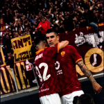
With AS ROMA we have had several working experiences in recent years until closing a license for their official Names and Numbers last year. But also working with their technical sponsor NEW BALANCE we had the pleasure of developing an expanded project that includes several decorative components of this season's jerseys.
Ma rivediamolo... pic.twitter.com/1amcuXkTLd
What kind of technique did you use to make the badges?
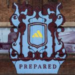
Among these projects, the most innovative and fun was definitely the third jersey's crest, which starts from an exclusive and patented technology of dekoGraphics - LENTEX ® | FLIP - a lenticular technique that allows you to appreciate two different images within a single shield, depending on the visual angle.
How did you take the news that Roma will not be able to take the field with the holographic crest on the jersey?
Our role in these new projects is to bring the latest innovations by always pushing for innovative choices. But all projects must always take into account the rules set internationally - UEFA - and nationally - Serie A. So it was clear from the beginning a use of this crest outside the playing field, which, however, did not limit its strong innovative impact.
How did the collaboration with Velasca Calcio come about instead?
The AS VELASCA collaboration was born in 2017 thanks to the introduction of LE COQ SPORTIF, the team's technical sponsor and a longtime dekoGraphics customer. As one fan collector puts it, Velasca "It's not a football club, it's not a work of art, it's all of this together." This is the true essence of the club, a reality that goes beyond the usual football's "rules" to enter a world of artists, dreamers and supporters. From the dekoGraphics - AS Velasca partnership come unique, exciting projects that are absolutely innovative for the football's world and that are not always allowed in professional football.
Would you like to tell us a little bit about the project you are pursuing with Stone Island?
The Stone Island project stems from the collaboration with NEW BALANCE, their partner, who requested our support to make the logos on this special jersey "special." Our well-diversified product portfolio allowed us to use different techniques and materials: jersey sponsor, sleeve and neck label made with flat technology, logo crest with a three-dimensional shiny/matte effect.
How do you think materials and techniques are changing with regard to soccer coats of arms and jerseys?
As demonstrated by the LENTEX® | FLIP crest of AS ROMA, jersey's crest materials and techniques are constantly evolving. The important thing is to find partners ready to understand their potential and possibly federations/leagues open to periodically reviewing regulations and accepting changing trends.
There has been much discussion in recent years about how the simplification of logos was necessary for greater aesthetic consistency? What is your idea as an insider in this regard?
The logos's simplification is certainly an essential process at this particular moment in history, as it allows a symbol to be cleaned up of superfluous details that would distract from the logo's graphic line. Many logos over the years have undergone a simplification process, precisely for the purpose of making it more recognizable and essential while keeping the concept clear: suffice it to mention Juventus FC in the football's world, or giants such as Apple, Google and IBM. Simplicity, then, means bringing the graphic sign to its most essential line. This process is useful, among other things, because a simple logo is more versatile and therefore more easily applicable in different contexts.