Venezia FC has changed its logo
The historic Lion of St Mark will move into a 'V' crest
Sports
July 1st, 2022
July 1st, 2022
If there is one club that in recent years has shown a completely different approach to all other clubs, it is certainly Venezia. A club that has differentiated itself not only for its way of communicating - you only have to open instagram and scroll through their feed to realise this - but also for the initiatives and projects related to the city and beyond, carried out throughout the season. And today the club has decided to take a further step forward, putting aside for a second the splendid collection of editorials, interviews and stories on the life and culture of Venice, presenting the new brand identity curated by Bureau Borsche, the same studio that a year ago designed Inter's new logo.
The German studio has completely overhauled the logo adopted in 2015, proposing a bold and modern design that honours tradition and at the same time projects itself into a new era. The circular-shaped logo makes way for a 'V' emblem that seamlessly integrates a modern reinterpretation of the historic symbol in a more minimal and abstract form, producing a new lion that looks more elegant, fierce and stylish than its predecessor. The horizontal lines representing the lion's wings are a clear reference to the traditional iron prow of the Venetian gondola with its protruding paddles. Furthermore, the 'V' will be surmounted by the club's colours, orange and green, which, on closer inspection, look like orange and green flags.


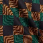
The surprises didn't end there, however, because on the occasion of the launch of the new brand identity, Venezia also presented the 22/23 pre-match jersey strictly signed by Kappa, the first tangible expression of the 'V' emblem, also designed by Bureau Borsche. The 22/23 pre-match jersey is a perfect example of the impact that the new brand identity will have on merchandising and is characterised by an orange-black-green chequered design and an eye-catching wave texture running through the chequered pattern where the logo stands out completely in gold.
The campaign for the 22/23 pre-match jersey was shot by photographer Alessandro Simonetti, a native of Veneto and a long-time New Yorker, and features Venetian actor Daniele Barison, star of the acclaimed film Atlantide by Yuri Ancarani, a youth drama set in the lagoon and premiered at the 2021 Venice International Film Festival.