How do you draw an "Ultras" group?
nss sports asked Antonello Colaps of Dopolavoro, who created all the graphics for "Ultras"
Sports
March 27th, 2020
March 27th, 2020
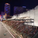
Before the chants, before the mentality and even before that complex system of rules that makes the world of ultras one of the last subcultures alive, the visiting card of each ultras group is its aesthetics. An aesthetic that, in the case of Italian stages, is made up of precise graphic codes, inspirations that are sometimes difficult to understand and above all consistency. So how do you act when you have to replicate all this cultural heritage in a film? nss sports spoke with Antonello Colaps, of Dopolavoro Napoli, who made all the graphics for "Ultras", the first film by Francesco Lettieri, released on Netflix on March 20 on Netflix.
In "Ultras" you worked to recreate the entire graphic history of a group of Neapolitan ultras. Ultras is a world that has very precise aesthetic standards, how do you approach it?
The aesthetic history of the Ultras movement begins with derivations from the imaginations of the political movements of the 70s. The names and lettering of many historical groups bear witness to this: Commando, Brigata, Fedayn and so on. With the failure of the revolutionary paths, in the 1980s new generations began to emerge on the tiers that joined different subcultures, each of which with its own reference aesthetic that was translated into movement. Alex's face of Clockwork Orange, that of Bob Marley, Andy Capp, The Dead Kennedys, Queen and Metallica, and then still Native Americans, Vikings, references to the sub-cultures Mods and Skinhead began to appear on the bleachers to mention just some. Curved colors, images and typographies multiplied and in practice any cultural or underground icon could become representative and useful in pointing out a difference in identity. In the 1990s, politics began to exert a certain influence on the movement, and aesthetics were affected as well. Looking at the real history, the Apaches are in a sense more a group of the early 80s, while the NNN are down 90s. But for the type of film it was not possible to insert them in those historical contexts, and they have been translated.


The first phase was therefore of cultural and visual research. Here I also realized that throughout Italy the groups emulated each other, often mixing the cards and the elements. It is no coincidence that Fedayn of Naples (1979) and Rome (1972) have similar typographies, just as the Lion of the Old Lions (1992) and that of the Fossa Milanese (used since 75/76) are almost the same. There are similar cases in many logos and lettering, both in the field of national and European support. In addition to this, finally, there is also one last fact that has radically influenced the approach. Ultras groups have always been, and I always hope will be, primarily groups of people who share passion and friendship. Many organized fans, in addition to having historically defined their aesthetics on the basis of political or iconic references, have always supported a healthy self-reference, representing what they were in fact together. It was not difficult for me to imagine that, to name just a few, the Skonvolts Cagliari, the Teste Matte (Naples), the SAB (Always at the Bar - Monza), the Astra Alcool Spal and the Oppini Sansepolcro Group have decided to call themselves so for a simple and genuine attitude to goliardia.
When I realized I had all this visual panorama available, the choice we made with Lettieri was to "act as if": we "did as if" Sandro, Barabba and the others had decided to call the Apache group for a reason that they could only know as a group of friends. The same methods could also be plausible in the practice of designing your logo and so on for the rest. Same identical approach and methodology for the NNN, Flegrean mentality, Brescia and Rome. In all these cases and willingly, he also supported a relaxed and fun-loving way of working, which I believe contributed not only to our enjoyment but also to make the whole project credible.


What kind of research did you do to work the graffiti and banner fonts of the Ultras groups?
As for typography, the first step was to collect and collect. By personal attitude I feel more comfortable in working with alphabets than with illustrations. I therefore started by creating an archive of typographies actually used in the world of cheering, taking advantage of the tempting opportunity to put on the table also some fonts with which I had always wanted to work but which in the commercial field are difficult to use. Screenplay in hand, it was then quite simple to guess which one was more appropriate for a tattoo, the identity of a group or a context than another, etc. Special mention for No Name Naples, whose glyphs I designed ad hoc starting from some writings of the Neapolitan groups, in particular of groups in my area.
Where do the inspirations for the subjects come from - among all the octopus of ''phlegrean mentality''! - the stickers and murals you made?
We already knew that Flegrean mentality would play a marginal role in the film, but an aesthetic that was also very characterized and different from the other two had to be defined here: you never know which details will be visible and which not at the end of the film. With Francesco Lettieri we imagined a small group of friends with a visceral passion for ice cold beer, mussel peppered and octopus salad: a bit like us. The designs come from some mosaics from the Roman era, even if both the visual materials and the characters of the group have not been seen so much (Antonella Mignogna, the costume designer, still suffers from them, they were real Puteolani Mods, very stylish).
More generally and for all the other visual materials, I made the same argument on the methodological approach. I designed and collected images, quotes, inspirations, elements that had references to stadium culture, to pop culture or to our personal ones. From T.V.O.R. Empty Heads Broken Bones name of an old Hardcore-Punk dance of the 80s, at the Vecchio Conio of Maccio Capatonda put under the face of Carmando, from the composition in red, blue and yellow of Piet Mondrian to the Skeletor of Greyskull, from an old sign of PALINURO to Joy Division, everything was put on the table by dismantling and reassembling the elements until you find a painting that worked for the film but that was also realistic in its being genuinely self-referential.
For the occasion, I also prepared a playlist.
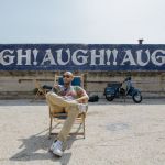
The Apache pier is one of the protagonists of the film, where graffiti and Vesuvius find a perfect fit. How did you work on mixing the two? And more generally, how difficult is it to combine the elements of an aesthetically characterized city like Naples?
The bulwark at the pier was built already in the old and gloomy departure, consumed by the wind and the salt, by the time spent. In short, it had to be consistent with the Apache condition. As few colors and as dark as possible, few clean lines. I think the perfect fit with the context is due a little to these few tricks and a lot to the location and nature of the location itself, but this I always think is true in Naples.
As for working here, I don't think it is possible to reason by singularity. Naples is unique is true, as unique are also many places in the world. Of course the different souls of the city, as well as Vesuvius and the islands there in the background, are elements that are difficult to circumvent in everyday life, both mentally and visually. But having removed these and many other objective conditions, I believe it is possible to work, here as elsewhere, by approaching in a logical and systemic way. Do research (a lot), always try to look for cause/effect connections and always be aware that everything we do will go in and then be part of a much wider context. It may be that I am the son of this earth, but I have no difficulty in moving in complexity. We are dwarves on the shoulders of giants, and of a volcano.


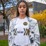
You also worked on the graphics of some stage clothes, such as Barabbas' nostalgic t-shirts: in that case, what kind of aesthetic research did you do?
When my support was asked, I tried to work with the other departments using the same approach just described. In Barabbas, as well as in the other characters there is a whole world. He still lives with his mother, he is the only one to ride a Vespa, he does not wear a signature but rather makes his shirts himself, opposing himself as he can to change: with a little infantilism but in a purely romantic way. This romantic nostalgia, the same one that Dalla in Caruso perhaps sings, is also a feeling that unfortunately belongs, today more than ever, to the imaginary Ultras: the nostalgia for that "old football", not dominated only by economic interests, now seems be a common feeling to many. It is slowly - and seems inexorably - going from being the twelfth man on the pitch to being an X number of subscribers to Pay TV. This is why many now also approach other sports or minor categories. It was not difficult to find references and interpret this feeling of nostalgia for the '90s, from Subbuteo to Mixed by Erry audio cassettes, ending with a very current "Eternal hate to Modern Football".
So what is the main difference between working on the graphics of a film and those of a disc or a music festival?
In a film everything that enters the frame is thought to be there, according to the scene and what happens to it. Very often they are details, objects and blurred images in the background. Speaking of "Ultras" for example: how many have noticed that in the billiard room on TV there are the screens of the odds of a betting site? The same goes for the labels of paper bombs or beers, for the logo of the dairy on the transfer vans and so on for a myriad of other elements that have so much to do with graphic design as well. Taking care of these details is a way to make the scene more credible to the viewer.
For me, almost all these elements have become an excuse to insert inside-jokes, but also one to do visual research without the commercial compromise in areas other than those of my usual work.
In the preparation phase and during the shooting, however, the commercial plan is completely absent, only the script and the needs of the departments exist. The compromises that are reached are always on a level of necessity and in function of the cinematographic - and therefore artistic - narration - not of the market.


How difficult is it to make one's work "disappear" within a set, still making it an added job?
Being my first project for a film, I let myself be guided and I learned a lot from those who knew more than me, first of all Marcella Mosca, the set designer and Gianluca Palma, the DOP. I have always been aware that my work was part of a whole, with very specific functions. Among creatives and designers we often complain of careful studies made on colors and typographies thwarted by the client's classic punching judgment: "Yes ok I understand but...I don't like it".
On the other hand, when it was necessary to change a color, a style, a design, it was always because this worked better in favor of the machine, because it integrated in the most appropriate way. And then I don't feel like an artist, I don't think I have something necessary and urgent to say to the world, nor do I have to claim any authorship. I can only be happy if part of my work has come out of focus, but it has helped to give strength and structure to the final image.