The timeless appeal of the first MLS
Celebrating the aesthetics of soccer before it was cool


Sports
January 11th, 2024
January 11th, 2024
The MLS officially kicked off in 1996 following the USA’s hosting of the 1994 World Cup, supposedly at FIFA’s encouragement after the awarding of the tournament. It was the US’s latest attempt at starting a professional soccer division following the North American Soccer League’s demise in 1984.
Bigger goals and throw-ins becoming kick-ins were just some of the tweaks that are reported to have been discussed to make the sport appealing to a new audience that had yet to fully embrace it. In the end just a couple of tweaks to the actual game were made, including the now mythical ‘MLS Shootout’: whereby a game that ended in a draw was settled with a shoot-out, not with the standard penalty kicks, but with players allowed a 35-yard run and 5 seconds on the clock to beat the goalkeeper. The thinking was, the American sports fan wasn’t accustomed to seeing ties (draws) in other sports, the idea that a sporting contest could end all square would be considered boring and strange to many, or so the thinking goes. Images of these regularly make the round on social media, it was even embraced to a degree in Italy, during the now defunct three-team summer friendly tournaments Trofeo Tim and Trofeo Birra Moretti. Exciting stuff!
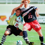
To increase appeal to their US audience, the league is also said to have allowed the brands designing for the 10 teams participating in the division creative license in the naming and branding of the teams, as well as the kits. According to the league executives, the brands knew the consumer better. The inspiration was supposedly embracing the idea that soccer was a counterculture sport, taking notes from the skateboarding scene prevalent in the US. The result makes for some of the most colourful and graphic kits any football league has ever seen. The naming conventions of the teams felt more aligned to American sports as opposed to traditional European club names, taking nods from the NASL teams of the 1970s but with a sprinkling of mutant bats, intergalactic-comic book themes and a personal favourite a “future vision of yesteryear.” Teams such as the New York Metrostars, Tampa Bay Mutiny, San Jose Clash and the Dallas Burn were born. What skateboarding soccer fan wouldn’t approve?
The new teams and their uniforms were officially launched in New York at a show called “MLS Unveiled” – viewing it back, it feels much more in line with a beauty pageant or fashion show than a sporting kit launch, add to it the Green Day and Hip-Hop tunes and dare I say it, much more akin to what we see from kit launches today. According to Kevin Payne, former president of DC United (speaking to SI in 2015) these were “some of the worst uniforms in sports history”. The kits were a riot of colour, featuring interesting placements of numbers on the front of the jerseys (something unusual in European club football), the crests were some of the most graphic and unique in world football and all the teams had their names emblazoned across the chest in classic US sports uniform style, with graphic typefaces to match the personality of the team names. It’s no surprise that these designs have become cult classics, with numerous clubs releasing “throwback jerseys” in their honour.
What makes the early part of the MLS so interesting from a design perspective looking back, is that it embraced the same American attitude that we had seen in the infamous World Cup ‘94 US denim jersey and Andre Agassi’s Nike Challenge court tennis range (again featuring denim this time for the shorts), committing to a loud and proud aesthetic, something only the Americans could pull off. One glimpse at a team crest from the MLS instantly made the European-based football fan in me associate it to US Soccer and drew me in to watch the games. The club names, the kits which always stood out in the football kit catalogues that would come out at the start of the footballing season, but also the markings on the pitch, often games were played on fields that had NFL markings still visible – to me added a personality and a uniqueness but also gave it an identity it could own.


Over the past 10 or so years, the MLS has had somewhat of a makeover, the fans have matured and interest in the game has increased massively. With the league looking to align itself with the top tier footballing institutions we saw a period of toning down the in-your-face attitude, stripping away the confidence of making a statement and replacing it with something much more familiar to a “traditional football fan”. First the league re-branded, then the clubs– out went the graphic names: Dallas Burn became Dallas FC, Kansas City Wizards became Sporting Kansas City and saddest of all, although slightly before, New York Metrostars were absorbed by sports’ favourite energy drink and become part of the Red Bull footballing family, as the New York Red Bulls.
The crests have also become far more conservative in their attempts to look more mature, which has led to numerous run-ins with fans, Columbus Crew (who also tried to rebrand to Columbus SC) and Chicago Fire both having to backtrack on proposed re-designs following fan discontent. The league aesthetic had gone from energetic and vibrant, and although far from perfect to very corporate and generic. The newer crests all felt like they bled into one another, and the jerseys looked like a badging exercise.
For the past couple of seasons however, we’ve seen a revival in the MLS from a design point of view – the graphic kits have returned, colour and personality has been embraced by the clubs and thanks to the focus on telling club and community specific stories, clubs feel like they have a point of view again. We’ve seen numerous throwback collections to the early-MLS era and the newly founded clubs seem to have understood the need to stand out as opposed to conforming in order to fit in with the wider footballing landscape, embodying American soccer. We may not be back to what MLS was in its early days, I’m not sure we ever will be, but it’s great to see the personality of that era return and shape the league visually.