All footballers' logos, from the ugliest to the most ugly
The question is: did they really need them?
Sports
October 19th, 2021
October 19th, 2021
Just last week, Valerio Bassan, a well-known journalist and product and digital strategy consultant, wrote an article about the importance of debranding.
"In the design world, debranding is a subtractive approach, which also involves choosing simpler, more defined, flatter forms."
Over the last ten years, many companies have opted to simplify their graphic identity, the automotive sector being a perfect example, with Mini being the first in 2015 and Volvo's being the first a few days ago. More than a trend now, the adoption of more minimalist logos is a real necessity to distinguish the logo as best as possible, especially in digital format. Leaving the world of motors for a moment, in 2019 Mastercard also removed its name from the logo, leaving only the two coloured circles. Footballers on the other hand have the opposite approach, their logos moving away from the simpler, more defined shapes that all brands today are heading towards, espousing complex, intertwined and in some cases unsightly shapes. We've noticed that in the mad rush to brand athletes, and specifically footballers, so that they become companies in every way, the logos that represent them are really ugly.

Created for purposes as yet unknown or perhaps just to troll Inter, Mauro's M wraps around Icardi's I in the middle, intertwining in a white background. Despite the fact that it was created in January 2021, this logo already looks old, enclosed in a strange circle as if it were the logo of a football team.

Pogba's logo is much closer to what was said before, compared to the others it is much simpler with only the initials of the player and close to those created in the automotive sector. What is not entirely convincing is the colour, designed in a very strong gold and the second "P" that turns into an "L", another initial of his name.

One of the latest is that of Neymar, who arrived at the same time as signing with his new technical sponsor: PUMA. Compared to his colleagues, here fortunately, the Brazilian has also opted for a simple approach and a very subtle font. Here too, the initials of the name the 'N' and the 'J' are intertwined but without touching, while the second 'J' is upside down. Although some of these elements make it modern and in some ways much more up-to-date than those of his colleagues, even this does not communicate much about the character in question.
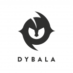
What you see here for example is the logo of Juventus number 10, Paulo Dybala. It should be the representation of his exultation, the Dybalamask, which has also become his brand. Specifically, the logo represents the helmet of a warrior (not well defined) of ancient times, one of the Joya passions out of the field. This is the logo description o at the time of the launch: "A warrior mask, but worn by a boy raised with the values of the Argentine province. A personal symbol, but also of belonging. An emblem of challenge, but also of peace. A mask of a superhero, to leave a mark in the stadiums and outside".
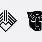
This (left) instead is the logo of the Welsh player of Real Madrid, Gareth Bale. Designed to incorporate his exultation with the hands that form a heart and its number, 11. Developed by a London-based company named Brane, it has caused quite a few criticisms on the Internet. Many users have pointed out that the Bale logo refers in a not too veiled way to the Transformers precisely of the Autobots, plus someone has defined the design of the brand of the Welsh number 11, "Batman who meets adidas". Also in this case, revisable design or at least, looking at the logo I can not think of the 11, neither a heart made with hands nor even Bale as a player.

Arrived in Serie A as the new "crack" of Argentine football, Lautaro Martinez, called El Toro, has yet to prove its value with the F.C. Internazionale shirt but from the point of view of choice and design of its logo one thing has demonstrated, is equal to that of the famous Neapolitan restaurant chain Fratelli La Bufala. I do not think there is anything else to add.
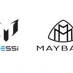
And then there is the logo of the strongest player in the world (along with Cristiano Ronaldo), Lionel Messi. Halfway between the representation of a mask and a double M that I honestly do not understand since the M has it only in the last name. Also in this case I found a resemblance to another extremely well known logo, that of MAYBACH, a German luxury automobile company well known especially in the United States. The launch of the personal logo took place on Facebook and these were the words with which Messi accompanied the presentation: "I share with you my personal logo that represents me as a player and as a person ... I hope you like it!".
Thank you so much Leo, do not be offended but you could do better.

Perhaps the ugliest of all is that of the Arsenal German player, Mesut Ozil. The number 10 is not going through a good period, it seems that too many hours spent playing Fortnite, have given him a bad back problem, this would explain his very poor use in the field by his coach Unai Emery this season. On the logo I really do not know what to say, look at it and judge for me because I can not.
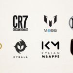
Many other players did not miss the opportunity to expand their business by creating a logo that reflects their personality and their character. The players are now companies and are also the first testimonials of themselves, here you can admire the logos of Cristiano Ronaldo, Neymar Jr., Kylian Mbappe, Marco Reus, Robert Lewandowski and last but not least Luciano Zauri.


After reviewing the most significant we try to explain why these logos are objectively ugly: the answer is actually very simple.
As is evident, the logos are immediate, white and black dominate and do not communicate anything of the character to which they belong because they do not have to. Their ultimate goal is to be more "accessible" as possible and therefore simpler they are more do their job and the ultimate user does not have too many visual stimuli, too many elements but on the contrary the cleanliness and recognizability (in fact most of logos are composed of the initials of the players) must stand out on everything else.