The new brand identity of AS Monaco
"The rebranding exists, but it is not evident"
Sports
May 12th, 2021
May 12th, 2021
A few hours ago AS Monaco revealed its new visual and brand identity through a campaign that tells the club's new vision. In the concept of "RISE. RISK, REPEAT" there is all the ambition of a company that works with young players, that dares and that does not stop believing in its own ideals and values. The launch also included a new logo, designed by Interbrand - the same agency that created the new Juventus logo. If there was a real transformation with the Bianconeri, with the Monegasques you have to use the magnifying glass to understand what are the differences between before and after. Compared to the one presented in 2013, the new crest is slightly more linear, with less golden details and no shadows. Even in terms of color there are no substantial differences, with a slightly duller red.

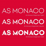


In the variant in white - used above all on a social level - the differences are more visible, testifying to the fact that the use of a single color enhances the quality of the drawing on a digital level. The new font - "AS Monaco Diagonale" - which will use Kappa on the next jerseys is also part of this rebranding. Speaking of jerseys, Monaco has also launched a limited edition collection that will debut in the next match against Rennais.
The real gem of the campaign is certainly the video, a product that tells the club's culture and above all the relationship with the territory. From Mbappé to today's youngsters, from European companies to Ligue 1 titles, passing through coach Niko Kovač who is trying to make the club return to glory one by one.
The restyling of Monaco includes all areas, as Oleg Petrov, CEO of the club, recalls. In addition to aesthetics, the French have inaugurated the new Performance Center, a wonderful and avant-garde sports center that will be the new home of the team starting this summer.