Il rebranding della Costa Rica
Un nuovo logo che guarda al futuro che riprende i colori della bandiera nazionale

November 30th, 2021
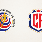
The Costa Rican national football team presented on its official website the new logo that will also be used by the football federation. A logo that highlights the history, tradition, flag and places of the Central American nation. The last rebranding dates back to 2014 but did not reflect the nation in any way, with shapes and symbols far from those proposed in the past. For this reason, the federation entrusted the task to the agency PUPILA, which expertly analysed all the national teams in the world and interviewed dozens of people, including players, former nationals, journalists and officials of the Costa Rican Football Federation. In the end, both the Central American federation and the agency opted for an elegantly shaped logo that echoes the traditional colours, but above all is as bold and impactful as the more than ten volcanoes that populate the country.
Graphically renewing the identity of the national team and the federation, for Costa Rica, can lead to new commercial and marketing opportunities. The agency then decided to do this by following the combination of tradition, hence the acronym 'CR', and a modern paradigm with its lines inspired by the territory. Costa Rica currently has 16 national symbols and the new identity is based on the only two that are unquestionably emblematic and representative: the national flag and the coat of arms. PUPILA has reinterpreted both, transforming an obsolete logo into a contemporary one. The new coat of arms, according to the federation, is not only inspired by Costa Rica, but also inspires it by creating a real dialogue between heritage and innovation.


