The best 10 jerseys of the MLS 2021
Many references to the 90s in the 25th season of Major League Soccer
Sports
March 9th, 2021
March 9th, 2021
The 25th MLS season will kick off on April 17 and in just over a month the new kits that adidas (the sole supplier of the Major Soccer League) has designed for the 2021 franchises will take to the field. Deductibles that have become 27 thanks to the addition Austin FC, a team that in part also belongs to movie star Matthew McConaughey, after reaching 26 last year with the debut of Nashiville and David Beckham's Inter Miami FC. The kits of the American soccer championship follow particular rules: in addition to having a single supplier, the teams do not launch two new kits every year but alternate the news, changing the home one year and the away one year. Among the new uniforms, we have chosen 10 that differ from the others in style, design and meaning.
Atlanta United - Home


Let's start with one of the hottest teams in the MLS - a bit for the style, and a bit for the wonderful Mercedes-Benz Stadium. For the next two seasons, the club will play in the super innovative arena with a total black jersey with 5 red stripes that symbolize the 5 seasons in MLS and the 5 principles of the club: unity, excellence, community, determination and innovation. The logo becomes a central part of the simple design of the shirt, which has been much debated in recent weeks in relation to the freedom to choose a certain style that clubs do not have. The claim "Unite & Conquer" is on the collar, in the back, and the kit is completed with black shorts and socks.
Portland Timbers - Home


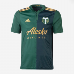
The Timbers home shirt is one of the gems of this season, both for the style and for the jersey sponsors. In fact, on the shirt, in addition to Alaska Airlines, there will also be TikTok (on the right sleeve) which also officially debuts on football shirts. The different shades of green and the chevron pattern that divides the shirt into two parts - ideally linked by the laces that were once used for kit collars - are accompanied by gold motifs. Inside the shirt is written "King of Clubs", the main fan group of the Oregon franchise. The kit is completed by shorts and socks in harmony with the green shades of the shirt.
Austin FC - Home + Away
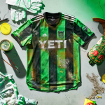


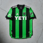


The first jerseys of Matthew McConaughey's adventure in MLS could not be missing. From a design point of view, the jerseys are identical and the template has already been seen several times in the past seasons - perhaps the club pays the price of being a new entry and the entry level is low level. The presentation, on the other hand, was very interesting: the first shirt (reminiscent of Sassuolo's) was declined in various versions to tell all the nuances of Austin, TX. There are important investors, now it's time to work on the style of the shirts.
DC United - Away


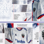


Renamed "The Marble Jersey", the capital's new home shirt is inspired by the monuments that make Washington DC a wonderful city. The texture reproduced as the main pattern of the shirt gives the shirt solemnity and style, a bit like Nike did with Inter's third shirt in the 2018-19 season. The red and navy blue colors recall the American flag and evoke a 90s jersey dear to the club. The jocktag chosen by the company is "Unite The District".
Los Angeles FC - Home


The only exception on this list is the Los Angeles FC home shirt, launched in 2020 and also in use in the 2021 season given the rule of alternating new throws. The combination of black (often shiny) and now makes this jersey incredible, complemented by a very special sponsor jersey (Youtube TV). The sobriety and elegance of the angelena glamor scene transported to perfection on a football uniform.
LA Galaxy - Away


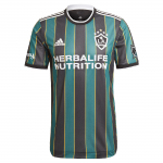
It's hands down one of the best of the season that is about to begin, in terms of style, history and meaning. Recalling one of the most beautiful jerseys of the franchise (years 1996-97 and 1997-98), adidas has decided to relaunch the Galaxy colors 25 years later, far from those used in recent years: green and black stripes, divided by yellow lines very thin. There is no pop font of the 90s, but it remains a shirt with a significant symbolic value, especially if we also consider the launch campaign that unites all the Angelene communities that have always supported the Galaxy.
Inter Miami FC - Away


After last year's debut, Inter Miami is ready to raise the bar. For the significant purchases made by David Beckham (Higuain and Matuidi above all) a quality jersey is needed and "La Palma" responds. On the away shirt of the Florida franchise, the herons that symbolize the club are flanked by palm trees, symbol of Miami, but also of unity, triumph, longevity, victory, royalty and honor in the vision of the management. the shirt will remain without sponsors once again, while details in blue have also been added in addition to pink. "Freedom to Dream" is the claim chosen for this season.
CF Montréal - Home
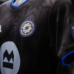
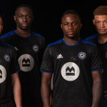


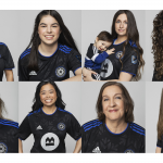


The change of name and coach - with the farewell of Thierry Henry - did not lead those who were Impact to change their style last year. The total black shirt proposed by adidas is embellished with an all-over print that incorporates the logo motif in a simple but very elegant way. A technique that was also widely used in the 90s, the golden age of kits. Inside the collar a black and blue interlaced line, symbol of the team's DNA. At the center of the shirt the - rather intrusive - logo of the BMO Financial Group.
New York Red Bulls - Home


Among the hype teams, the Red Bulls of New York are certainly in the top 3. Even their jersey is at least on the podium this year, with a checkerboard pattern that combines sporty design and an essential street style component to make a dent in the market. New Yorker. The red and yellow, typical of the brand that sponsors the team, create a chromatic harmony that breaks the rules of MLS a bit. The kit is completed with red shorts and white socks.
Orlando City - Home


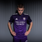


The MLS "purple lion" is at home in Orlando, FL, and the home shirt for the 2021 season is simple, straightforward but very attractive. The purple shade that starts from the bottom and almost reaches black in the shoulder area are not the only characteristics: geometric patterns make up the central part of the jersey. Other details, however, represent the Florida flag (on the back of the collar) and "Through thick & thin" as the jocktag of the season. The kit is completed with shorts and socks in purple.