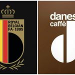
Where have we already seen the Belgian FA logo?
The new RBFA crest is similar to an italian coffee brand
Sports
November 11th, 2019
November 11th, 2019
For the 125th anniversary of its foundation - to be held in 2020 - the Royal Belgian Football Association decided to launch a rebranding operation starting with the logo, including the crest fot the male and the female teams and the official supporters club. On 7 November, the new RBFA unveiled its crest, replacing the current one on the Diables Rouges Euro 2020 jerseys made by adidas and just revealed. The new logo maintains the colours of the flag and the royal crown, but it seems to recall an Italian brand's logo, founded over a century ago: if you try to flip it horizontally, it is very similar to the Danesi Caffè's logo.


The Danesi Caffè was founded in 1905 in Rome by Alfredo Danesi and it spread abroad since 1973, when the company opened its first office away from Italy. According to the official website, Danesi exports its blends to over 60 countries and, for this reason, it is legitimate to assume that it's also known in Belgium. It's reckless to think that the designers chosen by the RBFA for the rebranding were directly inspired by the Danesi's logo, but the strong similarity between the 'd' of the Italian brand and the 'b' of the Belgian Football Association is undeniable.