FC Nantes unveils the new crest
The historic French team changed its logo, drawing inspiration from Juventus one?
Sports
May 24th, 2019
May 24th, 2019
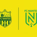
Together with the presentation of the home jersey for the new season, designed by New Balance, FC Nantes has unveiled the new crest, revolutionizing the one adopted in the last nine years and throughout the tradition of the Breton club, founded in 1943. As happened with Juventus two years ago, the decision was to realize a minimal and essential logo, focusing only on the letter N and deleting some omnipresent signs like the schooner and the ermine (one of the most recurrent symbols of the Breton iconography, of which only a small remains below in the figure), but also references like the year of foundation, only using the social colors, yellow and green.

Although the rebranding operation was developed according to the philosophy of 'we write the future on the basis of the past', the change of the old logo has not at all pleased the more traditionalist fans, despite the fact that in the statement released by the club eight times champion of France have been clearly explained the reasons that have led to this real visual revolution, 'because a great club always welcomes the great challenges' working for many months on updating the brand strategy and on developing a more modern and attractive visual style.
Nouveau logo, les détails du changement pic.twitter.com/UdhdD2rfiT
— FC Nantes (@FCNantes) 23 maggio 2019