10 forgotten Reebok jerseys
The thread that connects Steven Gerrard, the Salas' Chile and the Palmeiras of Rivaldo and Cafu

Sports
April 9th, 2019
April 9th, 2019
There is only one common denominator that links Gerrard while raising the 2005 Champions League, Salas amazing the world in France '98 and Kevin Nolan during his ten years with Bolton: the kit supplier. On those occasions, Liverpool and Chile were sponsored by the English brand founded in 1958 in Bolton, that signed with Bolton one of the longest partnerships in Europe. Since the mid-90s - for nearly 20 decades - Reebok served different clubs and national teams managing to leave an indelible mark in the history of the most recent and appreciated kit suppliers.
The relationship between Reebok and the world of football is rich but concretely short. After the acquisition by Adidas in 2006, the Foster brothers' brand gradually begins to look in other directions, leaving the German brand with the prerogative on football, poorly dealt by Reebok in the years to come.
Today the British brand has officially stopped to take care of the football, focusing on different areas of specialization and different sports areas (running, CrossFit and combat sports above all). But despite its fleeting parenthesis on the pitch, there are many small masterpieces that Reebok left to us, little football archaeologists constantly looking for amazing pieces to retrieve. We tried to dig up ten of the most iconic, the most beautiful, the most significant shirts Reebok ever made. No rankings, no standings, because we’d have made wrongs that honestly we didn't want to do. Only and simply ten, of those that somehow deeply remained in our hearts.
Argentina 2000-2001 Home

Nueve in the center, armband, hair blowing in the wind. Who could wear this shirt better than Batigol? In the very short agreement between Reebok and Argentina, this authentic pearl was created, undervalued and mistakenly slipped out of the popular imagination linked to the Selección kits. Cardinal sin.
Bolton 2004-2005 Home
Selecting one shirt by digging into the entire archive of the romantic marriage between Reebok and Bolton has been an odyssey. This one prevailed in the end, after a careful and rigorous selection processes. Minimal inserts with social colors for a clean, simple and dry shirt that evokes sweet memories, such as the sixth place in the Premier and the brilliant genius of Jay-Jay Okocha. Literally chills.
Borussia Mönchengladbach 1995-1996 away
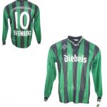
To contrast the total white home uniform, Reebok designs an away jersey that takes the rest of the social colors, almost ignored in the home shirt. The result is a very respectable kit, with a format used for the second uniforms between 80s and 90s. Since 1996 the vertical black and green stripes proposed by Reebok will never appear again on Borussia kits.
Chile 1998 Home

Italy's first match in France '98 ends 2-2, with the Azzurri twice folded by an unstoppable Salas, who scored 4 goals in 4 games (one of these in the 4-1 defeat against Brazil in the first knockout round). Chile flew in France with Reebok: mega logo that floods the shoulders and the upper part of the chest to create a shirt with a striking impact, emblem of a Chile that amazed and amused.
Liverpool 2004-2005 Home A

Symbol par excellence of the nightmare for a Rossoneri fan, top representation of the sport miracle. That Liverpool shirt evokes mixed feelings and diametrically opposed meanings. From the aesthetic point of view, however, a pearl that goes beyond any football allegiance. Clean, simple shirt, without any superfluous insert. If it’s not perfect, it’s not far off.
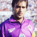
Fiorentina 1996-1997 Home

Cagliari and Fiorentina are the only two teams in Italy with which Reebok has signed a sponsorship contract. Despite the brief period in Serie A (from '95 to '98), the Foster brand left us a legacy of authentic beauty. Above all, the Viola uniform for the '96 -'97 season: collar with the colors of the city, lily and coccarda of the Italian Cup won the year before. At the end of the year they will win the Italian Super Cup thanks to a Batistuta brace.
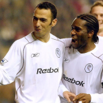
West Ham 2006-2007 Home
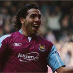
Mascherano's rising star, captain Mark Noble's first steps, Carlos Tevez's emergence. All of this under the same roof (the late Boleyn Ground) and with the same shirt, among the best designed by Reebok for the Hammers. Essential, claret and blue perfectly placed, little inserts and diagonal pinstripes not screwing up the last West Ham uniform signed by Reebok.
Kaizer Chiefs 1997-1998 Home


In the 90s Reebok lands in South Africa to dress up the players of the legendary Soweto club. Yellow, black and red combine to perfection, giving life to a jersey that is guiltily finished too soon under thick layers of dust. Symmetrical and simple, with inserts on the arms that continue vertically on the shorts. One of Reebok's last tail shots before giving space to Nike.
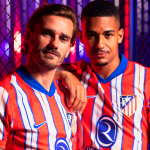
Atletico Madrid 1999-2000 Home

An original shirt for a disastrous season (and perhaps for this reason never retabled). A unique uniform for the Colchoneros that for divine retribution coincides with the second relegation of their history. And that’s's a real pity. The traditional narrow red and white stripes are reduced in number and become very wide, even turning upside down on the sleeves. The picture is completed by a V-neck, central crest and the Reebok logo just below, in a perfect NFL style.
Palmeiras 1996 Away

One of the most eccentric shirt for the Alviverde, which leaves Reebok a creative license on the second uniform. The white of the shirt is stained by a wave of green that spills unevenly on top, creating an original optical effect. The gem of the uniform is the logo of the Paulista championship winners, when Palmeiras could still count on the talent of the various Rivaldo, Cafu, Luizão and Conceição.