The special fonts of this Champions League
How some teams decided to make cup nights even more special
Sports
November 9th, 2023
November 9th, 2023
When the teams take to the pitch on the magical nights of the Champions League, the jerseys worn during the regular season are put in the spotlight by new fonts made exclusively for the Ol' big ears. A way to make the jerseys used even more special and exclusive and, why not, to create another product for clubs and technical sponsors to sell and communicate. And especially after the major national leagues in Europe started to impose a standardised font for all teams over the years, the Champions League phase became the most popular arena to show off all the jerseys' creativity and ingenuity by finally being able to print names and match numbers that had been thought up when creating the design. Even in this final round of the Champions League, the most observant could recognise the differences between the fonts used in Europe and those reserved for the national leagues.


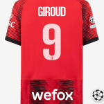
Of course, Paris Saint-Germain did not miss the opportunity to differentiate its jerseys, demonstrating once again that it is one of the clubs most attentive to its aesthetic profile and marketing opportunities. For the match against AC Milan at the San Siro, Mbappé and his team-mates wore the away jersey designed by Nike, in which the numbers are crossed vertically by a thin white line. A clear change from the jerseys in Ligue 1, which have a three-dimensional effect thanks to the use of a different coloured border. At the same time, AC Milan has designed a special font for the Champions League, unlike the other Italian teams competing in Europe's top competition. On cup nights, the monochrome black number gives way to a perforated white version.
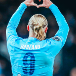
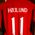
Defending champions Manchester City have also decided to celebrate last season's victory by changing the font they are using to try and defend their title. They are using a tone-on-tone number with a white inner line, in stark contrast to the Premier League's white block numbers. The other Manchester side, United, also opted for a narrower, less conspicuous number than the PL standard that counts on their return to Europe. Finally, even Real Madrid, the team most associated with the Champions League, naturally used a different font to the one used in LaLiga. Inspired by the one used in Europe from 1998 to 2000, it is a very elegant font with thin, sleek, almost liberty-like numbers that make the jersey perfect for the magical nights of the Champions League.