Real Betis Balompié has updated its symbol
A very subtle redesign that affects the entire identity of the club
Sports
September 15th, 2022
September 15th, 2022
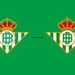
It takes a close look to notice the differences introduced in the restyling of Real Betis Balompié's symbol. Indeed, the green-and-white team has unveiled the club's new crest and visual identity, without upsetting the previous one but only making minimal changes to a historic design. The crown surmounting the iconic triangle has been slightly enlarged and defined, while the green stripes and lettering have been brightened to make the logo more current and eye-catching. The letters within the circle have also been simplified and revamped, thanks to new typography created exclusively for Betis by renowned Spanish designer Eduardo Manso.
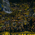
The rebranding operation is part of a broader and more ambitious project, dubbed La Vida En Verde, which will cover every aspect of cheering while enhancing the great identity of the Seville club. One of the most supported teams in Spain and one that recently lifted a trophy-the Copa del Rey-after more than a decade of waiting, in a blaze of green-and-white flags. Also just in the summer Betis ended its relationship with Kappa by choosing Danish Hummel as its new technical sponsor.