The 8 most beautiful jerseys of Serie B 2022/2023
From Kappa to Frankie Garage, the best seen on Italian minor league pitches
Sports
August 22nd, 2022
August 22nd, 2022
Serie B began last weekend and promises to be one of the most competitive cadet leagues ever. There are the great noble lapses of the previous season, such as Genoa, Cagliari and Venezia, and great places that are returning to Serie B after many years of absence, such as Bari, Palermo and Modena. If from a sporting point of view it will be difficult to win given the presence of so many well-equipped teams, from an aesthetic point of view this year the attention has also been high on everything concerning the game uniforms. Venezia and Kappa confirmed themselves as always, churning out three different jerseys with a unique flavour, continuing their aesthetic research project around the lagoon city. Como were no less impressive either, who, with the arrival of Fabregas, unveiled a unique jersey inspired by the lake that washes the city. Impossible then not to mention the arrival in Italy of Castore with Genoa and the good work done by Erreà with many of its sponsored teams.
8. Cittadella - Erreà
From the first to the third, one of the most surprising kits of the Serie B is certainly that of Cittadella which, thanks to Erreà, has succeeded in the arduous feat of rejuvenating an often anonymous jersey. All three jerseys are inextricably linked to the city, from the home to the third, they all take up the most characteristic architectural elements of the province near Padua.
7. Perugia - Frankie Garage
The Grifone presents itself as one of the possible surprises of the cadet tournament, the jersey is quite traditional, but well designed. It was produced by Frankie Garage, the streetwear brand owned by president Santopadre, who opted for a jersey with tone on tone graphics, as done by Roma, Real Madrid and many other teams.
6. Parma - Erreà
After having presented the classic first jersey with the historical Crociati motif, today Parma and Erreà presented also the new away uniforms for the movement players and the goalkeeper's one. The second uniform confirms the iconic and timeless motif of wide horizontal stripes on a yellow base accompanied by the classic blue stripes. As in the first jersey presented a few weeks ago, the stripes are distinguished by a new feeling of movement, creating a sort of imaginary additional energy for the players on the pitch.
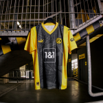
5. Bari - Kappa
After last year's great success with the jersey designed by LC23, Kappa and Bari are at it again this year with three jerseys with a vintage feel that mark the cockerel's return to the Serie Cadetta. Among the three, it is impossible not to fall in love with the home version designed entirely in red and with a collar. To embellish it all, there is a tone-on-tone diamond graphic that is very reminiscent of the one designed by adidas for Bari in the early 90s.
4. Genoa - Castore
After relegation, change of ownership and logo, Genoa, after three seasons with Kappa, announced that they have signed a multi-year partnership with Castore, a novelty that few expected. The Liverpool brand, already sponsor of Newcastle United, Aston Villa FC, Bayer 04 Leverkusen and Sevilla FC, has arrived in Italy for the first time after months of rumours. And its debut certainly didn't go badly, for the Grifone the Liverpool-born brand created two simple but extremely impactful jerseys. Of the two presented, the one that struck us was the away version with the two horizontal bands in the colours of Italy's oldest team.
3. Palermo - Kappa
After the promotion, the change of ownership and coach, the main novelty of Palermo is undoubtedly the first jersey, which after last year's two-colour design, for 22/23 will return pink with black accents. But the most iconic element is undoubtedly the wide collar held together by laces, a real dip into the past, a model used mainly in the late 1950s, when the Favorita warmed up with Ghito Vernazza's goals. The historical component of the collar meets by contrast the modern one of the jersey texture: a 'glitch' effect that breaks up and mixes different shades of pink, thus creating a bridge between past and future.
2. Como - Erreà
With the official arrival of Cesc Fabregas at the court of Giacomo Gattuso, Como also took the opportunity to unveil its new shirt signed by Erreà and designed by Golnaz Jabelli, stylist of the brand Didit Hediprasetyo. In their first collaboration, Jabelli and Erreà have created a design inspired by the tranquillity and serenity of the lake, transferring to the kit the variety of the texture of water and the strength and structural compactness of marble to convey a sense of intense energy.
1. Venezia - Kappa
Once again this year, Venezia did not disappoint expectations. On the contrary, after enjoying great success with the first and second shirts, today the lagunari also presented the third kit, again designed by the Bureau Borsche studio and produced by Kappa. The new jersey is characterised by its golden hue, a colour rarely seen on the playing fields but which Venezia have adopted to strengthen their ties with the city. This choice in fact is a tribute to the churches, monuments and golden palaces of the iconic city on the water and to the historical importance of this metal in Venetian art and commerce from the late Middle Ages and early Renaissance.