Changing your logo after fifty years is not a simple matter
Just ask Norwich City FC and their own crest that had stood since 1972
Sports
November 24th, 2021
November 24th, 2021
A few hours after the meeting of the members of Borussia Dortmund that ratified the new club code of values according to which the German team would never again change name, colors or logos, one of the oldest teams in the Premier League, the newly promoted Norwich City FC, has announced its crest. A non-trivial change, since the team had never changed crest depicting a canary perched on a ball, a lion and the medieval castle of the city since 1972. When the new logo officially enters into force, in the summer of 2022, it will be exactly fifty years of use of the same corporate emblem, an inconceivable amount of time if we think how quickly European teams are constantly redefining their design.
The Norwich City logo, on the other hand, has resisted the assault of time for decades, keeping company with generations of fans who now consider it immutable and untouchable. The club, in fact, in order to digest this change has used a process as complex as interesting to make us reflect on the intrinsic value of tradition and branding of a soccer club. The entire process that led to the new logo was then collected and explained on a site built ad hoc and that you can find here.
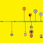
First of all, the need to update a piece of history and life of the club is motivated by the inconsistency of the design of a logo made "12 years before the invention of the Internet" and therefore totally unsuitable for a vector use. In addition, the half century of use had multiplied the interpretations and reproductions of it, so much so that in the same stadium there were different symbols creating a certain confusion. To conclude, the club has included a table showing the timeline of the latest logo changes of the teams now in the Premier League. Only four out of twenty, including Norwich, have not changed logos this millennium: Newcastle, Manchester United and Liverpool.
Subsequently, the club began to organize questionnaires, focus and cross-sectional working groups to listen to reactions and suggestions from Norwich legends like Jeremy Goss to players, staff members, representatives of organized supporters and ordinary fans. An important feedback to avoid annoying, though inevitable, complaints. The creative agency SomeOne then developed the new logo maintaining a strong link with the previous one, updating and simplifying the lines and colors in what even the teaser released on social media defines as "an evolution, not a revolution".
An inevitable step for a club that has just returned to the Premier League and wants to build a more modern and international profile to remain in the top English league, but to be taken with the utmost caution. The thread between tradition and future on which football clubs walk is, in fact, increasingly thin and there are no exact answers. There are, however, correct processes to get there and the one carried out by Norwich goes in the right direction.