The new Swansea logo
A nod to one of the greatest successes of their 109-year history
Sports
July 1st, 2021
July 1st, 2021
It was 1981, Duran Duran, Madonna and Michael Jackson were dominating the radio charts and Swansea had achieved historic promotion to the Premier League. The team captained by John Toshack not only won a historic title but, despite being newly promoted, was also in danger of winning the Premier League, finishing in sixth place. Forty years after that unforgettable season, the club has decided to change its logo with a new, updated and modernised representation of the coat of arms used in 1981 and again between 1992 and 1997. The only substantial difference between the two is that blue has been replaced by black and the year the club was founded will also appear, a detail not used in the last logo.
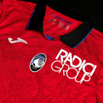
The decision to return to an updated version of the old design is intended as a recognition and tribute to a golden period in Swansea's history. The choice made by the Welsh coastal city does not fit in with the current visual identity of the clubs and brands in general. In fact, all clubs have decided to focus on more minimalist versions, a trend that does not seem to have arrived in the Channel. The new crest will also be present in the new kits made by Joma and deliberately retro. The new shirts have been created taking inspiration from the club's away kit worn in the 1978-79 season, as well as the royal blue design from 1981-82.