The 5 worst jerseys at EURO 2020
Design, colors and details that don't celebrate the aesthetics of the national teams
Sports
June 10th, 2021
June 10th, 2021
While on the one hand we have seen who will aesthetically illuminate the scene at EURO 2020 - which will begin on Friday with the inaugural match of Italy against Turkey - on the other hand there are those who do not stand out for the beauty of their kits. The national teams and the brands that sponsor them often distance themselves so much from traditional colors, perhaps they dare too much in terms of design and the results are not always brilliant. Nike's dominance over other brands allows the Beaverton brand to be massively present among the best but also among the worst. adidas, on the other hand, seems to have used the same template for a significant number of teams: Wales, Belgium, Spain, Russia and Germany have very similar styles, with few details that differentiate the shirts.
Croatia | Nike, away kit


Croatia has always been at the top, both football and aesthetically. The copyright of the checkered design seems to belong to the vice world champion national team after the 2016 final. But Modric, Brozovic and Perisic will wear two different versions of chess: the home kit is always spectacular - despite the different spaces between the white and red squares - while the away seems to be a disaster. The same pattern but in black and gray makes the first jersey lose value and charm, so iconic and so recognizable worldwide. An incomprehensible slip by Nike and Croatia.
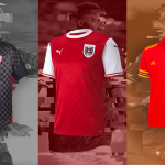
Wales | adidas, home kit


A national team pushed by an entire population that will give a hard time to all the teams in Group A, including Italy. Bale and Ramsey, however, will play with an adidas shirt that is not the best of aesthetics: the red chosen by the brand is not tied to the traditional colors of the flag, while the only detail is on the sleeves - a little bit in terms of creativity. And there is always the flaw of the giant numbers - with a revisable font - in the center of the shirt.
Austria | PUMA, home kit


PUMA's kit work over the past couple of years has been excellent, but some style drops happen. This is the case of Austria and its home kit - beyond the tiffany green and black broken piece that has left many speechless. The courage to pay homage to Austrian culture is certainly to be appreciated, but the almost polka dot pattern that honors the "Österreich" (typical Alpine clothes) on the field is not the best. All-over graphics are a solution that the German brand is using very often, but the eye wants its part.
Portugal | Nike, away kit


One of the most divisive of EURO 2020. That of Portugal produced by Nike is one of the strangest jerseys of this edition, especially due to the background color chosen by the Swoosh. Even if the pattern remains faithful to the colors and tradition of Cristiano Ronaldo's national team, that shade of blue used as the background of the shirt is the furthest away from the wonders that Nike has produced in the last 20 years.
Turkey | Nike, away kit


Nike's trio completes the away version of Turkey, with a simple and linear shirt that becomes less pleasant if we consider the two shades of red present on the kit: the main red of the shirt and the red band that recalls the Turkish flag are not from the same coloring and differences create a bit of confusion. Among the five present in this particular ranking, he is the least negative but it didn't take much to do better.