Premier League 5 best crests
Stories of how a logo can tell an entire community
Sports
January 13th, 2021
January 13th, 2021
Shiny blades and crossed hammers, red devils and saints, eagles flying over monumental crystal palaces and mythological creatures. What, at first, may sound like the promo for a new Game of Thrones season actually is the Premier League universe, the top league of English football.
Whereas in other European championships reign badges displaying clubs’ initials or rather accurate references to the cities’ coats of arms, Premier League’s crests simultaneously stand out as pioneering marketing intuitions and symbols conveying all the heritage of some of the oldest football clubs on earth. The crests bring our minds back to the manuscripts miniated, amidst the Medieval fog, on precious paper under the dim light of a candelabra in some Anglican abbey, and now conserved in the ancient libraries of those colleges whose playgrounds witnessed the birth of the beautiful game.
As if they had been conceived with the concept - first born in the ‘70s with the American NASL - of football as a commercial and entertainment product in mind, Premier League’s crests are ancient works of graphic design made when the concept of graphic design itself was from being coined. Take, for instance, the intuition to associate, within the crest of Liverpool FC, the Liver Bird – symbol of the city – with the Anfield front gate, therefore synthesizing in one badge the axis connecting the club’s origins with one of its iconic and well-identifiable landmarks.
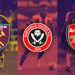
Sheffield United
When writing about the origins of football, we can’t help but mention Sheffield, home - other than to Sheffield F.C., the world’s oldest football club - to the steel city derby between Sheffield Wednesday and Sheffield United. In Sheffield, the paradigm of those grey Northern England cities vibrating with working-class pride, to avoid a future spent in a steel factory, people either go for music - like successfully done by Pulp and Arctic Monkeys - or football. Sitting at the bottom of the table but leading it in matter of crest beauty, Sheffield United portrays on its badge the steel symbol of the city in the form of two crossed swords: the blades, memories of that Victorian England made of lords and corsairs.


Everton
Definitely sitting in a better table position, and also one of this year’s revelations, Carlo Ancelotti’s Everton has managed to redeem itself after a series of seasons where shadows dominated over lights. The crest of the Toffees - nickname coming, as for many British clubs, from their cities’ labouring traditions, in this case the production of toffee sweets - is emblazoned with Prince Rupert’s Tower, a seventeen-hundreds brick building that, since the birth of the Everton district, has been symbolically attached to the area where Goodison Park stands. Crowned by the Latin motto ‘Nil Satis Nisi Optimum’ (meaning ‘Nothing but the best is good enough’), the Everton badge was born as a fashion accessory for the 1937/38 season, when president and future manager Theo Kelly spent four months working hard to design a logo to use on the club’s necktie.


Crystal Palace
Animals are a classic of English crests, like in the case of Crystal Palace, a club worthy of a focus for the pioneering branding dynamics that have characterised its history. Founded as the team of the workers of the Crystal Palace, the massive steel and glass structure projected by architect Joseph Paxton and built in Hyde Park for the 1851 London universal expo, Palace has changed different crests and nicknames over the years. At first the Glaziers, then the Eagles, when in 1972 the volcanic manager Malcolm Allison, inspired by both the marketing strategies of the new-born American soccer league and by FC Barcelona blaugrana kit, decided to change the South London team’s crest and colours. Freshly restyled, Crystal Palace's new crest combines several of the club’s historical identities by placing a fierce spread-wing eagle taken from the team’s 1980s badge onto the now long-gone Crystal Palace.


Arsenal
Sticking to London, Arsenal nonetheless has one of the most fascinating crests of the whole Premier League. The gun from which the nickname Gunners originates is rooted in the coat of arms of Woolwich Borough, where the club was founded. Born on Christmas day 1985 at the Royal Oak pub under the initiative of 15 employees of the Woolwich artillery, Royal Arsenal, then simply Arsenal, couldn’t help but adopt a gun as its symbol.


West Ham United
When writing about English football crests, we can’t avoid mentioning the crossed hammers of West Ham, another team whose symbol is linked to the working-class tradition of its area. Born from the evolution of Thames Ironworks FC – the team of one of the iron works and shipyard firms operating on the East bank of the Thames, in a Dickensian London as polarised in its social structures as it still is today – the Hammers, or Irons, have always shown off their crossed hammers as a symbol of pride and identity. Although long associated with the team’s excessively glorified and overdone hooligan tradition, the hammers have also been generally adopted by West Ham supporters as a gesture of identification and fandom obtained by crossing arms in the shape of two hammers; a pose often adopted in photographs by the likes of Paolo Di Canio and Cass Pennant among others.