Browse all

The story behind a badge: Inter FC

112 years of history condensed into a simple logo

The story behind a badge: Inter FC 112 years of history condensed into a simple logo

"This splendid night will give the colors to our emblem: black and blue against the golden background of the stars. It will be called International, because we are brothers of the world"

These words date back to March 9, 1908 and were pronounced by the painter Giorgio Muggiani, one of the 44 members of the new club and creator of the emblem of what we now call Inter. For what has been founded as an International Foot-Ball Club, a 112-year history made up of successes, difficulties, glory, tears, but above all a stylistic identity that has lasted for more than two centuries.

The emblem of a sports club has always been its brand, its logo, one of those distinctive characters that will never disappear. It can be seen waving on flags, worn by players and fans, it is seen in modern times on every marketing tool used by increasingly advanced companies that must keep up with the times. Yet FC Internazionale Milano - its official name today - has never deviated its way, has rarely bowed to market needs and trends and today maintains a more unique than rare integrity, with a fan base of 70 million of fans around the world.

The story behind a badge: Inter FC 112 years of history condensed into a simple logo  | Image 235004
The story behind a badge: Inter FC 112 years of history condensed into a simple logo  | Image 235003
The story behind a badge: Inter FC 112 years of history condensed into a simple logo  | Image 234988
The story behind a badge: Inter FC 112 years of history condensed into a simple logo  | Image 234989
The story behind a badge: Inter FC 112 years of history condensed into a simple logo  | Image 234990
The story behind a badge: Inter FC 112 years of history condensed into a simple logo  | Image 234991
The story behind a badge: Inter FC 112 years of history condensed into a simple logo  | Image 234992
The story behind a badge: Inter FC 112 years of history condensed into a simple logo  | Image 234995
The story behind a badge: Inter FC 112 years of history condensed into a simple logo  | Image 234997
The story behind a badge: Inter FC 112 years of history condensed into a simple logo  | Image 234996
The story behind a badge: Inter FC 112 years of history condensed into a simple logo  | Image 234994

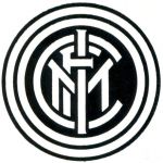
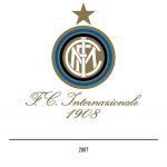
Born from the split of the Milan Cricket and Football Club, Inter left from the night of March 9, 1908 in search of a style that could be recognizable. It obviously started with the colors. The black remained unchanged compared to the colors of AC Milan, while something was needed that would replace the red of the "Devils". At the time, the pencils used for the graphic drafts were only two: one red and one blue. Muggiani therefore decided to draw the first monogram with the blue pencil, clearly inspired by the liberty style that already characterized the logo of several English clubs. At the center of the first historic circular logo of Inter were 3 intertwined letters: FCIM. The acronym was in white on a gold background, all represented in two concentric black and blue circles.

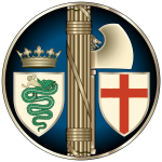
To see the first change, even if forced, we must wait until 1925, when the impositions of fascism forced the clubs to revisit their coats of arms. Inter, who in the meantime had become "Ambrosiana" for the reasons mentioned above, opted for a circular symbol with the lictorial bundle on a blue background. Everything was completed by the shield with the image of the Visconti biscion on the left, while on the right the red-crisscross shield, the symbol of Milan.

Four years later, the new replacement, a first radical change: in the center a rhombus with nerazzurri stripes on whose sides, on a white field, the letters A and S appeared while at the bottom, full width, a black band with the name "Ambrosiana" in gold. If 1929 represents a watershed in the style of the Interista logo, 1932 is the moment when the fans become the center of the club's graphic choices. From the stands of the Arena Civica there was no chorus for the Ambrosiana, but everyone sang only "Inter". The company decided to change its name - transforming it into "Ambrosiana-Inter" - and consequently also changed the brand: rhombus with nerazzurri stripes, in the center a ball of the time and all around a blue frame with the words "Associaz. Sportiva Ambrosiana Inter".

The story behind a badge: Inter FC 112 years of history condensed into a simple logo  | Image 235005
The story behind a badge: Inter FC 112 years of history condensed into a simple logo  | Image 235006
The story behind a badge: Inter FC 112 years of history condensed into a simple logo  | Image 234993
The decidedly dramatic interlude of the war takes us directly to 1945, when the company decided to call itself "Inter" only, with no other addition. An innovation accompanied by a return to tradition in stylistic terms: still rounded shape and intertwined letters but the background turns white. For 15 years the same symbol reigns and stands out, but at the beginning of the sixties a new radical change, with a clear and decisive greeting to tradition. It is probably the first significant form of restyling of the Inter logo, with the division in the middle of it: nerazzurri stripes on the left, biscione and soccer ball with the foundation year on the right. After two years, a small modification: the emblem will become oval in nerazzurri stripes with the golden biscione in the center and, at the top, a black band with the word "Inter", surmounted by the golden letters "FC" on a blue field. It lasted only one season, because in 1963 it returns to its origins. The club will resume the mark of 1908, with the only addition of a golden circle between the black and the blue one.

The story behind a badge: Inter FC 112 years of history condensed into a simple logo  | Image 234998
The story behind a badge: Inter FC 112 years of history condensed into a simple logo  | Image 234999
At the end of the 70s a new modernization arrives, with the Inter badge showing two transversal black and blue stripes on which there is the white biscione no longer in the classic twisted position with the little man in the mouth but with more sympathetic features and shown in transit; for the first time in the upper left corner there was the star that symbolized the conquest of 10 badges. After the innovations and the return to the origins, the 70s represent the moment of stylization of the Inter brand, always keeping the historical symbols and the representative colors. After the 1989 championship, it was decided to renew the logo again. In fact, in the 90-91 season it will return to the 1963 logo, reducing its size and enlarging the star. After the European successes of the last decade of the twentieth century - with 3 UEFA Cups won in '91, in '94 and in '98 - the changes at the end of the millennium arrive: the new emblem had concentric centers inside which we find the wording "Inter" and the foundation date, with the star positioned high but next to the letters.

The story behind a badge: Inter FC 112 years of history condensed into a simple logo  | Image 235000
The story behind a badge: Inter FC 112 years of history condensed into a simple logo  | Image 235002
Modern times are coming and the freshness of a winning project is also reflected in the club's graphic choices. In 2007 the writing "Inter" becomes in calligraphic italics. The spread and expansion of the idea of the club as a real brand declinable in terms of merch and style becomes increasingly important and in 2014 another restyling arrives, this time entrusted to Leftloft: a compositional simplification with a review of the four letters and a reduction of the concentric circles, with the right proportional balance between the graphic elements of the Inter symbol to allow for improved readability and reproducibility. Even the font, the true distinctive character of modern logos, changes and an ad hoc product is used. The theme of the font has been a topic of debate in recent weeks, with Serie A having decided to share a single font with all the teams.

The story behind a badge: Inter FC 112 years of history condensed into a simple logo  | Image 234987
The story behind a badge: Inter FC 112 years of history condensed into a simple logo  | Image 234986

112 years of history, of a long history also graphic. The Inter logo, however, has always remained faithful to the ideals of those 44 members who 112 years ago met at the "L'Orologio" restaurant in Piazza Duomo to found what is now FC Internazionale Milano. The best words that can tell the Nerazzurri story are by Gianfelice Facchetti, son of the great Giacinto.